(EN) The quick brown fox jumps over the lazy dog. (NL) Op brute wijze ving de schooljuf de quasi-kalme lynx. (CS) Nechť již hříšné saxofony ďáblů rozezvučí síň úděsnými tóny waltzu, tanga a quickstepu. (HU) Jó foxim és don Quijote húszwattos lámpánál ülve egy pár bűvös cipőt készít. (RO) Înjurând pițigăiat, zoofobul comandă vexat whisky și tequila. (RU) Разъяренный чтец эгоистично бьёт пятью жердями шустрого фехтовальщика. (BG) Огньове изгаряха с блуждаещи пламъци любовта човешка на Орфей. (SR) Фијуче ветар у шибљу, леди пасаже и куће иза њих и гунђа у оџацима. (EL) Ταχίστη αλώπηξ βαφής ψημένη γη, δρασκελίζει υπέρ νωθρού κυνός. Type your own text to test the font!
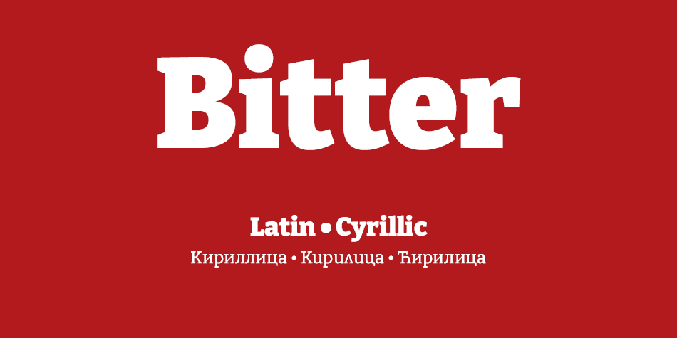
Description
People read and interact with text on screens more and more each day. What happens on screen ends up being more important than what comes out of the printer. With the accelerating popularity of electronic books, type designers are working hard to seek out the ideal designs for reading on screen.
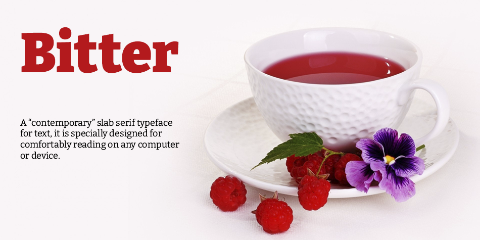
Motivated by my love for the pixel I designed Bitter. A “contemporary” slab serif typeface for text, it is specially designed for comfortably reading on any computer or device. The robust design started from the austerity of the pixel grid, based on rational rather than emotional principles. It combines the large x-heights and legibility of the humanistic tradition with subtle characteristics in the characters that inject a certain rhythm to flowing texts.
Bitter has little variation in stroke weight and the Regular is thicker than a normal ‘Regular’ style for print design. This generates an intense color in paragraphs, accentuated by the serifs that are as thick as strokes with square terminals.
Each glyph is carefully designed with an excellent curve quality added to the first stage of the design, that was entirely made in a pixel grid. The typeface is balanced and manually spaced to use very few kerning pairs, especially important for web font use since most browsers do not currently support this feature.
Early versions of the Italic and Bold styles were added in December 2011 and have been updated and complemented by a Bold Italic in early 2012.
Sol Matas is an Argentinian type designer born in Buenos Aires. She holds a degree in Graphic Design from Universidad de Buenos Aires, as well as a specialisation degree in Digital Design and a postgraduate diploma in Type Design from the same school.
She started her career as a graphic designer at the Saatchi & Saatchi agency. In 2001, she founded her own branding studio Sonnenshine, through which she has been working for clients in Latin America, Europe and the United States.
She co-founded the type foundry Huerta Tipografica with fellow Argentinian designers in 2009. In 2013, after many visits to Berlin and discovering the large type community there, she decided to move to this city. Since then, she has focused on developing font projects in Latin, Cyrillic, Greek, Oriya and Devanagari. In 2019, she founded her own type venture, Hungry Type Society.
• Open the file.
• On the “You need permission” page, click “Request access”.
• The owner of the file will get an email asking for approval.
• After they approve your request, you’ll get an email.