M+ FONTS are Japanese font families designed by Coji Morishita. The ‘M’ stands for ‘Minimum’, while the plus sign means above minimum. The M+ FONTS are a font family under the Free license. You can use, copy, and distribute them, with or without modification, either commercially or noncommercially.
All Latin glyph sets were completed with Basic Latin, Latin-1 Supplement, Latin Extended-A, and IPA Extensions. And most of Greek, Cyrillic, Vietnamese, and extended glyphs and symbols were prepared too. So the fonts are in conformity with ISO-8859-1, 2, 3, 4, 5, 7, 9, 10, 13, 14, 15, 16, Windows-1252, T1, and VISCII encoding. Available as a multi-lingual or multi-purpose fonts.
In addition, proportional M+ P Type-1 and M+ P Type-2 fonts were completed with Latin Extended-B, Latin Extended Additional, Windows Glyph List 4 (WGL4) and Hebrew (ISO-8859-8). And many Greek, Cyrillic, IPA Extensions glyphs, and symbols were expanded. Those additional glyphs are included in M+ C Type-1 and M+ C Type-2 provisionality.
Japanese and Latin proportional fonts are available in 7 (Thin to Black) weights.
Latin fixed-halfwidth fonts are available in 5 (Thin to Bold) weights.
In the Japanese fonts, there are 2 variations of Kana Glyphs. M+ Type-1: Consists of contrasting straight lines and hand-drawn curves, and M+ Type-2: Incorporates traditional feature of Kana script in the overall modern sans-serif design. The Kanji glyphs are identical between fonts of same weights.
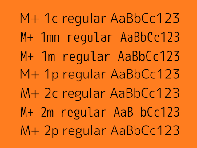
In the Latin fonts, M+ P is aimed as sophisticated and relaxed design, while M+ C is optimized to be proportioned well in typesetting, M+ M emphasize the balance of natural letterform and high legibility. Each have 2 variations of the Type-1 and Type-2, corresponding to the Japanese fonts.
PROPORTIONAL FONTS (proportional Latin and fixed-fullwidth Japanese)
M+ P Type-1
Combination of fixed-fullwidth M+ Type-1 for Japanese and proportional M+ P Type-1 for alphabets.
mplus-1p-thin.ttf
mplus-1p-light.ttf
mplus-1p-regular.ttf
mplus-1p-medium.ttf
mplus-1p-bold.ttf
mplus-1p-heavy.ttf
mplus-1p-black.ttf
M+ P Type-2
Combination of fixed-fullwidth M+ Type-2 for Japanese and proportional M+ P Type-2 for alphabets.
mplus-2p-thin.ttf
mplus-2p-light.ttf
mplus-2p-regular.ttf
mplus-2p-medium.ttf
mplus-2p-bold.ttf
mplus-2p-heavy.ttf
mplus-2p-black.ttf
M+ C Type-1
Combination of fixed-fullwidth M+ Type-1 for Japanese and proportional M+ C Type-1 for alphabets.
mplus-1c-thin.ttf
mplus-1c-light.ttf
mplus-1c-regular.ttf
mplus-1c-medium.ttf
mplus-1c-bold.ttf
mplus-1c-heavy.ttf
mplus-1c-black.ttf
M+ C Type-2
Combination of fixed-fullwidth M+ Type-2 for Japanese and proportional M+ C Type-2 for alphabets.
mplus-2c-thin.ttf
mplus-2c-light.ttf
mplus-2c-regular.ttf
mplus-2c-medium.ttf
mplus-2c-bold.ttf
mplus-2c-heavy.ttf
mplus-2c-black.ttf
FIXED-WIDTH FONTS (fixed-halfwidth Latin and fixed-fullwidth Japanese)
M+ M Type-1
Combination of fixed-fullwidth M+ Type-1 for Japanese and fixed-halfwidth M+ M Type-1 for alphabets.
mplus-1m-thin.ttf
mplus-1m-light.ttf
mplus-1m-regular.ttf
mplus-1m-medium.ttf
mplus-1m-bold.ttf
M+ M Type-2
Combination of fixed-fullwidth M+ Type-2 for Japanese and fixed-halfwidth M+ M Type-2 for alphabets.
mplus-2m-thin.ttf
mplus-2m-light.ttf
mplus-2m-regular.ttf
mplus-2m-medium.ttf
mplus-2m-bold.ttf
M+ MN Type-1
Combination of fixed-fullwidth M+ Type-1 for Japanese and fixed-halfwidth M+ MN Type-1 for alphabets.
mplus-1mn-thin.ttf
mplus-1mn-light.ttf
mplus-1mn-regular.ttf
mplus-1mn-medium.ttf
mplus-1mn-bold.ttf
Design: Coji Morishita
Copyright 2015 by M+ FONTS PROJECT. All rights reserved.
License: FREE. Local Fonts Free For Personal and Commercial Use License
Free License
Download: M+ | Google Drive
Get permission to open a file on Google Drive
• Open the file.
• On the “You need permission” page, click “Request access”.
• The admins of the site will receive your request to access the file you want to download.
• After they approve your request, you’ll be notified by email.
Font development: M+ Fonts | GitHub | rayshan
Font development: M+ Fonts | GitHub | coz-m