By Szandra Peev • 25 January 2021
INTERVIEW with Botio Nikoltchev | LETTERSOUP
PHOTOS: © Lettersoup, © Boryana Pandova, © Svoboda Tzekova
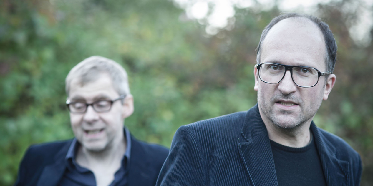
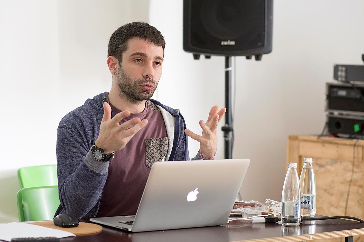
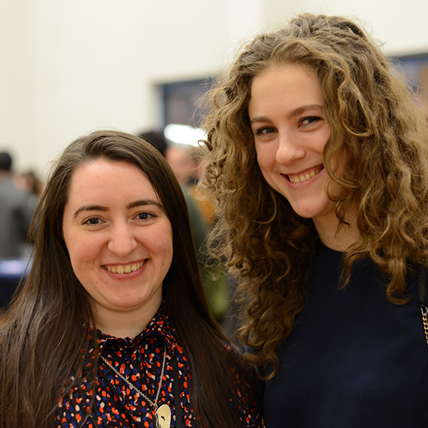
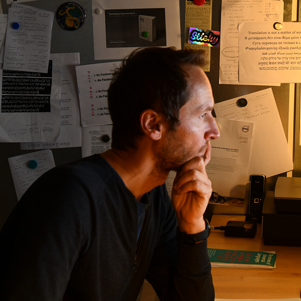
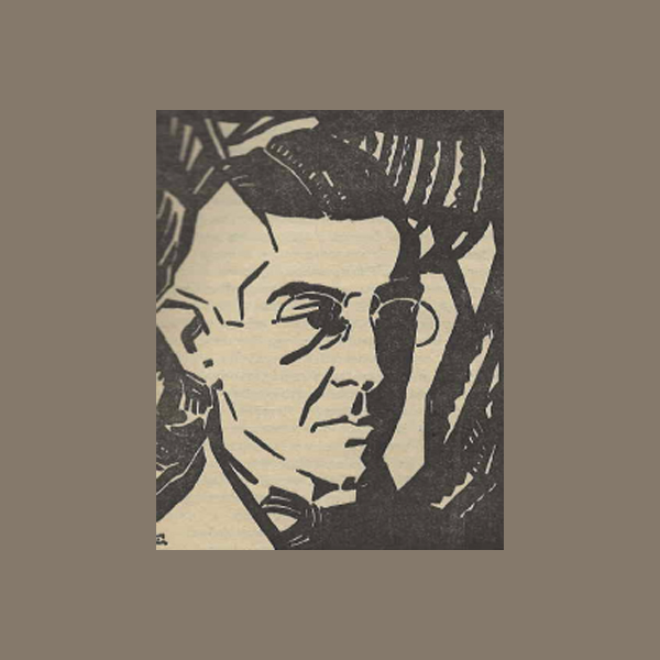
Lettersoup founder: Botio Nikoltchev, photo by Boryana Pandova
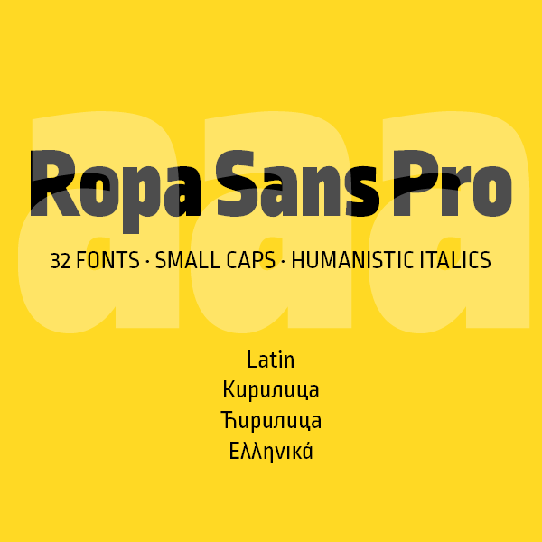
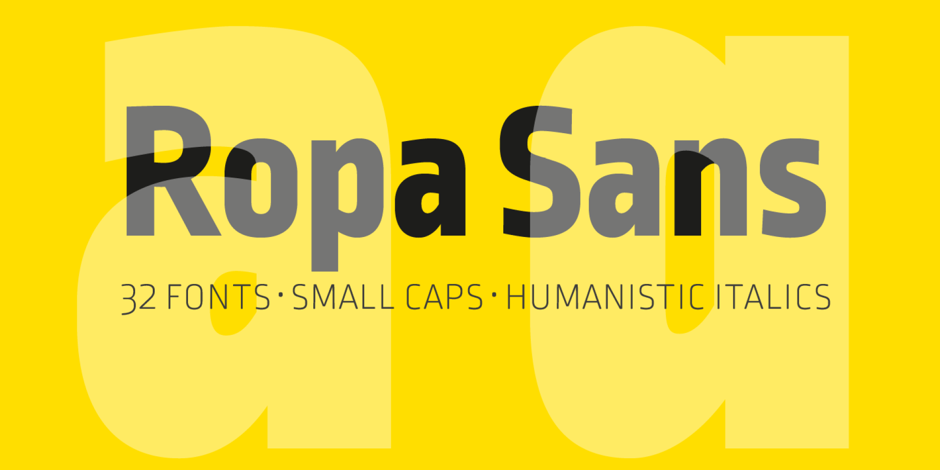
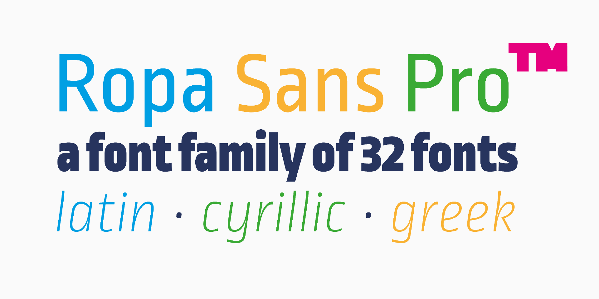
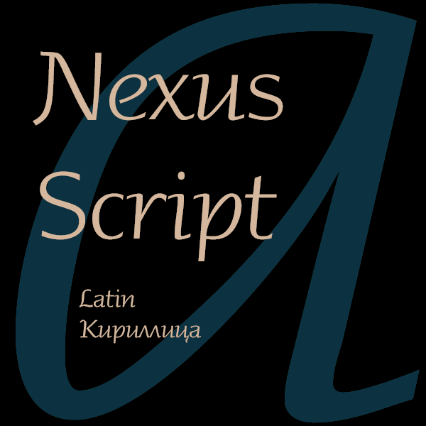
In this exclusive interview Botio Nikoltchev speaks about his professional development. He was a student of Lucas de Groot and after graduating he had the chance to work with such famous type designers as Akira Kobayashi and Erik Spiekermann. Botio also shares his views on the diversity of Cyrillic letterform models in the different Cyrillic alphabets. He tells us about the project Sofia Sans, which is now the typeface of Sofia – the capital of Bulgaria. Botio also describes his newest release Apparat and reveals his future plans.
Let’s talk about your professional and creative journey. Where did it start – in Sofia or Berlin? Which colleagues and professors have left a mark on your work?
Botio Nikoltchev (BN): I don’t see myself as an artist but more as an addict. Type design is actually an endless way of improvement, an endless search of harmony and rhythm, an endless desire of beauty and ugliness.
It was a long way until I started designing typefaces. But yes, it was in Berlin, I started my studies as an industrial designer. My love for type came by taking typography classes with Prof. Betina Müller and type-design classes with Prof. Lucas de Groot.
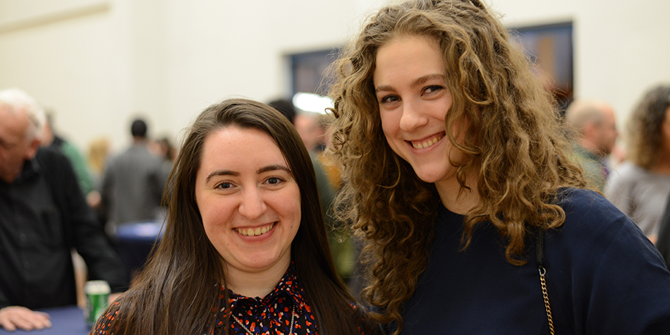
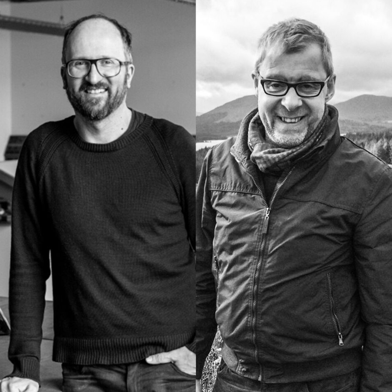
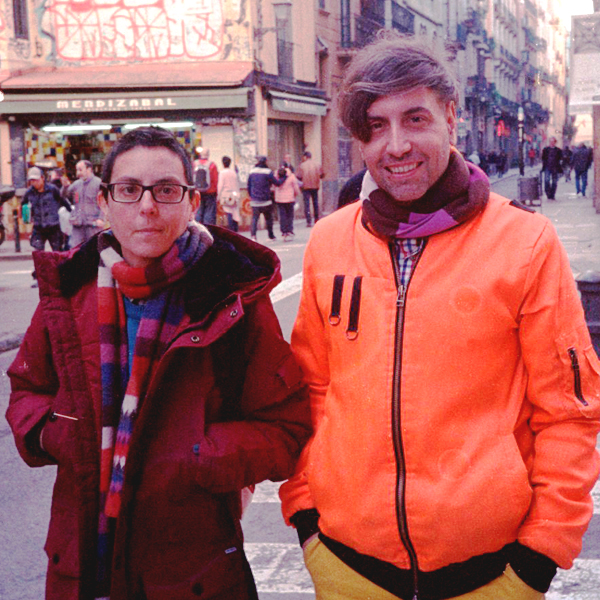
Pepa Karaivanova, Lucas de Groot, Sonja Knecht, Botio Nikoltchev in Sofia on 24th May, photo Sv. Tzekova
I was lucky to have the opportunity to work with some leading type designers. There were moments I thought Akira Kobayashi doesn’t have eyes, but microscopes. His ability to see the smallest details is really incredible.
Erik Spiekermann –– what a literate and entertaining man. Оnce we talked about Bulgarian history and his knowledge truly impressed me. He is not just able to recognize problems on a daily life basis, and solve them through design, but he is also excellent in finding the right people at the right time for the job.
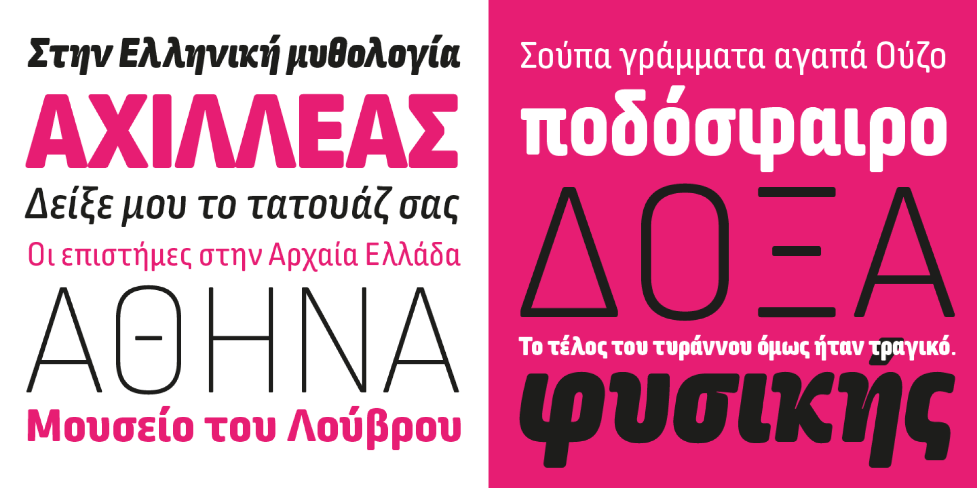
You are part of many font projects in which you are also responsible for the development of the Cyrillic script. What are the main challenges which a modern type designer needs to overcome when working on Cyrillic font projects?
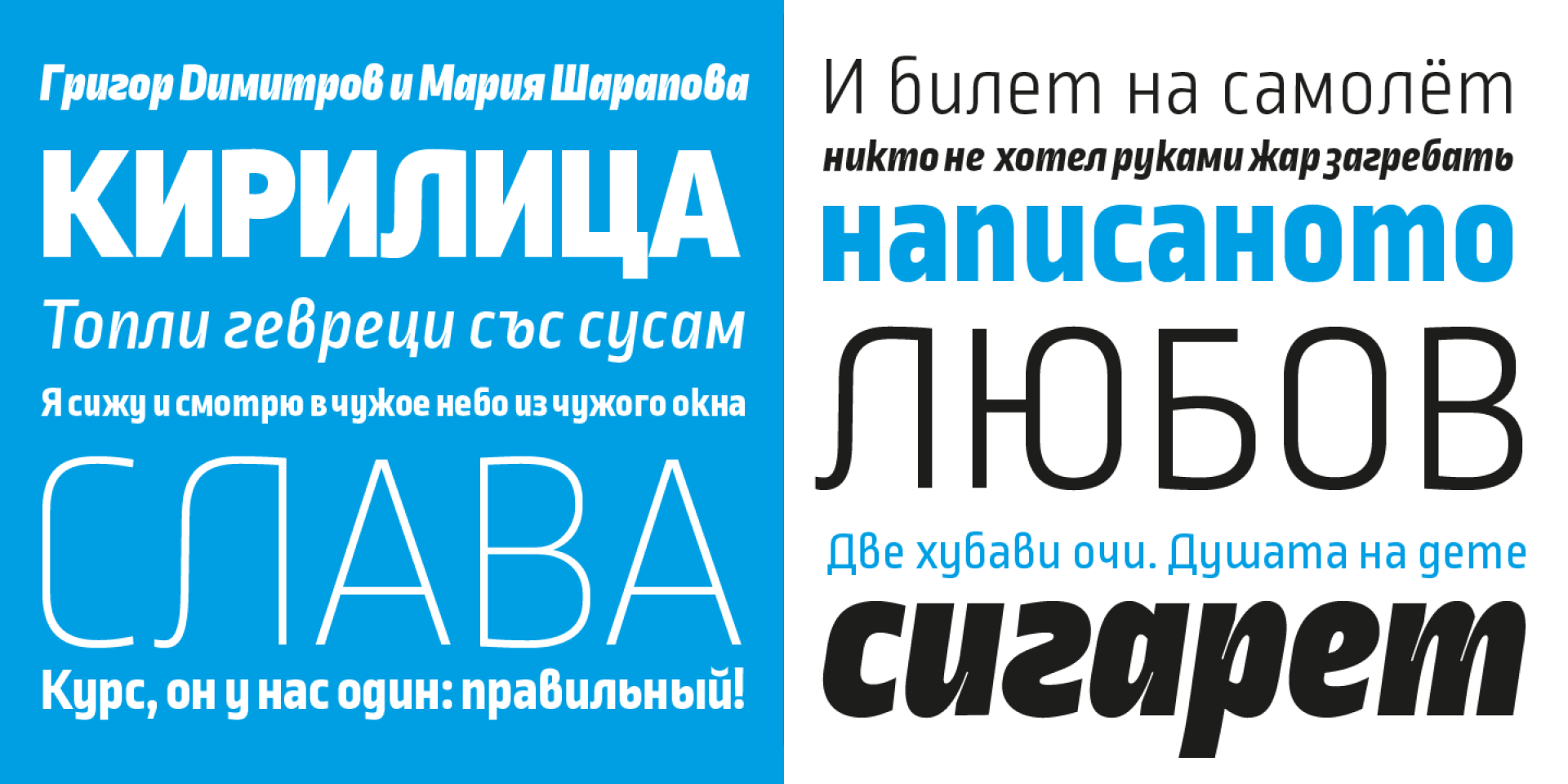
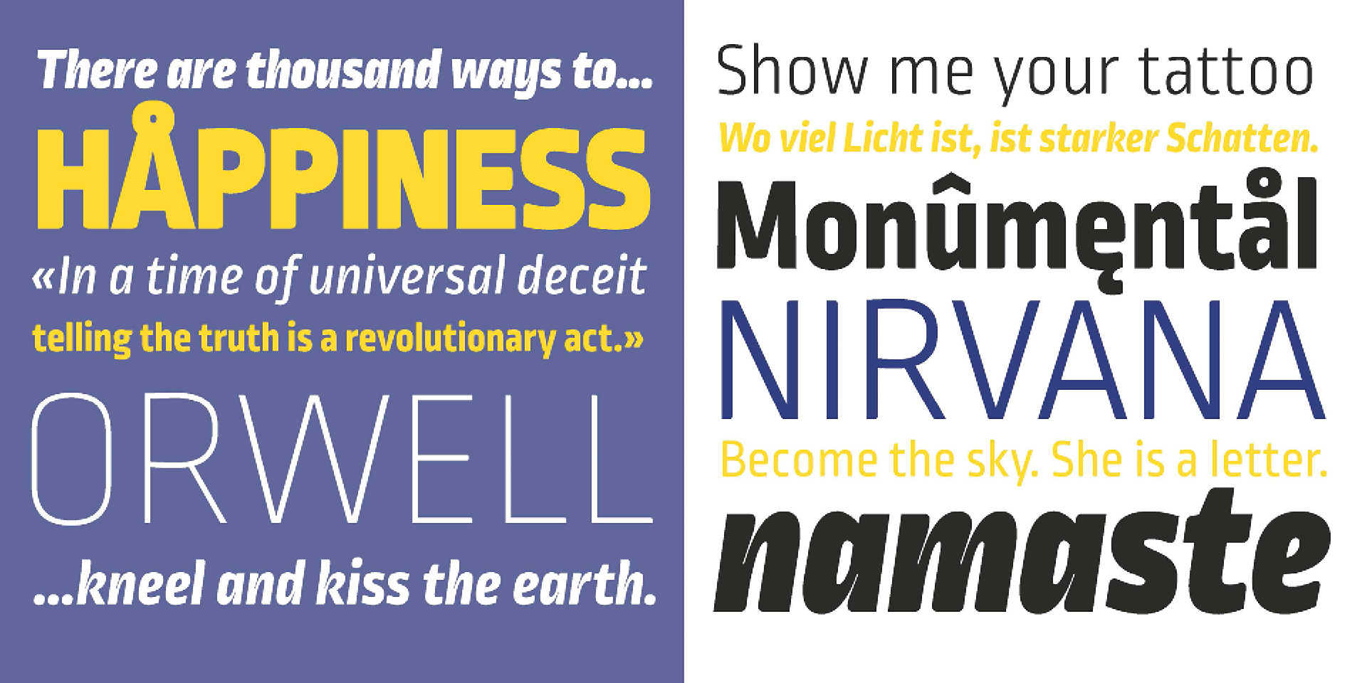
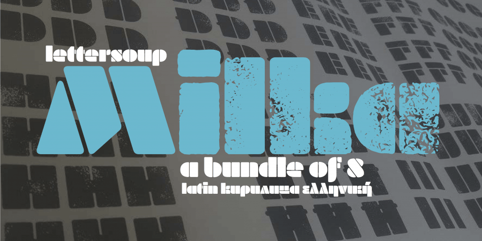
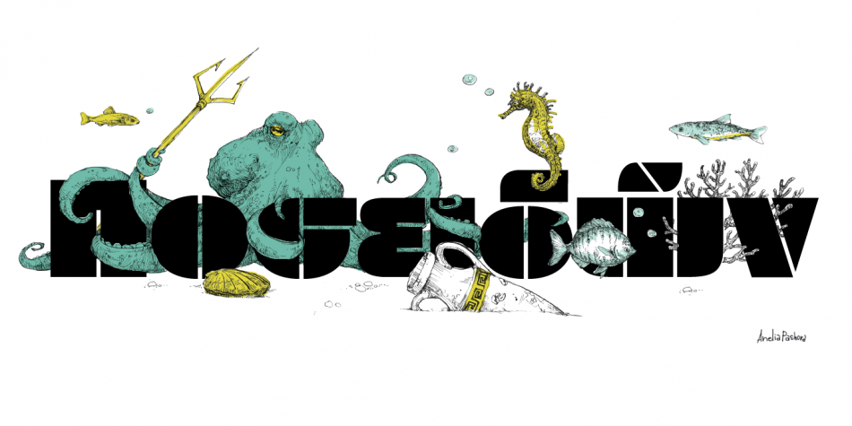
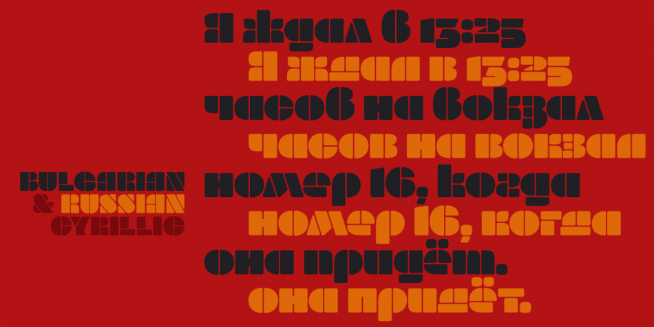
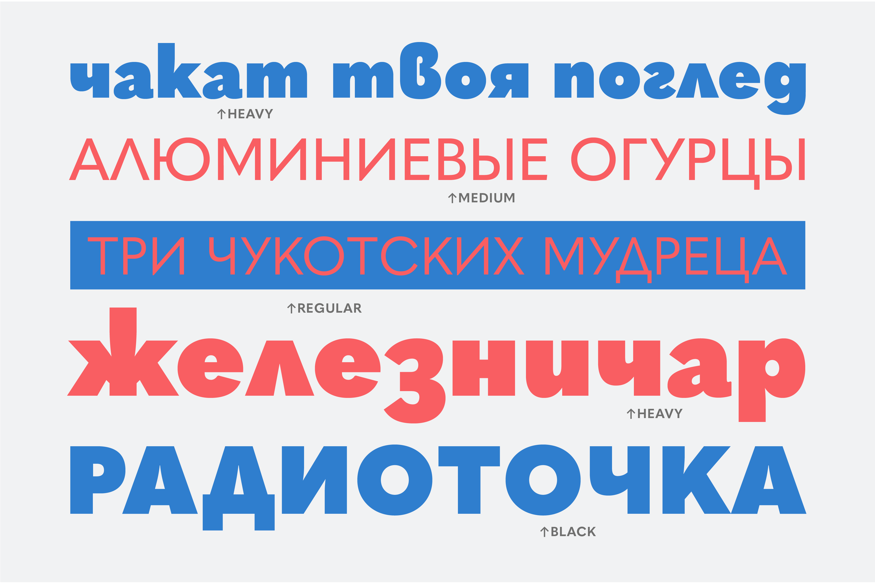
Font family: Apparat; Release 2020; Copyright: Botio Nikoltchev
BN: The challenges are quite similar to the Latin and there are no particular ones. It always depends on the project, the client etc.
Of course there are decisions to be made e.g. how to handle characters like “K”. They could have the same grapheme but they also could look different in Latin, Cyrillic and Greek.
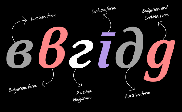
What is your personal and professional view on the local forms of the Cyrillic like Bulgarian, Serbian, North Macedonain, Ukrainian and the Cyrillic used by Mongolians, Bashkirs etc.?
BN: Although as a type designer I work mostly with a black and white colors, I enjoy very much the colorful aspects of life. I like the diverseness of the Cyrillic world and the character variations.
When you think in terms of evolution, it never moves in a straight direction and it never ends at one particular point. So to me these variations are the epitome of the continuously flowing and changing Cyrillic world.
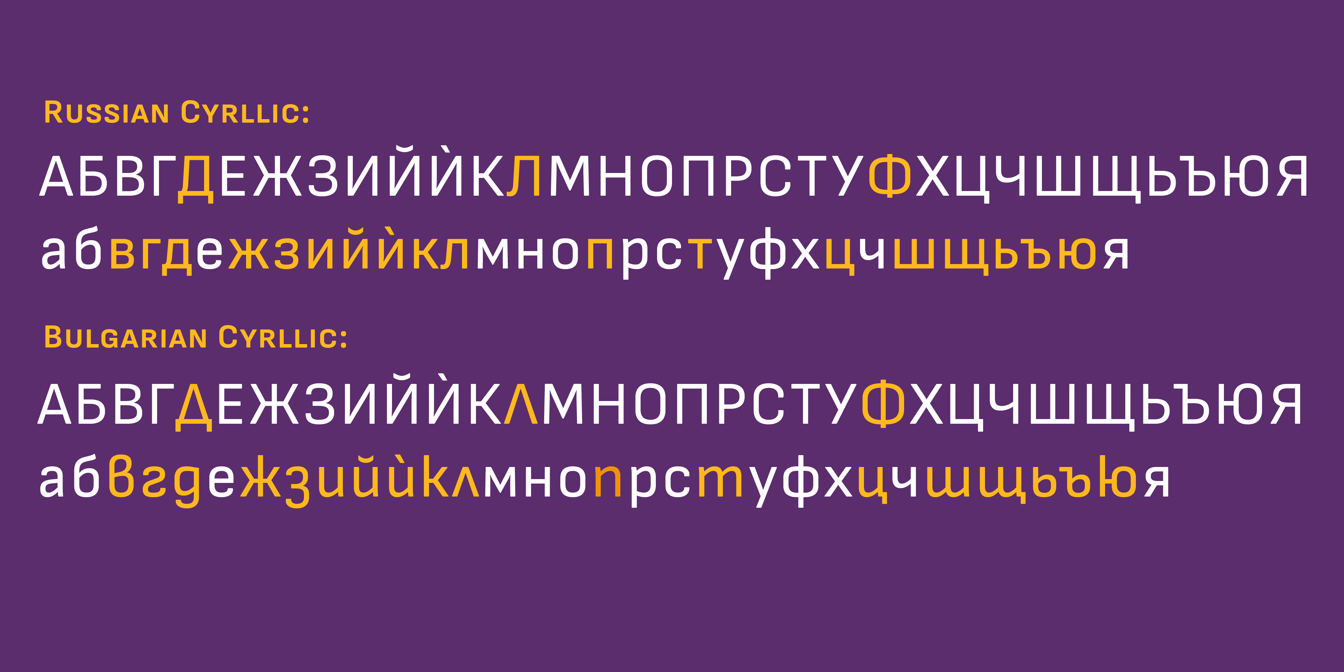
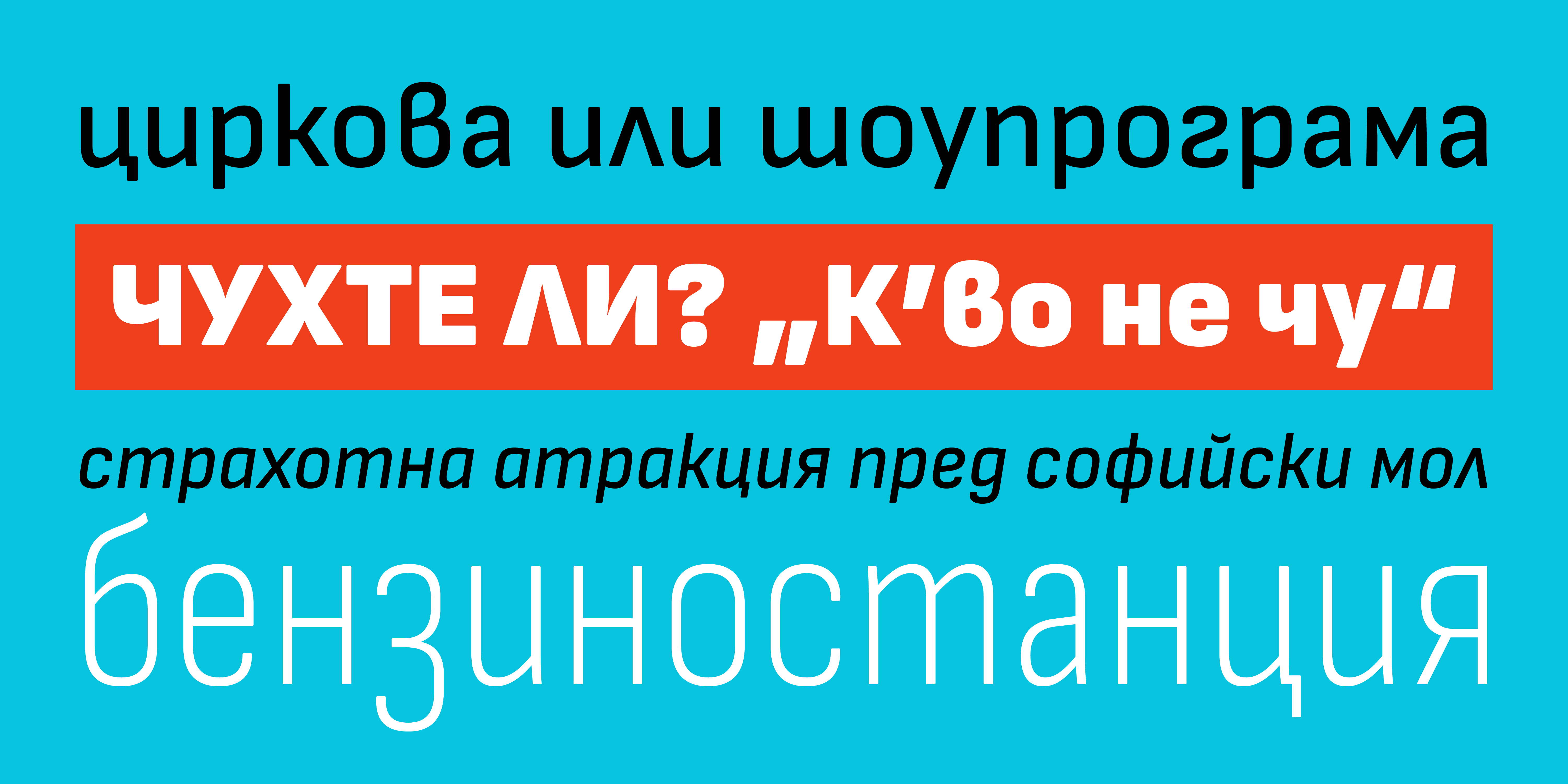
A while ago, together with Vassil Kateliev we launched a research on the handwritten forms of these languages. The idea was and still is to prove if Buglarian Cyrillic can serve the entire Cyrillic character set.
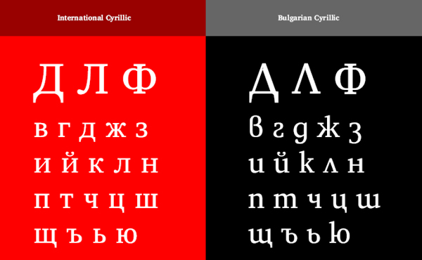
What motivates you to support the Bulgarian Cyrillic form (you call it Rounded Cyrillic)? In your opinion, what is the future of the Cyrillic script?
Font family: Apparat; Release 2020; Copyright: Botio Nikoltchev
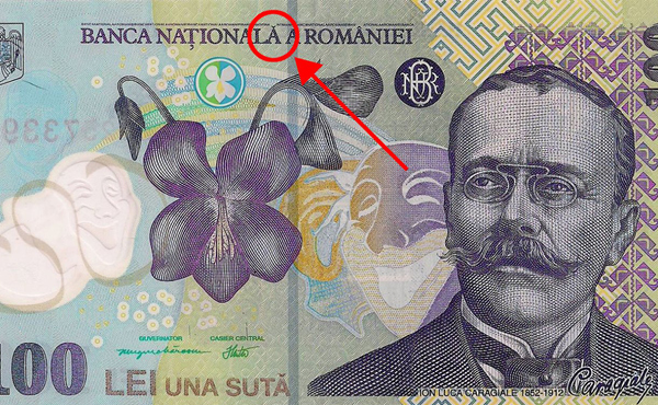
BN: I believe Bulgarians need the Bulgarian Cyrillic. Type is a cultural heritage, it is one of the ways to recreate the surrounding world. Thus type expresses our worldview, our philosophy of life. By not having the Bulgarian Cyrillic we’ll also lack our worldview.
“Type is a cultural heritage, it is one of the ways to recreate the surrounding world.”
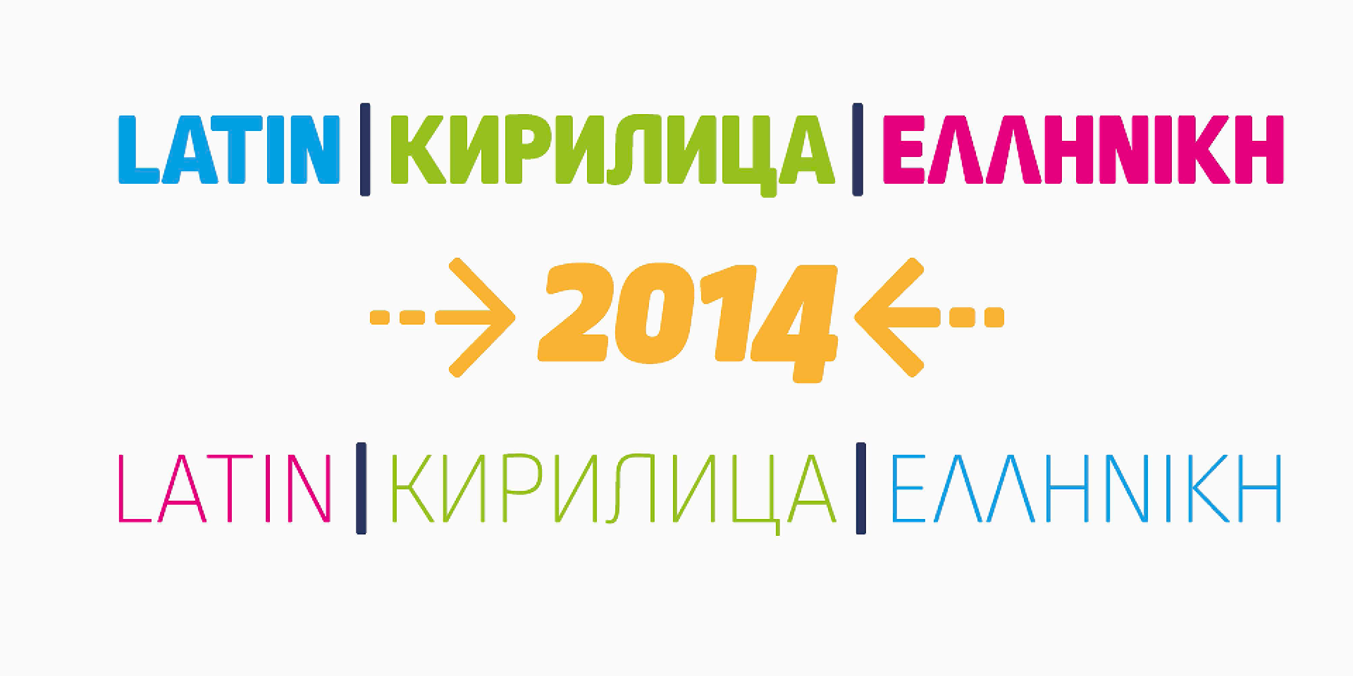
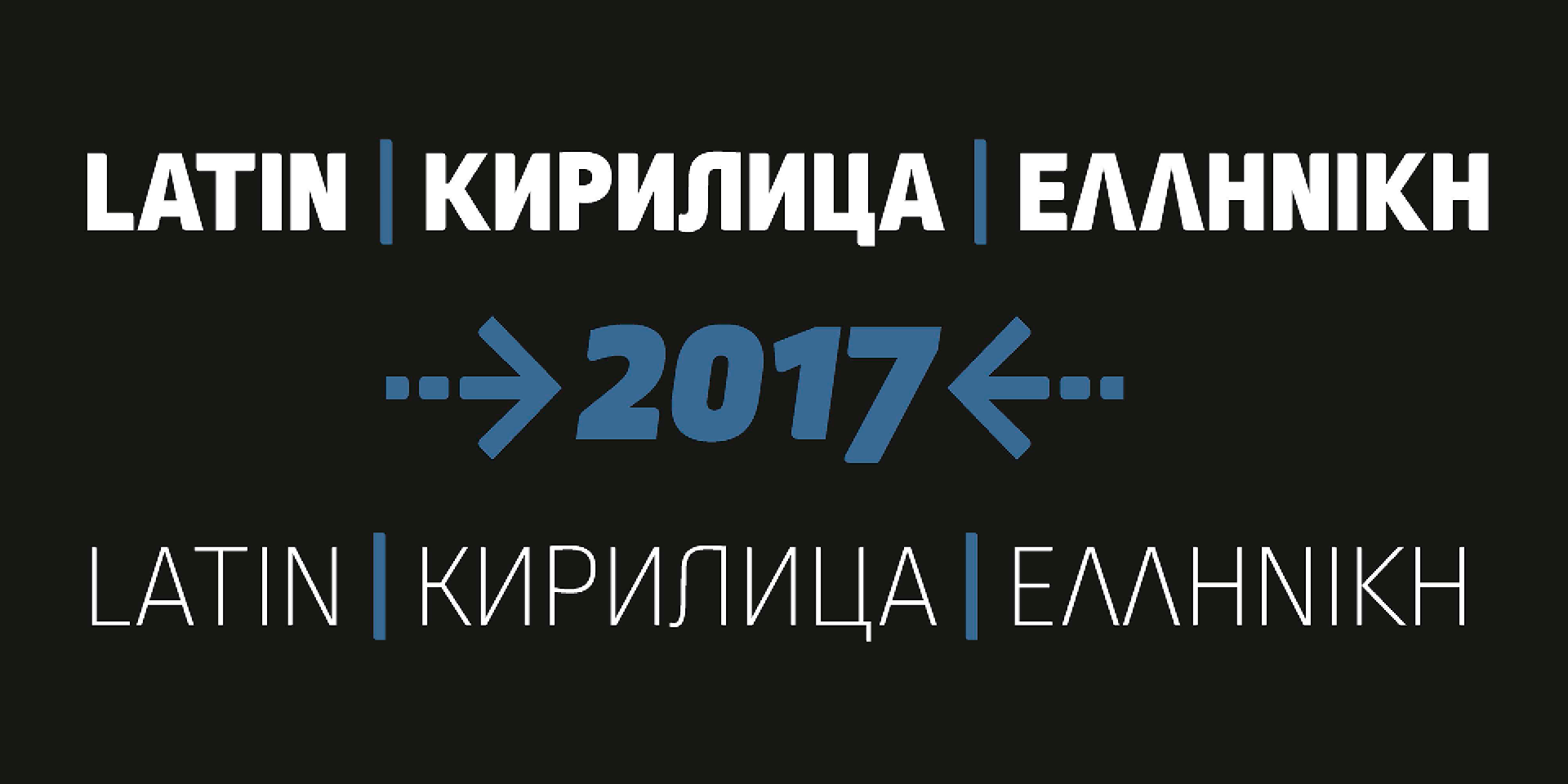
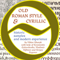
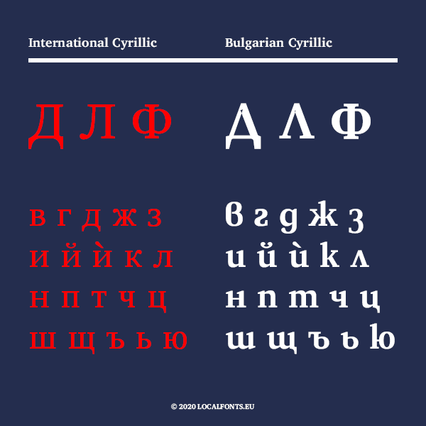
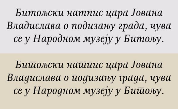
Yes, I prefer to call the Bulgarian forms Rounded Cyrillic and the Russian forms Square Cyrillic. It describes the designs and it does not have political touch. Back in 2017, my friend Adam Twardoch came up with the idea about the name. It was based on the rounded- and square Glagolitic.
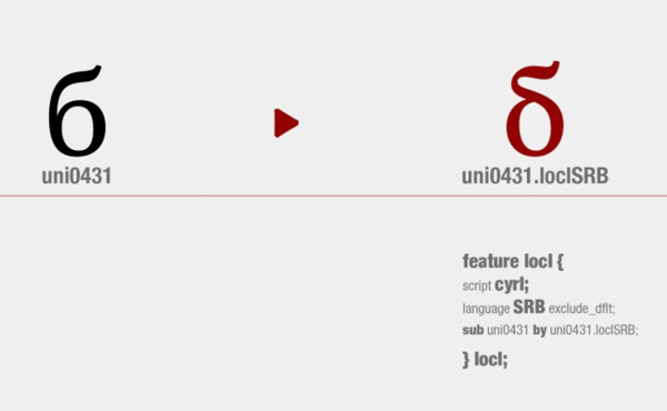
I worked several years, of course together with a number of colleagues and friends, on “the future” and now there is a standard which characters should be designed for Bulgarian Cyrillic, as well as implemented Bulgarian character set (encodings) in the font editors, there is a technical guideline on how to set the Open Type features in order to perform properly local forms in all browsers and apps. Monotype and Google fonts are including and producing the Rounded Cyillic in nearly all new releases and an increasing number of western designers are creating Bugarian Cyrillic for their typefaces. When you look back, several years ago the fonts with Bulgarian Cyrillic were scarce goods.
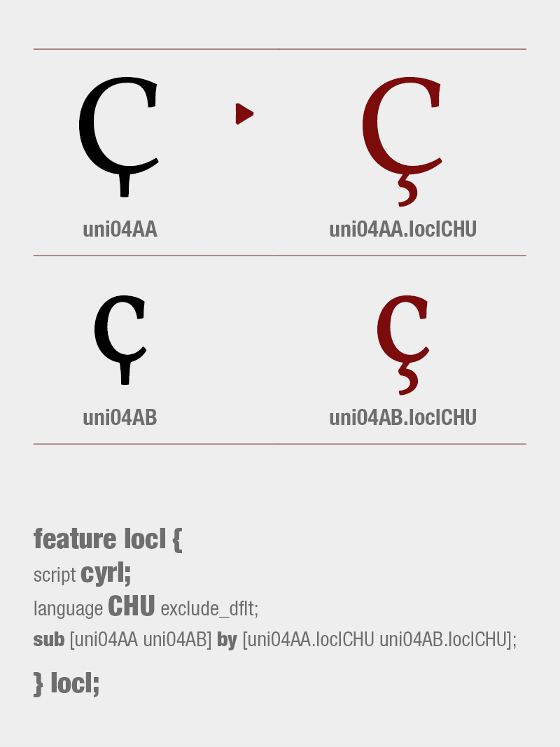
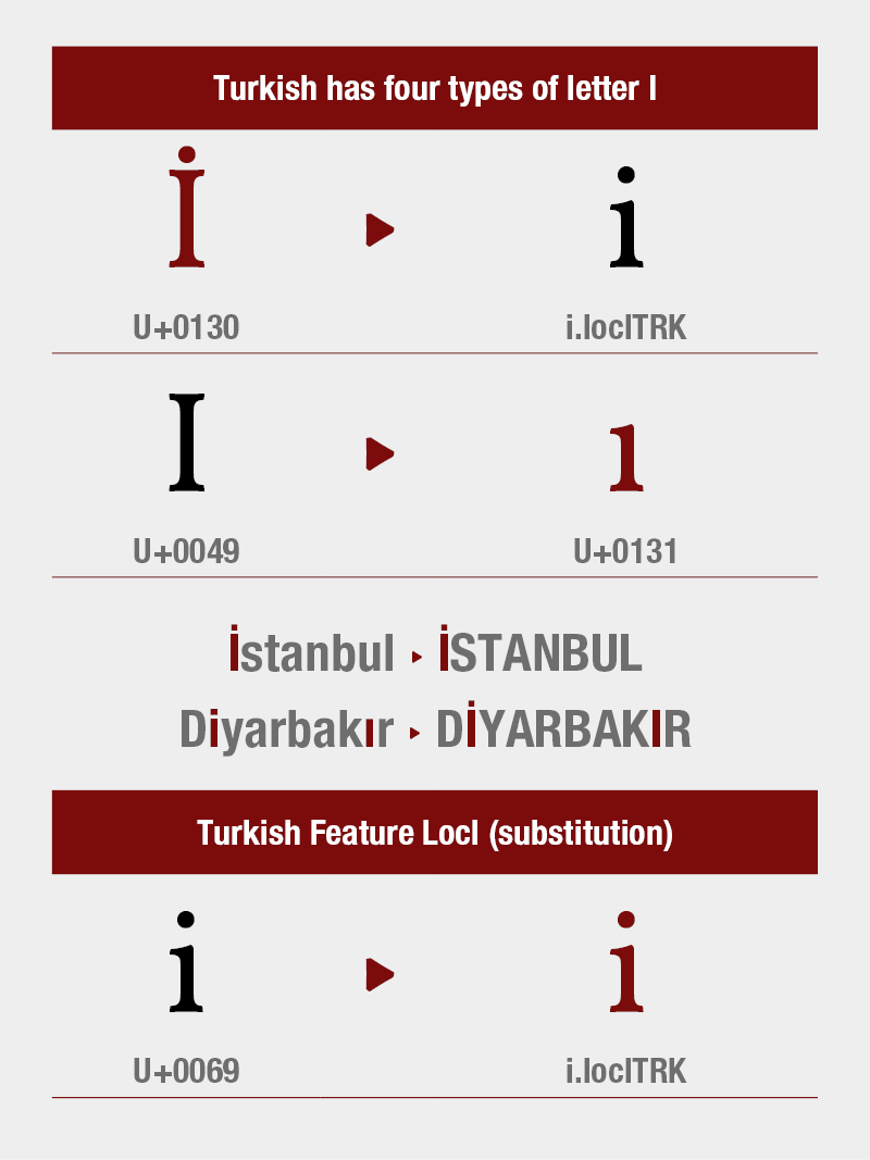
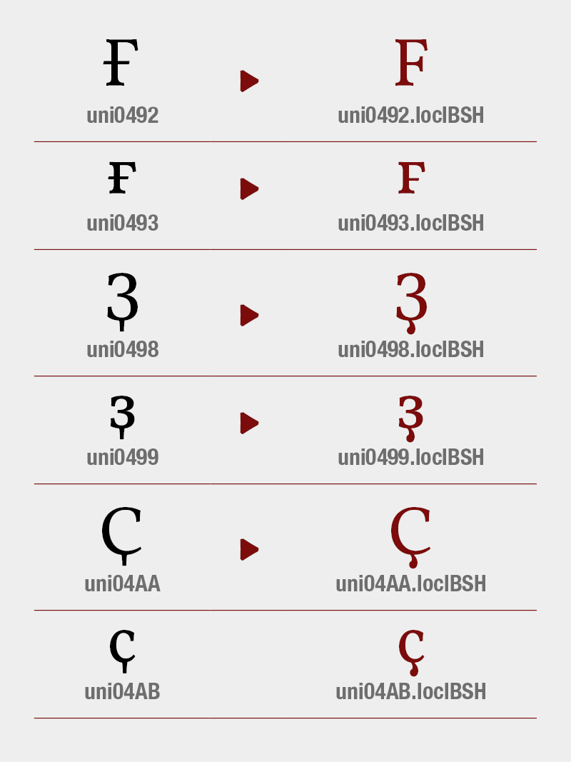
What shall be done for Bulgarian Cyrillic .loclBGR
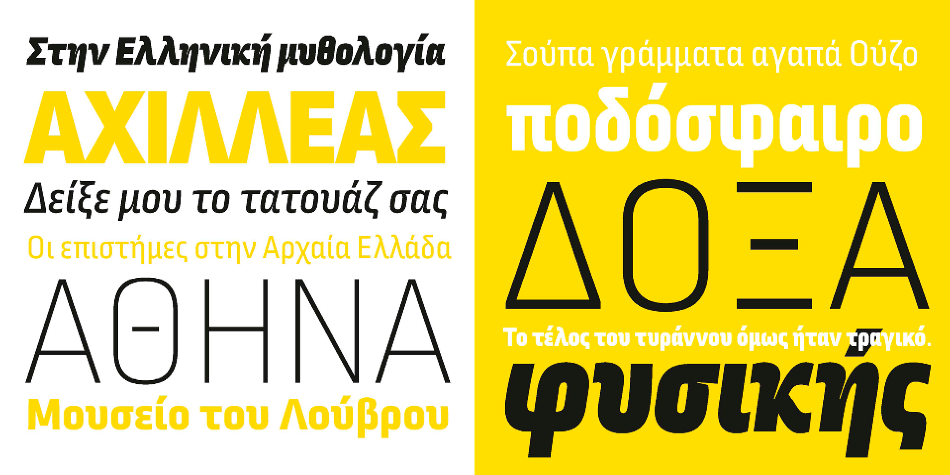
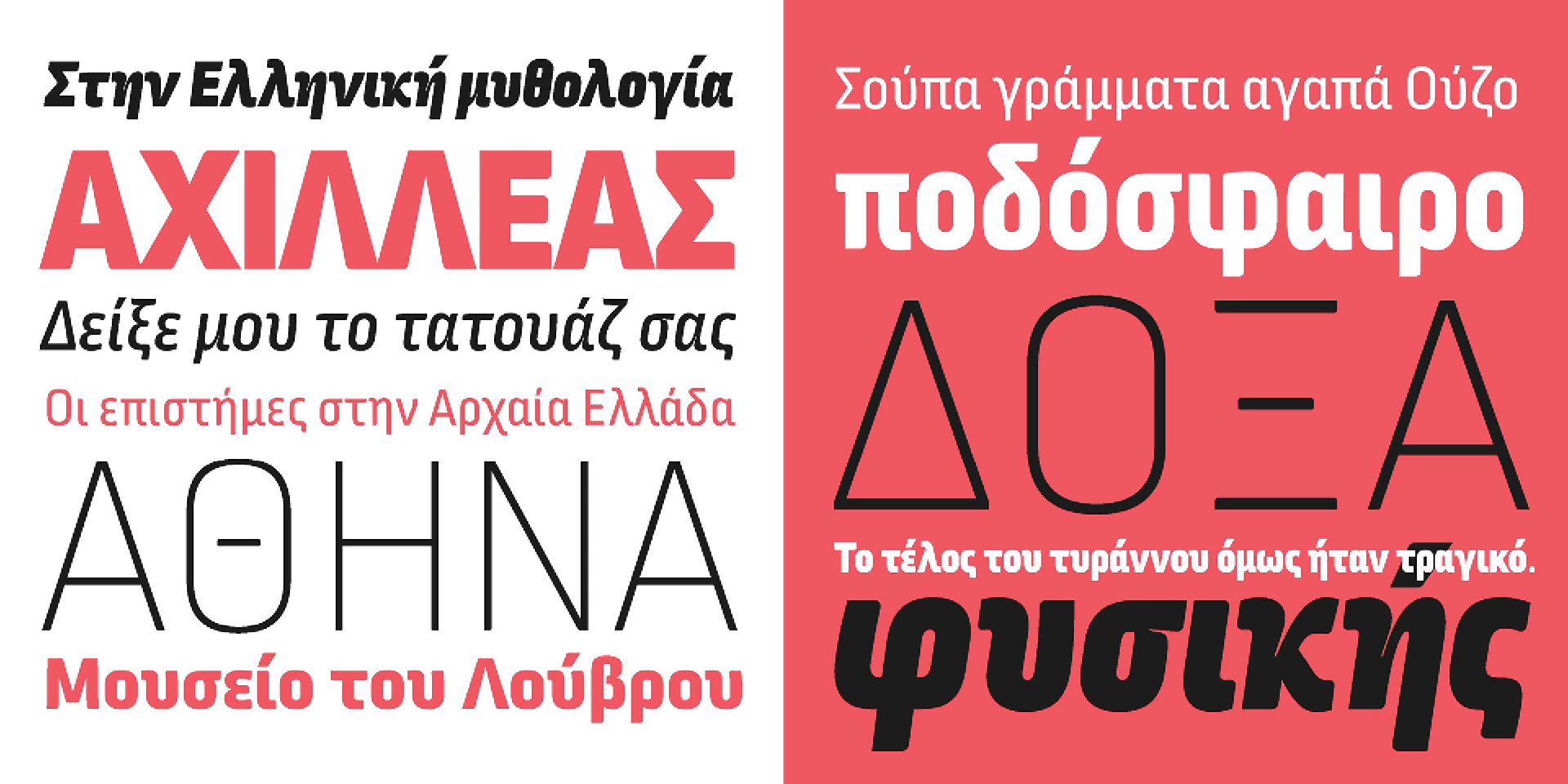
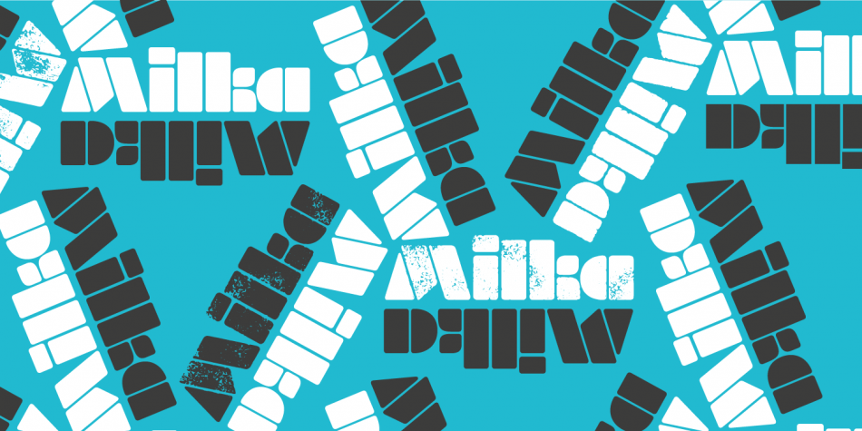
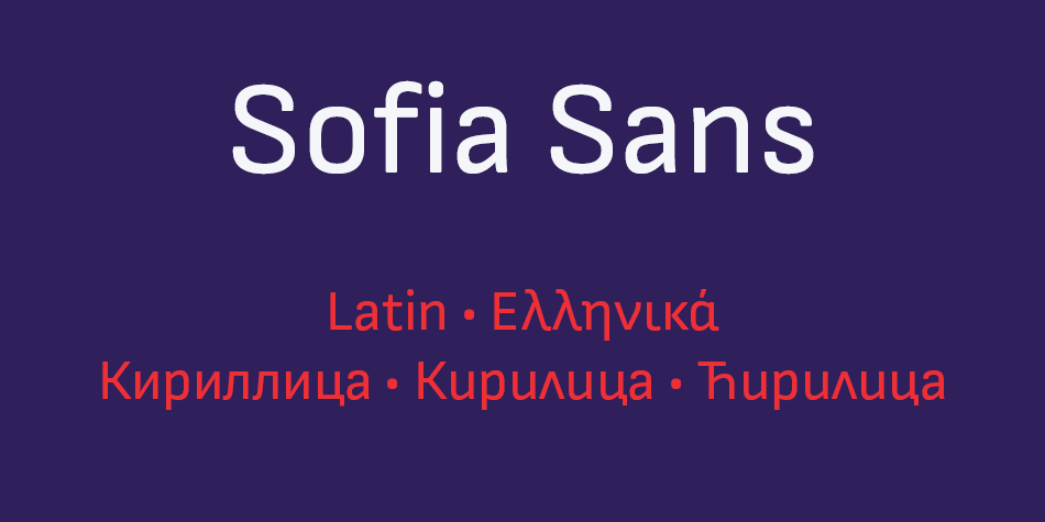
Font family: Sofia Sans; Release 2019; Copyright: Botio Nikoltchev, Ani Petrova
Тhe next step for me is to see the Rounded and Squared Cyrillic as equals. By now, the Russian forms are in default position in the fonts and Bulgarian forms on local feature or stylistic set. Soon, I’m about to release quite a big font family where the Bulgarian forms are in default position.
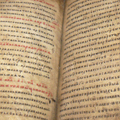
But I would like to see the next years in “the past”. We do have so many artefacts, books, manuscripts that are quite unexplored. We don’t really know much about the history. In fact, we don’t even have a reasonable answer to questions like why the Cyriliic was developed and why we switched to it instead of the Glagolitic.
How many Bulgarian books about typedesign do you know… four! And how many of them are translated into English – none!
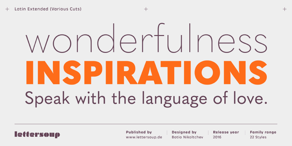
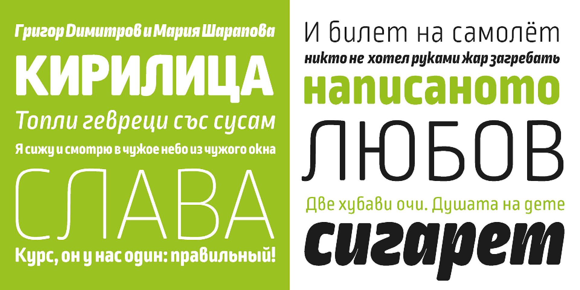
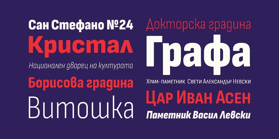
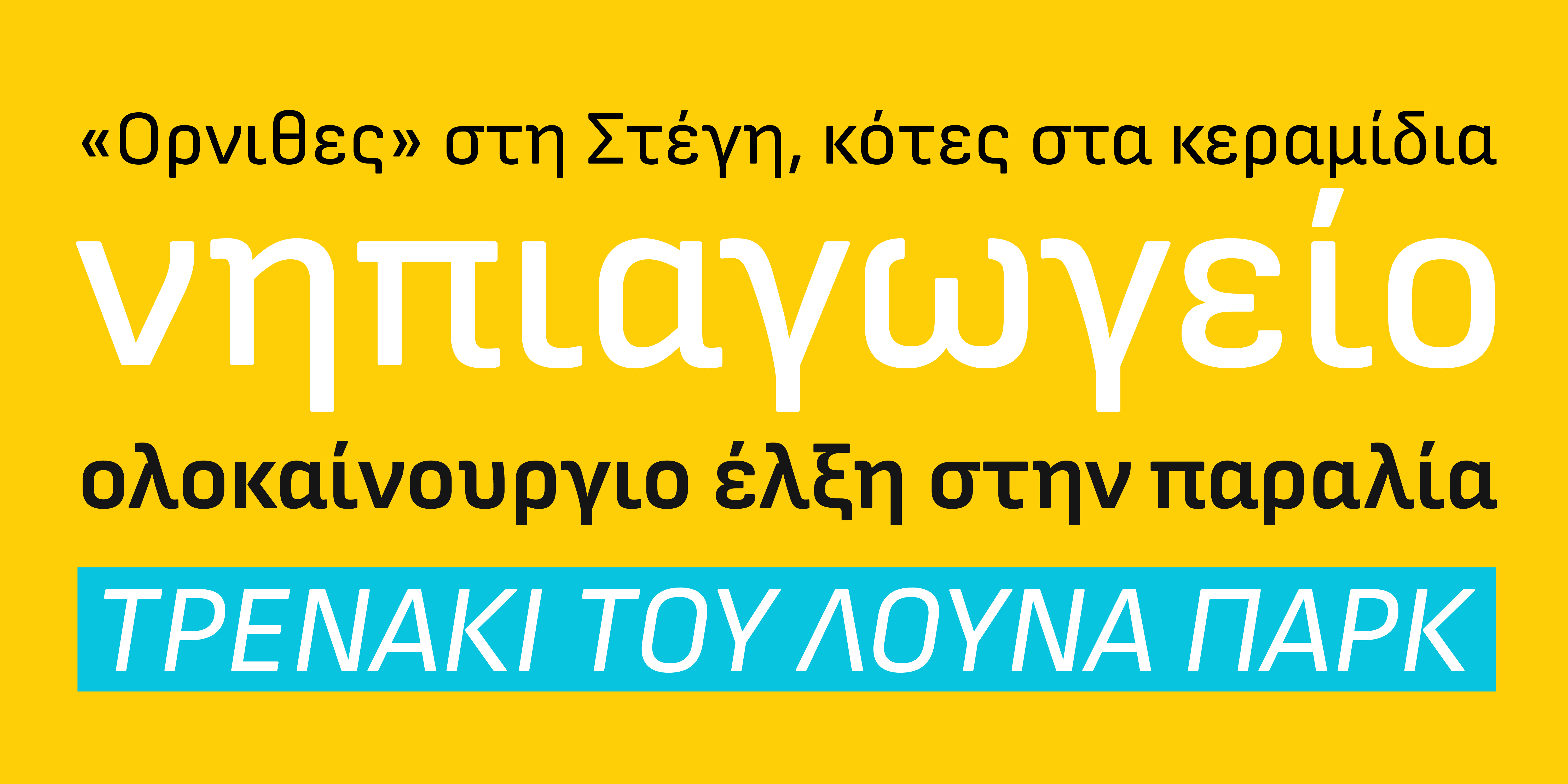
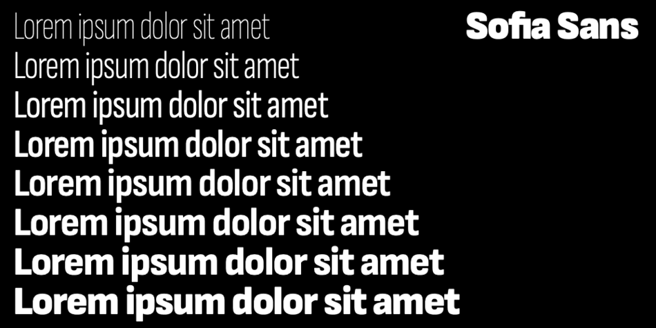
In 2019, the chief architect of Sofia Zdravko Zdravkov announced that he will suggest all the labels on the streets and official documents of Sofia municipality to use a unified font standard. This font is called Sofia Sans – a co-project of Ani Petrova and Botio Nikoltchev. Did Sofia Sans become the typeface of the capital?
BN: I’m truly happy this project happened. More than 30 years after so many efforts, there is a political understanding for the need of better visual language in our cities. But this transformation happens quite slowly.
This project is also made in a large team – it started with Ani Petrova, Filip Bojadjiev and me. Then Andreas Eigendorf, Eli Hoyer and Viviana Monsalve did the mastering and produced Variable Fonts. Mario Evstatiev and I made several pixel versions of Sofia Sans for the public transport. But yes, I think meanwhile it is the typeface of the bulgarian capital city. You can see it on the tourist wayfinding system, on the street signs, on the public transport. Аlso the Bulgarian State Railways use it, I saw it also on one of the private TV channels. It seems people like it a lot.
It is worth mentioning that we published the typeface with an Open Font License, as I think such projects should be Open Source. Sofia Sans will be soon released on Google Fonts as well, and the latest versions will be always published on our Github account.
With this project I also managed to achieve a goal of mine. Bulgarian Cyrillic is in default position in the fonts.
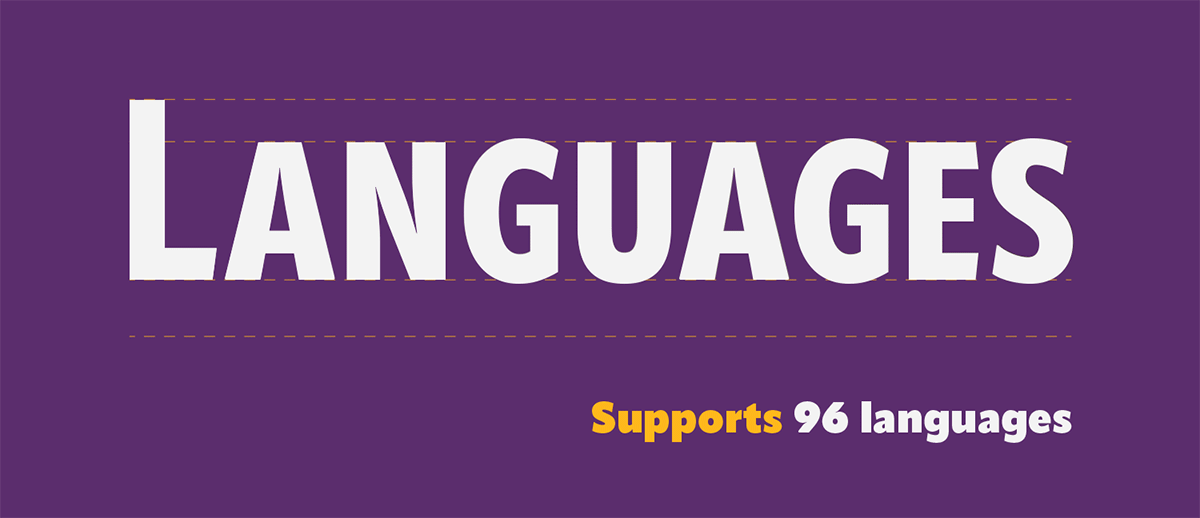
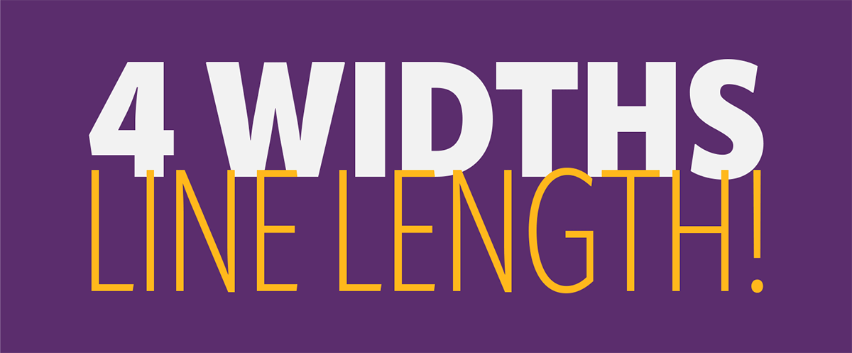
I think with a typeface of such a largе scale – 4 widths and 11 weights and also on Google Fonts, where there is a huge amount of users, it is quite a statement.
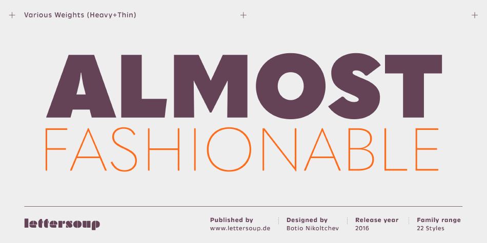
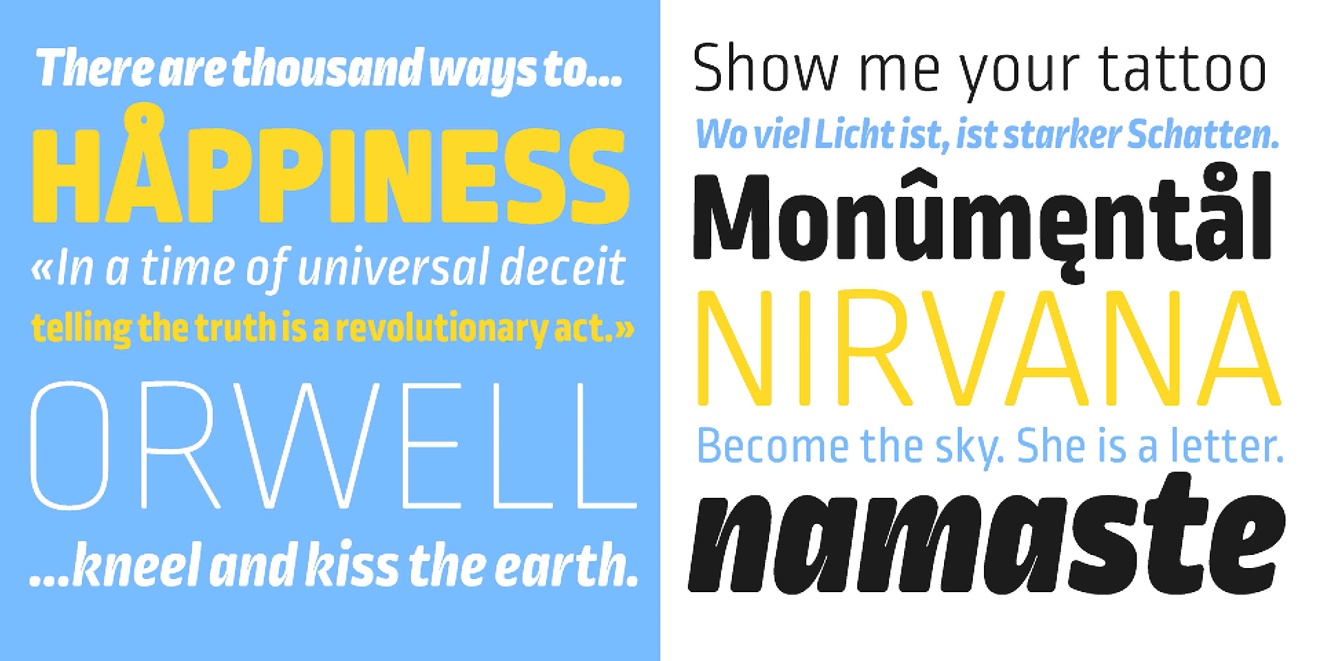
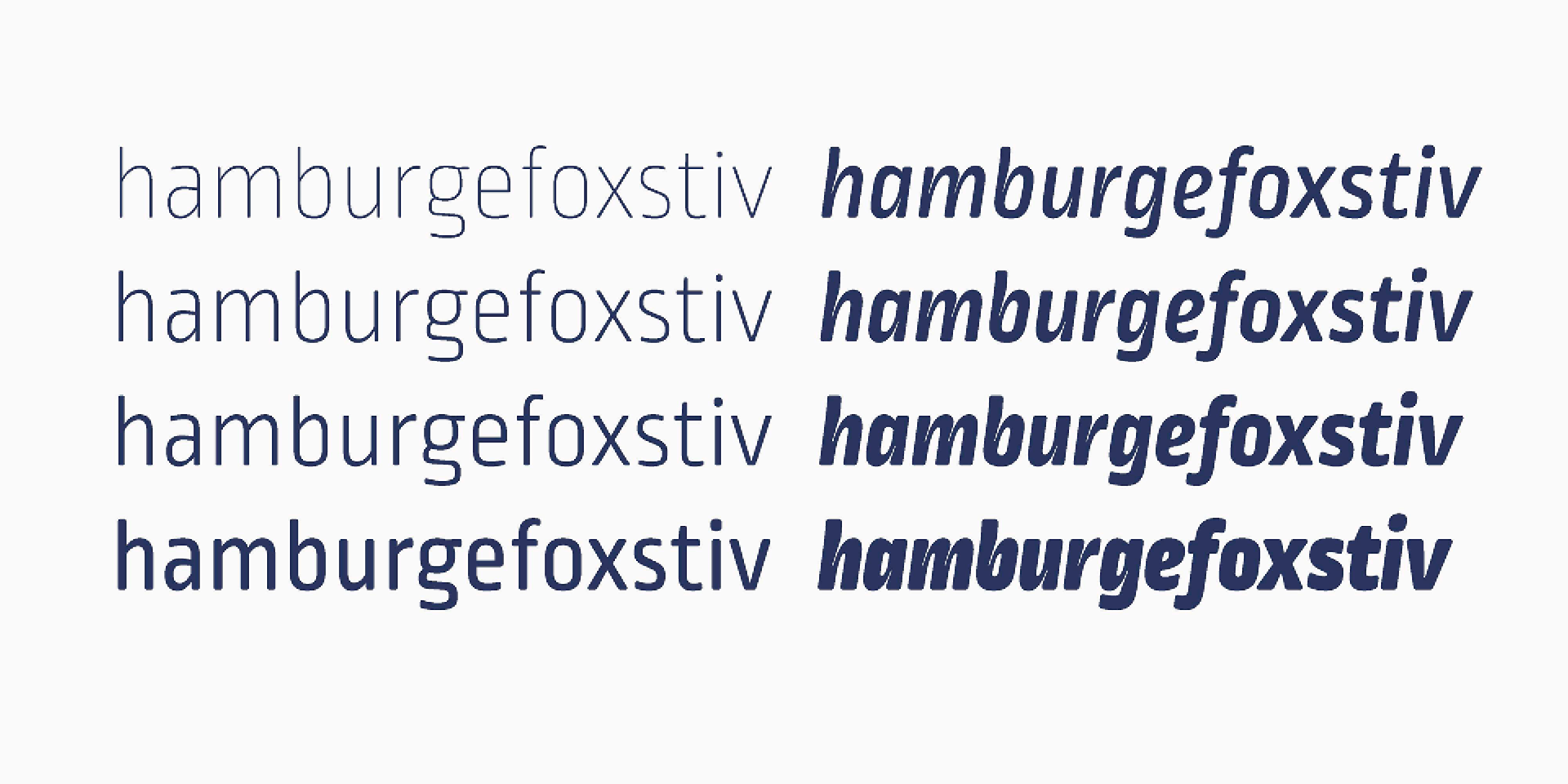
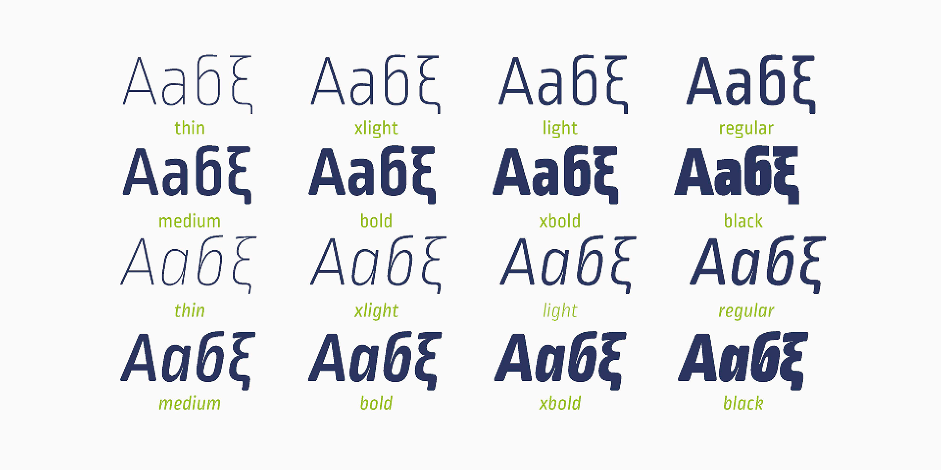
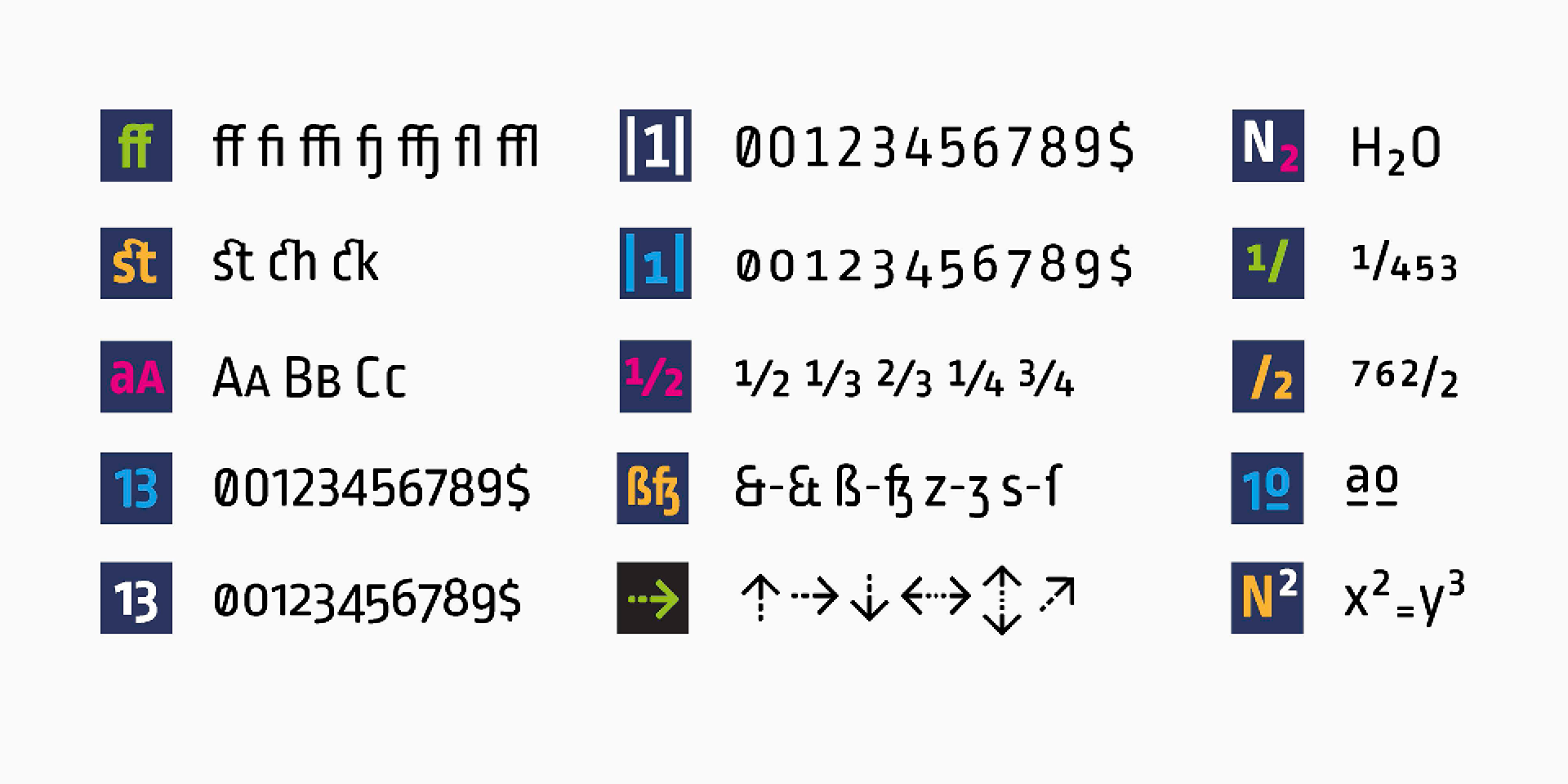
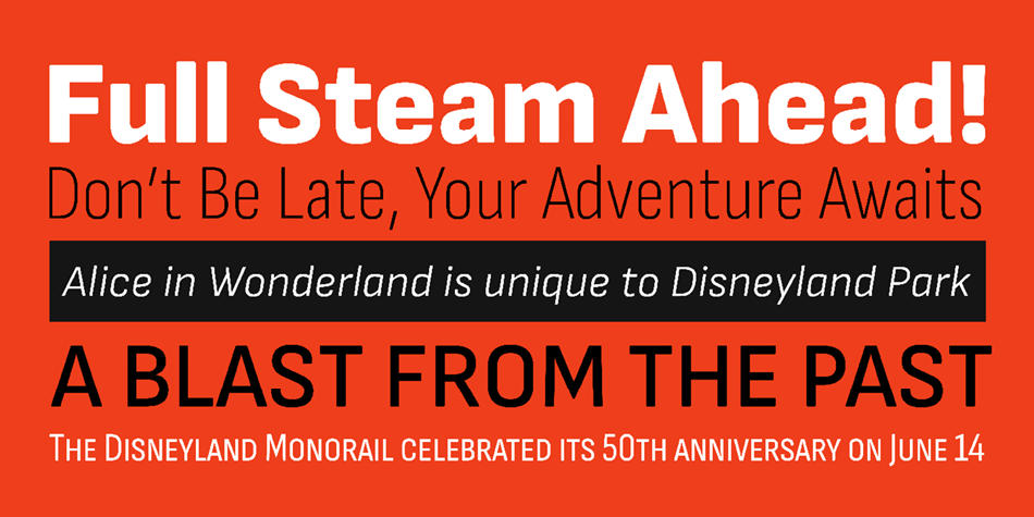
At the beginning of 2021 you published your latest font – Apparat. How does Apparat fit in the modern visual communication – as a reinterpretation of the past or as a search for classic clean and modern drawing?
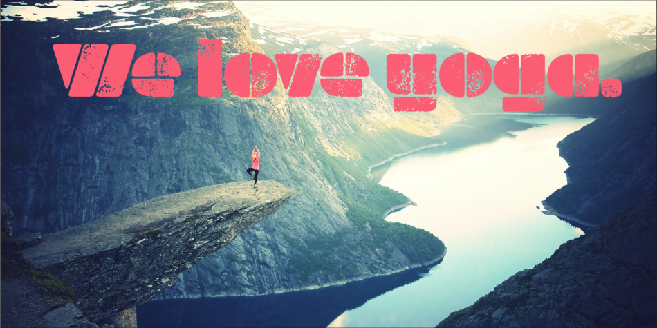
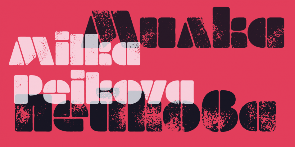
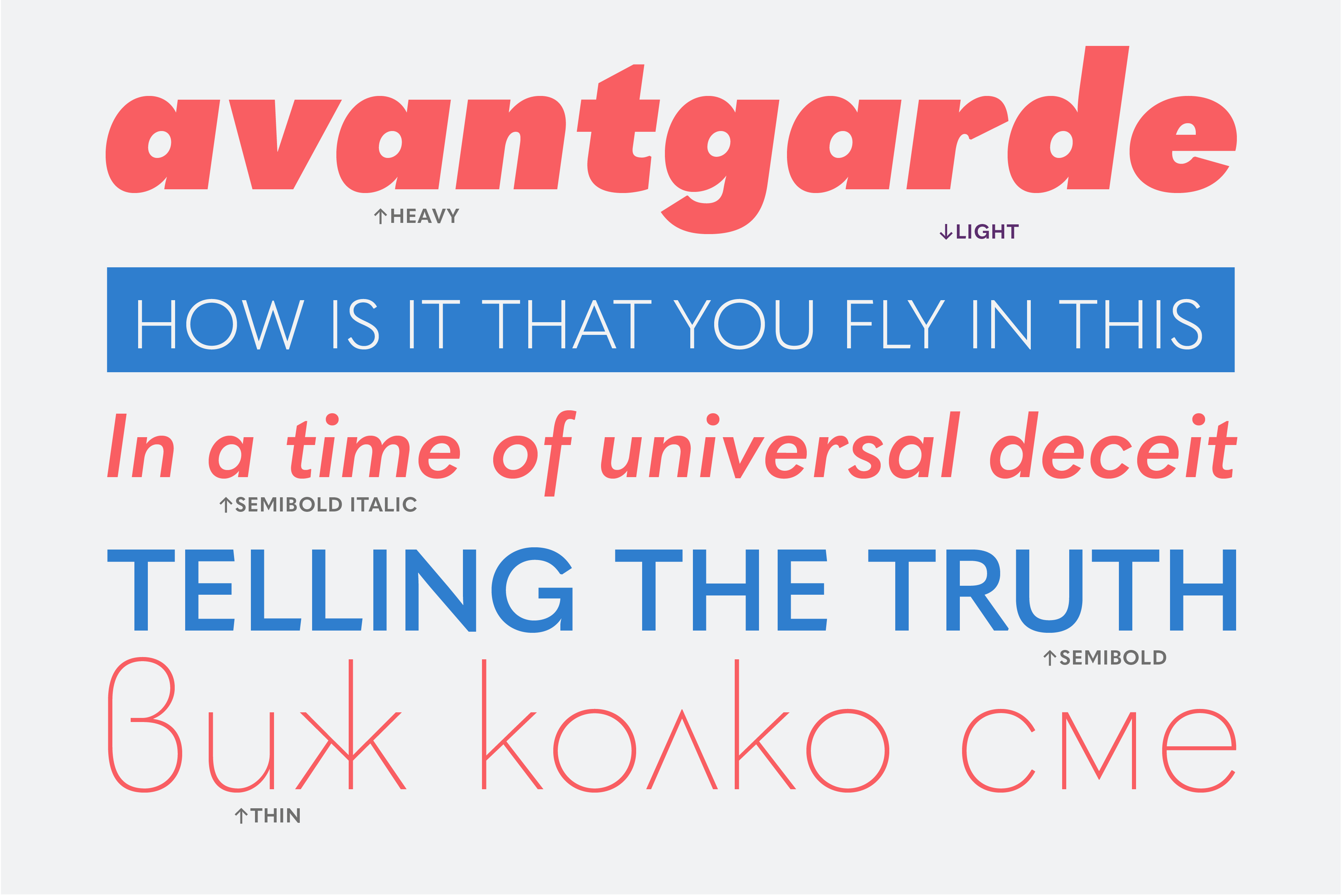
Font family: Apparat; Release 2020; Copyright: Botio Nikoltchev
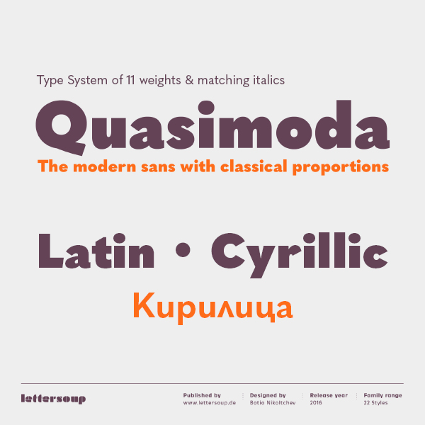
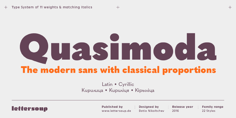
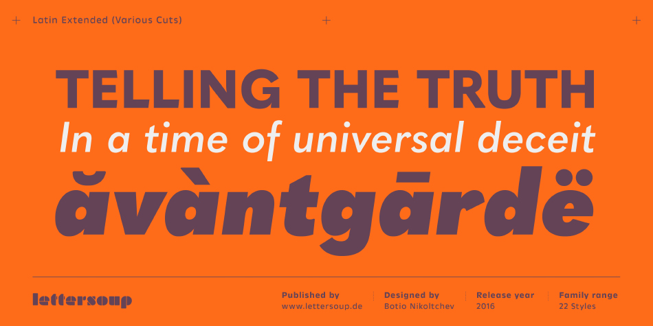
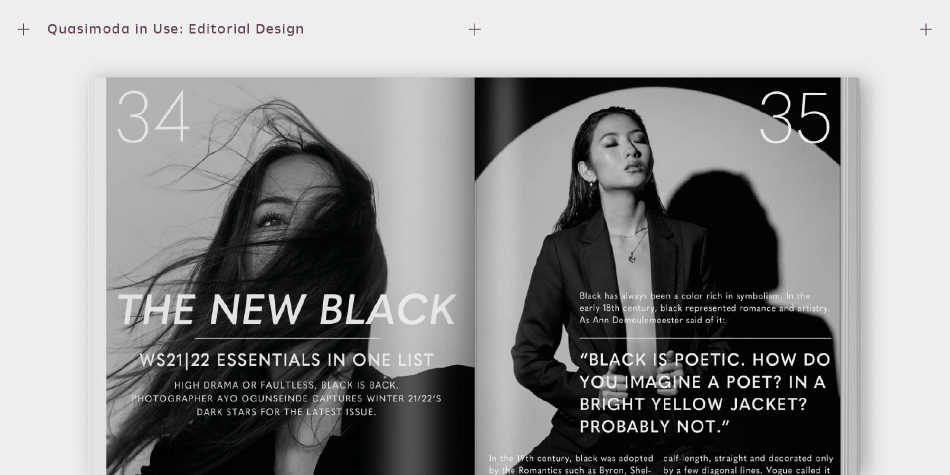
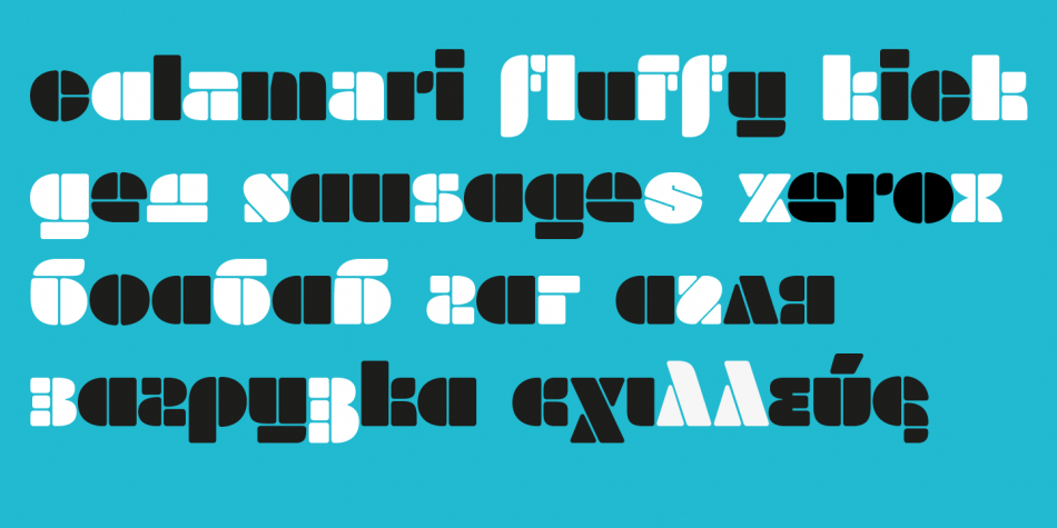
Font family: Quasimoda; Release 2016; Copyright: Botio Nikoltchev
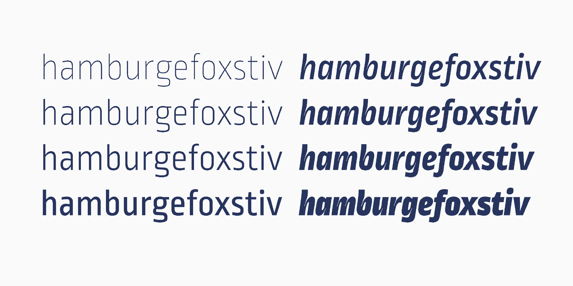
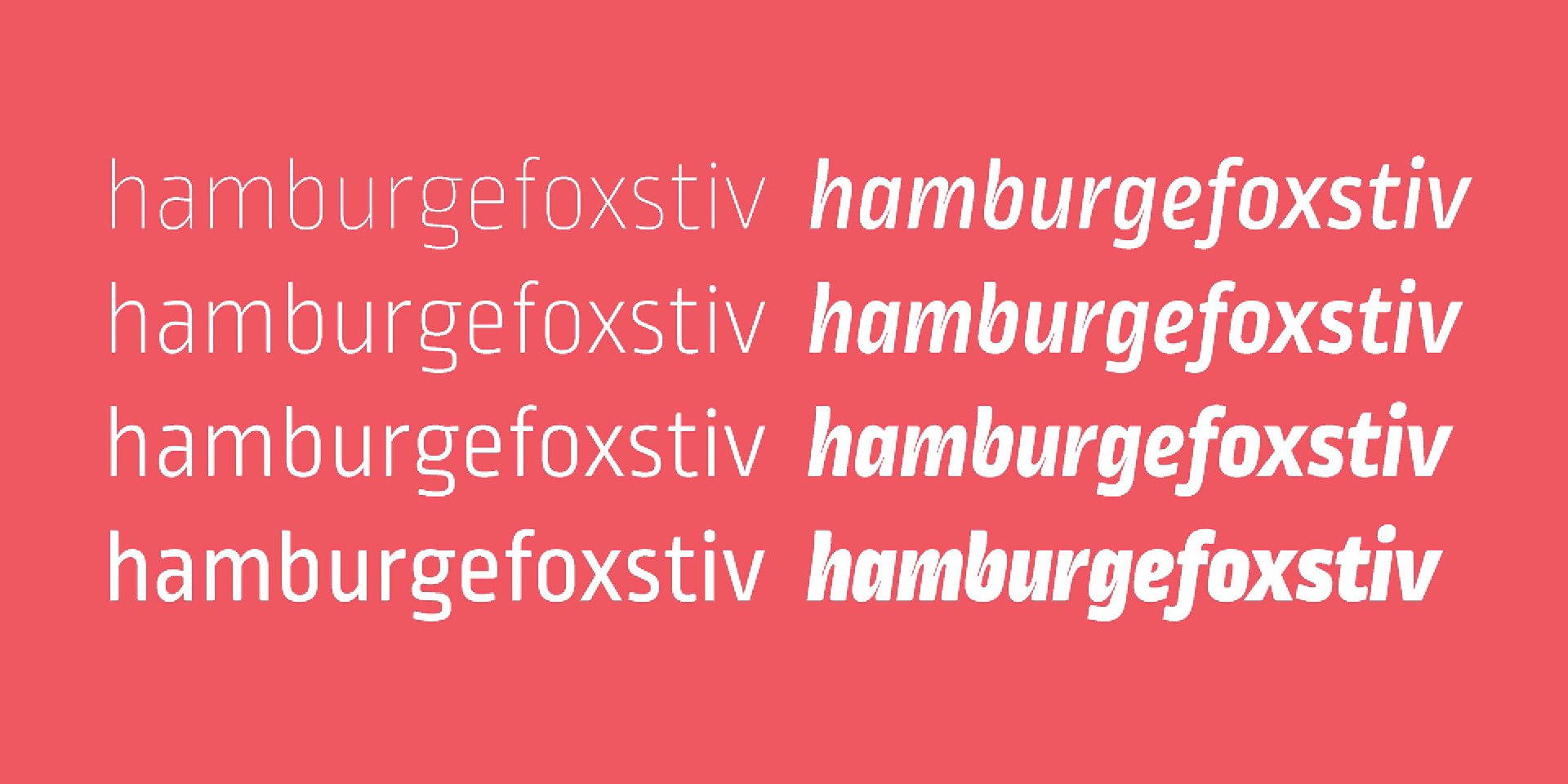
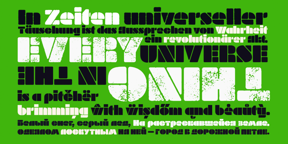
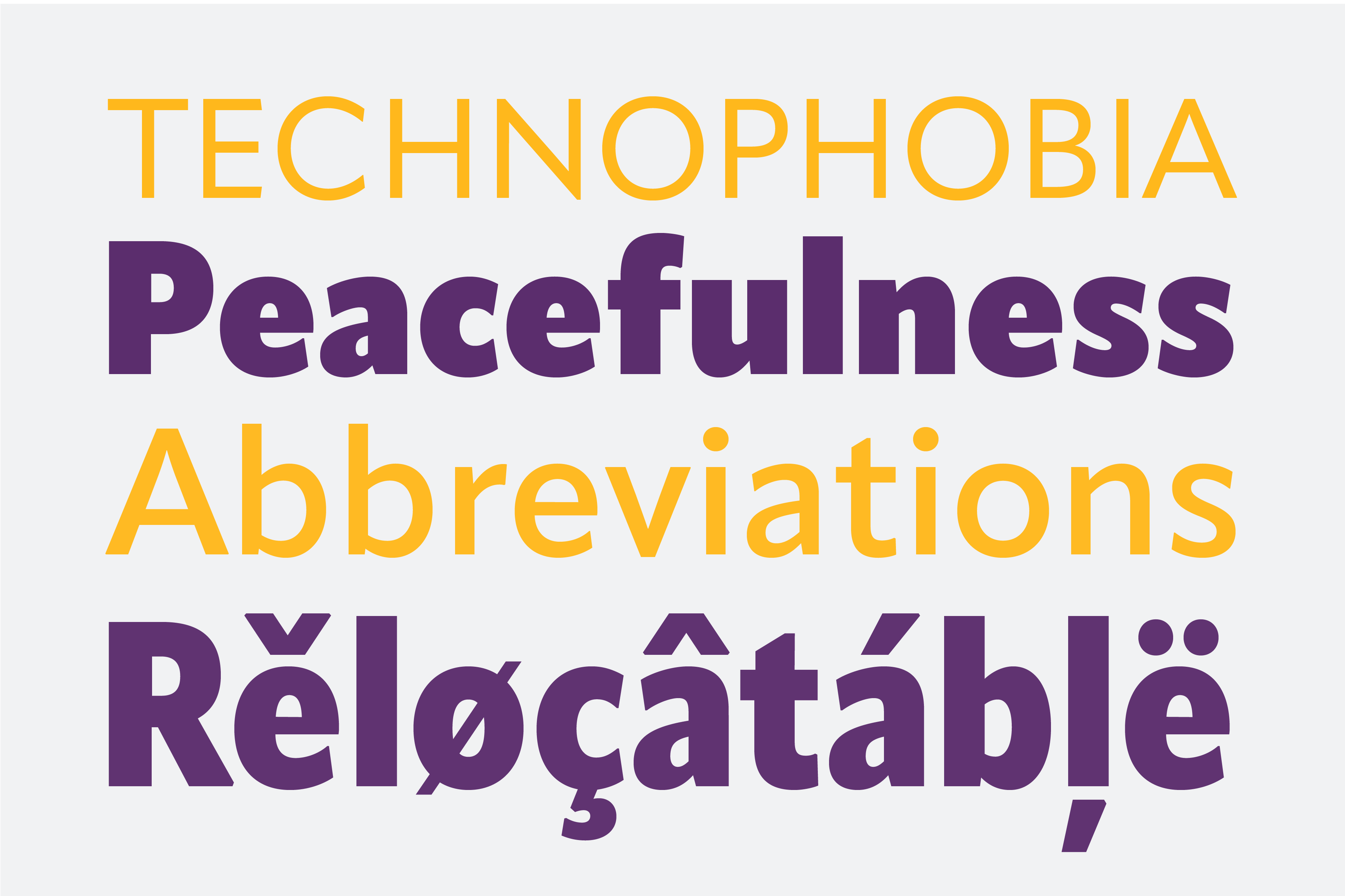
BN: It is clearly an interpretation of the past, actually I´m exploring Dwiggins approach to “humanise” geometric sans forms. Apparat’s design is the result of both historical research and experience gained during the design of custom fonts.
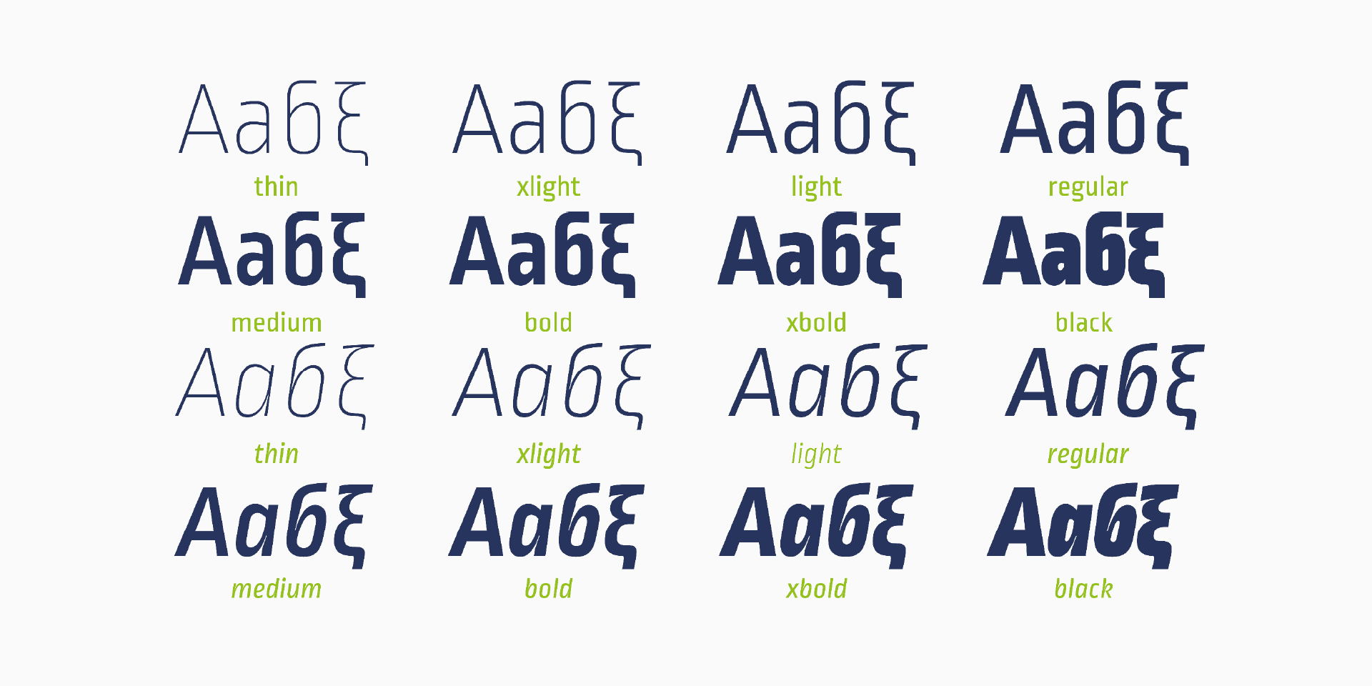
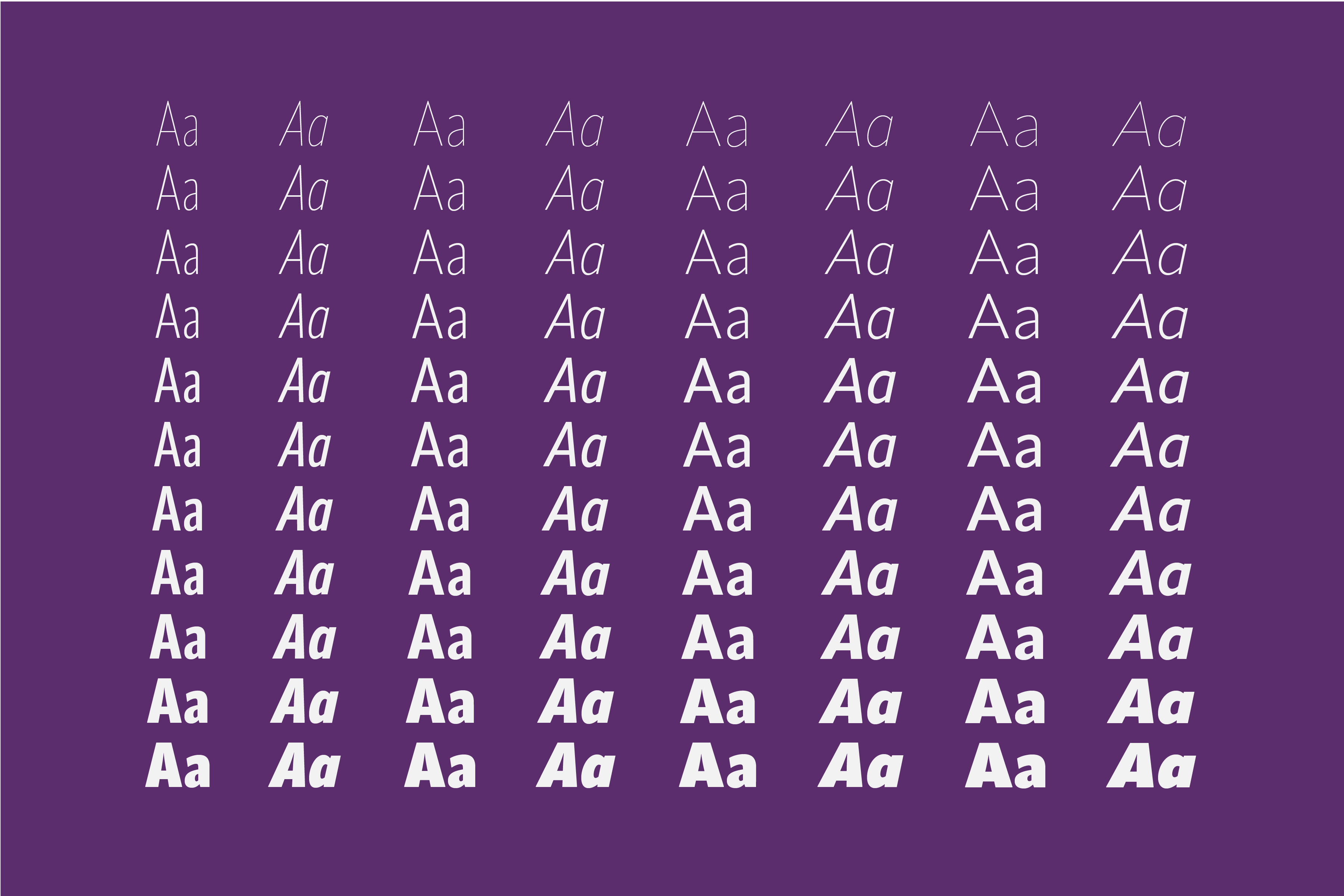
The idea was to create a large contemporary type family in four widths—Standard, Semi Condensed, Condensed, and Extra Condensed, a geometric sans serif with subtle humanistic design traits that has a well-rounded personality that stands out when used in display applications; however, the characteristic design details recede to the background not to attract unnecessary attention when using the typeface in small sizes for body copy.
Creating such a wide range has become more accessible in contemporary typeface development thanks to interpolation, which facilitates calculating intermediary steps between two extremes. But typefaces that are clearly interpolated run the risk of looking mechanic and soulless and often lack character. Having the technology available doesn’t mean it necessarily needs to be used. Apparat avoids these pitfalls by having no perfect harmony between the different weights and widths. These intentional variations lend each type style its specific personality that complements the others.
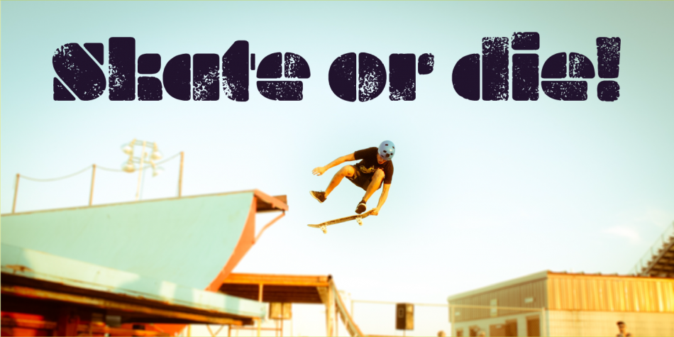
Font family: Apparat; Release 2020; Copyright: Botio Nikoltchev
Peter Bilak once said that modern fonts are a result of teamwork between many professionals. What is the future of typedesign and where is the thin line between individual and teamwork?
BN: Typedesign is and was a very consrvative field. I don’t think we will see any big revolutions in type soon.
I absolutely agree with Peter Bil’ak that modern typefaces are teamwork in a design aspect but also because they are complex products. It is not just the idea or the design. There are many script systems, there is quality assurance, there is mastering of the fonts, there are marketing materials like specimens, websites, social media communication.
So yes, for a big multilingual typefaces you need a large team of professionals in all these fields. But I also love to discuss my basic designs with friends and colleagues, to exchange ideas, to hear different points of view.
What are your plans for 2021 and beyond?
BN: I hope 2021 is more favorable to all of us! This year together with Viktor Nübel I will resume a big custom project for Cornelsen publishing house. Cornelsen are one of the main schoolbook publishers in Germany. I´m very proud that we won this design pitch and very thankful for this opportunity. We are creating a huge type sistem with sans and serif typeface, also with different widths, optical size designs etc.
It is quite interesting to work for such a big company with all the different departments like print, web, app developer who all have their own requirements on a very high quality level.
In the next few weeks, there will be a long awaited Sofia Sans variable font release on Google Fonts with OFL license.
I’m working on several new typefaces simultaneously, but I don’t want to reveal so much.
Font family: Apparat; Release 2020; Copyright: Botio Nikoltchev
Botio Nikoltchev is a typographer, CEO and “chef” of the lettersoup fonts. Born in Sofia, he graduated in communication design in Potsdam, Germany. He lives and works in Berlin.
Explore LETTERSOUP and its activities:
LETTERSOUP Behance Facebook Instagram Adobe Fonts
Editor
Szandra Peev
Szandra Peev has been working in the field of communications and marketing for almost a decade now. Her curiosity to explore new cultures and destinations took her to Asia where for five years she worked with some of the biggest multinational companies globally. Currently, Szandra is back in Europe, leading the communications and marketing efforts for localfonts.eu and contributing as a writer in print and online media outlets.
If you like this site and find it useful, help us to make it better by giving feedback, suggesting improvements or by donation.