Based in Sofia, Bulgaria, Radomir Tinkov began his career as a graphic and web designer. “Typography is an essential part of almost every aspect of life and design in particular,” he says, “so it got me curious and little by little I started to create fonts on the side.” His earliest designs were limited to mainly display faces, but he knew that he wanted to create a deeper type library filled with more versatile and useful designs. “As time passed, I learned more and more and began to create custom typefaces to solve real problems in other design projects I was working on and just like that, my first marketable font was created.”
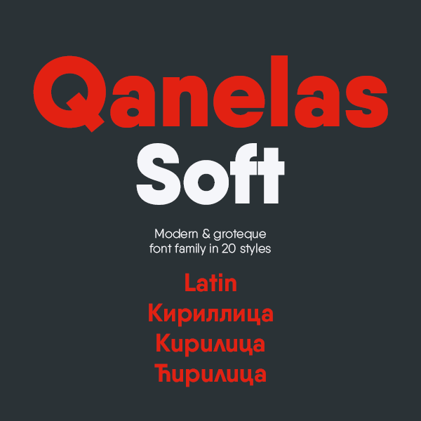
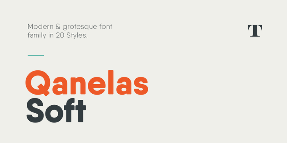
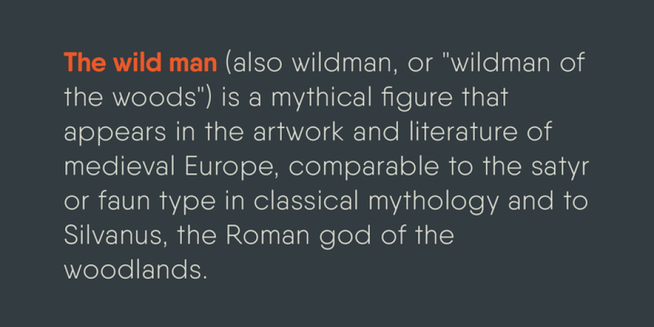
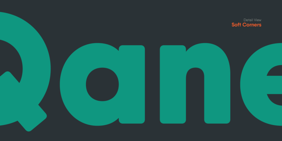
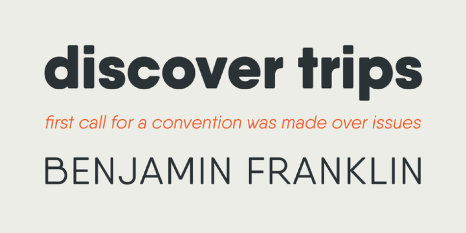
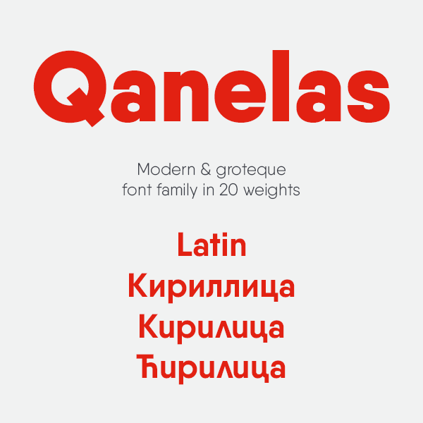
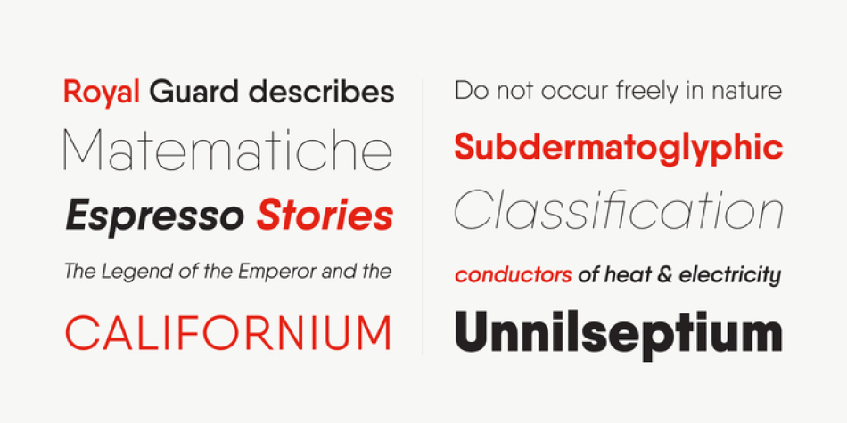
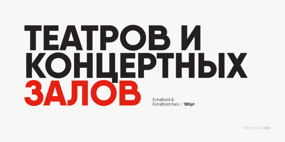
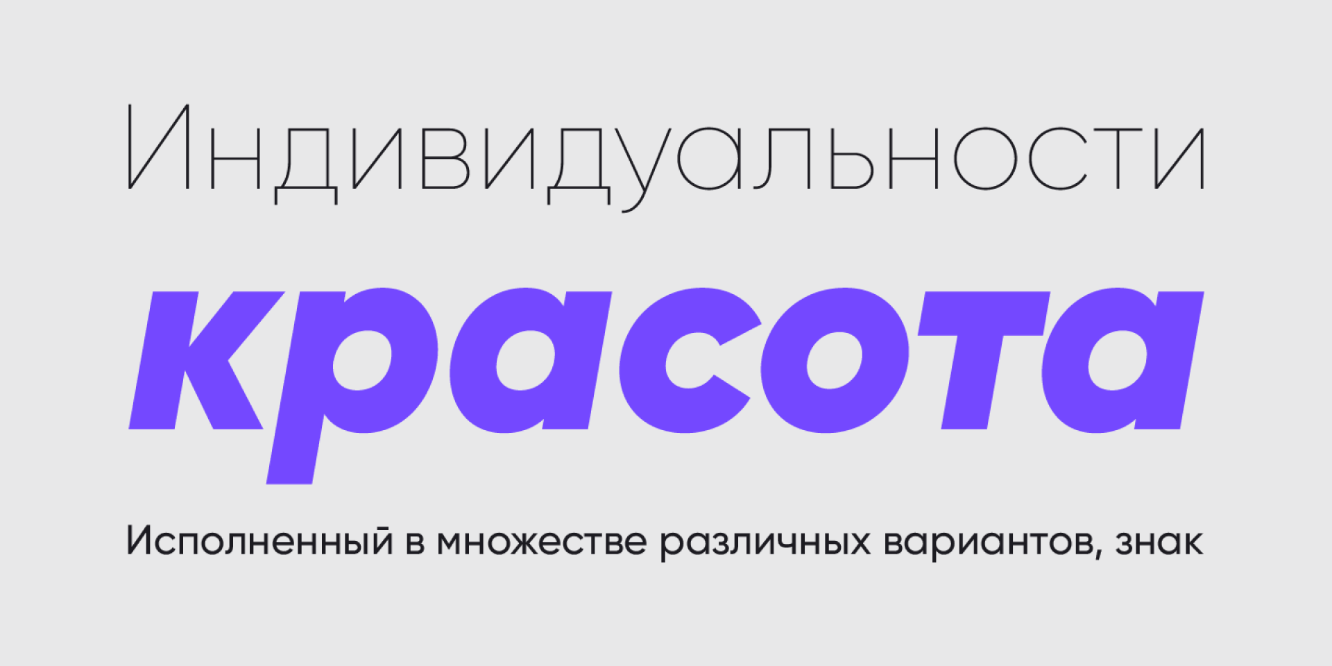
Qanelas Soft is a modern sans serif with a geometric touch, and a friendlier version of the original Qanelas font family. It comes in 20 weights, 10 uprights and its matching italics.
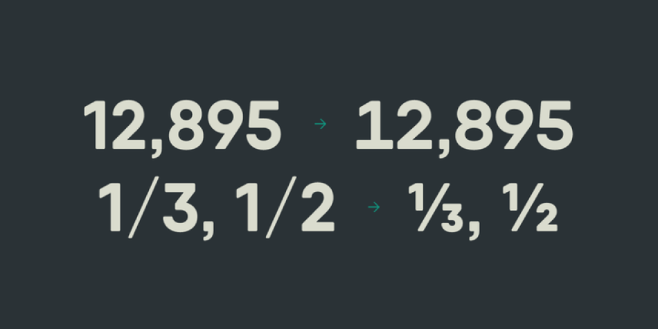
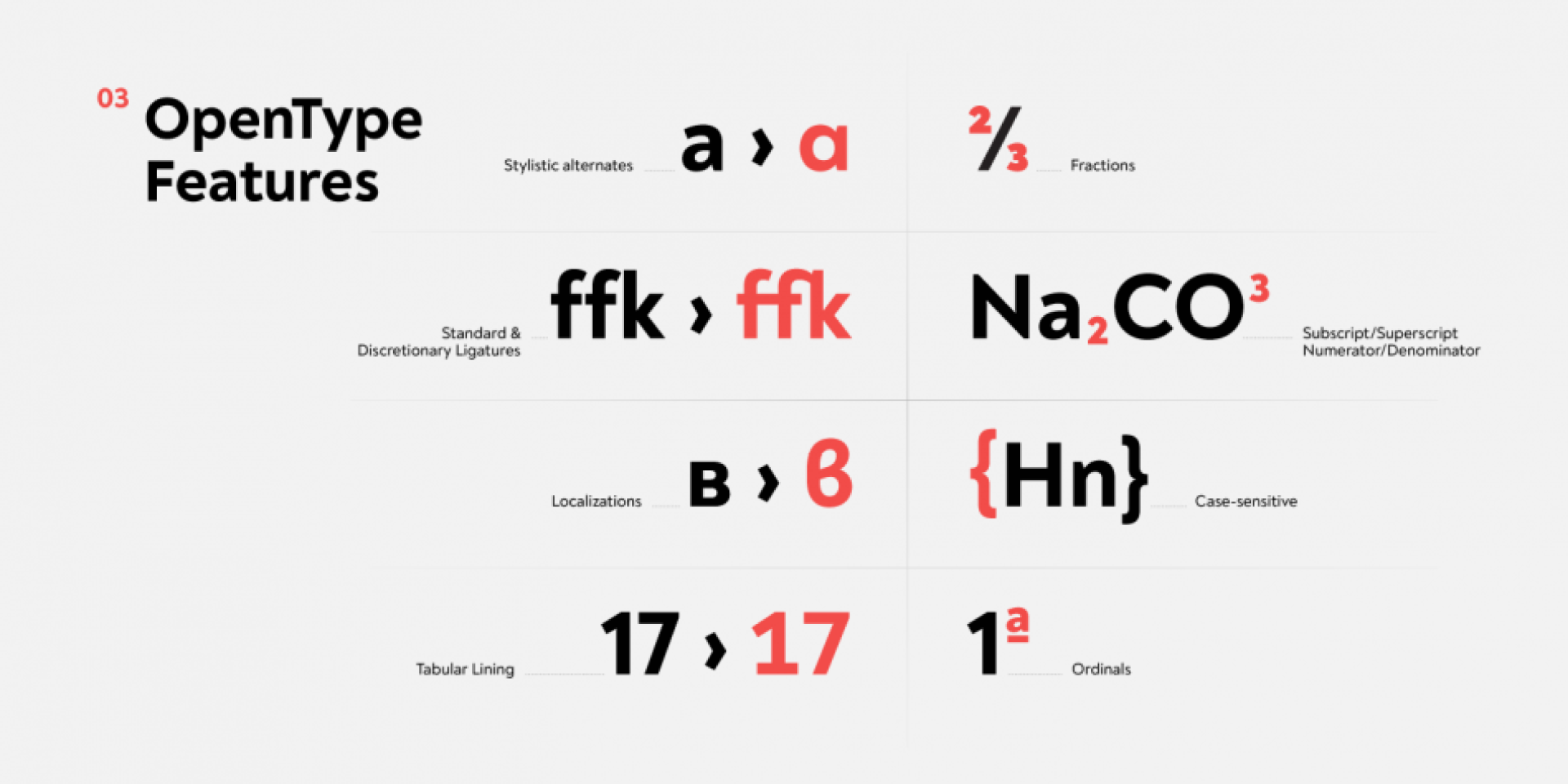
Designed with powerful OpenType features in mind, each weight includes alternate characters, fractions, extended language support (+ Cyrillic), arrows, ligatures and more. Perfectly suited for graphic design and any display use. It could easily work for web, signage, or corporate use as well as for editorial design.
Design, Publisher, Copyright, License
Design: Radomir Tinkov
Publisher: Radomir Tinkov
Copyright 2016 by Radomir Tinkov. All rights reserved.
Radomir Tinkov
Based in Sofia, Bulgaria, Radomir Tinkov began his career as a graphic and web designer. “Typography is an essential part of almost every aspect of life and design in particular,” he says, “so it got me curious and little by little I started to create fonts on the side.” His earliest designs were limited to mainly display faces, but he knew that he wanted to create a deeper type library filled with more versatile and useful designs. “As time passed, I learned more and more and began to create custom typefaces to solve real problems in other design projects I was working on and just like that, my first marketable font was created.”
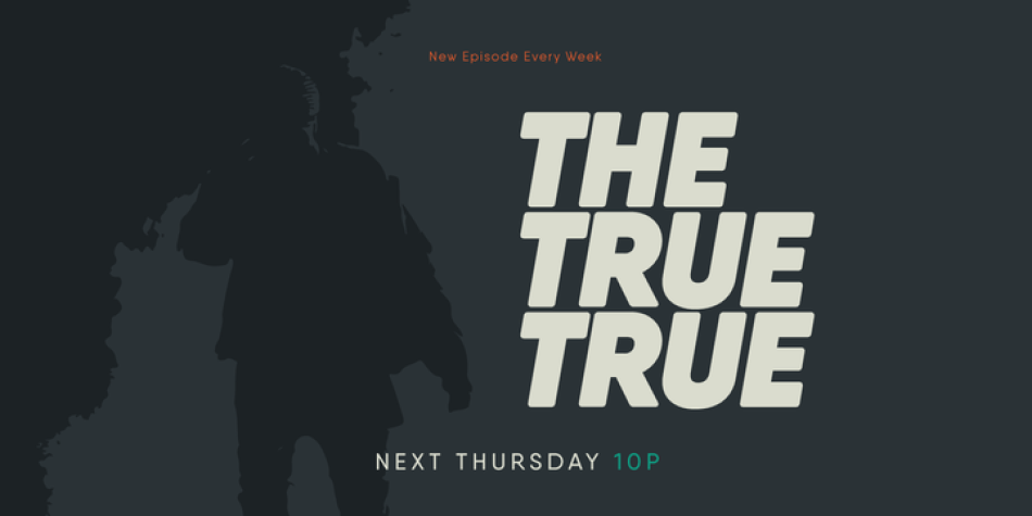
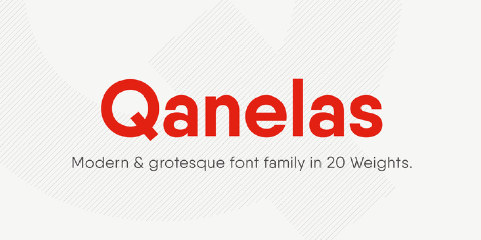
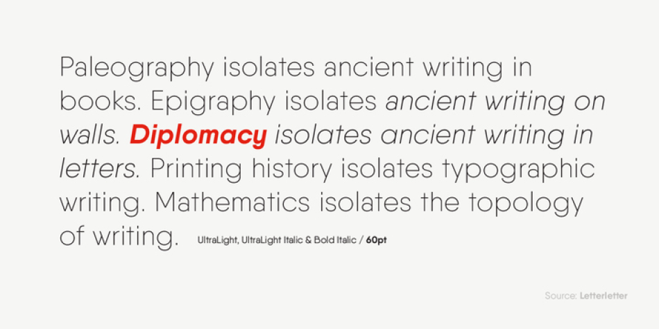
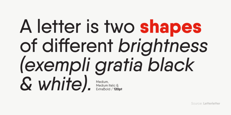
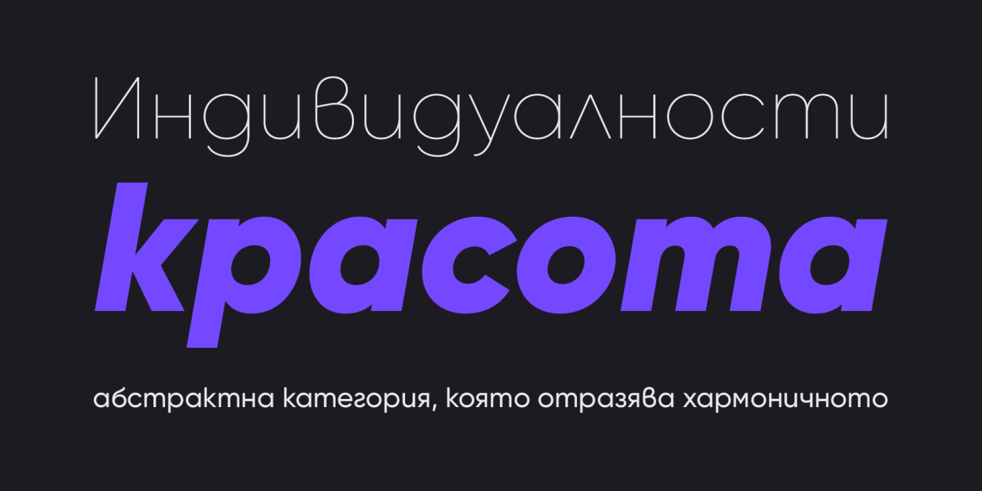
Qanelas is a modern sans serif with a geometric touch. It comes in 20 weights, 10 uprights and its matching italics.
Designed with powerful opentype features in mind. Each weight includes alternate characters, fractions, extended language support (+ Cyrillic), arrows, ligatures and more. Perfectly suited for graphic design and any display use. It could easily work for web, signage, corporate as well as for editorial design.
Design, Publisher, Copyright, License
Design: Radomir Tinkov
Publisher: Radomir Tinkov
Copyright 2015 by Radomir Tinkov. All rights reserved.
Radomir Tinkov
Based in Sofia, Bulgaria, Radomir Tinkov began his career as a graphic and web designer. “Typography is an essential part of almost every aspect of life and design in particular,” he says, “so it got me curious and little by little I started to create fonts on the side.” His earliest designs were limited to mainly display faces, but he knew that he wanted to create a deeper type library filled with more versatile and useful designs. “As time passed, I learned more and more and began to create custom typefaces to solve real problems in other design projects I was working on and just like that, my first marketable font was created.”
(EN) The quick brown fox jumps over the lazy dog. (NL) Op brute wijze ving de schooljuf de quasi-kalme lynx. (CS) Nechť již hříšné saxofony ďáblů rozezvučí síň úděsnými tóny waltzu, tanga a quickstepu. (HU) Jó foxim és don Quijote húszwattos lámpánál ülve egy pár bűvös cipőt készít. (RO) Înjurând pițigăiat, zoofobul comandă vexat whisky și tequila. (RU) Разъяренный чтец эгоистично бьёт пятью жердями шустрого фехтовальщика. (BG) Огньове изгаряха с блуждаещи пламъци любовта човешка на Орфей. (SR) Фијуче ветар у шибљу, леди пасаже и куће иза њих и гунђа у оџацима. (EL) Ταχίστη αλώπηξ βαφής ψημένη γη, δρασκελίζει υπέρ νωθρού κυνός. Type your own text to test the font!
Description
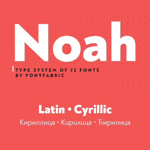
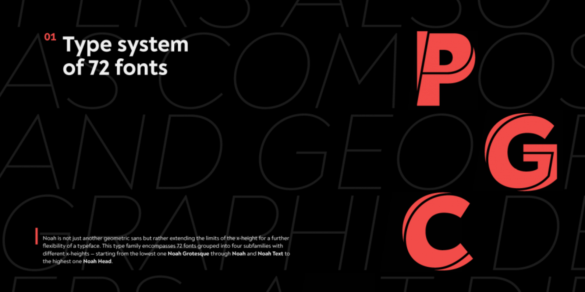
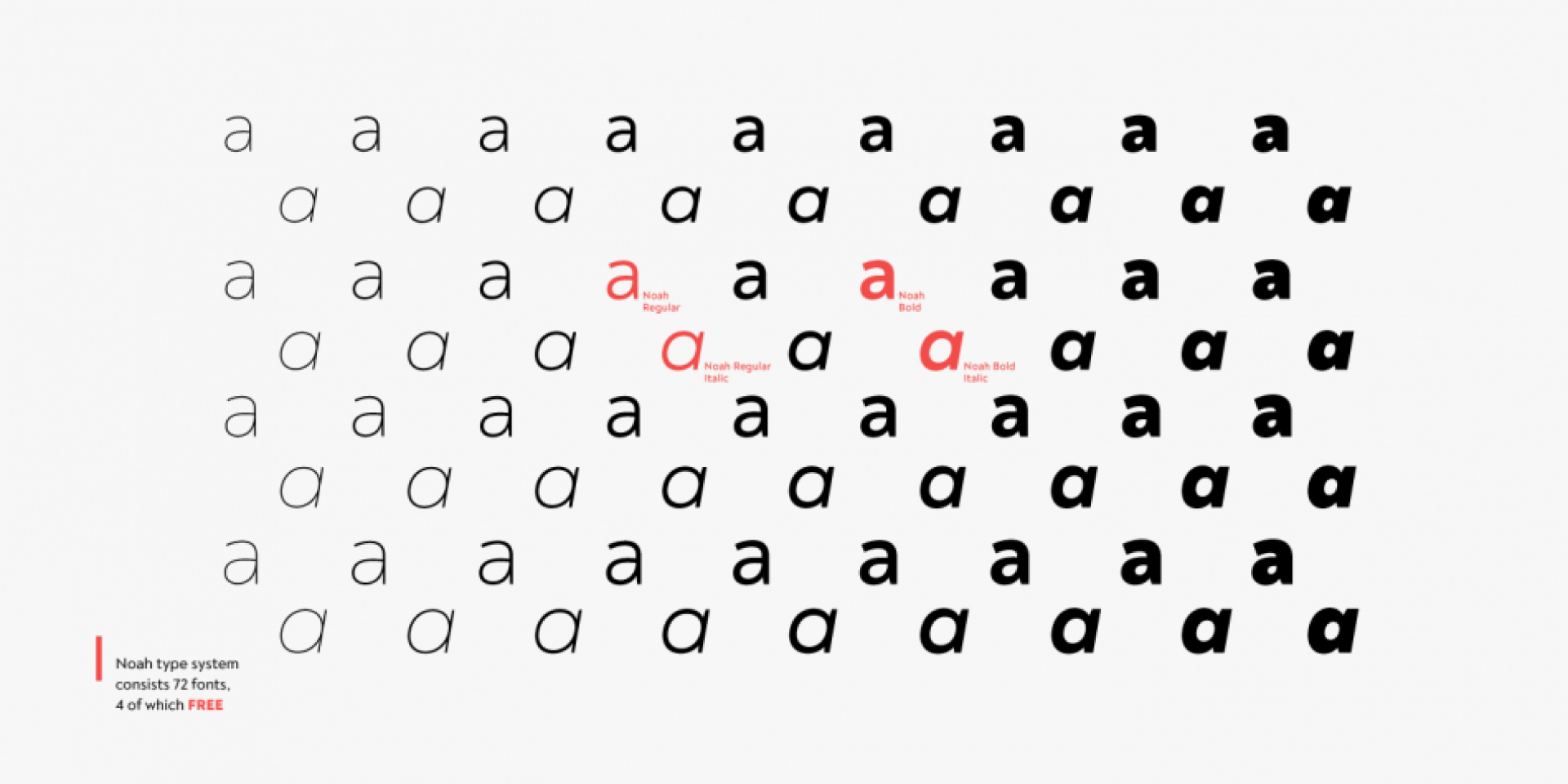
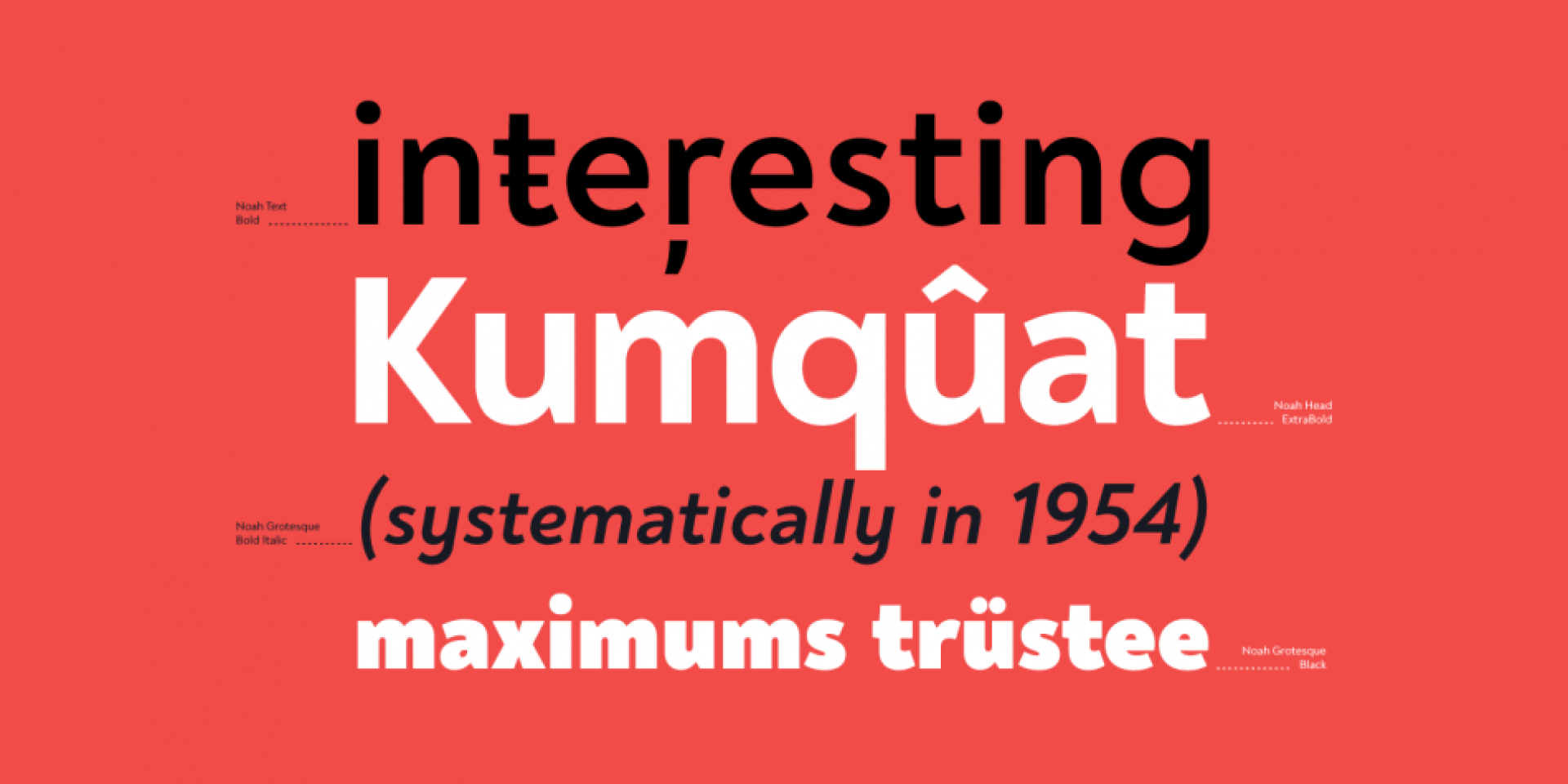
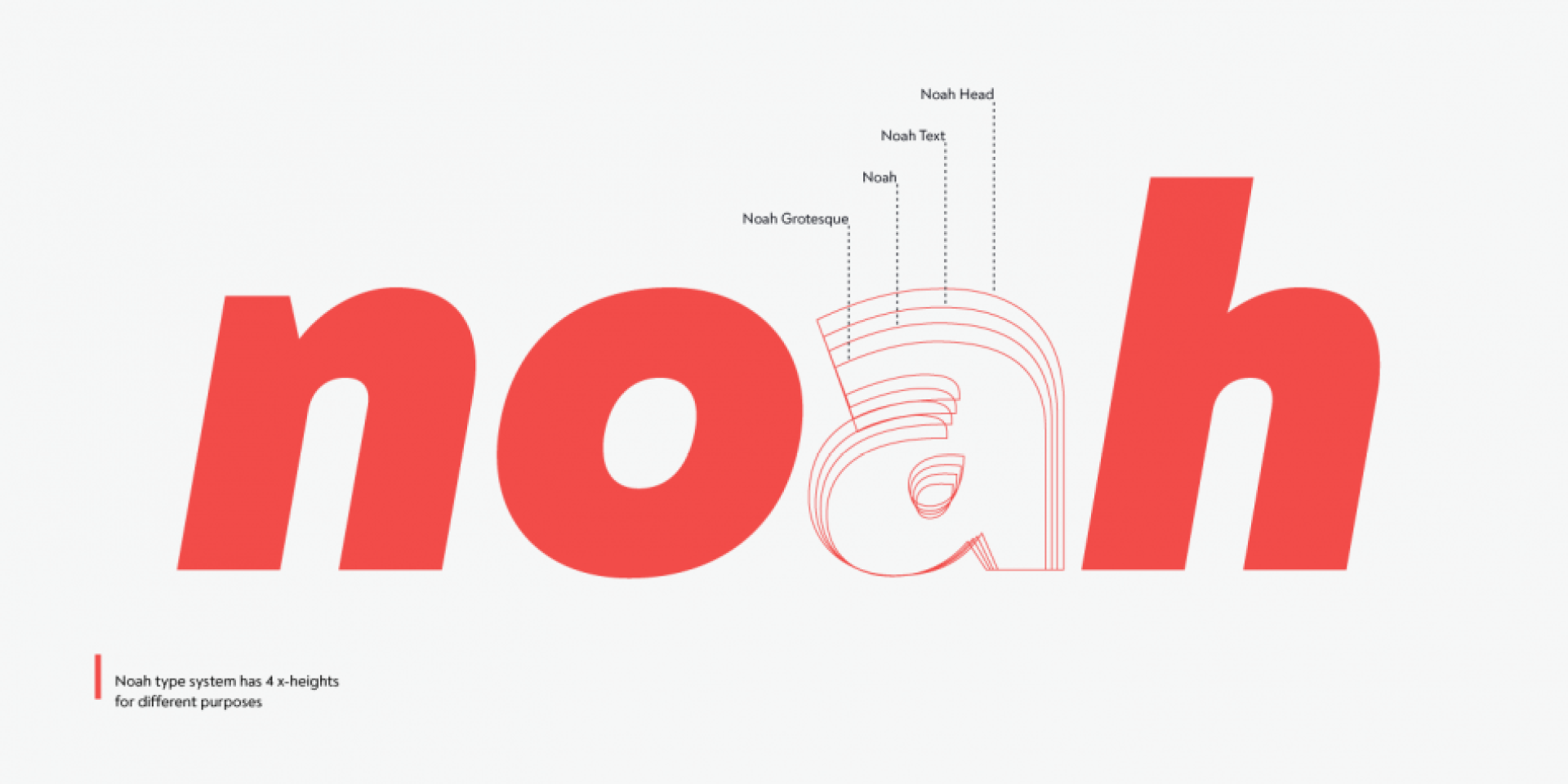
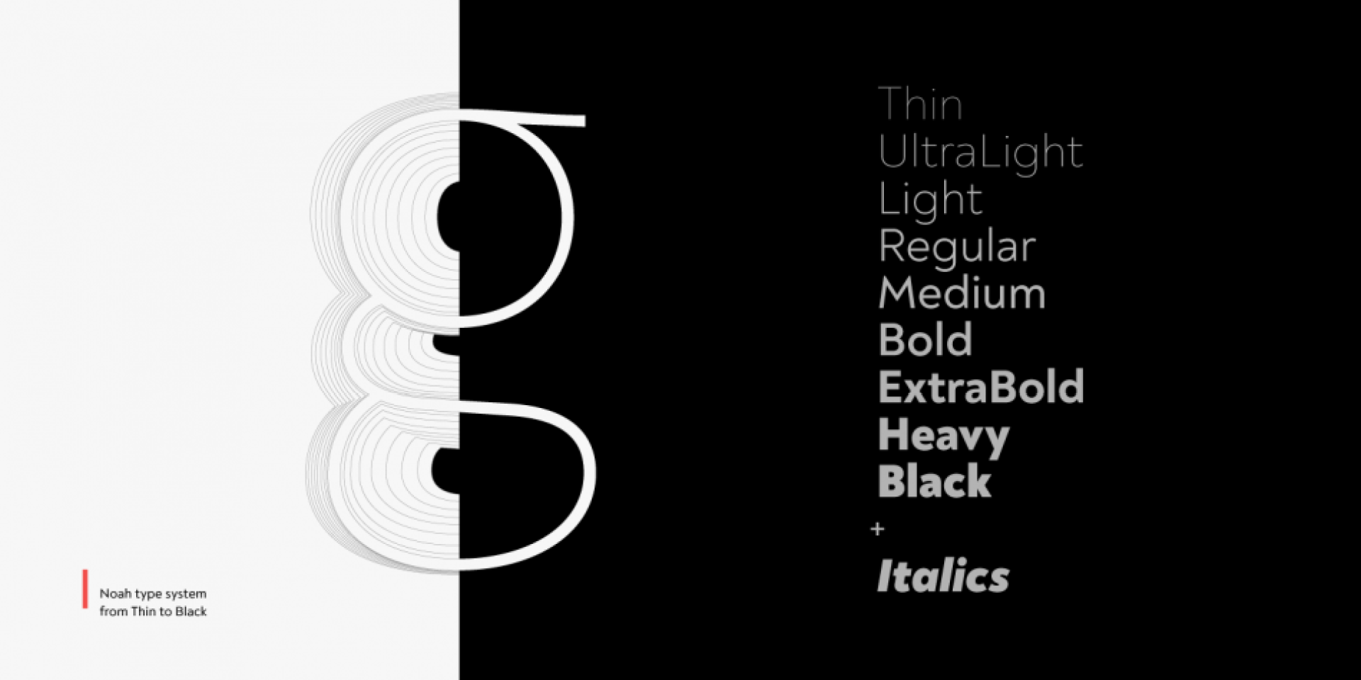
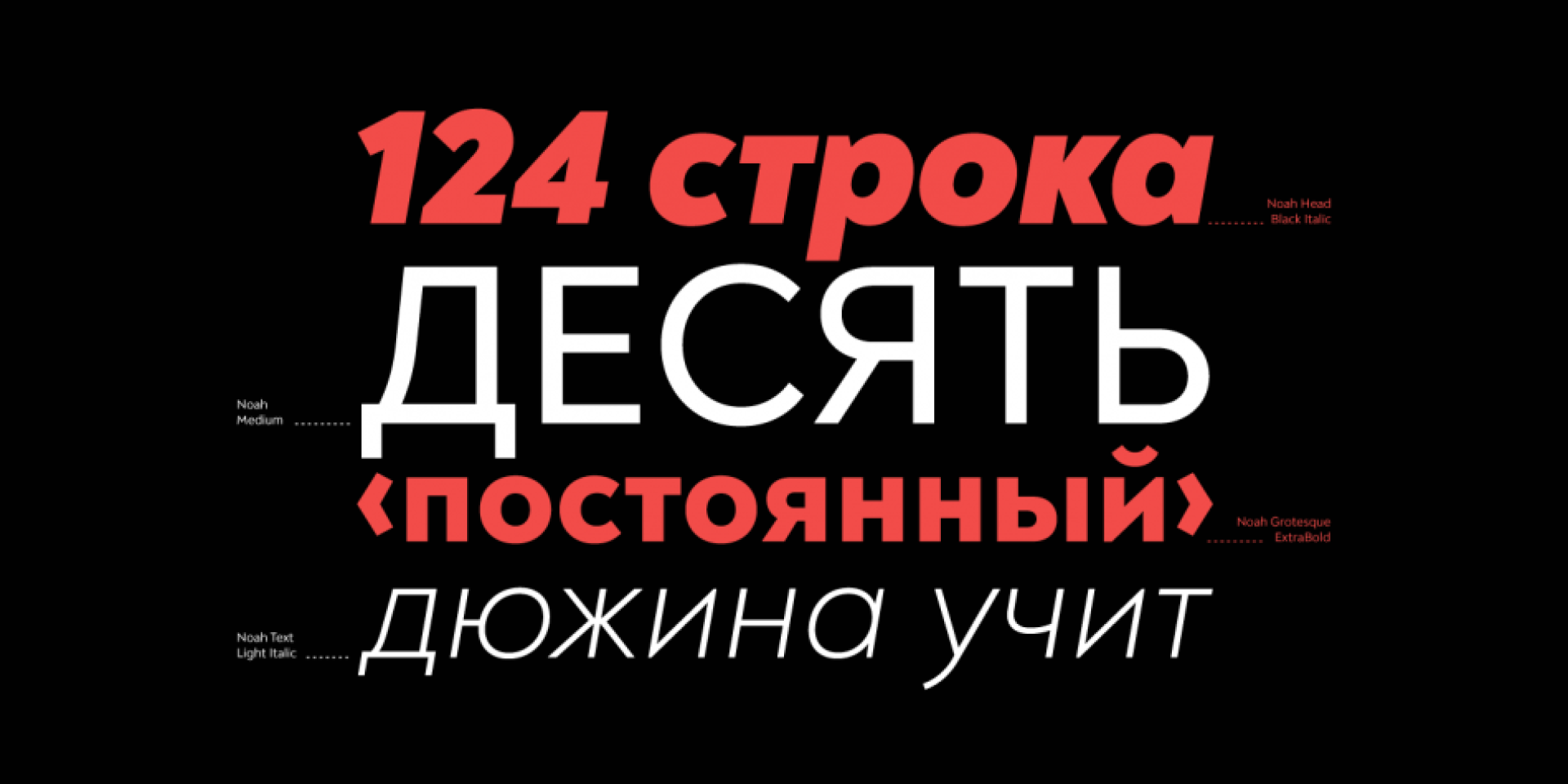
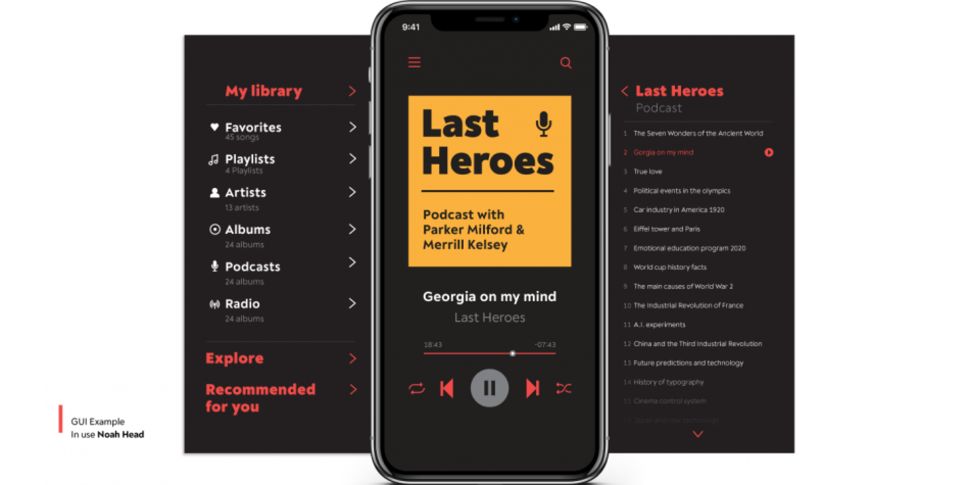
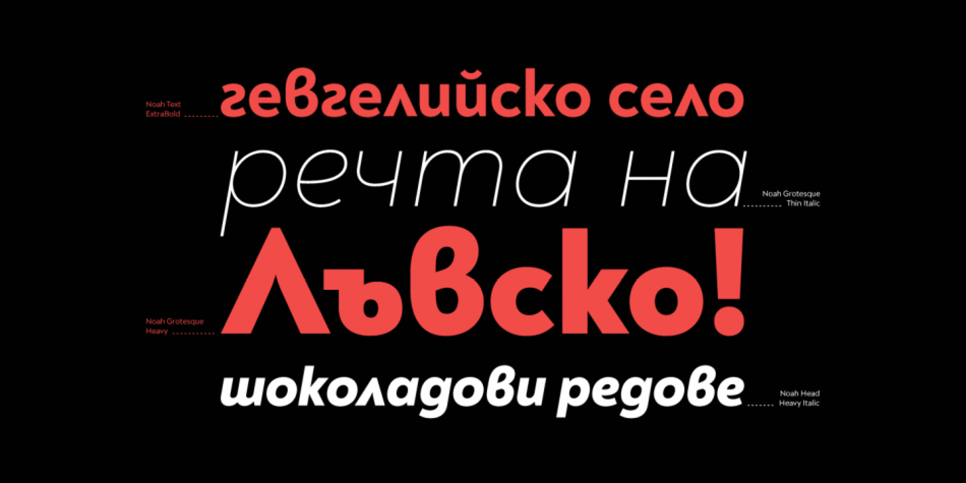
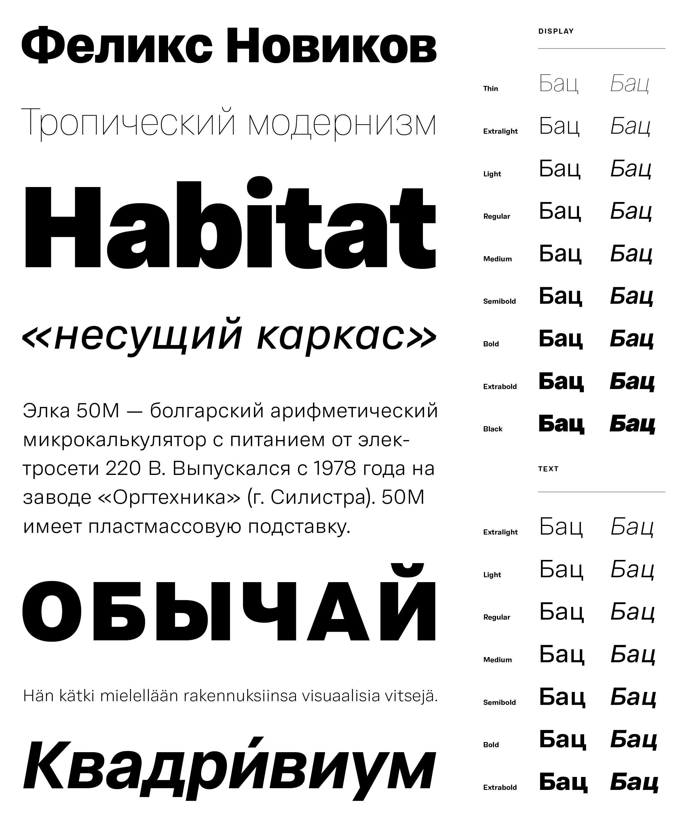
Noah is not just another geometric sans but rather extending the limits of the x-height for a further flexibility of a typeface. This type family encompasses 72 fonts grouped into four subfamilies with different x-heights — starting from the lowest one Noah Grotesque through Noah and Noah Text to the highest one Noah Head — all they including styles from Thin to Black with matching true italics.
The geometric structure combined with normal width proportions, moderate contrast and vertical stress make this type family suitable for various typographic usages whereas the enhanced legibility of Noah Text optimizes it perfectly for long texts, and Noah Head intended for strong headlines. Sharp details, terminals with humanistic flavor and typographic alternates of letters, such as the binocular “g” or the geometric “a” successfully blend the best aspects of both geometric and grotesque typeface classics.
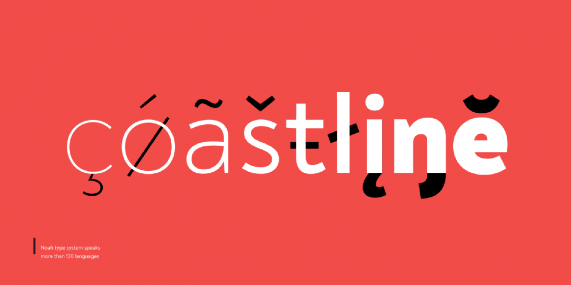
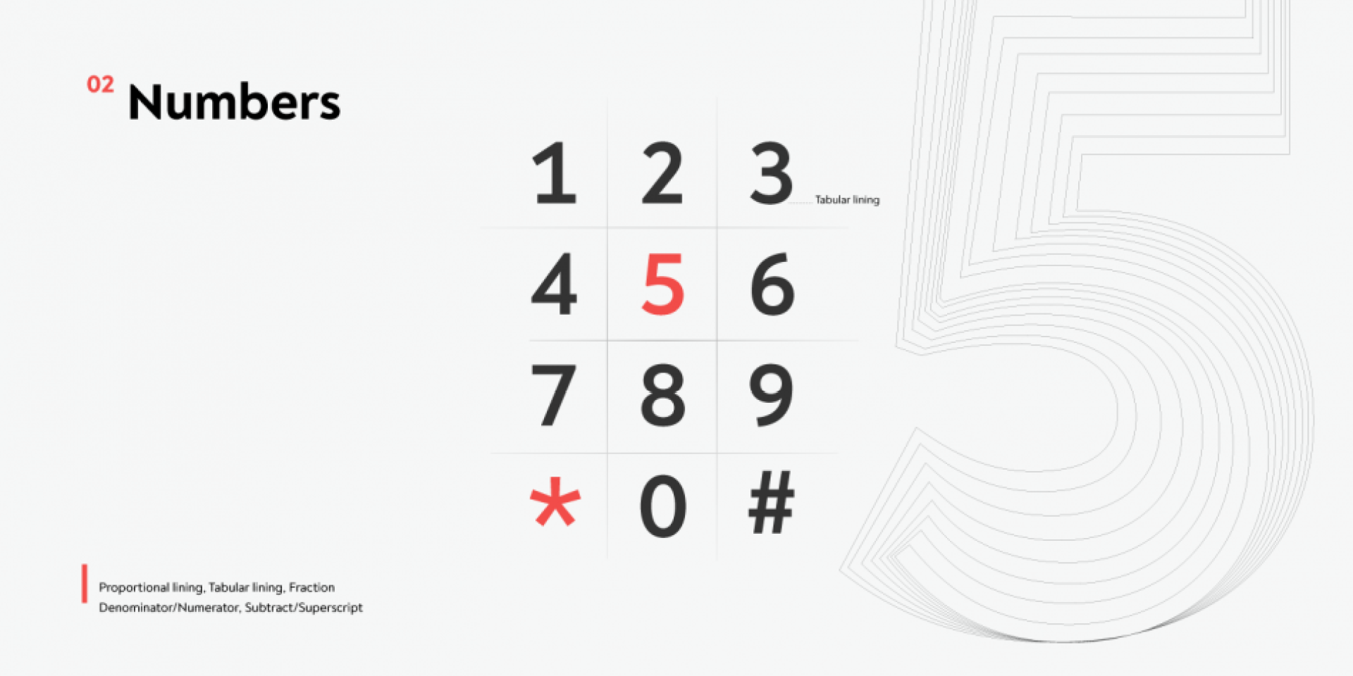
The underlying flawless functionality show coverage of Extended Latin and Cyrillic with span for more than 130 languages; support of many OpenType features, such as localizations, tabular numerals, inferiors and superiors, numerators and denominators, fractions, standard and discretionary ligatures, case sensitivity etc. The versatile characteristics of Noah type family are solution for every design challenge.
Features
Over 650 glyphs in 72 styles (Thin to Black)
Extended Latin and Cyrillic scripts for more than 130 languages
4 different x-heights
Normal width proportions
Moderate contrast and vertical stress
Geometric characteristics and terminals with humanistic flavor
Design, Publisher, Copyright, License
Design: Svet Simov, Radomir Tinkov, Stan Partalev
Publisher: Fontfabric LLC
Copyright 2019 by Svet Simov. All rights reserved.
License: COMMERCIAL
Svet Simov
Fontfabric is the foundry of Svetoslav Simov, a visual designer who is located in Sofia, Bulgaria, b. 1984. Highly innovative designer whose creations have lots of style and flair. Many fonts are for both Latin and Cyrillic.
Based in Sofia, Bulgaria, Radomir Tinkov began his career as a graphic and web designer. “Typography is an essential part of almost every aspect of life and design in particular,” he says, “so it got me curious and little by little I started to create fonts on the side.” His earliest designs were limited to mainly display faces, but he knew that he wanted to create a deeper type library filled with more versatile and useful designs. “As time passed, I learned more and more and began to create custom typefaces to solve real problems in other design projects I was working on and just like that, my first marketable font was created.”
Type designer at Fontfabric in Sofia, Bulgaria. He was part of the Fontfabric team that designed the 521-font family Zing Rust, Zing Sans Rust and Zing Script Rust in 2017. In 2018, he published the free all caps lapidary typeface Colus at Fontfabric. In 2019, Svet Simov, Radomir Tinkov and Stan Partalev designed the 72-strong Noah family of geometric sans typefaces, which is partitioned into four groups by x-height from small (Noah Grotesque) to medium (Noah and Noah Text) to large (Noah Head).
(EN) The quick brown fox jumps over the lazy dog. (NL) Op brute wijze ving de schooljuf de quasi-kalme lynx. (CS) Nechť již hříšné saxofony ďáblů rozezvučí síň úděsnými tóny waltzu, tanga a quickstepu. (HU) Jó foxim és don Quijote húszwattos lámpánál ülve egy pár bűvös cipőt készít. (RO) Înjurând pițigăiat, zoofobul comandă vexat whisky și tequila. (RU) Разъяренный чтец эгоистично бьёт пятью жердями шустрого фехтовальщика. (BG) Огньове изгаряха с блуждаещи пламъци любовта човешка на Орфей. (SR) Фијуче ветар у шибљу, леди пасаже и куће иза њих и гунђа у оџацима. (EL) Ταχίστη αλώπηξ βαφής ψημένη γη, δρασκελίζει υπέρ νωθρού κυνός. Type your own text to test the font!
Font Sampler
(EN) The quick brown fox jumps over the lazy dog. (NL) Op brute wijze ving de schooljuf de quasi-kalme lynx. (CS) Nechť již hříšné saxofony ďáblů rozezvučí síň úděsnými tóny waltzu, tanga a quickstepu. (HU) Jó foxim és don Quijote húszwattos lámpánál ülve egy pár bűvös cipőt készít. (RO) Înjurând pițigăiat, zoofobul comandă vexat whisky și tequila. (RU) Разъяренный чтец эгоистично бьёт пятью жердями шустрого фехтовальщика. (BG) Огньове изгаряха с блуждаещи пламъци любовта човешка на Орфей. (SR) Фијуче ветар у шибљу, леди пасаже и куће иза њих и гунђа у оџацима. (EL) Ταχίστη αλώπηξ βαφής ψημένη γη, δρασκελίζει υπέρ νωθρού κυνός. Type your own text to test the font!
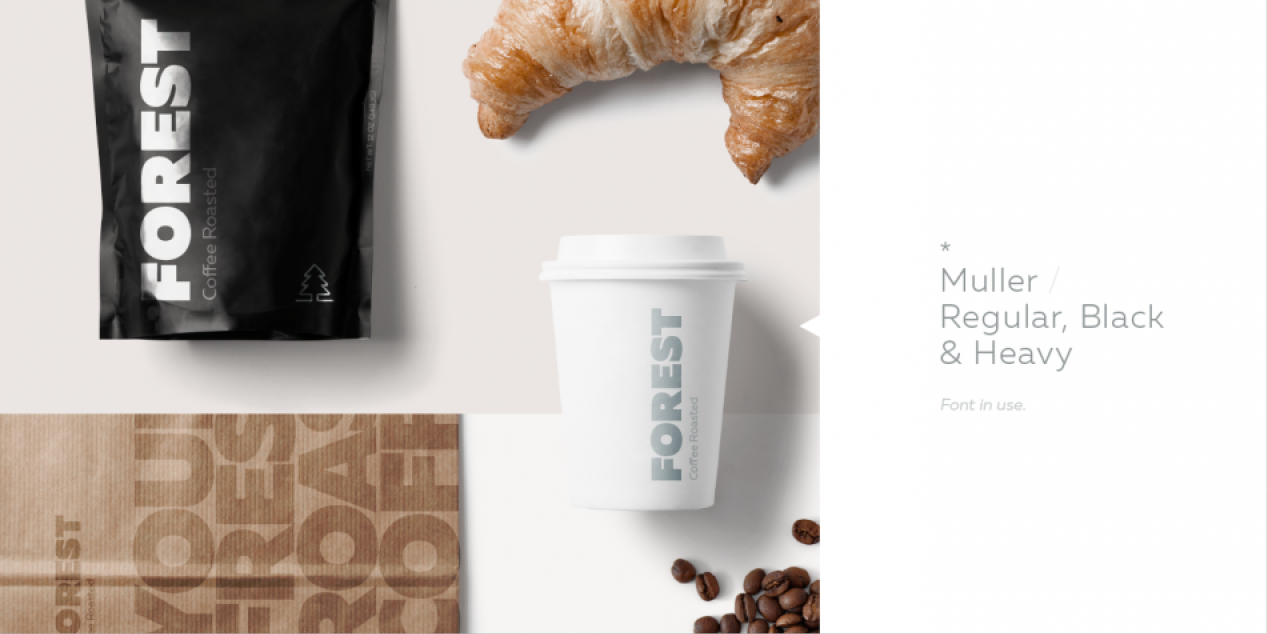
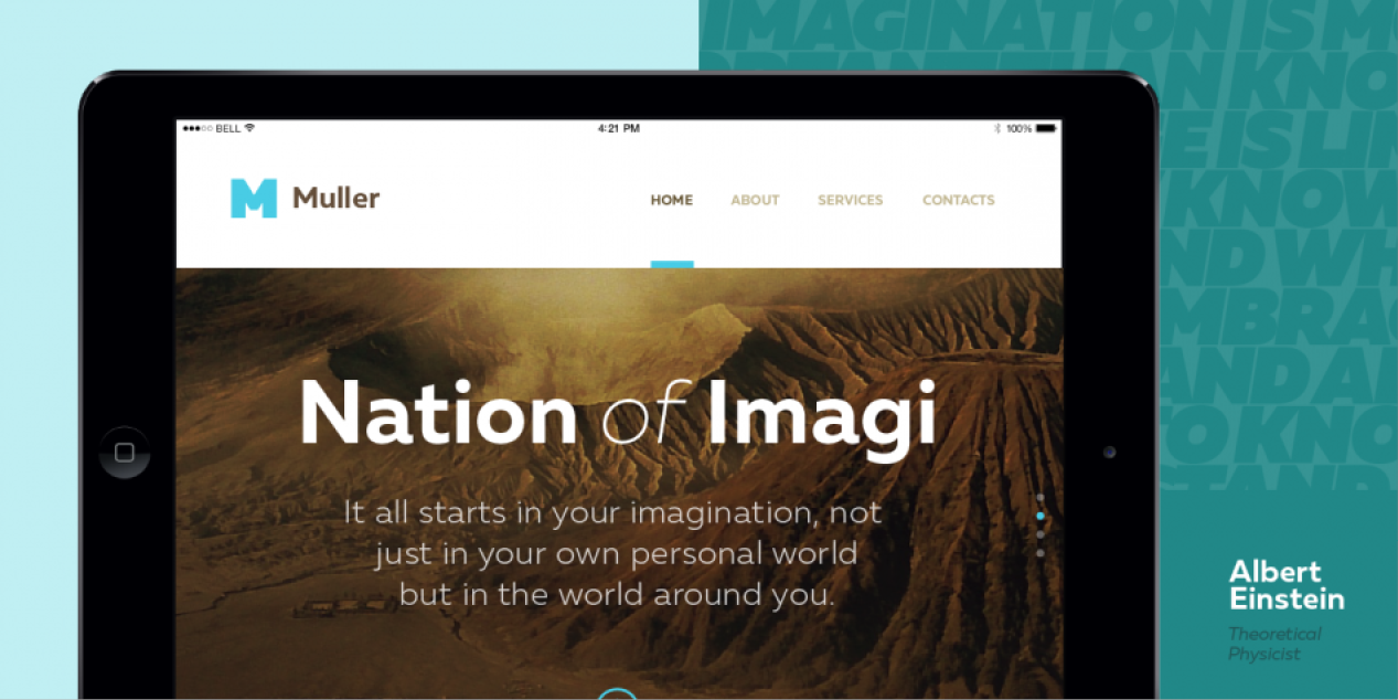
Description
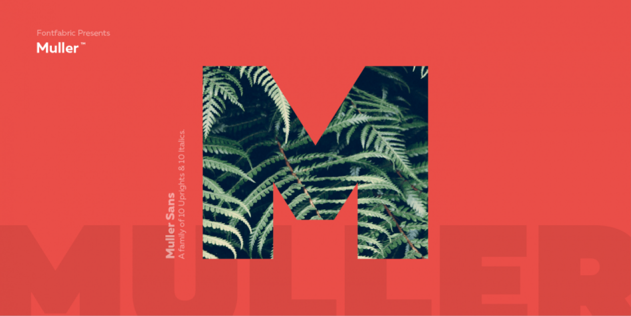
The very first sketches of Muller were made about four years ago. In the process they changed to the point where they had nothing in common with the original idea. As it is with most work we do, when we seek perfection, changes are inevitable.
It is specifically designed with a wider structure for better appearance in small sizes and the extra attention to the detail was needed for the big sizes. We managed to find the right balance for the perfect universal font family.
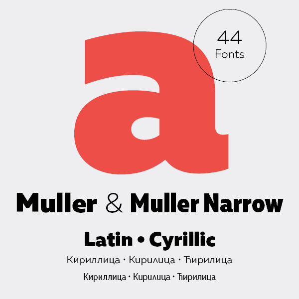
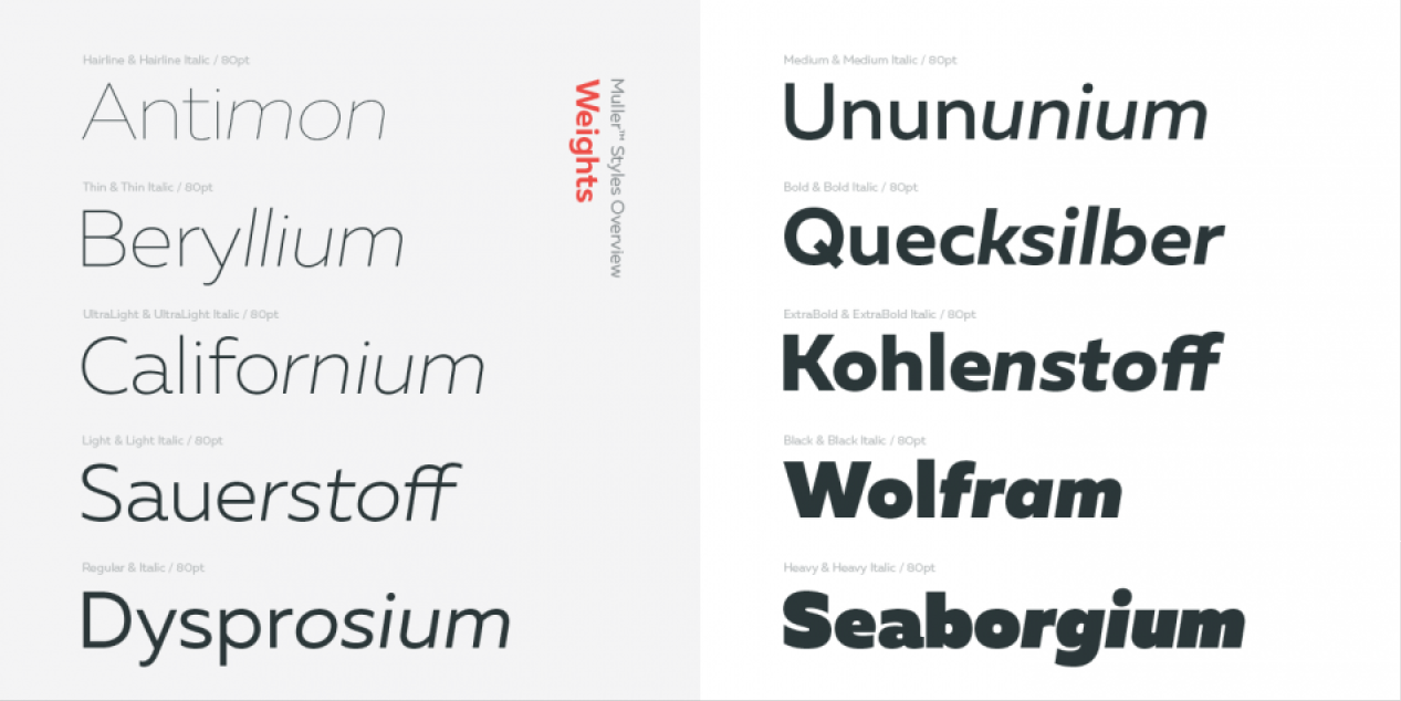
The family consists of 20 weights, raging from Thin to Heavy with matching Italics. This font family is suited for everything, raging from advertising, packaging, editorial and branding, to web and screen projects.
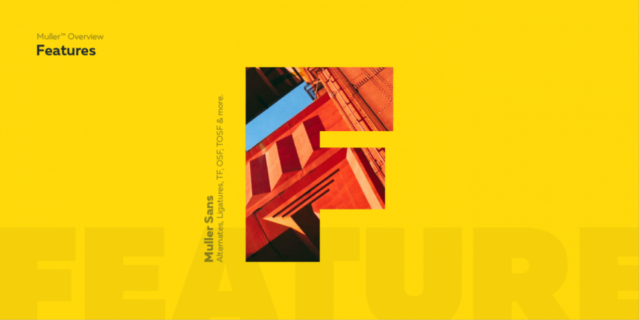
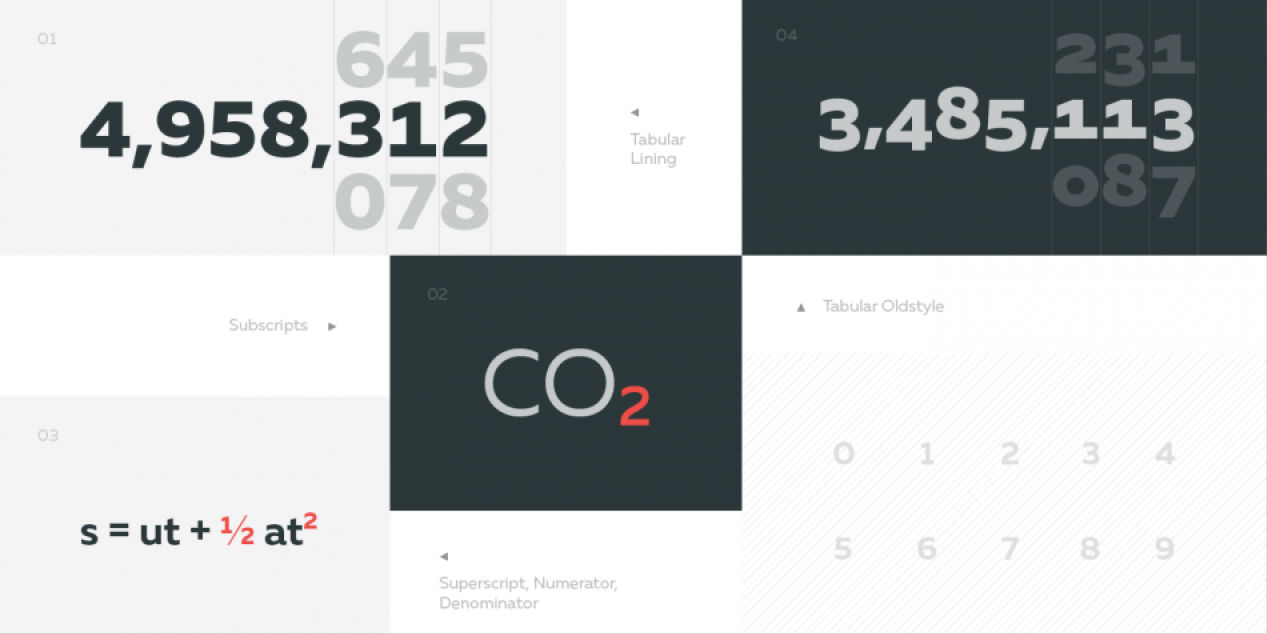
Muller comes with a complete range of figure options, including proportional and old style figures, each in its tabular version.
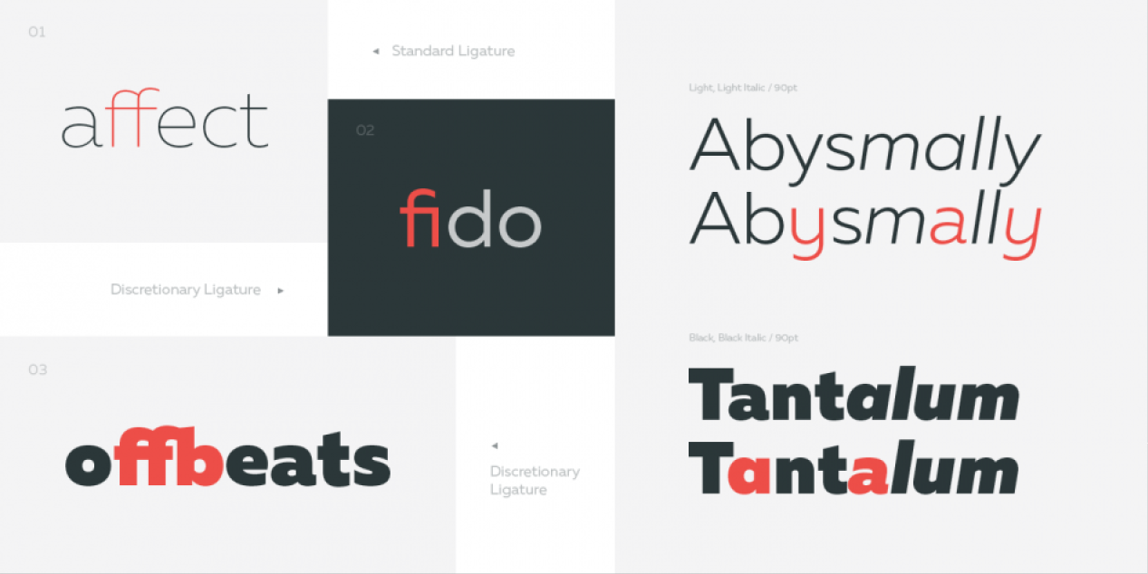
It also includes advanced typographic features such as ligatures, fractions, alternate characters, case-sensitive forms, superscripts and subscripts.
Design, Publisher, Copyright, License
Design: Radomir Tinkov
Publisher: Fontfabric
Copyright 2015 by Fontfabric. All rights reserved.
Based in Sofia, Bulgaria, Radomir Tinkov began his career as a graphic and web designer. “Typography is an essential part of almost every aspect of life and design in particular,” he says, “so it got me curious and little by little I started to create fonts on the side.” His earliest designs were limited to mainly display faces, but he knew that he wanted to create a deeper type library filled with more versatile and useful designs. “As time passed, I learned more and more and began to create custom typefaces to solve real problems in other design projects I was working on and just like that, my first marketable font was created.”
(EN) The quick brown fox jumps over the lazy dog. (NL) Op brute wijze ving de schooljuf de quasi-kalme lynx. (CS) Nechť již hříšné saxofony ďáblů rozezvučí síň úděsnými tóny waltzu, tanga a quickstepu. (HU) Jó foxim és don Quijote húszwattos lámpánál ülve egy pár bűvös cipőt készít. (RO) Înjurând pițigăiat, zoofobul comandă vexat whisky și tequila. (RU) Разъяренный чтец эгоистично бьёт пятью жердями шустрого фехтовальщика. (BG) Огньове изгаряха с блуждаещи пламъци любовта човешка на Орфей. (SR) Фијуче ветар у шибљу, леди пасаже и куће иза њих и гунђа у оџацима. (EL) Ταχίστη αλώπηξ βαφής ψημένη γη, δρασκελίζει υπέρ νωθρού κυνός. Type your own text to test the font!
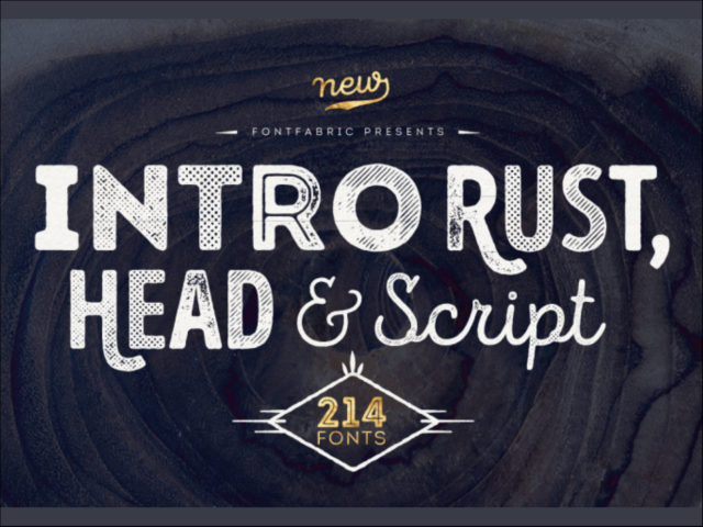
Description
Intro Rust family is one of the biggest packages on the market, including 214 fonts. The font family is a rough version of the famous Intro and includes 4 sub-families Intro Rust, Intro Script, Intro Head and Intro Goodies. For all types of design projects like print materials and web design, with just a little imagination you can watch them come alive. Intro Rust fonts will make them more vivid than ever. You want to make a greeting card, a package design, or even a brand identity? Feel free to play with all the patterns and shapes, scripts or those cool fonts with the dots to clinch your next successful project.
Design, Publisher, Copyright, License
Design: Ani Petrova, Svet Simov, Radomir Tinkov
Publisher: Fontfabric
Svet Simov
Fontfabric is the foundry of Svetoslav Simov, a visual designer who is located in Sofia, Bulgaria, b. 1984. Highly innovative designer whose creations have lots of style and flair. Many fonts are for both Latin and Cyrillic.
Type designer, b. 1988, Sofia, Bulgaria, who works at Fontfabric, Svetoslav Simov’s typefoundry. She completed her Bachelor’s degree at The National Academy of Art in Sofia. In 2014 she obtained a Master’s degree in type design.
Based in Sofia, Bulgaria, Radomir Tinkov began his career as a graphic and web designer. “Typography is an essential part of almost every aspect of life and design in particular,” he says, “so it got me curious and little by little I started to create fonts on the side.” His earliest designs were limited to mainly display faces, but he knew that he wanted to create a deeper type library filled with more versatile and useful designs. “As time passed, I learned more and more and began to create custom typefaces to solve real problems in other design projects I was working on and just like that, my first marketable font was created.”
(EN) The quick brown fox jumps over the lazy dog. (NL) Op brute wijze ving de schooljuf de quasi-kalme lynx. (CS) Nechť již hříšné saxofony ďáblů rozezvučí síň úděsnými tóny waltzu, tanga a quickstepu. (HU) Jó foxim és don Quijote húszwattos lámpánál ülve egy pár bűvös cipőt készít. (RO) Înjurând pițigăiat, zoofobul comandă vexat whisky și tequila. (RU) Разъяренный чтец эгоистично бьёт пятью жердями шустрого фехтовальщика. (BG) Огньове изгаряха с блуждаещи пламъци любовта човешка на Орфей. (SR) Фијуче ветар у шибљу, леди пасаже и куће иза њих и гунђа у оџацима. (EL) Ταχίστη αλώπηξ βαφής ψημένη γη, δρασκελίζει υπέρ νωθρού κυνός. Type your own text to test the font!
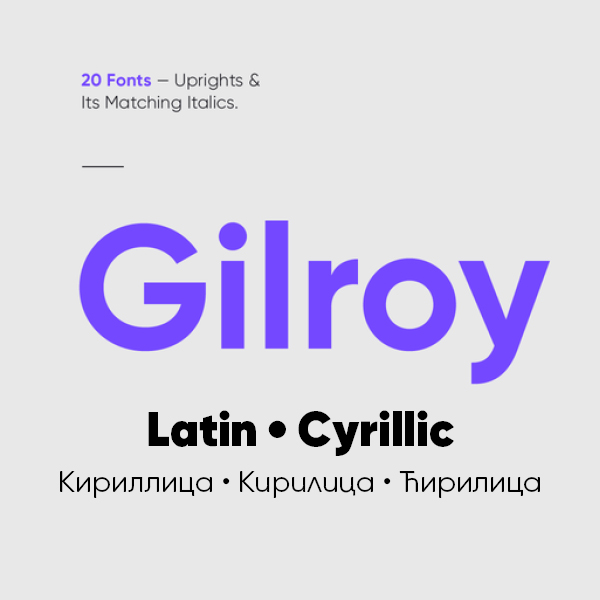
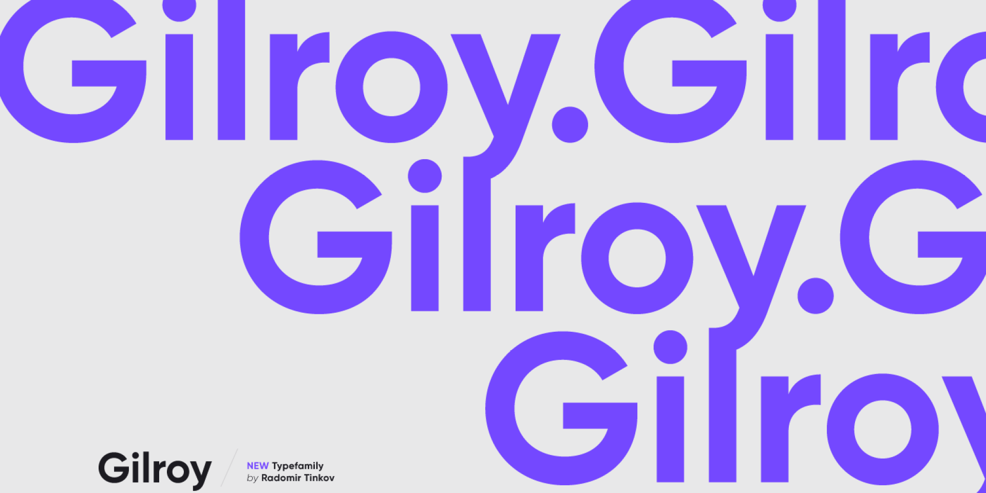
Description
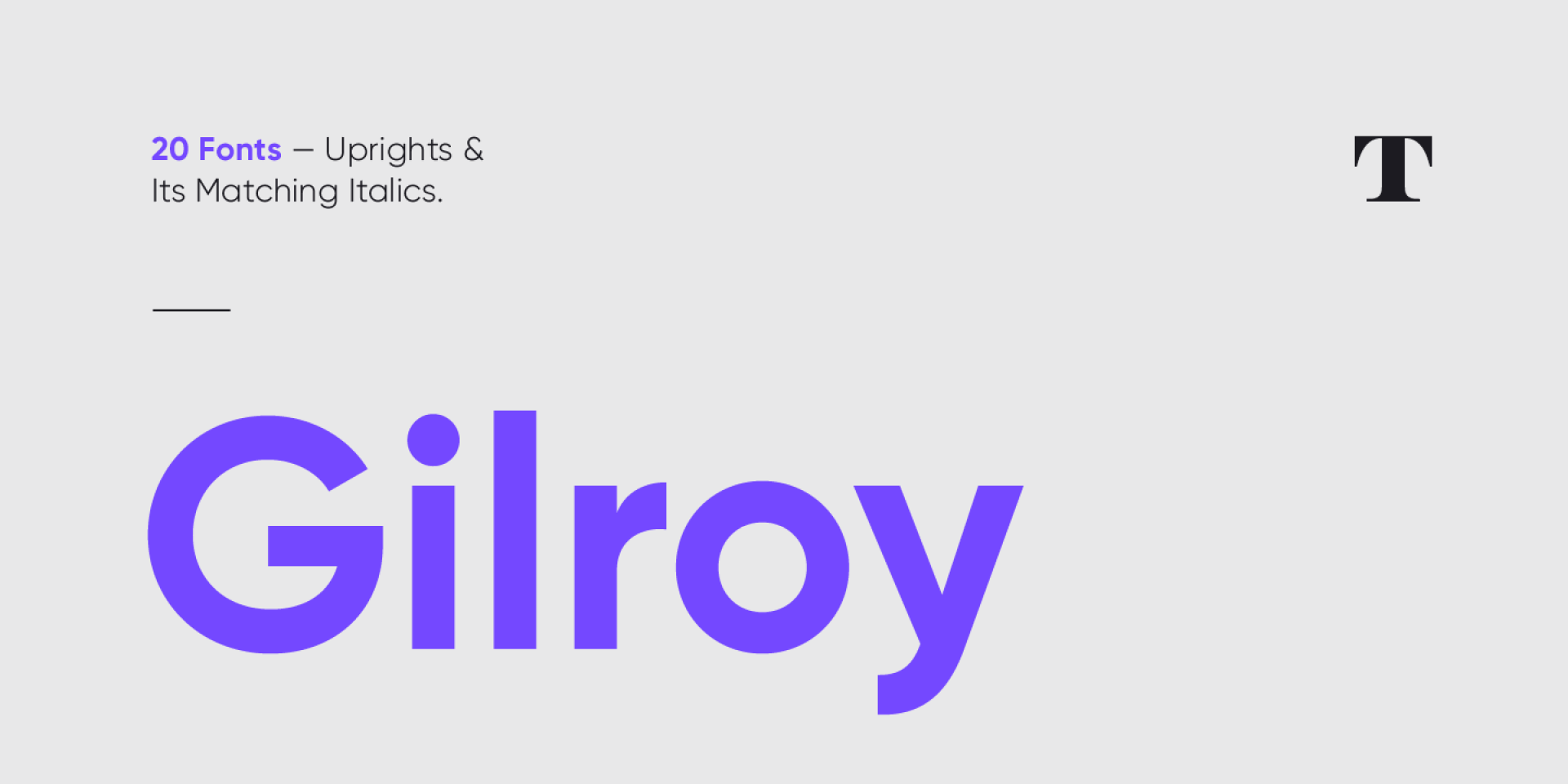
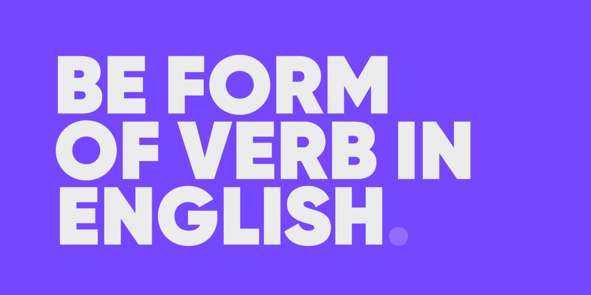
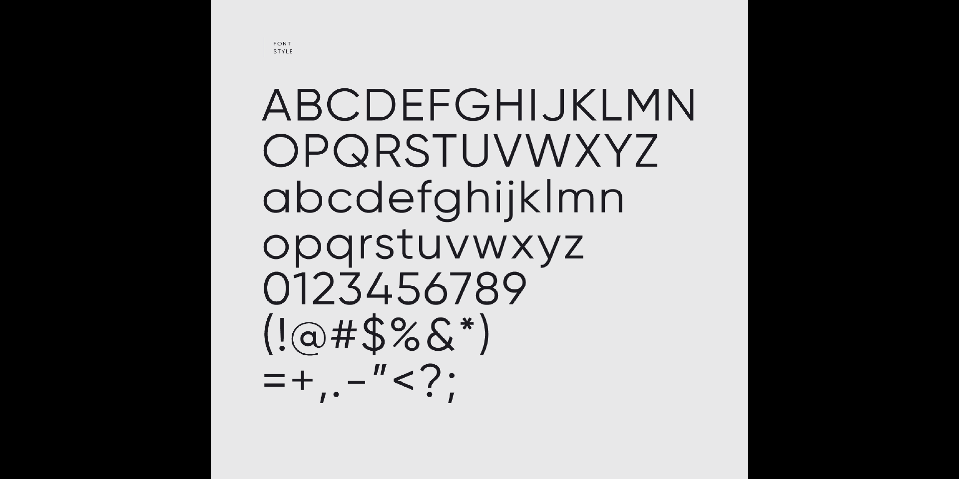
Gilroy is a modern sans serif with a geometric touch. A younger brother of the original Qanelas font family. It comes in 20 weights, 10 uprights and its matching italics. The Light & ExtraBold weights are free of charge, so you can use them to your heart’s content.
Designed with powerful opentype features in mind. Each weight includes extended language support (+ Cyrillic), fractions, tabular figures, arrows, ligatures and more. Perfectly suited for graphic design and any display use. It could easily work for web, signage, corporate as well as for editorial design.
Design, Publisher, Copyright, License
Design: Radomir Tinkov
Publisher: Radomir Tinkov
Copyright 2016 by Radomir Tinkov. All rights reserved.
Radomir Tinkov
Based in Sofia, Bulgaria, Radomir Tinkov began his career as a graphic and web designer. “Typography is an essential part of almost every aspect of life and design in particular,” he says, “so it got me curious and little by little I started to create fonts on the side.” His earliest designs were limited to mainly display faces, but he knew that he wanted to create a deeper type library filled with more versatile and useful designs. “As time passed, I learned more and more and began to create custom typefaces to solve real problems in other design projects I was working on and just like that, my first marketable font was created.”
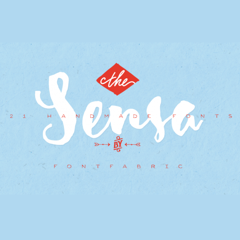
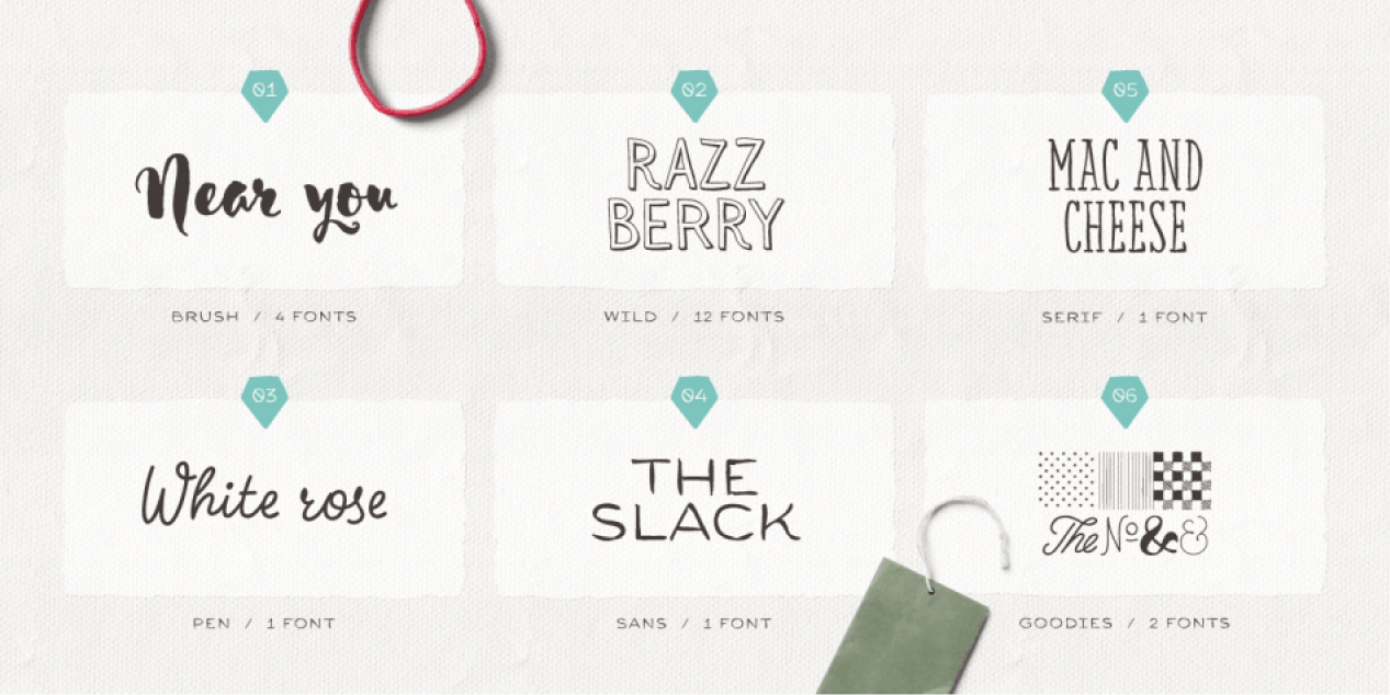
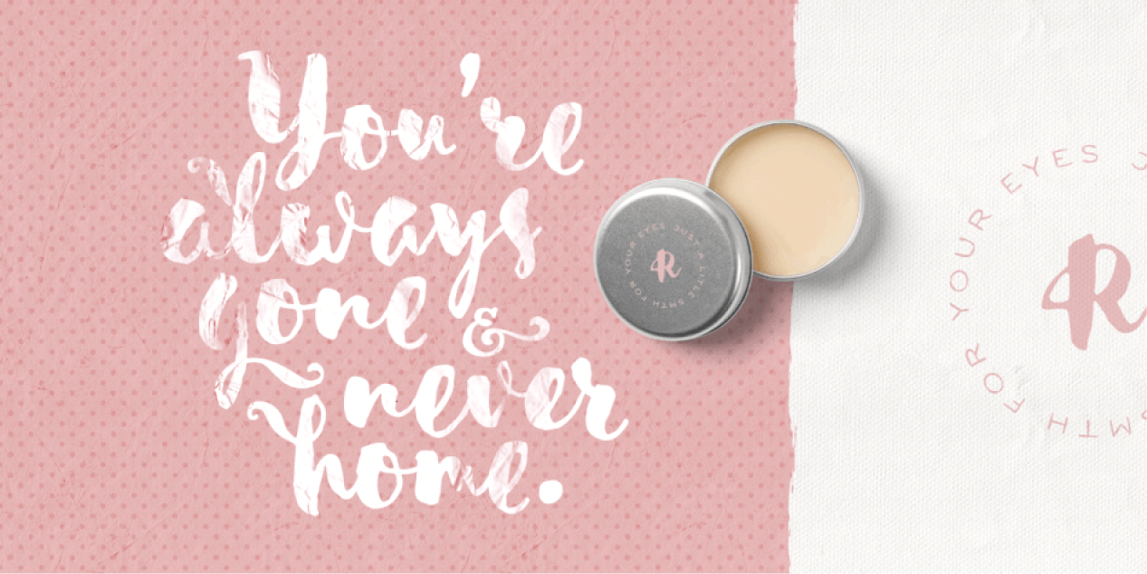
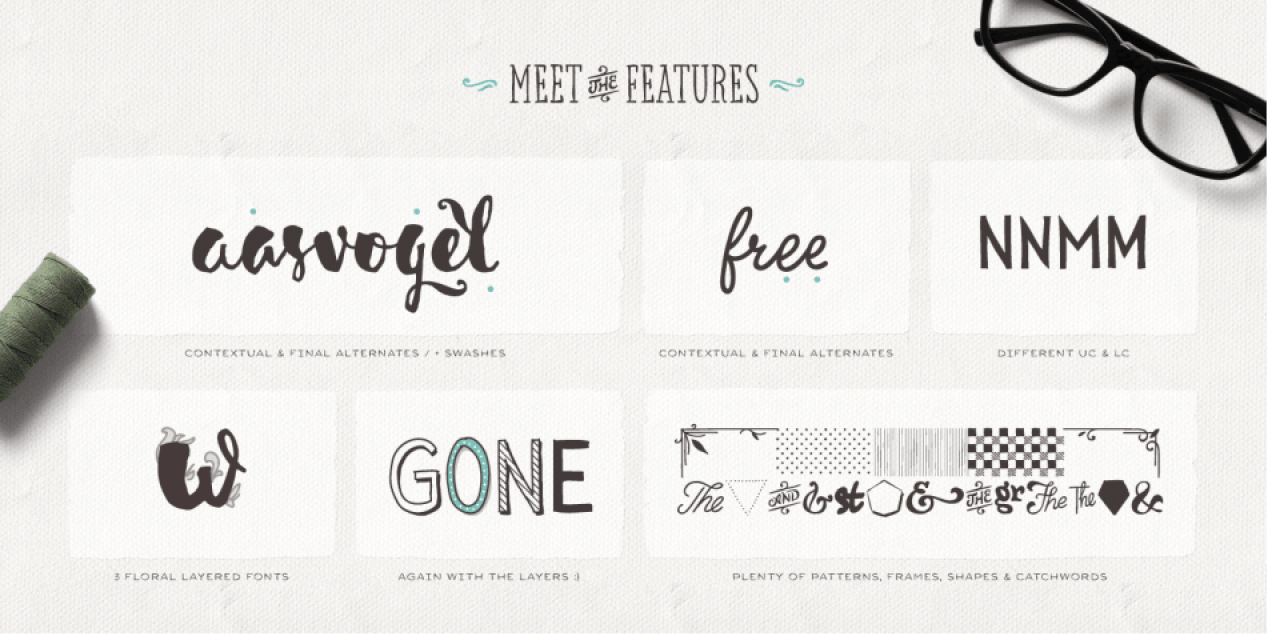
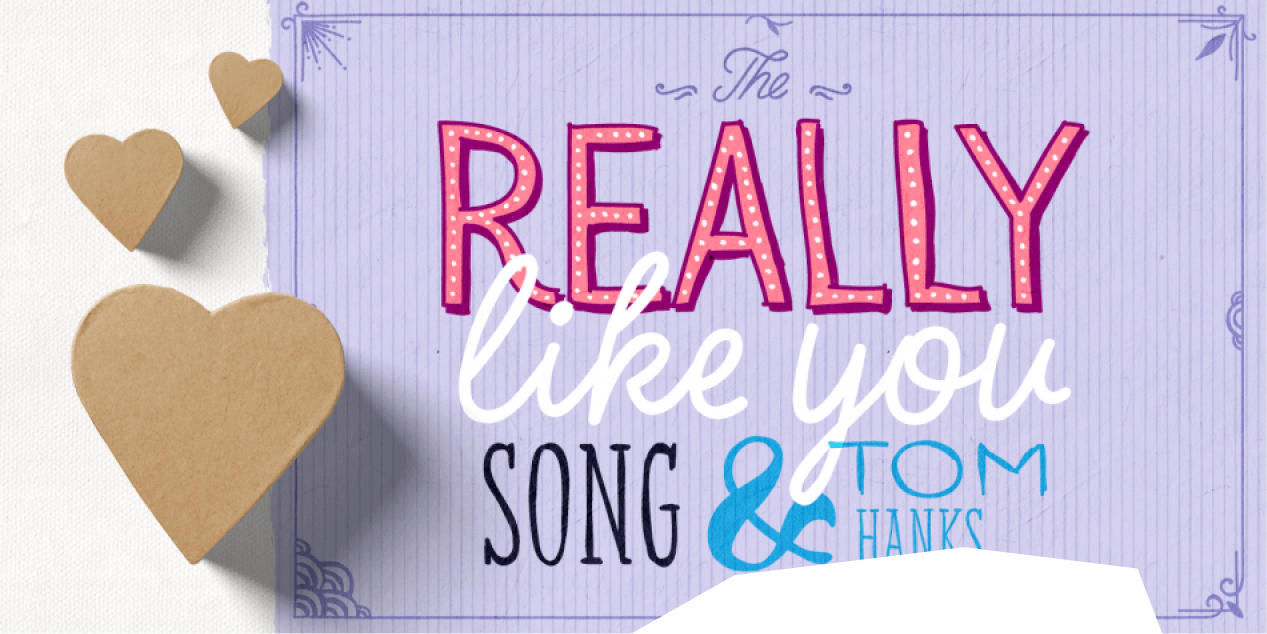
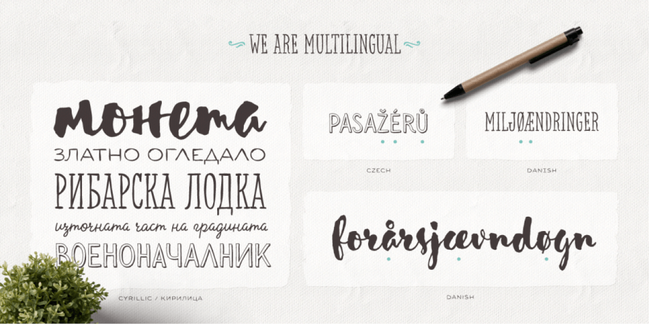
Sensa is a handmade font family consisting of 21 fonts. It is divided into 6 subfamilies, each contributing to its wide range of visual power – Sensa Brush, Sensa Pen, Sensa Wild, Sensa Sans, Sensa Serif and Sensa Goodies. Only your imagination is the limit. Pick any of the font as a leading one and the rest of the fonts can accompany it with ease. To work together in all possible combinations, all fonts in this package were created with that simple idea in mind. Sensa is applicable for almost every design project – from advertising, packaging, editorial and branding, to web and screen projects. For a beauty and tender sensation or for more male and strong communication – you have a wide selection.
Welcome to the first annual ranking of the Top 10 Cyrillic fonts of 2019! Choose from the list below your favourite font. If you can’t find it in the list, you can add its name at the bottom of the page. If you are suggesting a Cyrillic font, please make sure that it has been published in 2019. Fonts published before 2019 will not be included in the ranking.
The winning font will be announced in December 2020. Until then the voting will remain open. We are looking forward to your votes!
Adapter
Author
William Montrose,
Sláva Jevčinová,
David Březina
Year of creation
2019
Test
Baldufa
Author
Ferran Milan,
Pilar Cano
(Letterjuice)
Year of creation
2019
Test
Zangezi Sans
Author
Daria Petrova
Year of creation
2019
Test
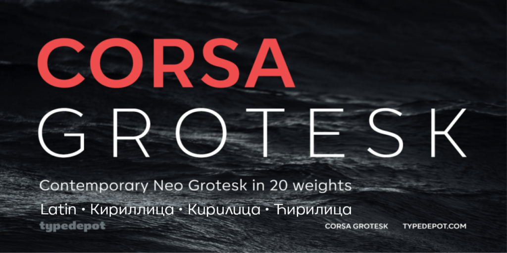
Corsa Grotesk
Author
Alexander Nedelev
Year of creation
2019
Test
Maver
Author
Ani Dimitrova
Year of creation
2019
Test
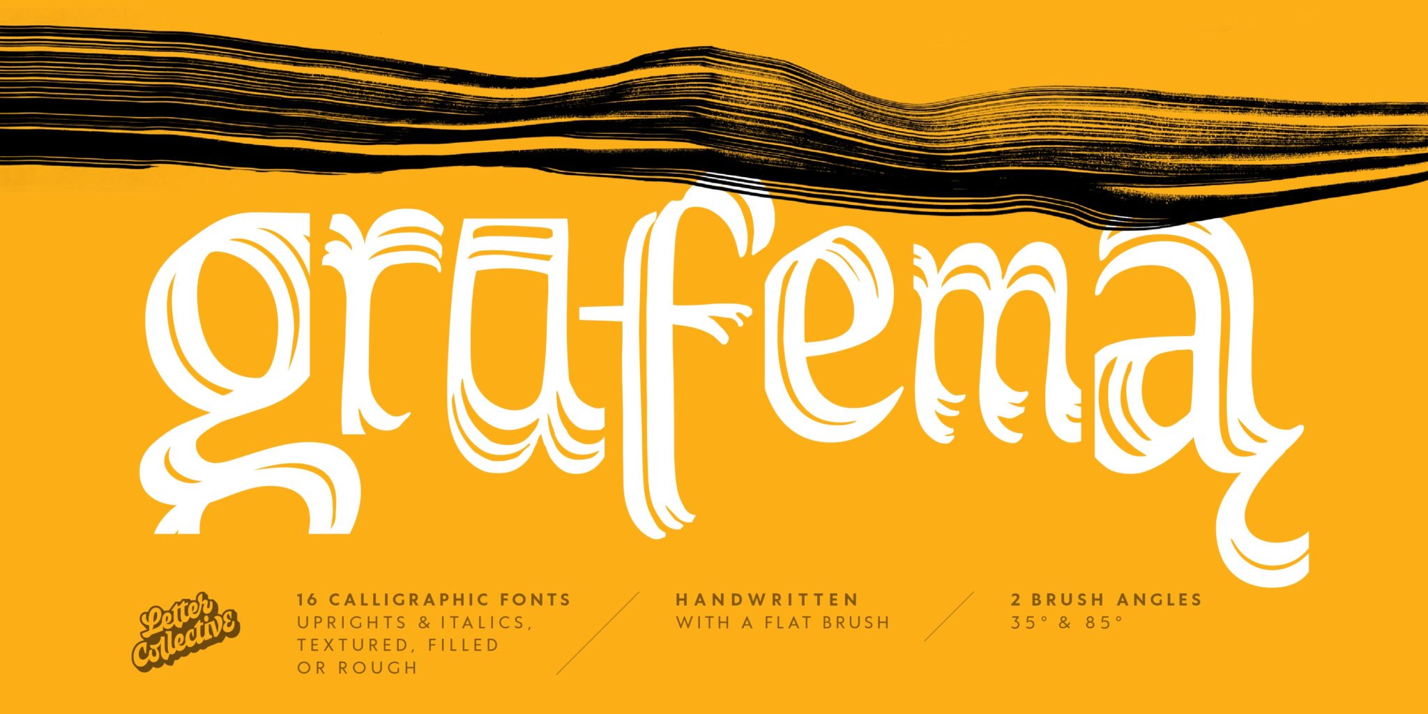
Grafema LC
Author
Jacklina Jekova,
Todor Georgiev
Year of creation
2019
Test
FM Bolyar Sans Pro
Author
Jordan Jelev,
Vassil Kateliev
Year of creation
2019
Test
Noah
Author
Svet Simov,
Radomir Tinkov,
Stan Partalev
Year of creation
2019
Test
FS Brabo Pro
Author
Fernando Mello,
Pedro Arilla,
Krista Radoeva
Year of creation
2019
Test
Curbe
Author
Olga Pankova
Year of creation
2019
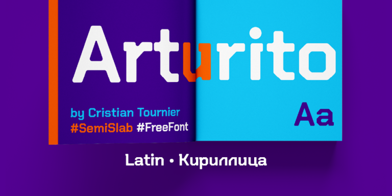
Arturito
Author
Cristian Tournier,
Denis Ignatov
Year of creation
2019
Test
If you like this site and find it useful, help us to make it better by giving feedback, suggesting improvements or by donation.
Type designer at Fontfabric in Sofia, Bulgaria. He was part of the Fontfabric team that designed the 521-font family Zing Rust, Zing Sans Rust and Zing Script Rust in 2017. In 2018, he published the free all caps lapidary typeface Colus at Fontfabric. In 2019, Svet Simov, Radomir Tinkov and Stan Partalev designed the 72-strong Noah family of geometric sans typefaces, which is partitioned into four groups by x-height from small (Noah Grotesque) to medium (Noah and Noah Text) to large (Noah Head).