How are font ideas born – please describe the creative process from the impulse to the technical realization.
JJ: The font ideas are most often conceived as calligraphic or lettering experiments. Our concept at Letter Collective is based on the idea that letters must come from our hands, the instrument with which you write and draw. That being said, we do a lot of sketching before we start to build or transfer the letters into some kind of software. Each type designer knows that it is a huge amount of work and one needs a “fresh look” on their project. In our case, being a team of two helps us see and correct mistakes, test new options and give each other the time to rest. The time which goes into the development of a typeface is relative because it all depends on the number of glyphs and how big the family is going to be. It could be done in a few months, a year and sometimes more.
What place does the creative purpose have in the work process?
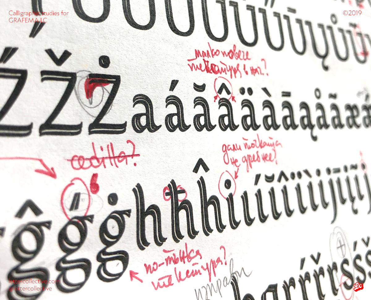
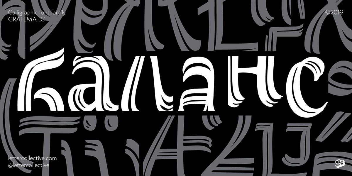
TG: I’ll straight out say that we do not profit from selling fonts. It would be great if we did, however that’s how things are for the time being. We do not ask questions such as “What would bring us the most money?”. In our non-client projects we strive to invest the most of our own selves, to look for a challenge, to make something we haven’t done before. We don’t expect our font releases to be part of any “best selling” rankings. If I have to narrow it down I’d say we strive to be original and contribute to the growth of the art of Type design locally and internationally as well. An invariable part of our designs is the Bulgarian Cyrillic form. Even on some occasions we provide just that – without Latin, for example. We strongly care for it to become much well known and used, we firmly believe in this cause and strive to contribute as much as we can on the matter.
Is the type designer free in his work?
TG: Freer than ever. Right now people experiment more boldly and their limits are shrinking. The same could be said for the users of these fonts. OpenType and its constant evolution gives us many new possibilities.
It is very satisfying to see designs from western artists get quirkier and I often say to myself “how didn’t I think of that?”. Also some that are way out of my skill range at least for now.
As long as you’re able to find them, there are lots of resources on the matter, discussion, etc. which can give you the basis to start designing type without having studied that before. In some cases it is even better, because you are not burdened with the limitations and dogmas of classical forms and norms.
JJ: As far as custom type goes, the designer is free to experiment and do whatever he/she wants. It gets much more common for calligraphic scripts based on expressive brushstrokes to emerge or typefaces based on a rich variety of alternatives and ligatures which at one point might assume are custom lettering instead of fonts. Even further, various software allow for the development of variable fonts. This function offers a new perspective on fonts which can now be modified on several parameters (axis) and the possibilities for experimentation in this field is huge.
As far as commissioned fonts go things are quite different. In those cases the designer must comply with the requirements of the brand.
What must the type designer comply with?
TG: Tough question. All designers must comply with thousands of things and the list goes for miles. In our case we are mainly constricted by the time we have simply because we are not a type foundry and making fonts is not our first line of work. For the time being that comes more as a luxury which we can rarely afford.
For us it is vital to have balance in everything we do. We firmly believe that it is a fundamental part of the design of anything including every aspect of our lives as well. The lack of balance can also be a kind of balance. If the concept of your typeface implies exactly that, then you have to adhere to it and apply it wherever fitting.
Another important aspect is the idea. A font must be subjugated to some sort of basis – a direction which gives meaning to its development and its use after that. Even if that idea is applying a certain technique or style which you want to try out or the font’s application when it is finished. The idea could be simply “experimentation” without having a clear final product in mind. In the best case scenario it has to be usable and applicable, however, I’d say even that is not mandatory. If we look at type as an art form and not as a tool we can say that the process is just as important as the final result. If you intend to make sales then go on and conform with the trends and what users are looking for but we do not work that way. We strive to make things we are proud of; which are in some ways a novelty; which we or nobody else has tried before; which advance us as artists or the sector we work in.
JJ: A typeface is a system of glyphs which first and foremost must work together and have consistency between each other. If we look at fonts as a tool for communication then they have to be readable. Type designers must consider each individual letter and make it in balance and in harmony with the rest. Another part which is just as important is the space between the letters which helps with legibility and is a fundamental part of building the letter’s silhouette.
Which typeface would you say is ugly – what are your fundamental design principle, the axioms of type design?
TG: People in our line of work say that each typeface when used in the right way can work and look good. This may be the case in some situations and I agree, however it is a fact that there are typefaces which are just garbage – whatever you do with them, wherever you try to apply them they remain ugly. A bad font I’d say it the one that has been made without an intended purpose and is not subjugated (unknowingly) to fundamental rules which form the letter. That becomes immediately apparent.
How many font families does a small design studio need?
TG: For our small design studio specifically we can generally manage with a sans and serif one. However we do differ in the way that our focus is on making unique lettering for each specific client and occasion. In other words we strive NOT to use ready-made fonts when working on a logotype for instance. For the time being that is our main line of work which pays the bills. It all depends on budgets, requirements, deadlines, etc., of course.
Who are your teachers in type design?
TG: My teachers have all been professors from NAA (National Academy of Art, Sofia). It was Prof. Dr. Christina Borisova who sparked the flame and later I majored in Type design with Prof. Todor Vardzhiev and Assoc. Prof. Dr. Iliya Gruev. I must mention Assistant Prof. Dr. Stoyan Dechev as well who in fact has never been my lecturer, however I value each encounter and talk with him as an important lesson – for type and design and their subtleties as well as for life in general.
Other teachers have been books and catalogues, specimens, projects published online. But in fact my greatest teachers have been time and practise. Type design is such a subject that in my opinion requires a huge amount of time to pass by in order to make one get acquainted with the essence of letters, get a feeling for their shapes and get close and personal with each one. With time you accumulate tens of thousands of sketches, you start reaching new geometries, other solutions and alternatives. You become your own teacher and that lasts forever.
JJ: My first type design teacher was Assistant Prof. Dr. Svetlin Balezdrov in the Advertising Design department at NAA (National Academy of Art, Sofia). He taught type and graphic design and at that time I did my first ever attempts in calligraphy. Afterwards I decided I’d like to dig deeper into the world of letters and I continued my studies in the Master’s program Calligraphy in NAA. There I met with Prof. Dr. Christina Borisova and Kostadin Kokalanov who were my teachers in classical and experimental calligraphy. After graduating I decided to take on type and calligraphy professionally and attended workshops thus learning new approaches and techniques for building fonts and free calligraphic compositions. Lecturers in the workshops I’ve attended were Luc(as) de Groot, Vincent Deboer, Hans Schuttenbeld, Julien Priez and Jakob Engberg. What mostly excites me about type design and calligraphy is that it is an endless field and you can more or less never stop learning and meeting people who work in a different way, share their work and approaches and give the opportunity to learn something new.
How do you perceive the future of the Bulgarian Cyrillic form?
TG: As far as forms and content goes I truly have no idea what might happen. I’ll be glad if it evolves and gets refined, follows a path of evolution. But most importantly to be recognized by the whole of Bulgaria as a standardized local form which it already is in the world of type design and to be used as intended. For this to happen, however, the simple function for the usage of local forms must be implemented at a wider scale. It must be easy to use in operating systems and all kinds of software, including mobile apps.
JJ: I hope it gets richer, evolves and is much more frequently seen in books and printed materials as well as in the digital world. For that to happen we must talk more about the local forms of fonts and their application not only amongst designers, but amongst the wider mass audience as well.
What are you working on at the moment? What can people who like your fonts expect in the near future?
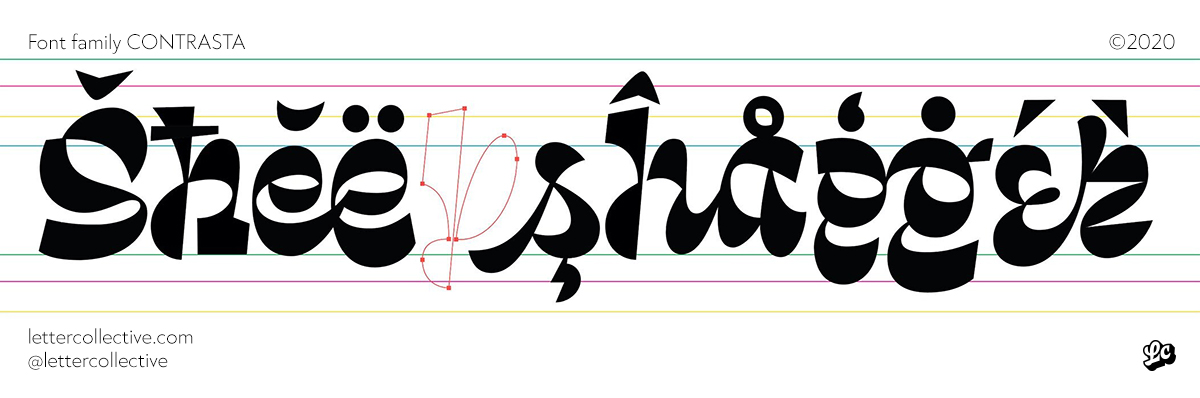
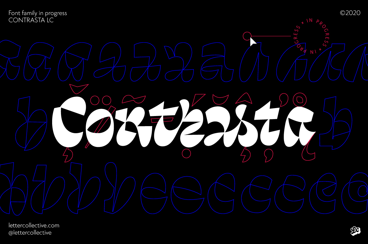
TG: At this very moment we are working on projects which can bring us profit. The pandemic hit us hard and we struggle to pay our studio’s rent. We are developing two series of beer labels, a logotype for electronic cigarettes, a backlit sign for a restaurant, we are preparing for a window painting on the storefront of a dairy shop. Right now we cannot afford to work on a project which is not certain to put food on the table. A few months ago we announced the beginning of a big type project which is currently on hold until we can afford to dedicate the time it needs. And it really would need a lot of time since we haven’t done anything like that before. The font’s name is Contrasta and its purpose is to mimic custom lettering inspired by our own works from the last couple of years. We started off with the heavy weight and we are planning to do a light master in order to generate a variable font family as a final product. I bit more can be seen on our webpage lettercollective.com.
Editor
![]()
Stefan Peev
graphic designer and typographer from Bulgaria