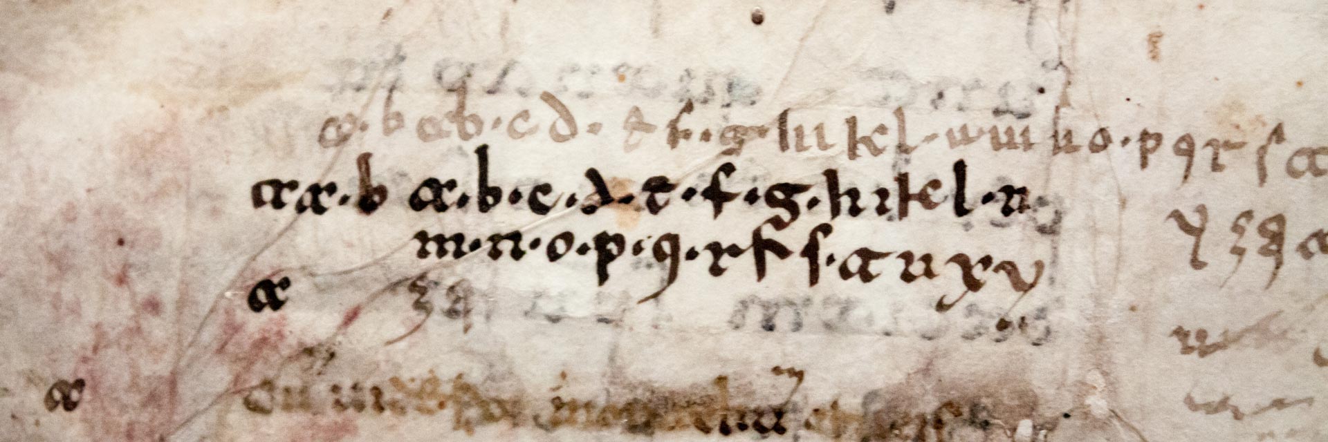
Lectionary of Luxeuil
Source: WIKIPEDIA
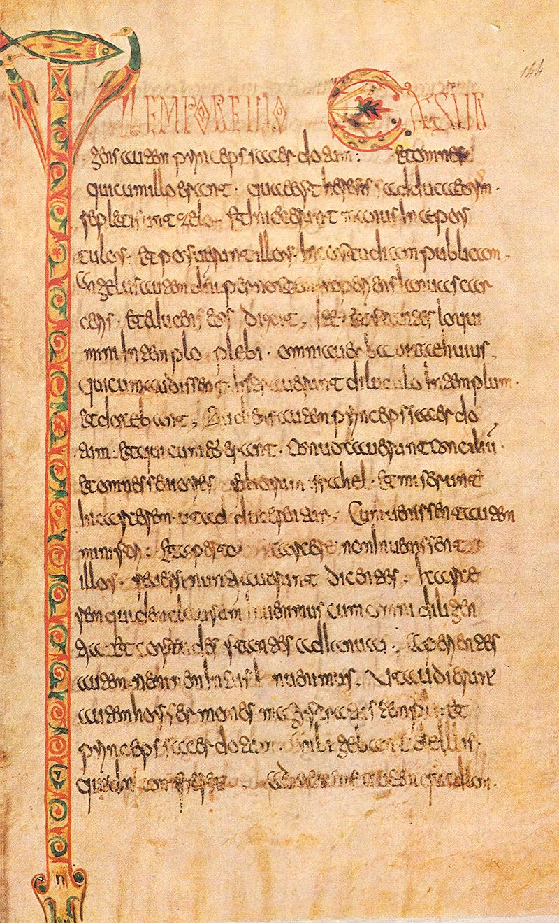
Merovingian script or Gallo-Roman script was a medieval variant of the Latin script so called because it was developed in Gaul during the Merovingian dynasty. It was used in the 7th and 8th centuries before the Carolingian dynasty and the development of Carolingian minuscule.
There were four major centres of Merovingian script: the monasteries of Luxeuil, Laon, Corbie, and Chelles. Each script developed from uncial, half-uncial, and the Merovingian charter scripts.
Luxeuil
The Luxeuil type uses distinctive long, slim capital letters as a display script. These capitals have wedge-shaped finials, and the crossbar of ⟨a⟩ resembles a small letter ⟨v⟩ while that of ⟨h⟩ is a wavy line. The letter ⟨o⟩ is often written as a diamond shape, with a smaller ⟨o⟩ written inside. The letter ⟨a⟩ resembles two ⟨c⟩s (“cc”), and because of this distinctive feature the Luxeuil type is sometimes called “a type”.[1] The letter ⟨b⟩ often has an open bowl and an arm connecting it to the following letter, the letter ⟨d⟩ can have either a vertical ascender or an ascender slanted to the left; ⟨i⟩ is often very tall, resembling l; ⟨n⟩ can be written with an uncial form (similar to a capital ⟨N⟩); ⟨o⟩ is often drop-shaped and has a line connecting it to the next letter; and ⟨t⟩ has a loop extending to the left of its top stroke. The letter ⟨t⟩ is also used in numerous ligatures where it has many other forms. The letters ⟨e⟩ and ⟨r⟩ are also quite often found in ligature.
Laon
The Laon type has thicker display capitals than the Luxeuil type. Capital initial letters are often decorated with animals, and there are many ligatures with the letter ⟨i⟩. Like Visigothic script, there are two different ⟨ti⟩ ligatures, representing two different sounds (“hard” and “soft”). The letters ⟨d⟩ and ⟨q⟩ often have open bowls. The letter a is unique, resembling two sharp points (“<<"), and the letter ⟨z⟩, uncommon in Latin, is nevertheless very distinctive in the Laon type, with a flourish projecting upwards to the left, above the line. Because of these features, Laon type is sometimes called "a-z type".
Corbie
The Corbie type as used in the 8th century, was based on uncial and the Luxeuil type, but was also similar to half-uncial and insular script, with elements of Roman cursive. It is sometimes called “eN-type”, as the letter ⟨e⟩ has a high, open upper loop, and the uncial form of the letter ⟨n⟩ (resembling majuscule ⟨N⟩) is very frequently used. After the mid-8th century, the letter (a) also has an open loop and resembles the letter ⟨u⟩; this type is referred to as “eNa-type”. A more distinctive type was developed at Corbie in the 9th century, the “a-b type”. The letter ⟨b⟩ is similar to Luxeuil type, but the letter ⟨a⟩ has a straight first stroke, resembling a combination of ⟨i⟩ and ⟨c⟩. This type was used from the end of the 8th century until the mid-9th century. The Liber glossarum, a major medieval reference work, was written in the “a-b type” script of Corbie.
Chelles
The Chelles type was similar to the Luxeuil a-b type. Other features include the uncial ⟨N⟩, with strokes leaning to the left; the letter d with an ascender leaning to the left; the letter ⟨g⟩ with a descender resembling the letter ⟨s⟩; the letter ⟨s⟩ with a very small top loop; and the letter ⟨x⟩ with the two strokes crossing near the top of the line rather than the middle.
Development
There was also a Merovingian cursive script, used in charters and non-religious writings. All of these types were later influenced by Carolingian script, which eventually replaced it entirely. Along with resemblances to Carolingian and Visigothic, Merovingian shares some features with Beneventan script.
Further Reading
Wikipedia: Merovingian script
Visigothic script
Source: LITTERA VISIGOTHICA
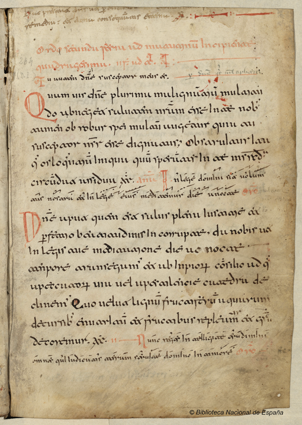
Visigothic script was a type of medieval script that originated in the Visigothic kingdom in Hispania (the Iberian Peninsula, modern Spain and Portugal). Its more limiting alternative designations littera toletana and littera mozarabica associate it with scriptoria specifically in Toledo and with Mozarabic culture more generally, respectively.
The script, which exists in book-hand and cursive versions, was used from approximately the late seventh century until the thirteenth century, mostly in Visigothic Iberia but also somewhat in southern France. It was perfected in the 9th-11th centuries and declined afterwards. It developed from uncial script, and shares many features of uncial, especially an uncial form of the letter ⟨g⟩.
Other features of the script include an open-top ⟨a⟩ (very similar to the letter ⟨u⟩), similar shapes for the letters ⟨r⟩ and ⟨s⟩, and a long letter ⟨i⟩ resembling the modern letter ⟨l⟩. There are two forms of the letter ⟨d⟩, one with a straight vertical ascender and another with an ascender slanting towards the left. The top stroke of the letter ⟨t⟩, by itself, has a hook curving to the left; ⟨t⟩ also has a number of other forms when used in ligatures, and there are two different ligatures for the two sounds of ⟨ti⟩ (“hard” or unassibilated and “soft” or sibilated) as spoken in Hispano-Latin during this period. The letters ⟨e⟩ and ⟨r⟩ also have many different forms when written in ligature. Of particular interest is the special Visigothic z ⟨ꝣ⟩, which, after adoption into Carolingian handwriting, eventually transformed into the c-cedilla ⟨ç⟩.
From the standard script, a capital-letter display script was developed, with long slender forms. There was also a cursive form that was used for charters and non-religious writings, which had northern (“Leonese”) and southern (“Mozarabic”) forms. The Leonese cursive was used in the Christian north, and the Mozarabic was used by Christians living in the Muslim south. The cursive forms were probably influenced by Roman cursive, brought to Iberia from North Africa.
Visigothic script has many similarities with Beneventan script and Merovingian script.
Breviarium mozarabicum
Between 1210 and 1500?
Manuscript
Please click the picture to look inside the book.
Further Reading
Wikipedia: Visigothic script
LITTERA VISIGOTHICA: Visigothic script: struggling for finding its name
Paleographie: Interactive Album of Mediaeval Palaeography
Carolingian Gospel Book, written in Carolingian minuscule
Source: WIKIPEDIA
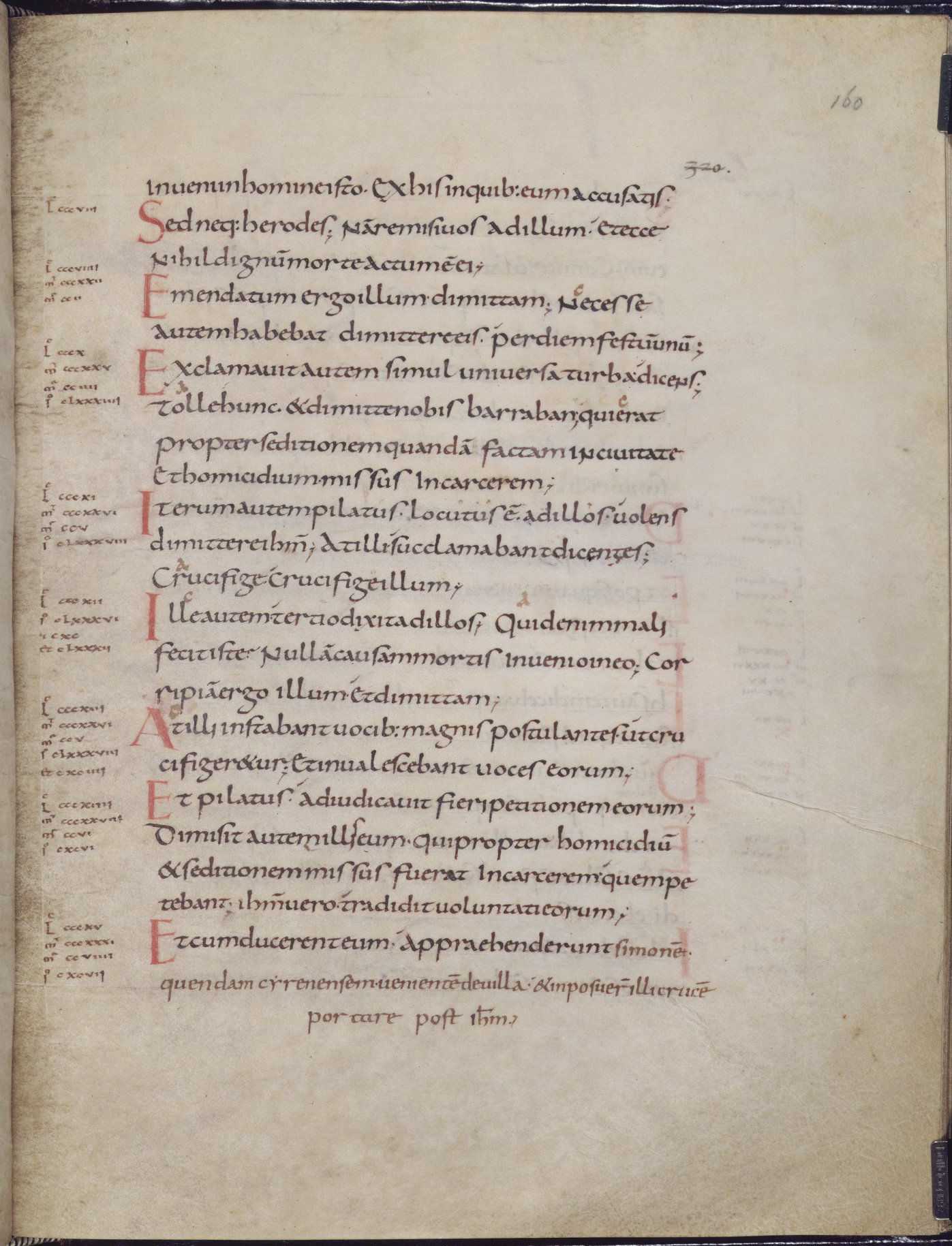
Carolingian minuscule or Caroline minuscule is a script which developed as a calligraphic standard in Europe so that the Latin alphabet of Jerome’s Vulgate Bible could be easily recognized by the literate class from one region to another. It was developed for the first time, in about 780, by a Benedictine monk of Corbie Abbey (about 150 kilometres (93 mi) north of Paris), namely, Alcuin of York. It was used in the Holy Roman Empire between approximately 800 and 1200. Codices, pagan and Christian texts, and educational material were written in Carolingian minuscule throughout the Carolingian Renaissance. The script developed into blackletter and became obsolete, though its revival in the Italian Renaissance forms the basis of more recent scripts.
The script is derived from Roman half uncial and the insular scripts that were being used in Irish and English monasteries. The strong influence of Irish literati on the script can be seen in the distinctively cló-Gaelach (Irish style) forms of the letters, especially a, e, d, g, s, and t.
Carolingian minuscule was created partly under the patronage of the Emperor Charlemagne (hence Carolingian). Charlemagne had a keen interest in learning.
Carolingian minuscule was uniform, with rounded shapes in clearly distinguishable glyphs, disciplined and above all, legible. Clear capital letters and spaces between words became standard in Carolingian minuscule, which was one result of a campaign to achieve a culturally unifying standardization across the Carolingian Empire.
Traditional charters, however, continued to be written in a Merovingian “chancery hand” long after manuscripts of Scripture and classical literature were being produced in the minuscule hand. Documents written in a local language, like Gothic or Anglo-Saxon rather than Latin, tended to be expressed in traditional local script.
Carolingian script generally has fewer ligatures than other contemporary scripts, although the et (&), æ, rt, st, and ct ligatures are common. The letter d often appears in an uncial form with an ascender slanting to the left, but the letter g is essentially the same as the modern minuscule letter, rather than the previously common uncial ᵹ. Ascenders are usually “clubbed” – they become thicker near the top.
The early period of the script, during Charlemagne’s reign in the late 8th century and early 9th, still has widely varying letter forms in different regions.
Further Reading
Wikipedia: Carolingian minuscule
Dartmouth: How to Write Caroline (Carolingian) Minuscule
Beneventan Script sample from Monte Cassino.
Sources: Sexy Codicology WIKIPEDIA
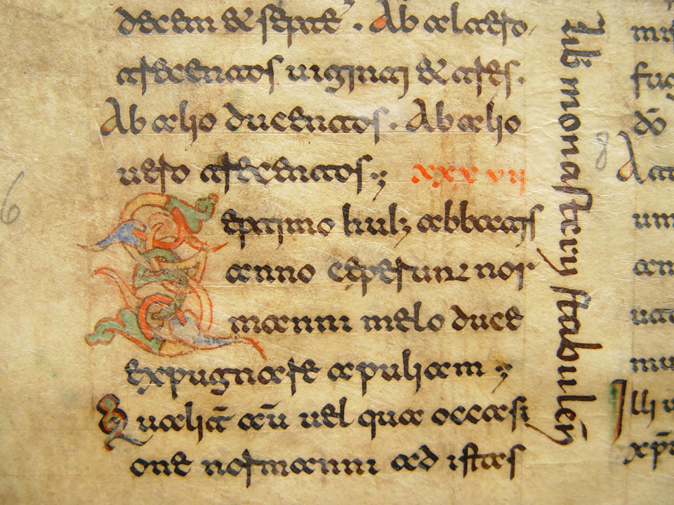
The beneventan script was a medieval script which originated in the Duchy of Benevento in southern Italy. It was also called Langobarda, Longobarda, Longobardisca (signifying its origins with the Lombards), or sometimes Gothica; it was first called Beneventan by palaeographer E. A. Lowe.
It is mostly associated with Italy south of Rome, but it was also used in Beneventan-influenced centres across the Adriatic Sea in Dalmatia. The script was used from approximately the mid-8th century until the 13th century, although there are examples from as late as the 16th century. There were two major centres of Beneventan usage: the monastery on Monte Cassino, and Bari. The Bari type developed in the 10th century from the Monte Cassino type; both were based on Roman cursive as written by the Langobards. In general the script is very angular. According to Lowe, the perfected form of the script was used in the 11th century, while Desiderius was abbot of Monte Cassino, declining thereafter.
Beneventan Palaeography
Beneventan script is fairly easy to recognize and the letters “a” and “t” are the easiest to identify once you know what they look like. They look quite similar to each other; the “a” resemble an “oc” when both letters are touching. The “t” is very similar, but the top stroke in the “c” of the “oc” shape, is flat. Other particular shapes of letters are the “e” and the “r”. A sample of the alphabet of this script will help to understand it better than any description:
To these letterforms you have to add also the small galaxy of ligatures that were typical of this script: “et”, “ex”, “ri”, etc., and the many non standardized abbreviations. Typical of the Beneventan script was also the use of a standardized form of punctuation, such as the typical two points and comma that would indicate a contemporary full stop. All these details make the Beneventan script easy to identify, but fairly difficult to read, until you get used to it.
Further Reading
Wikipedia: Beneventan script
Digitized Medieval Manuscripts Blog: Beneventan script

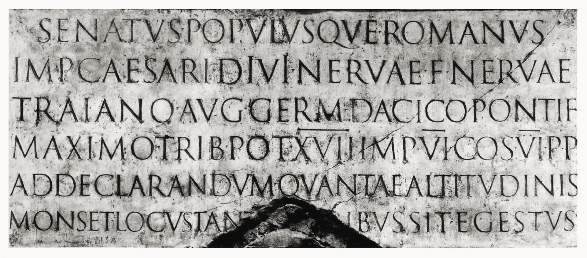
Venetian or “old style” Latin types are also called antiqua. The inscriptional capitals on Roman buildings and monuments were structured on a euclidean geometric scheme and the discrete component-based model of classical architecture. Their structurally perfect design, near-perfect execution in stone, balanced angled stressing, contrasting thick and thin strokes, and incised serifs became the typographic ideal for western civilization. The best-known example of Roman inscriptional capitals exists on the base of Trajan’s Column.
Sources: Wikipedia

Claude Garamont (c. 1510 – 1561) was a French type designer, publisher and punch-cutter based in Paris. Garamond worked as an engraver of punches, the masters used to stamp matrices, the moulds used to cast metal type. He worked in the tradition of what is now called old-style serif letter design, that produced letters with a relatively organic structure resembling handwriting with a pen but with a slightly more structured and upright design. Considered one of the leading type designers of all time, he is recognised to this day for the elegance of his typefaces.
Garamond was one of the first independent punchcutters, specialising in type design and punch-cutting as a service to others rather than working in house for a specific printer. His career therefore helped to define the future of commercial printing with typefounding as a distinct industry to printing books.
Sources: Wikipedia

Christophe Plantin (Dutch: Christoffel Plantijn; c. 1520 – 1 July 1589) was an influential Renaissance humanist and book printer and publisher. Plantin was a prolific printer and prosperous entrepreneur, publishing more than 40 editions of emblem books. In contrast, his most important work is considered to be the Biblia Regia (King’s Bible), also known as the Plantin Polyglot.
Sources: Wikipedia
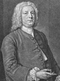
William Caslon I (1692/1693 – 23 January 1766), also known as William Caslon the Elder, was an English typefounder. The distinction and legibility of his type secured him the patronage of the leading printers of the day in England and on the continent. His typefaces transformed English type design and first established an English national typographic style.
Sources: Wikipedia
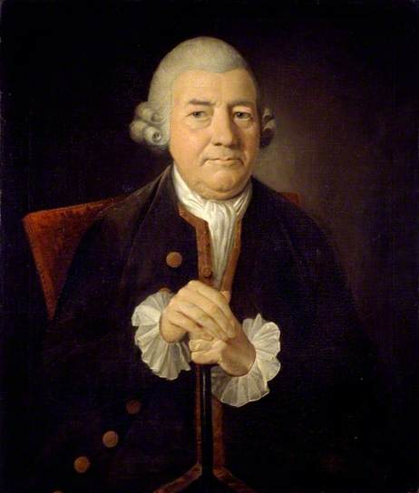
John Baskerville (28 January 1706 – 8 January 1775) was an English businessman, in areas including japanning and papier-mâché, but he is best remembered as a printer and type designer. He practised as a printer in Birmingham, England. Baskerville was a member of the Royal Society of Arts, and an associate of some of the members of the Lunar Society. He directed his punchcutter, John Handy, in the design of many typefaces of broadly similar appearance. Baskerville also was responsible for significant innovations in printing, paper and ink production. He developed a technique which produced a smoother whiter paper which showcased his strong black type. Baskerville also pioneered a completely new style of typography adding wide margins and leading between each line.
Sources: Wikipedia

Giambattista Bodoni (February 16, 1740 in Saluzzo – November 30, 1813 in Parma) was an Italian typographer, type-designer, compositor, printer and publisher in Parma. He first took the type-designs of Pierre Simon Fournier as his exemplars, but afterwards became an admirer of the more modelled types of John Baskerville; and he and Firmin Didot evolved a style of type called ‘New Face’, in which the letters are cut in such a way as to produce a strong contrast between the thick and thin parts of their body. Bodoni designed many type-faces, each one in a large range of type sizes. He is even more admired as a compositor than as a type-designer, as the large range of sizes which he cut enabled him to compose his pages with the greatest possible subtlety of spacing. Like Baskerville, he sets off his texts with wide margins and uses little or no illustrations or decorations.
Sources: Wikipedia
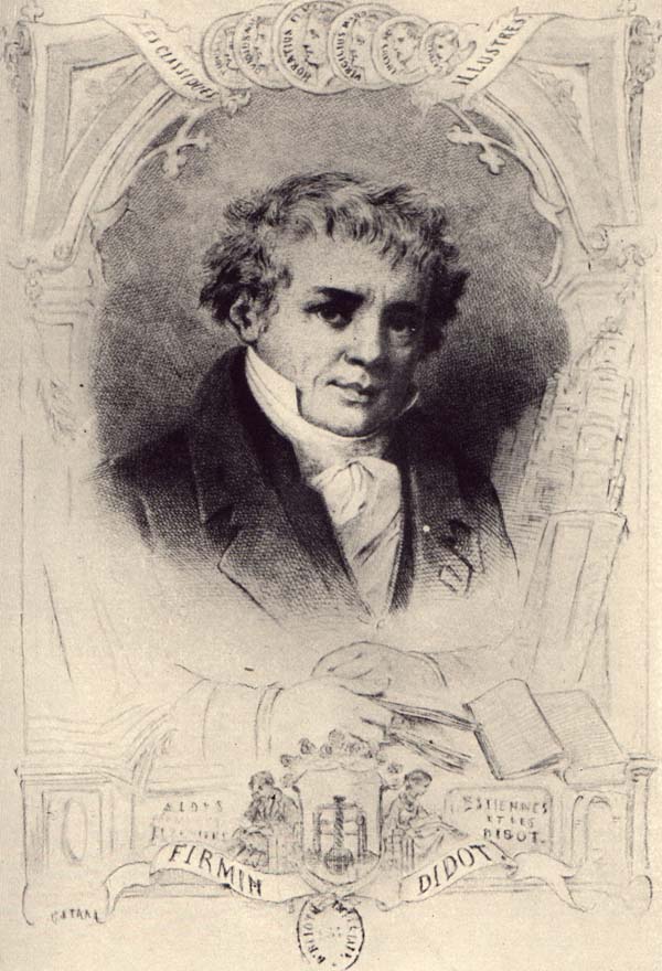
Firmin Didot (son of François-Ambroise Didot) was born in 1764 and died in 1836. Firmin Didot was the inventor of stereotypography which entirely changed the book trade. Firmin Didot was the first to engrave slips of so-called “English” and round hand-writing. Among the works which issued from his press were “Les Ruines de Pompéi”, “Le Panthéon égyptien” of Champollion-Figeac, and “Historial du Jongleur”, printed in Gothic type, with tail-pieces and vignettes, like the editions of the fifteenth century. In 1827, Firmin Didot gave up business to devote himself to politics and literature. He was a member of the Chamber of Deputies and wrote tragedies (“La Reine de Portugal”, “La Mort d’Annibal”) and essays on literary topics. Along with Giambattista Bodoni of Italy, Firmin Didot is credited with designing and establishing the use of the “Modern” classification of typefaces. The types that Didot used are characterized by extreme contrast in thick strokes and thin strokes, by the use of hairline serifs and by the vertical stress of the letters. Many fonts today are available based on Firmin Didot’s typefaces. These include Linotype Didot and HTF Didot.
Sources: Wikipedia
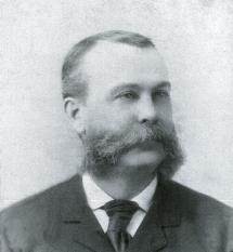
Joseph Warren Phinney (born 1848, Nantucket – d. 1934) was an American printer, type designer, and business executive. Phinney began his career at the Dickinson Type Foundry in Boston where he designed type and worked in management, eventually becoming owner. He was a key player in arranging the merger of twenty-six large foundries to form the American Type Founders Company in 1892, becoming both manager of the Boston branch and head of the design department, where he oversaw the consolidation of type faces following the merger.[1] Though his own designs were largely derivative, Phinney took a great interest in type and its history and throughout his tenure at A.T.F. he sought to preserve and protect that company’s legacy, as for instance, when he oversaw the re-introduction of Binny & Ronaldson’s 1796 type design, Roman No. 1, as Oxford in 1892, or when he purchased Frederick W. Goudy’s first type design, Camelot, in 1896.[2] He stayed with A.T.F. for the rest of his career, passing the role of design head to Morris Fuller Benton and becoming senior vice-president. Phinney retired shortly before the company fell upon hard times during the Great Depression and died in 1934.
Sources: Wikipedia
Evolution of minuscule
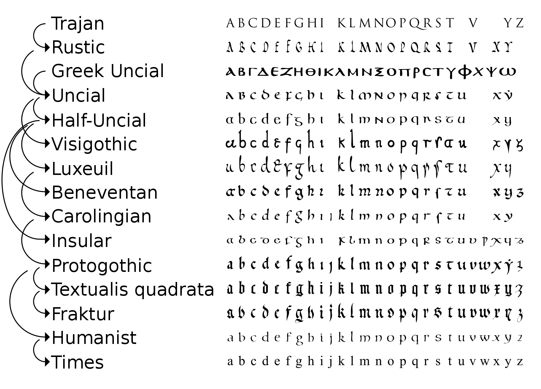
Cyrillic Uncial by P. P. Chobitko
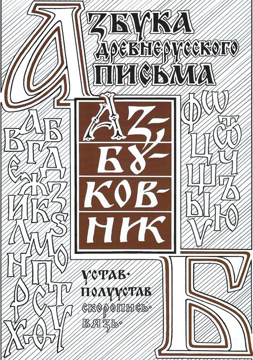
Source: A Brief History of Type
Source: Typographic History
Other sources
Igino Marini: The Fell Types and Some Revival Fonts. A brief history of the Fell Types
Typefoundry: Porson’s Greek type design
Typefoundry: A British national letter
Typefoundry: Commercial at
Typefoundry: Caractères de l’Université
Typefoundry: The types of Jean Jannon at the Imprimerie royale
Typefoundry: Elzevir letter
Wikipedia: Bembo
I love typography: History of typography: Humanist. Incunabula
I love typography: History of typography: Old Style. Griffo to Caslon
I love typography: History of typography: Transitional. Siècle des Lumières
I love typography: A brief history of type. Modern (Didone)
I love typography: A brief history of type. Slab Serif / Egyptian
Wikipedia: History of Western typography
Ashton: Historical type 19th century advertising boom
Smashingmagazine: Making Sense Of Type Classification (Part 2)
Peter Bilak: Beauty and Ugliness in Type design
Alastair Johnston: Robert Grabhorn Collection on the History of Printing
James Mosley: The Nymph and the Grot
Wikiwand: Slab serif
Wikiwand: Clarendon
Wikiwand: Reverse-contrast typefaces
Wikiwand: Брусковый шрифт
Wikiwand: History of Western typography
Wikiwand: Vincent Figgins
Wikiwand: William Caslon
Wikiwand: Caslon
Wikiwand: Caslon Egyptian
Wikiwand: Grotesque (Stephenson Blake typefaces)
Wikiwand: Sans-serif
Martin Majoor: My Type Design Philosophy
Typophile: Unborn: sans serif lower case in the 19th century
Typophile: German Grotesks and the origins of sanserif
Christian Schwartz: Caslon’s Egyptian
Spoongraphics: A History of Typeface Styles & Type Classification
FontRu: Полуунциальное письмо (VI-IX вв.)
I Love Typography: TAG: Type History
Juan José Marcos: Paleographic Fonts for Ancient Greek
Juan José Marcos: Latin Paleography
MUFI: Medieval Unicode Font Initiative
Encyclopædia Britannica: Uncial
Олег Мацуев, Мария Скопина: О двух техниках древнерусской каллиграфии
Agnieszka Warnke: A History of Polish Fonts
Tapenik: Старославянские кириллические шрифты
Mnamon: Ancient writing systems in the Mediterranean

