


In this exclusive interview Pilar Cano and Ferran Milan, founders of Letterjuice type design studio, talk about the importance of respecting the language and the culture when creating new font designs. They also share their view on global and local fonts and the process of creating new fonts. They reveal the launch of their new font Baldufa, which now supports 4 writing systems.
What is the formula for creating a successful type design studio and how do you achieve such heights at competitions like TDC, Ed-Awards, Morisawa, Grashan, Horouf and Modern Cyrillic with such a small team?
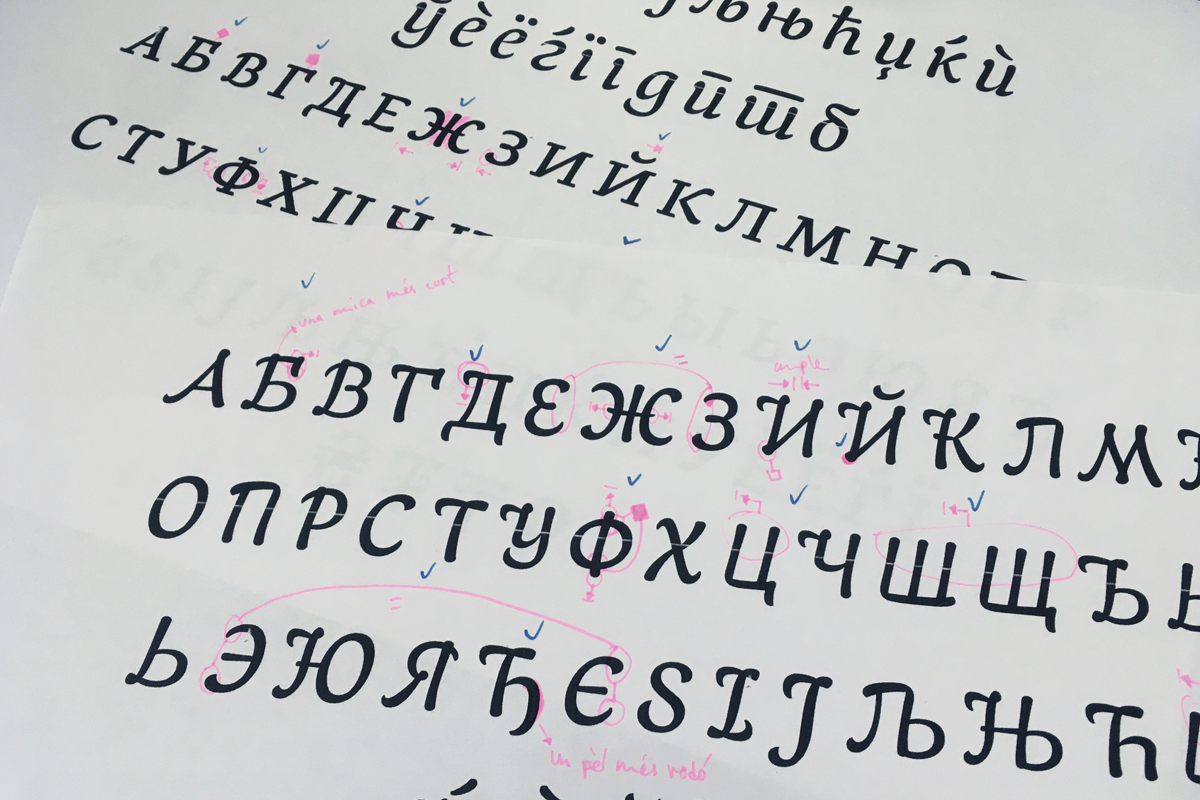
Pilar Cano (PC): We don’t think that there is a formula. What we have done since we started our type design studio Letterjuice is to work on what is interesting for us, playing and experimenting with letterforms and exploring our creativity. All the recognition came unexpectedly. We guess the key for having such recognition is hard work and being very self-demanding with the quality of work. When we create scripts for languages that are not our native languages it is very important for us to do a lot of research and to respect both the language and the cultures it represents.
In the case of Baldufa (our latest font) we are particularly happy with the Granshan, Modern Cyrillic, and Horouf, because they have been judged by native users, so we know that we are on the right path.
You not only create fonts, but also actively research the connection between local fonts and the Unicode Standard, which specifies the representation of text in all modern software products and standards. What are the problems that derive from the local forms of the Cyrillic languages – like Bulgarian, Serbian, North Macedonian, Ukranian and Belarussian?
Ferran Milan (FM): At the moment, thankfully, for those languages there are no technical problems. The specific letters that are local can be added to the character set and programmed to automatically appear when the user applies the specific language to the text. However, there is a problem with knowledge about the existence of these specific letters that are not just a matter of taste, but of identity which should be respected. Websites like localfonts.eu play a key role in reaching out to type designers and providing them with information in order to preserve these cultural differences.
What is your view on global and local fonts when it comes to typography? Would it be possible in the future to neglect the localisation of different fonts in the name of global standards as the current design softwares are not really sensitive when it comes to local fonts?
PC: We hope we don’t have to compromise the local for the global. In the type editing software it is possible to keep the local identities, however, the struggle is with the text setting software. They are big companies that are a little sensitive to these issues. Type and graphic designers need to push those multinational companies in order to make them look further than their own benefit, they need to understand that they have a huge responsibility when it comes to local identity, especially in languages which are considered minority languages and therefore are endangered.
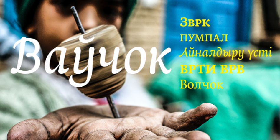
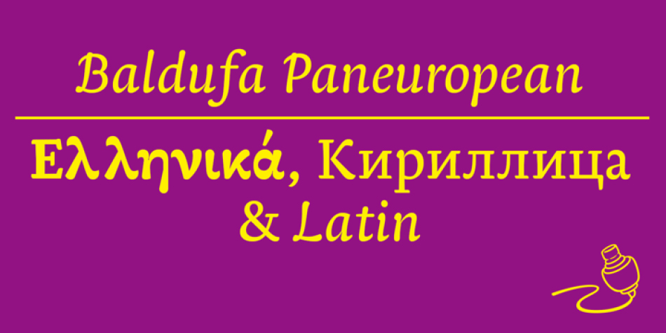
Your Baldufa font “speaks” many languages. Apart from a Latin version, it also offers Arabic, Greek and Cyrillic localized versions – including Bulgarian, Serbian and Northern Macedonian. What are your main sources when it comes to researching the local characteristics of the Cyrillic fonts? When and how did you come across the Bulgarian Cyrillic and what were your first impressions?
FM: It is hard to remember the first time we came across the localized letters. We have been working on Cyrillic fonts for over ten years now, and we still have a lot to learn about them. What we know is that our sensibility for this kind of issue comes from our linguistic background. We are Catalans and we speak a language which is considered a minority language, that helps us understand the importance of languages as cultural carriers.
It is hard with the localized versions, because sometimes the information is not complete. Some resources online which have helped us to better understand the Cyrillic scripts in general (also with extended Cyrillic covering many minority languages) are localfonts.eu, Learn Cyrillic, The Type Journal.
PC: We also work with Irina Smirnova, who is our consultant and a very talented designer from Moscow. She studied type design at The Hague, and now teaches type design at the Moscow State University of Printing Arts. She has worked for Paratype and has collaborated with many type foundries internationally.
We also look at what other designers do, read discussions on type forums like TypeDrawers or GitHub and look at orthography texts. Over the years we have collected quite a bit of information on the writing systems we work on, we have a folder on our computers called research and in there we have a folder for each script we work on with images, links, PDFs etc. That is very useful, because sometimes you need to double check things and you have all your resources there.
How was the idea born to create the Baldufa font? How do you see Baldufa being used in design?
PC: We both studied at the University of Reading and Baldufa was born there. Initially, it was the project Ferran designed during his Masters in Typeface Design. When we started Letterjuce, we decided to retake it, we thought that it was a good project, so we finished it properly and made it work as one of our library fonts.
There is a lot of experimentation behind this design, it has some features that make it very particular. It started with the Latin script, letterforms are inspired in some of the distortions created by old printing types when letters strike on the paper and its shapes become slightly altered. This inspired me to interpret some parts of the letters my way. Since then, we have worked with the challenge of bringing this concept to other writing systems such as Arabic, Greek and now Cyrillic.
Baldufa is designed to be used in publications such as catalogs, books or even magazines, especially in cases where a multi-script typeface is required.
Tell us more about your past typeface projects. Which designs are the most popular and which ones are you the most proud of and why?
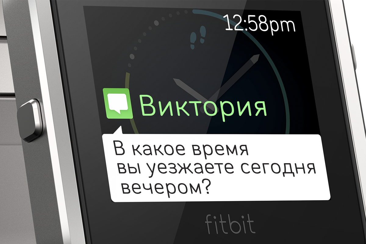
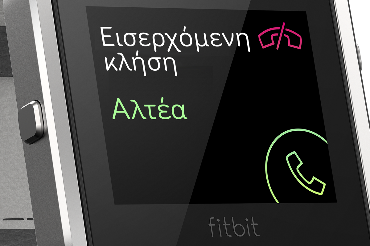
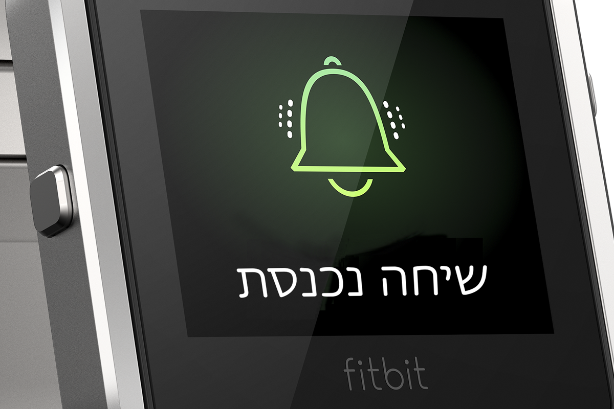
FM: Popularity is a very hard thing to measure. I would say that Baldufa and Arlette are the most popular, if we are talking about our own catalogue. From our client custom work, we guess the most popular is Seville, which is an extension of a typeface from Latin of another type studio based in Spain, Atipo, for which we do linguistic extensions. This particular project is a typeface developed for Fitbit, a global smart devices and health app, based in San Francisco. The typeface has Greek, Cyrillic and Hebrew, which makes it a widely used project.
PC: We have a few projects we are especially proud of. Baldufa would be one of them. From its beginning with Ferran’s hard work at his Masters it has now grown to 4 writing systems and it has helped us evolve as designers over the years. As we add more scripts, we always use the typefaces on our catalogue to experiment and learn something new or consolidate the knowledge we have.
The Arlette font has been a great challenge we set to ourselves, both at a design and at a technical level. It is an experimental yet functional text typeface designed upon two main concepts. The first one is Roger Excoffon’s work – in general his experimental approach to type design and more specifically his typeface Choc. Even more specifically its lowercase c. We were inspired by its fast stroke movement and its energy, which fascinated us.The second inspiration source was the concept of Sans Serif itself. There are many very similar Sans Serifs, which we find of little interest, unless they are used specifically. At a technical level it is a very complex project with 8 weights plus italics, a large character set including swashes and lots of ligatures and it also contains Thai which also has some swash-like characters.
FM: Additionally, the Aanaar font is a very nice project, which covers Sámi, a group of minority languages for the Sámi indigenous people of Lapland. Pilar got a place for a PhD on Sámi typography at the Aalto University in Helsinki, which she unfortunately couldn’t carry out due to economic reasons. During her preliminary research for the application process she got in touch with Hannu Kangasniemi, secretary of learning material at the Sámi Parliament in Aanaar, Finland. He mentioned that they had a problem when teaching kids their language. The Finish government has an official typeface for education, which does not cover Sámi properly and for Sámi textbooks it is not easy to find typefaces. When we started the studio Pilar thought it would be nice to develop a typeface family to give to the Sámi people, so they could use it for teaching. We also decided to give them a bigger typographic palette which would enable them to set better typographic quality layouts by adding information hierarchies, which will help kids navigate the text easier and will improve their learning process.
What are your professional plans for this year?
PC: We have some exciting things coming up this year. We are working on a very extensive typeface which contains Hebrew and Latin. We are also working on an Arabic typeface for a children’s book, and we are redesigning our website.

Letterjuice has worked on type projects covering Latin, Arabic, Greek, Cyrillic, Hebrew and Thai scripts amongst others. The studio’s work has been recognised internationally at type competitions such as TDC, ED-Awards, Morisawa, Granshan and Horouf.
Explore LETTERJUICE and its activities:
LETTERJUICE Behance Twittter Linkedin Vimeo
Editor
![]()
Szandra Peev
Szandra Peev has been working in the field of communications and marketing for almost a decade now. Her curiosity to explore new cultures and destinations took her to Asia where for five years she worked with some of the biggest multinational companies globally. Currently, Szandra is back in Europe, leading the communications and marketing efforts for localfonts.eu and contributing as a writer in print and online media outlets.


