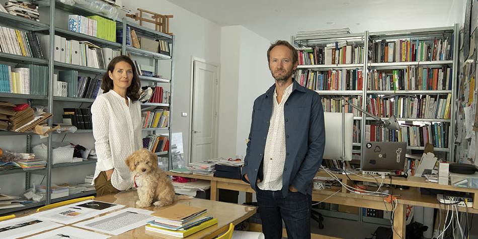
LOCALFONTS INTERVIEW
Questions: Szandra Peev
19 September 2022
SUPERTYPE FOUNDRY
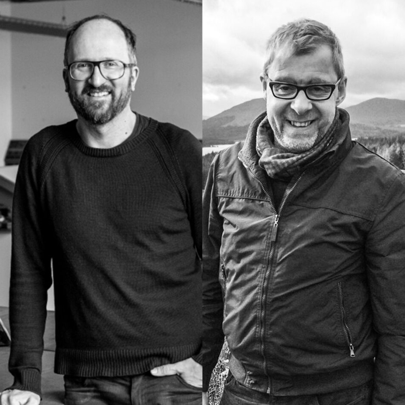
Jürgen Huber and Martin Wenzel: The design of a typeface must resemble the key values of the brand
In this exclusive interview we spoke with the creators of the Lidl corporate font family – Jürgen Huber and Martin Wenzel from Supertype foundry (Germany) about the process of creating a corporate font that is used in 29 European markets. The designers shared details about the start of the project, what were the challenges along the way and how did they create the localized versions of the corporate font.
Read More
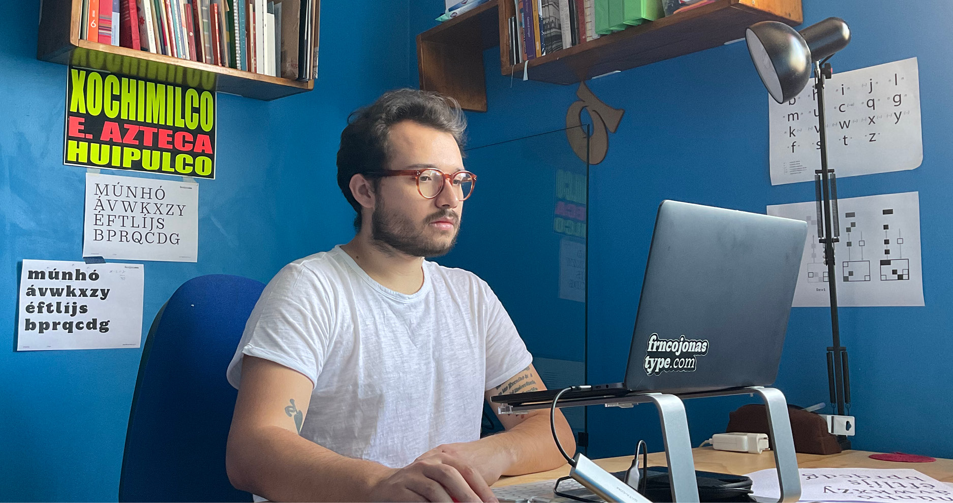
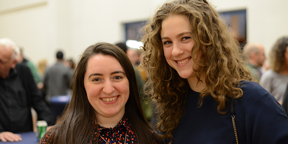
LOCALFONTS INTERVIEW
Questions: Szandra Peev
17 May 2021
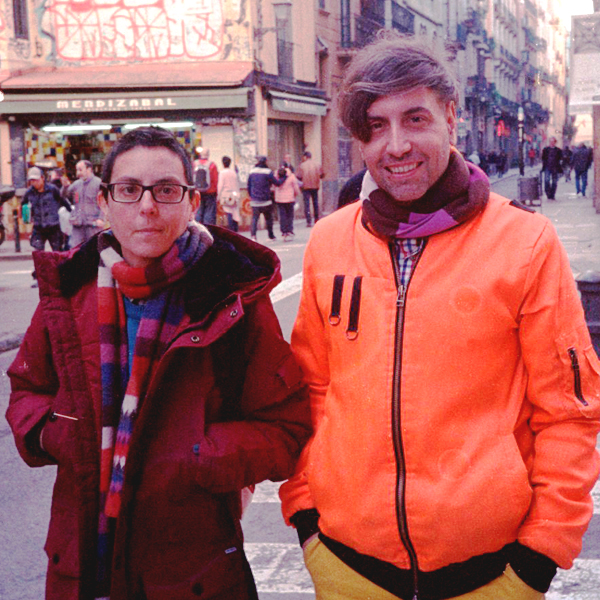
FRNCOJONAS FOUNDRY
Franco Jonas: You can find very good quality typeface designs in Chile
In this interview Franco Jonas is talking about the typography design education in Chile and Latin America, and the main forums for ideation in the field of typography. He also shares how he started designing non-Latin fonts (Cyrillic and Greek), how he sees the development of font design in Chile and reveals his professional plans for the near future.
Read More
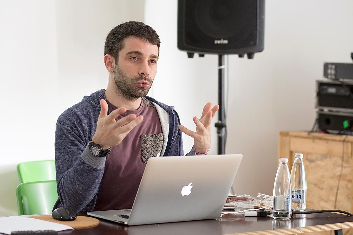
LOCALFONTS INTERVIEW
Questions: Szandra Peev
29 March 2021
CONTRAST FOUNDRY
An interview with Maria Doreuli about the evolution of the Cyrillic script and her forthcoming workshop with Krista Radoeva, titled Cyrillics: Theory and Practice.
Maria Doreuli: Cyrillic fonts are on the rise
In this interview Maria Doreuli talks about the relationship between the Latin and Cyrillic scripts, about the exponential growth of the Cyrillic script market, about the future plans of her studio, Contrast Foundry, and a series of online workshops on Cyrillic Typography that she works on with the Bulgarian type designer Krista Radoeva.
Read More
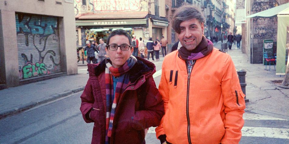
LOCALFONTS INTERVIEW
Questions: Szandra Peev
15 March 2021
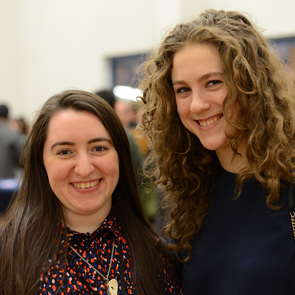
LETTERJUICE
An interview with Pilar Cano and Ferran Milan about global and local fonts and their latest font Baldufa
Type design needs to respect the language and the culture it represents
In this exclusive interview Pilar Cano and Ferran Milan, founders of Letterjuice type design studio, talk about the importance of respecting the language and the culture when creating new font designs. They also share their view on global and local fonts and the process of creating new fonts. They reveal the launch of their new font Baldufa, which now supports 4 writing systems.
Read More
LOCALFONTS INTERVIEW
Questions: Szandra Peev
25 January 2021
LETTERSOUP
An interview with Botio Nikoltchev from LETTERSOUP about the type as a cultural heritage and as one of the ways to recreate the surrounding world
Type is a cultural heritage, it is one of the ways to recreate the surrounding world
In this exclusive interview Botio Nikoltchev speaks about his professional development. He was a student of Lucas de Groot. After graduating he had the chance to work with such a famous type designers as Akira Kobayashi and Erik Spiekermann. Botio shares his views on diversity of Cyrillic letterform models in the different Cyrillic alphabets. He tells us about the project Sofia Sans, which is now the typeface of Sofia – the capital of Bulgaria. Botio also describes his newest font release Apparat and reveals his future plans.
Read More
LOCALFONTS INTERVIEW
Questions: Szandra Peev
23 November 2020
TYPOTHEQUE
An interview with Peter Biľak from TYPOTHEQUE studio about the seemingly marginal languages and the need of font’s localization
Seemingly marginal languages are an integral part of the world
In this exclusive interview Peter Biľak shares why there are no marginal languages, which Bulgarian designer inspired him to start creating fonts with a Bulgarian form of Cyrillic and is the Bulgarian form of Cyrillic just an upright italic. He also talks about his latest plans and projects with South Asian languages.
Read More
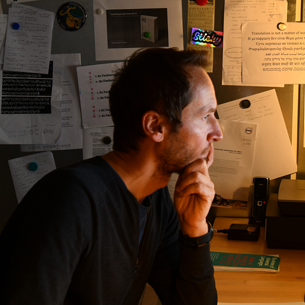
LOCALFONTS INTERVIEW
Questions: Stefan Peev
30 October 2020
PUNKT
An interview with Krassimir Stavrev and Georgi Lazarov from PUNKT studio about the graphical identity of Plovdiv as a European Capital of Culture in 2019
How to turn a city into a capital of culture
In the final version of the Plovdiv’s logo (as a European Capital of Culture) we successfully synthesized the most important symbols of the city – the seven lines in an arch form symbolise: the silhouettes of the seven hills in Plovdiv, the mimic the famous vaults at the entrances of the Ancient Stadium and Ancient Theater. They also represent the shape of the theater from a bird eye view, they symbolize the letter P (in Bulgarian П) as Plodviv from our Cyrillic alphabet. We saw in these seven lines the curves of Maritsa river, the hundreds of arc windows built during the Bulgarian revival period and the architectural boom of our city in the XIX century. There are a few more words that correspond with the spirit of Plovdiv – namely multy layered, wide range, preserving and transformation, and last but not least a lot and together. The latter became the motto of the event for the whole year.
Read More
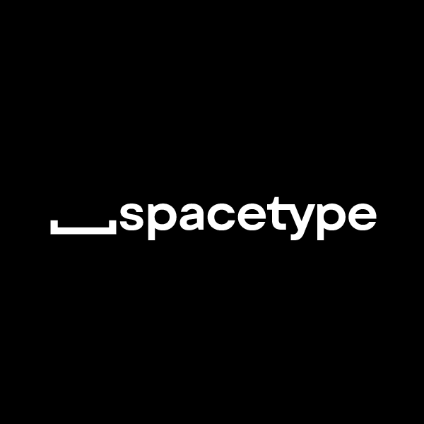
LOCALFONTS INTERVIEW
Questions: Stefan Peev
21 October 2020
Spacetype
Stan Partalev and Mirela Belova from the independent type foundry Spacetype talk about their very first common font family – Gogh which covers a broad spectrum of languages, including extended Latin and Cyrillic.
A typeface should be visually appealing and technically sound
We believe that type designers need to create products that they themselves would use. As we work on many other projects, we wanted a font that can be easily used in many contexts. This is how the font idea was born. We wanted it to be easily readable and at the same time usable for headlines.
Read More
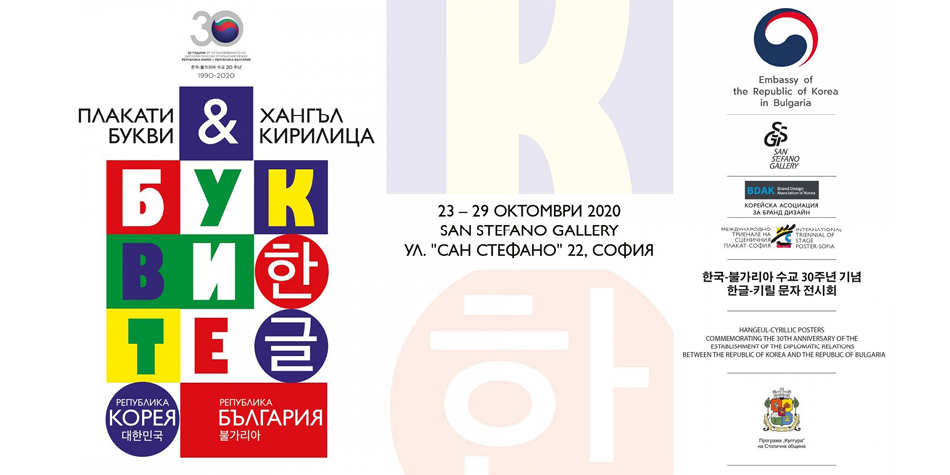
Exhibition
21 October 2020
Embassy of the Republic of Korea in Bulgaria
International Triennial of Stage Poster
Korean Brand Design Association
An exhibition of Hangul and Cyrillic collection of posters
POSTERS & LETTERS
HANGUL & CYRILLIC
October 24 – October 29, 2020
From October 24 to 29 in the main hall of the Gallery of San Stefano you will be able to see the exhibition “POSTERS & LETTERS / HANGUL & CYRILLIC”, presenting posters inspired by the Korean script “Hangul”.
The Korean Brand Design Association uses HANGEL as a starting point to invite authors from South Korea and around the world to create posters on the subject. The result is an extremely rich and diverse collection that explores the role of the written sign as a source of inspiration and artistic provocation, providing unlimited opportunities for contemporary visual reading.
Among the exhibition stand out the three posters of the talented current Bulgarian visual artist – Ivan Kashlakov, recently awarded a number of awards for graphic design, including that for a young Bulgarian poster artist “Assen Stareishinski”, presented by the International Triennial of Stage Poster.
The exhibition is organized on the initiative of the Embassy of the Republic of Korea in Bulgaria together with the International Triennial of Stage Poster and the Korean Brand Design Association.
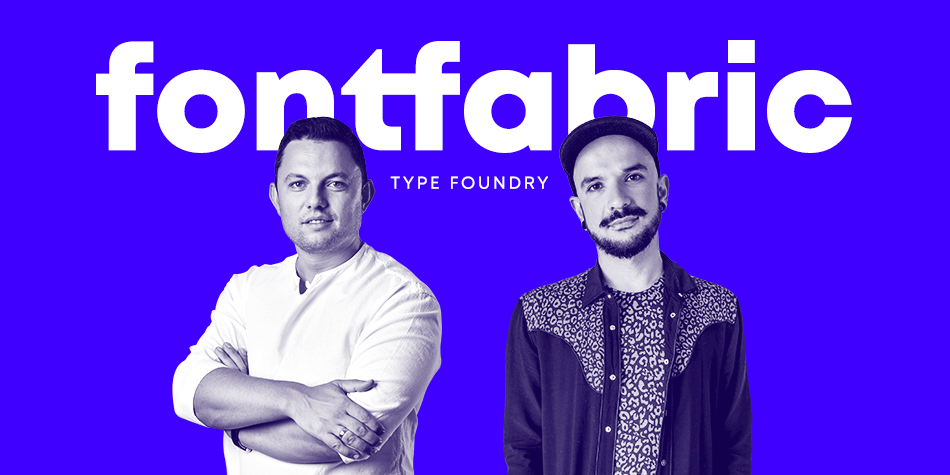
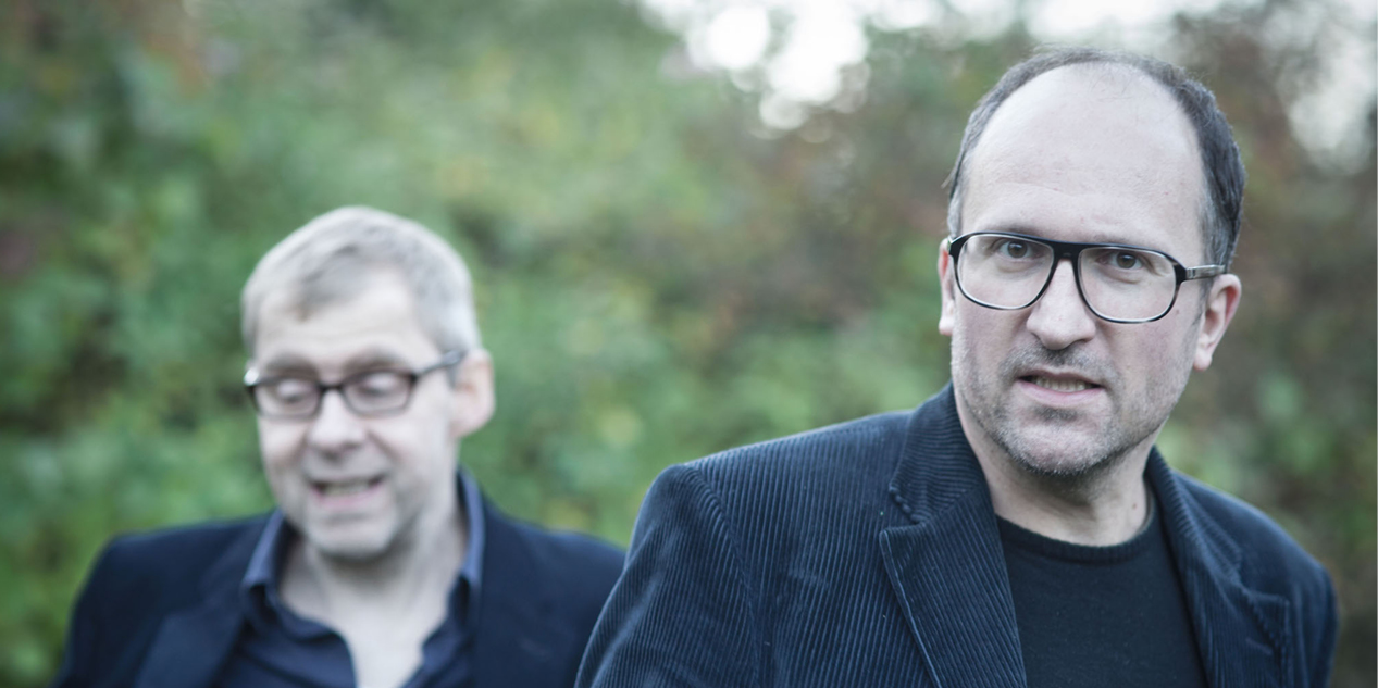
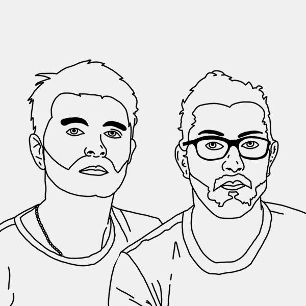
LOCALFONTS INTERVIEW
Questions: Stefan Peev
15 October 2020
Fontfabric
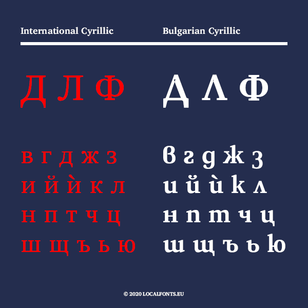
Svetoslav Simov (CEO and founder, on the left) and Plamen Motev (type director, on the right) from the renowned Bulgarian type studio Fontfabric share their thoughts on the popularization of the Bulgarian Cyrillic and the key presence of the local type craft in the evergrowing font scene.
The Bulgarian type craft belongs on the global stage
Fontfabric thrives as an independent digital type foundry dedicated to crafting premium typefaces for over 12 years now. Drawing inspiration from both analog and digital typography practices, a compact team of talented designers aims to create future-proof fonts for exceptional projects and leave a legacy for generations to come.
Read More
SUPERTYPE FOUNDRY

FRNCOJONAS
CONTRAST FOUNDRY
LETTERJUICE
LETTERSOUP
TYPOTHEQUE
PUNKT
Spacetype
Letter Collective
Letters must come from our hands
Interview
Fontfabric
Editor: Stefan Peev
Book cover design in Bulgaria during XX century
Virtual Exhibition
Чавдар Мутафов
Есе
Vasil Stanev
Viktor Kharyk
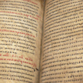
Old Slavic alphabets and new fonts
Presentation
Viktor Kharyk
Botio Nikoltchev
Stefan Peev
Article
LOCALFONTS
10 October 2020
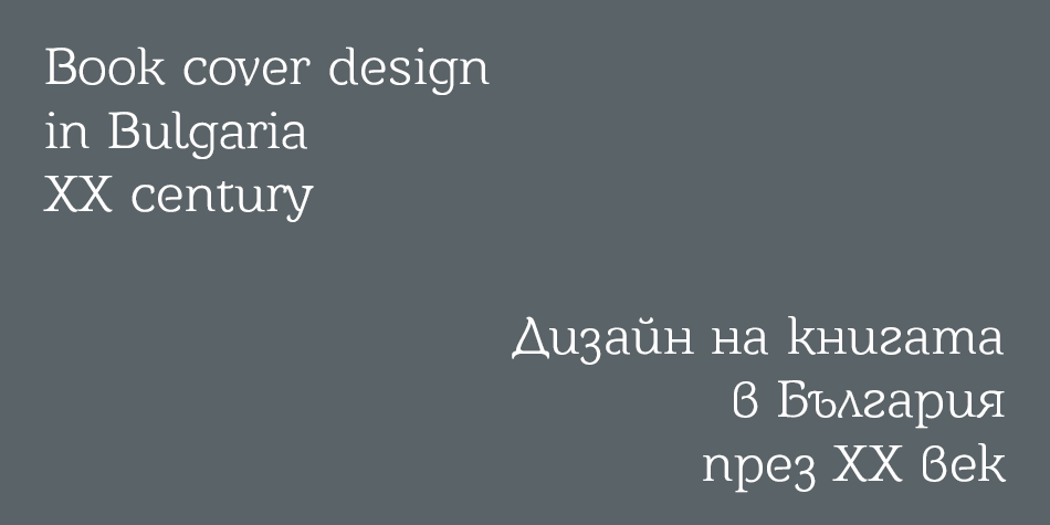
Virtual Exhibition
Book cover design in Bulgaria during XX century
The section presents covers of Bulgarian editions created in the XX century. The virtual exhibition is intended for type drawers that want to explore the development of the Bulgarian Cyrillic type form in the last century, but also the section in intended for graphic designers and book lovers.
Read More
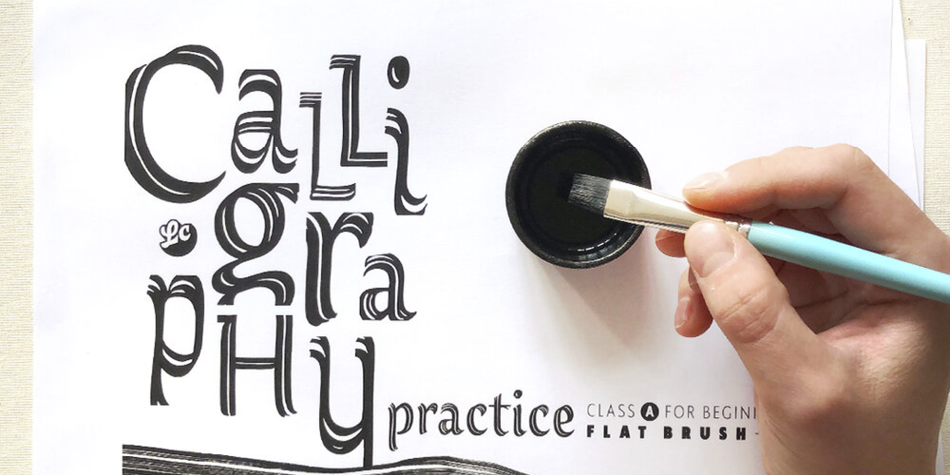
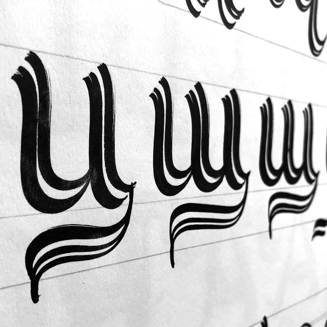
Master classes
21 October 2020
Letter Collective
Todor Georgiev and Jacklina Jekova from Letter Collective creative studio offer free calligraphy practices on their website.
The art of beautiful handwriting and calligraphy
Todor Georgiev and Jacklina Jekova (Letter Collective) offer a series of classes suitable for everyone interested in the art of beautiful handwriting and calligraphy. Class A is free and perfect for beginners who want to learn the basic parameters in typography and the basic lowercase letters of the Latin and Cyrillic alphabet. The calligraphic tool in this class is a flat brush. See more on Letter Collective’s website.
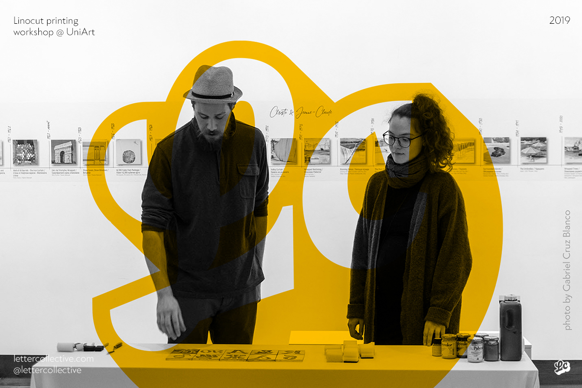
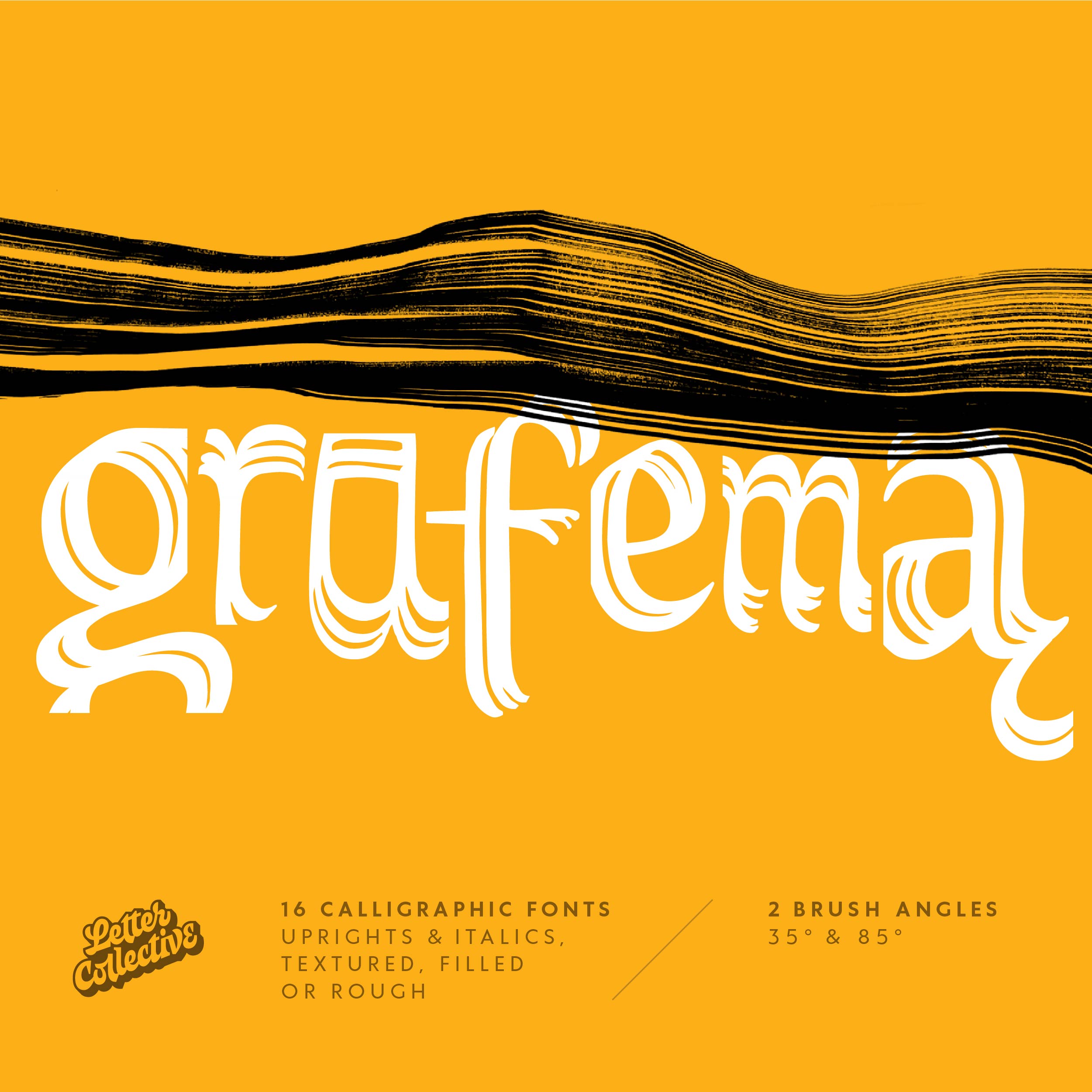
LOCALFONTS INTERVIEW
Questions: Stefan Peev
22 September 2020
Letter Collective
Interview with Todor Georgiev and Jaklina Jekova, founders of the Letter Collective creative studio in Bulgaria, share their experience about creating fonts and their latest project, the font GRAFEMA.
Letters must come from our hands
The ideas for fonts are most often conceived as calligraphic or lettering experiments. Our concept at Letter Collective is based on the idea that letters must come from our hands, the instrument with which you write and draw. That being said, we do a lot of sketching before we start to build or transfer the letters into some kind of software.
Read More
LOCALFONTS
10 October 2017
Vasil Stanev
Letterbats – a union of fine and typographic art
Letterbats are а special case of dingbat fonts – they consist not of images like pictograms or icons, but of pictures drawn to resemble a glyph, most often a letter.
Read More
LOCALFONTS
10 October 2017
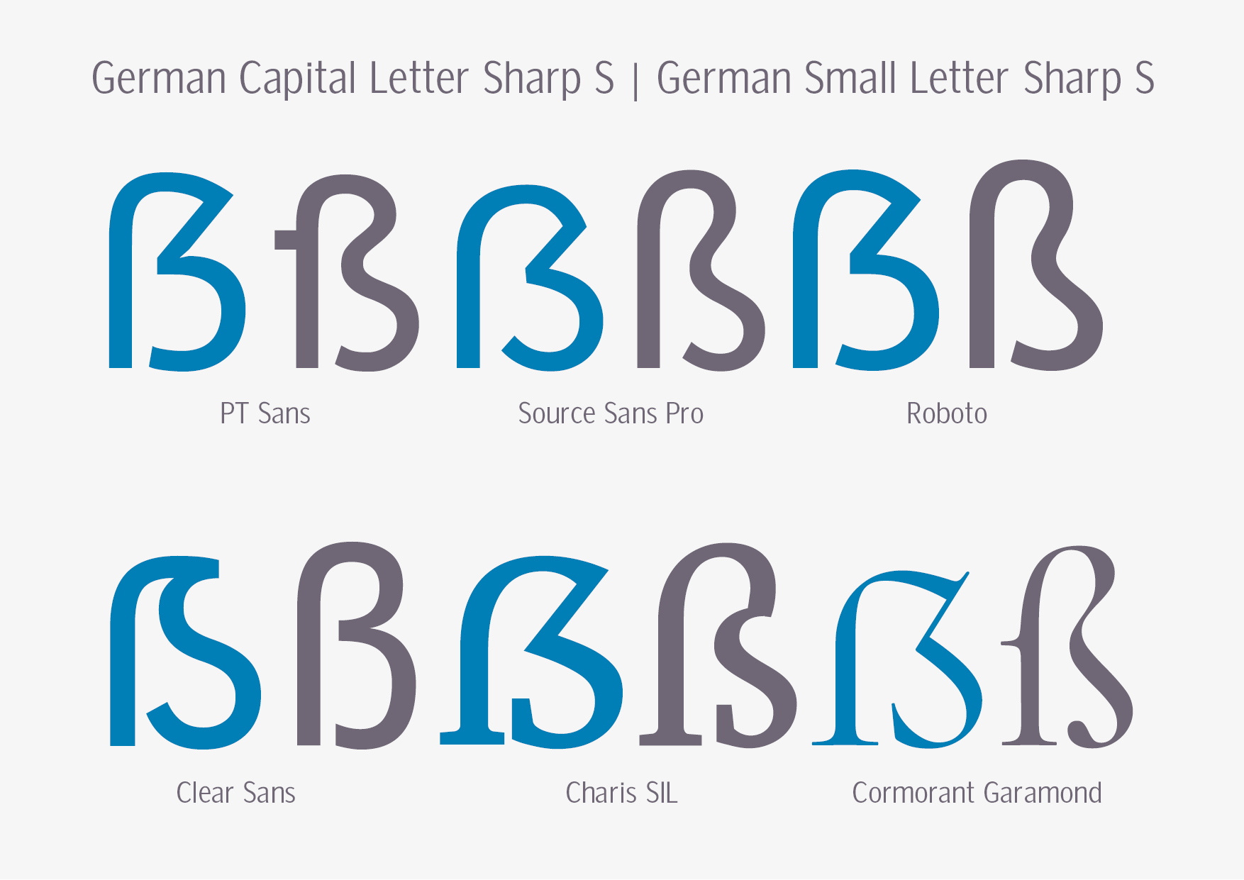
Stefan Peev
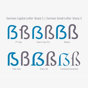
Capital sharp S (ẞ; German: großes Eszett) is the majuscule (uppercase) form of the eszett (also called scharfes S, ‘sharp s’) ligature in German orthography (ß).
Read More