


In this interview Maria Doreuli talks about the relationship between the Latin and Cyrillic scripts, about the exponential growth of the Cyrillic script market, about the future plans of her studio, Contrast Foundry, and a series of online workshops on Cyrillic Typography that she works on with the Bulgarian type designer Krista Radoeva.
You are one of these type designers who take the Cyrillic type seriously, but also playfully. You are not only a font author, but also an author of neologisms. From the English word seriously you created a word “Cyrillicsly” and you also created a blog with the same name together with Krista Radoeva. Do people who use the Cyrillic script take it too seriously (“Cyrillicsly”)? Do you think that having a more playful attitude towards the Cyrillic script might lead to new forms and ways to develop the Cyrillic script?
Maria Doreuli (MD): The word “Cyrillicsly” came up accidentally during one of our conversations with Krista Radoeva while studying Type and Media at the Royal Academy of Arts (KABK) in The Hague back in 2012. We even have a slogan “Cyrillicsly—Serious About Cyrillic”. Yet this is more of a joke, a provoking phrase. In fact, even though we take Cyrillic seriously we do not look at it conservatively. It is conservatism that we are fighting against. We are proud and happy that since we started back in 2013 things are changing and with a growing number of Cyrillic typefaces lately we can see that a lot more experiments have been made.
We are advocates of having an open mind and trying out things that have been considered a “no-no” for a long time. I think that each rule can be questioned and this questioning is what helps to discover something new and unexpected.
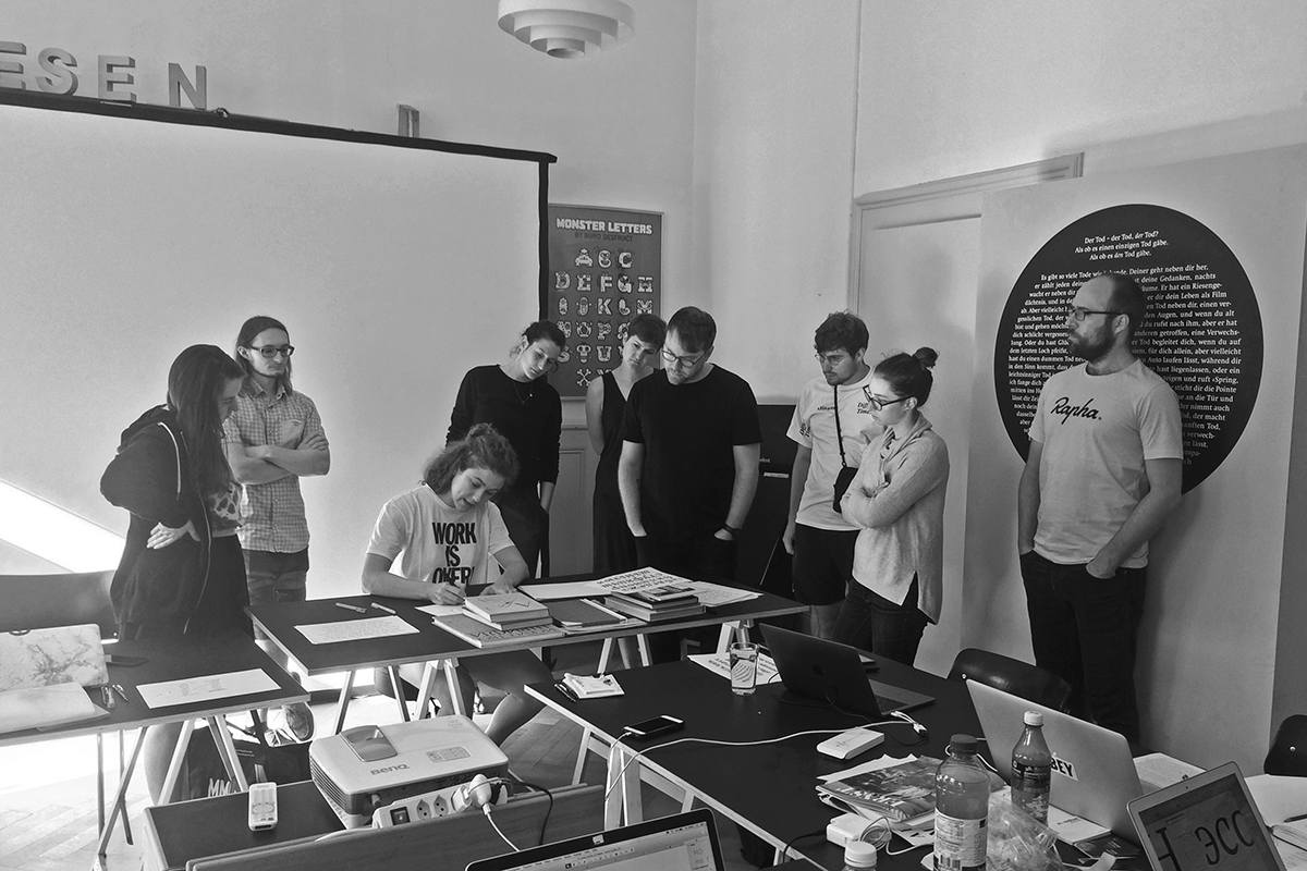
In April, together with Krista Radoeva, you are preparing a 2 part workshop named Cyrillics: Theory and Practice. In the description of the course you mention that participants will learn more about the context and logic behind the Cyrillic shapes. Do you think that the modern Cyrillic script has a unified logic or it rather breaks down to local forms like Russian, Serbian and Bulgarian?
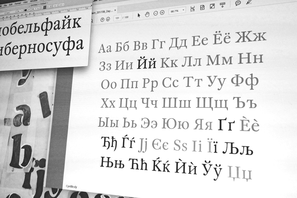
MD: Like in any other script Cyrillic characters are related to each other in a certain way and there is a logic behind. At the same time I assume that every designer has a slightly different way of looking at letterforms as a system. During the workshop we will talk about the ways of approaching Cyrillic letterforms, grouping Cyrillic letters, how and what you can apply from Latin to Cyrillic. Localized forms (Serbian, Bulgarian, etc.) are an important part of the same big system.
The mistakes done by graphic designers aren’t also the mistakes of the font users? In our daily lives we use a lot of fonts, but we rarely find mistakes in them. Which are the typical mistakes in the Cyrillic fonts?
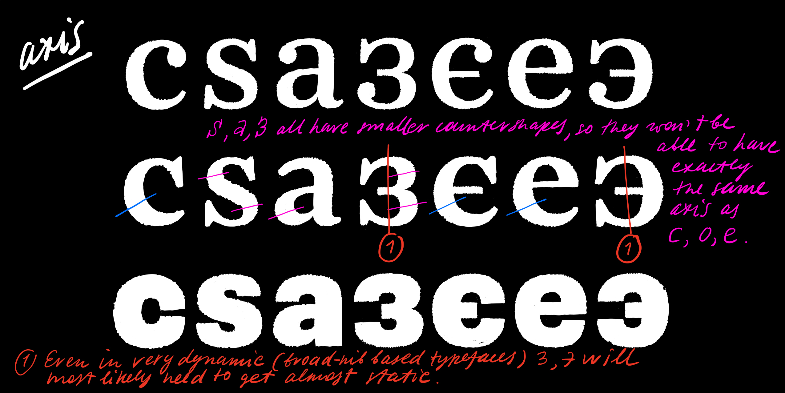
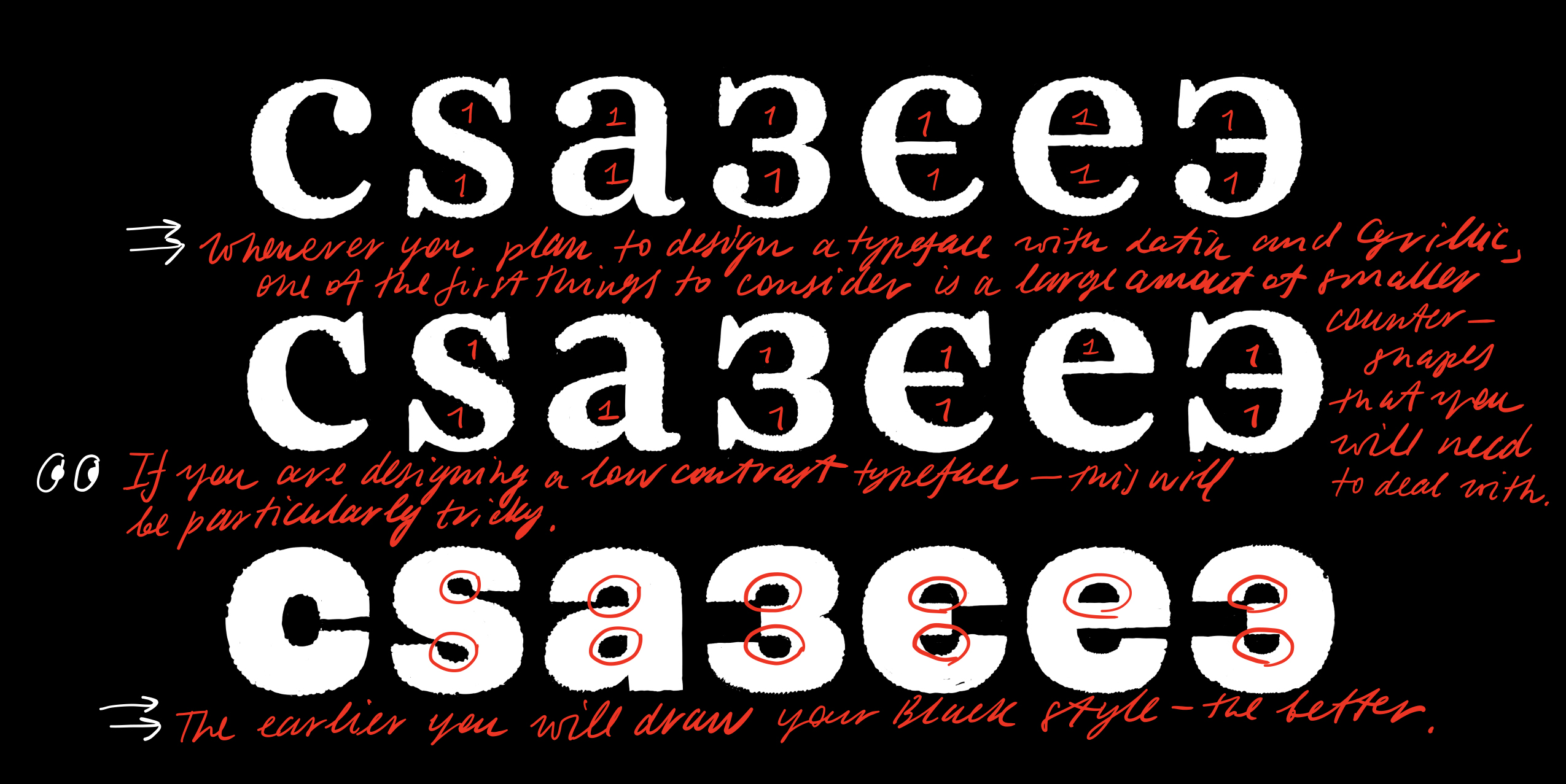
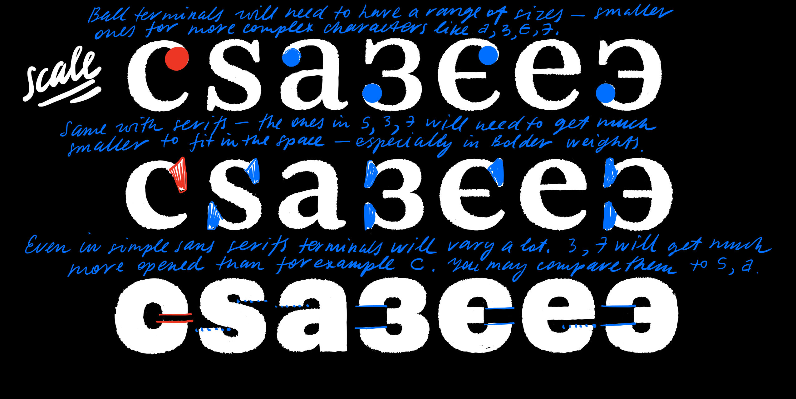
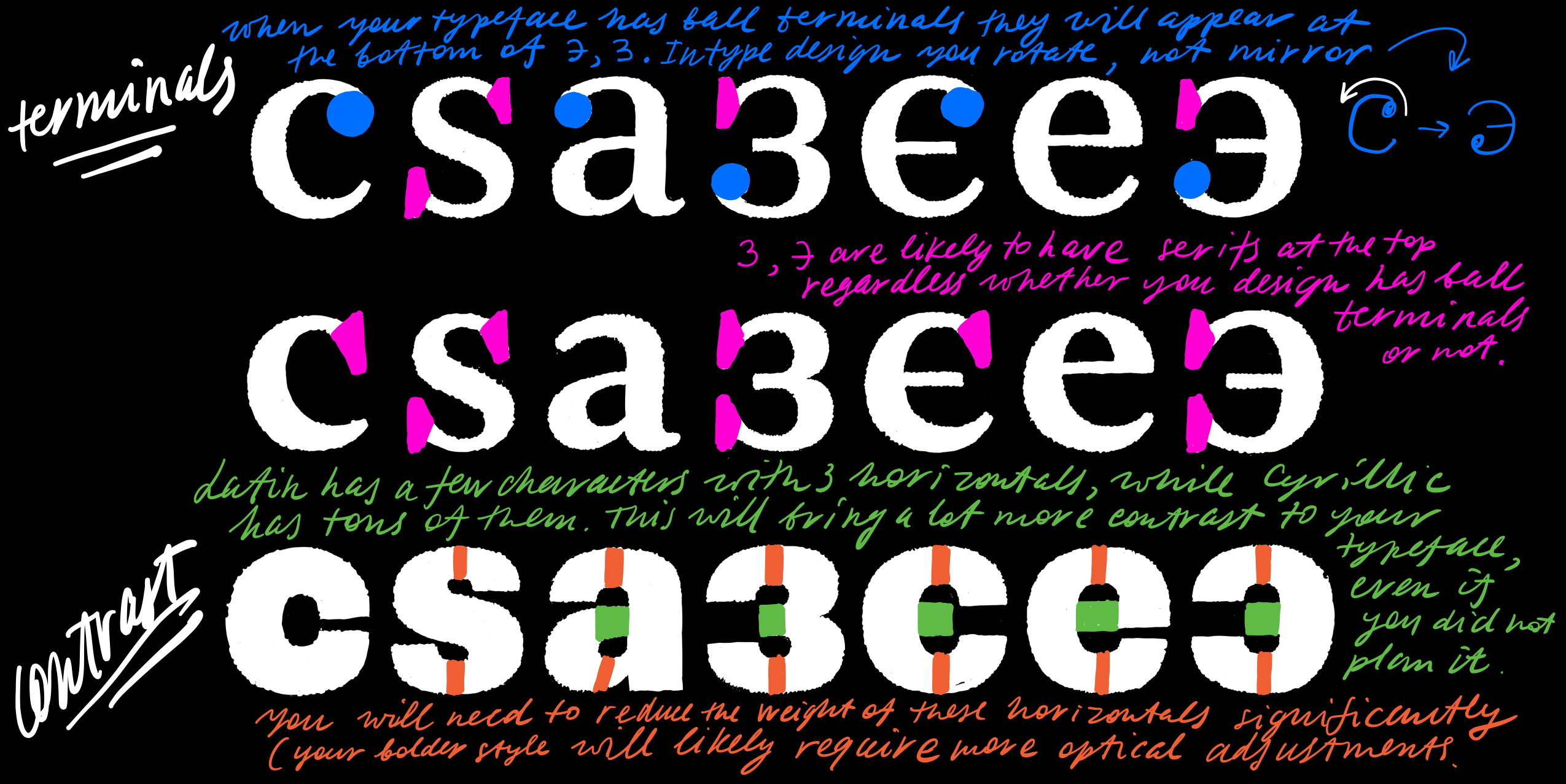
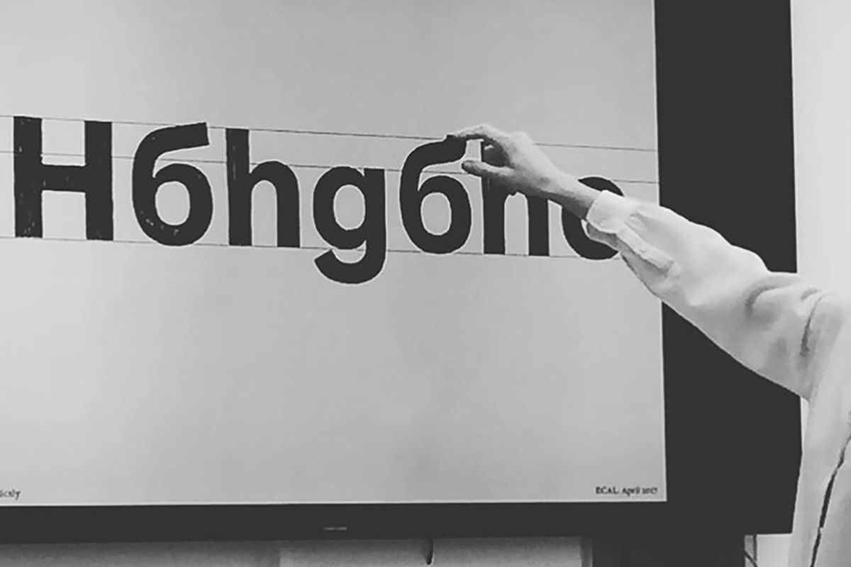
MD: I do not like the word “mistakes” as well as the word “rules”. Talking about the way we see Cyrillic as type designers, I think that there are much more optical adjustments that we need to consider while designing Cyrillic, much more than in an average Latin alphabet. Therefore, I always encourage people to look at the letterforms and not measure them with a ruler or put them strictly on a grid.
Most problems (within both the users of type and typeface designers) usually appear when people try to apply the same principles from one script to another rather than creating a larger system that allows Latin and Cyrillic to happily coexist.
This problem often comes from education. At university we are frequently taught on Latin examples, Latin typography. This leads to a lot of unjustified expectations when working with Cyrillic.
As digital fonts develop, the Cyrillic fonts are entering a new Renaissance era – both in Russia and other countries which use the Cyrillic script. Do you think that typeface designers in different Cyrillic cultures have a common understanding of the modern Cyrillic type which serves as a base for the development of the localized forms of the Cyrillic script?
MD: The growing market for Cyrillic fonts is what plays a big role nowadays. It allows designers to spend more time on a single type family and cover many languages. The growing market also becomes visible to “foreign” type foundries that more and more often consider adding Cyrillic for their typefaces. The overall tendency nowadays is towards multilingual typefaces and that is a very positive change.
In 2014 you founded Contrast Foundry and you have successfully completed many commercial font projects. You use traditional type forms with an innovative twist and in each font family you have incorporated the local forms of the Cyrillic script. How do you see the future of Contrast Foundry?
MD: I often find that the letters from the least used languages are the hardest to design. Yet we do our best to be as inclusive as possible.
Talking about the future, I think that most importantly—the future is multilingual. We’ve been seeing a lot of generalized designs that started with Latin and later tried to fit other scripts in. Many designers already realized that and try to adjust to include other languages in the typefaces as early in the process as possible. I am curious to see more projects that start with a collaboration of designers all working on different scripts right from the concept, without prioritizing Latin.
I think that Latin has been dominating for long enough and it is time for it to step aside a bit and get influenced by other scripts more. And this is what we often do in our projects. Looking at Latin and Cyrillic we often bring some of our “Cyrillic ideas” into Latin. We also have some experience designing Greek and we’ve designed Hebrew for our font CoFo Peshka. I am curious how working on different scripts will affect our workflow in the future.
What have you lined up after the workshop in April?
MD: We already have another edition of the workshop planned for May and an in-house workshop in June. In the meantime we are going to put together what we’ve learned so far and publish a book.
What is your “Cyrillicsly” message to the people who use the Cyrillic script, but do not speak Russian?
MD: I can still feel some tension between type designers using default Cyrillic design and designers from countries using localized forms. Personally, I think it is great that we have certain characteristics that are preferable in each country. And we should all respect that and not try to centralize/unify that and find the only “right” way. Similar things exist in Latin too—look at how many peculiarities there are in the way each country prefers their accents to be designed.
We are living in a great time when tools become accessible and we do not have to rely on others to make our letters great again. It is now up to us to design fonts for our own regions and make them look the way we think they should look like. Cyrillic does not exist on its own. It is part of a global system of languages from which there is a lot to learn.
Krista Radoeva is a type designer from Bulgaria. She holds a degree in Type and Media from the Royal Academy of Arts (Holland). Krista lives and works in Sofia as a freelance type and graphic design professional. She is a co-founder of the Cyrillicsly blog and lecturer at many type design workshops, mainly focusing on the Cyrillic script.
Explore CONTRAST FOUNDRY and its activities:
CONTRAST FOUNDRY Behance Twittter Linkedin Facebook
Editor
![]()
Szandra Peev
Szandra Peev has been working in the field of communications and marketing for almost a decade now. Her curiosity to explore new cultures and destinations took her to Asia where for five years she worked with some of the biggest multinational companies globally. Currently, Szandra is back in Europe, leading the communications and marketing efforts for localfonts.eu and contributing as a writer in print and online media outlets.


