


In this interview Franco Jonas is talking about the typography design education in Chile and Latin America, and the main forums for ideation in the field of typography. He also shares how he started designing non-Latin fonts (Cyrillic and Greek), how he sees the development of font design in Chile and reveals his professional plans for the near future.
Which are the main educational institutions in Chile that focus on font design and font art? Where do the modern Chilean font designers get their education from – in Chile or abroad?
Franco Jonas (FJ): Typography education in Chile has always been connected to the printing industry up until the 90’s.
When talking about typography, it is important to mention the name of Mauricio Amster, a Polish graphic designer who arrived in Valparaíso (Chile) in 1939. In my opinion, Amster is “the father of book design”. He was one of the first designers who revived the graphic design industry in Chile. He is well-known for designing many books and illustrating book covers and magazines for a wide range of Chilean editorials until the 1980s. Amster also published two very important books – “Técnica Grafica” (“Graphic Technique”), which explains the details of the printing work and touches upon topics like composition of moveable types and typographical classification. His other book called “Normas de Composición” (“Composition Norms”) is a kind of a guide book for authors, editors and designers, in which he talks about text composition and structure.
In the 90’s, other names connected to type design came up like Francisco Galvez, Rodrigo Ramirez, José Soto and Luis Rojas. These designers started to focus more on type design for two reasons. First, there was an emerging need to learn more about typography. At that time in the graphic design schools in Chile there wasn’t a subject focusing on typography. Second, designers felt the need to experiment and understand better the typefaces offered by computer operating systems at that time.
Francisco Galvez emerged as the main name connected to typography in Chile. He wrote two books “Educación tipográfica, una introducción a la tipografía” (“Typography education, an introduction to typography”), which was published in Argentina and Chile and “Hacer y componer, una introducción a la tipografía” (“Creating and composing, an introduction to typography”).
The first university in Chile that offered a diploma in typography was Pontificia Universidad Católica de Chile in Santiago where Francisco Galvez teaches, even till today. This is the first place where Typography Design was academically taught in Chile. Some of the prominent students who have graduated from the Faculty of Design are: Luciano Vergara, Daniel Hernandez, Javier Quintana, Rodrigo Araya, Sergio Leiva and Alexis Navarro.
Several years later, in 2012, the Universidad de Chile in Santiago, started offering a diploma in Typography. Prominent graphic design students who have graduated from the university are: Diego Aravena, Patricio Gonzales and Magdalena Arasanz, some of them are founders of type foundries such as Latino Type, W TypeFoundry, Rodrigo Typo, Untype, Sudaca.
I must say that most of the Chilean type designers receive their education in Chile. However, there are some exceptions such as Juan Bruce, who in 2015 did a Masters Degree in Type Design (MATD) at the University of Reading in the UK. Tania Chacana also graduated from MATD, but in 2018. Lastly, another Chilean designer, Joaquin Contreras is taking the Expert Class Type Design (EcTd) at the Plantin Institute of Typography in Antwerp, Belgium.
Typography existed in Chile since the start of the first print publications in 1810. However, digital typography has been taught in the country only in the last 20 years. For a country with 209 years of history this seems rather the beginning, compared to the tradition in European countries such as England, France, The Netherlands and Belgium.
In my opinion, it is very good to have such a young history in type design as it allows designers to develop new perspectives and designs, allowing more freedom due to the lack of historical heritage and one can see that in the work of the young Chilean designers mentioned above.
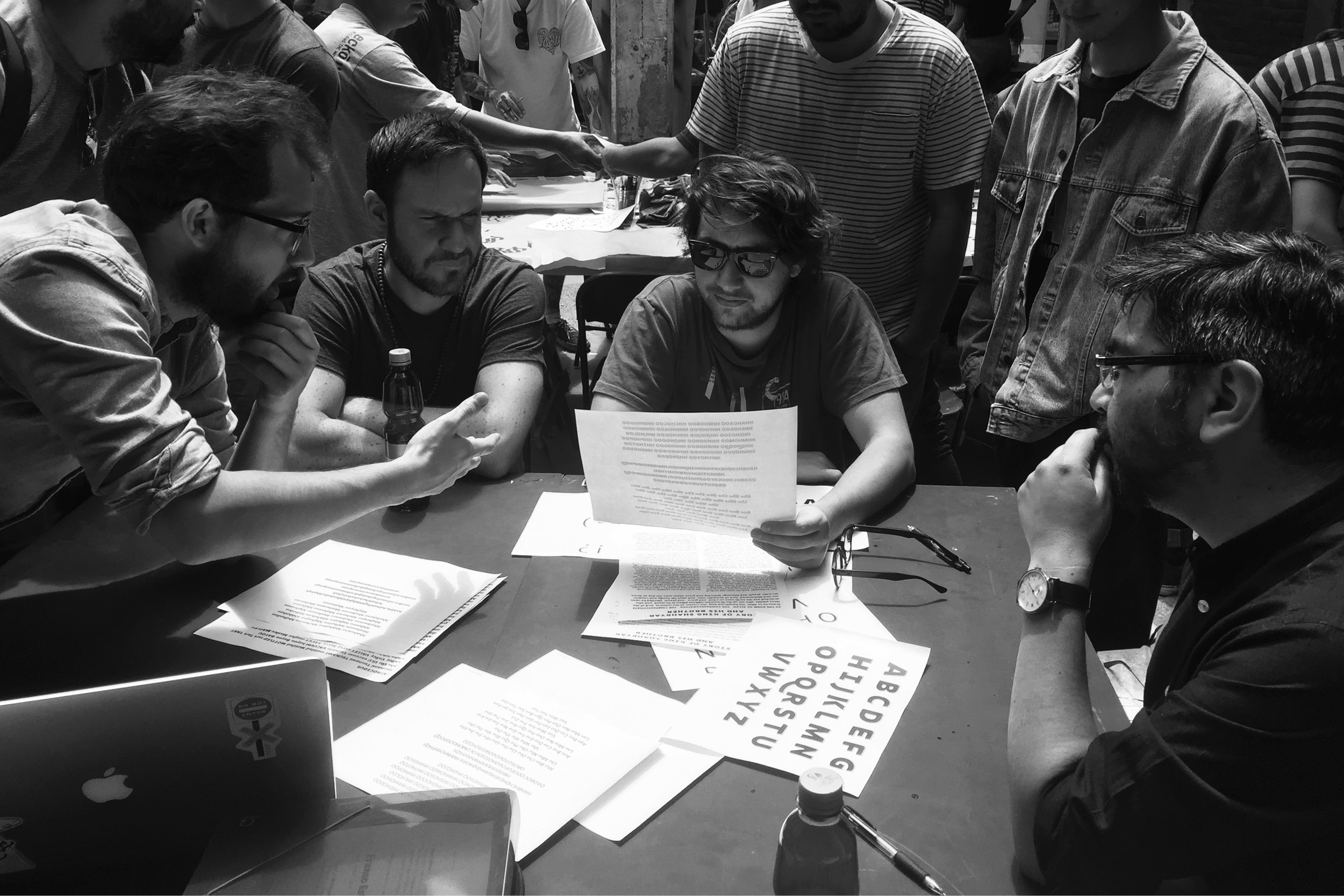
Which are the main forums for ideation for font designers in Chile and Latin America (exhibitions, seminars and conferences)?
FJ: Since 2002, the Pontificia Universidad Católica de Chile is a great place for exchanging ideas and learning about type design. Many designers from Chile and other countries in Latin America choose to study here because of the experience they gain and the knowledgeable faculty.
The University of Buenos Aires in Argentina is also a great place where many of the leading type designers of Latin America come from.
The most important event in the field of typography in Latin America is the biennale Tipos Latinos, which started in 2004 and now covers 12 countries in Latin America. Tipos Latinos really provides a platform for people from the typography field to exchange ideas and see the latest developments in the industry. The last edition of the event was in 2019 and is currently suspended due to the global pandemic.
The “Revista Tipográfica” (tpG) magazine was also a very important publication that covered the field of typography and design in Latin America. Its first edition appeared in 1987 and the magazine discontinued in 2007. It was founded by the Argentinian designer Ruben Fontana.
What is typical in the approach of Chilean artists in the contemporary visual and graphic culture and communication? Do you think that there are national cultural specifics?
FJ: I think that the modern graphic design in Chile follows the concept of adding a local twist to designs created abroad. In the typography field there is still a lot that we can learn in order to shape our own Chilean identity. However, I believe that our identity is always going to be like a “mixed race” as our heritage is influenced by the movement of people through our lands and the culture that they have left behind.
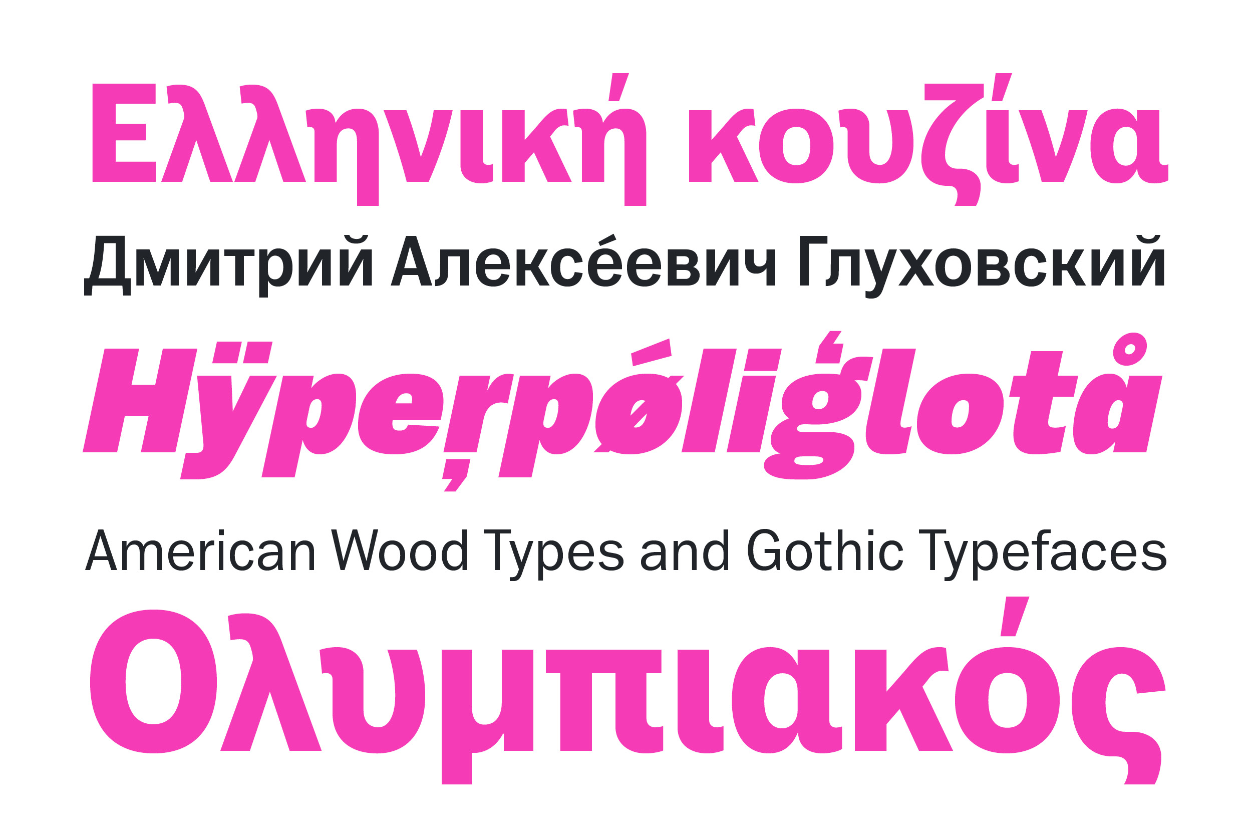
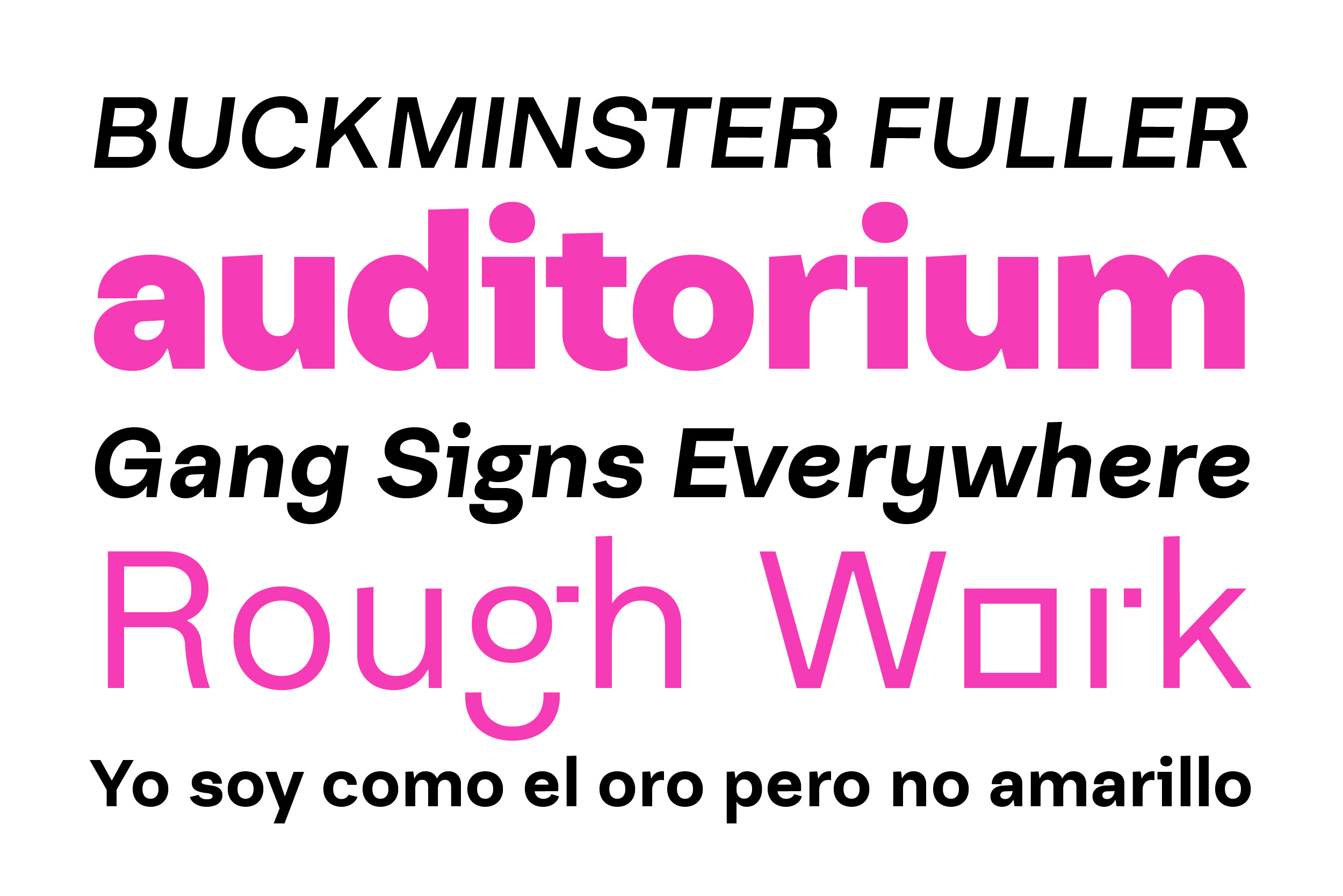
In 2019, together with Diego Aravena Silo you published in MyFonts the Ryman Gothic font, which features multilingual support, including Greek and International Cyrillic. Could you please tell us more about this project – from ideation to the final product?
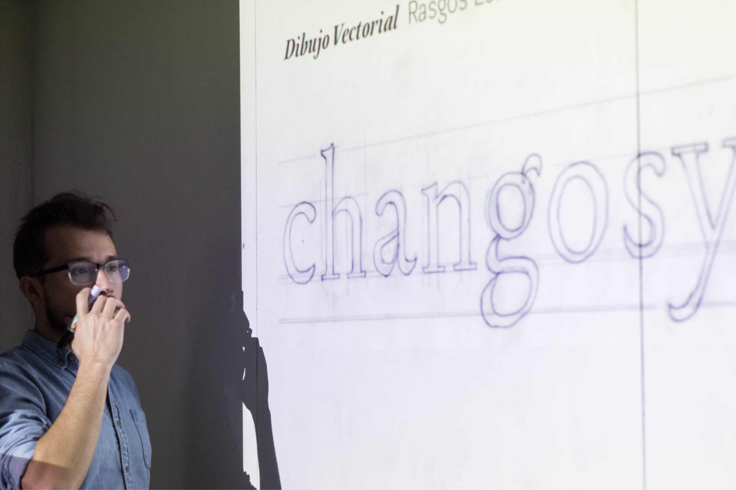
FJ: In 2016, through Rodrigo Araya and Patricio Gonzalez, two outstanding typographic designers and teachers respectively, I met Diego Aravena, a graphic designer and typographer and also a partner-founder of W Type Foundry. I have always been a fan of his work and we actually share a great friendship. Diego invited me to participate in the Ryman Gothic font project which explores the Edwin Allen and Morris Fuller Benton works. Diego was interested in extending this project to other alphabets.
Before starting work on the Ryman Gothic font project, in 2017 I worked on another font project called Platz Groteske. It was my very first sans Cyrillic typeface. I was curious to see how I can design a typeface that is different from the Latin that I know.
When I started work on the Cyrillic version of the Ryman Gothic font in 2017, I really took it slowly and step by step. I was looking at different references and ways to build the typeface correctly. After finishing the Cyrillic version, I became bolder and thought to myself “Why not design it for the Greek alphabet as well?”
I contacted Kostas Barsokas, who to me is one of the greatest typography designers in the world, specializing in Greek language. Kostas guided me in the process of creating the font and corrected some of my work, which for me was like a dream come true. It always means a lot to me when professionals that I admire share their opinion and correct my work. I finished the project deeply grateful to Kostas for all the knowledge and his generosity.
Through typography projects, I meet really great professionals and wonderful people.
How do you see the development of font design in Chile?
FJ: You can find very good quality typeface designs in Chile. I think that they are even more attractive and stimulating than most of the work in Europe. However, surviving on font design is a big challenge, because we don’t have enough tradition and practice in that field. Fonts are almost the last thing people would think to buy, but of course this is changing slowly.
In my personal opinion we have been stuck in time. If we look at the other Latin American countries, we see that in Mexico, Colombia, Argentina and Brazil there is definitely more knowledge being shared, more projects being executed. In Chile we can’t see the same drive, the same rapid development.
What is missing here is the interconnection between colleagues, cooperation and knowledge sharing. If we manage to work in a more united way, our industry will definitely benefit a lot and will develop more rapidly.
What are your professional goals for this and next year?
FJ: In 2019 I started my own studio Frncojonas and I am fully focused on developing it at the moment. I really like the fact that I can work on projects that I like. When you can’t find your place, you have to create your own.
This and the next year, my main priority is to polish my English. I would also like to continue my education, hence I am looking at different masters degrees and diplomas in typography in Europe. Some of the options I am looking at are – a Masters in Typography (MATD) in Reading University, UK, the national workshop of typographic investigation in Nancy (ARNT), expert master class in typographic design in Amberes (EcTd), Belgium and the diploma in typography of the arts and design School of Amiens. I would love to experience living abroad and to be able to immerse myself in a different culture.
In conclusion, I would like to add that excellence in typography can be achieved with hard work and dedication, something that is reflected in the work of Francisco Galvez and Sergio Leiva, two of my favourite graphic and typography designers from Chile. Their level of detail and depth is inspiring and I am hoping that one day my name will stand next to theirs.
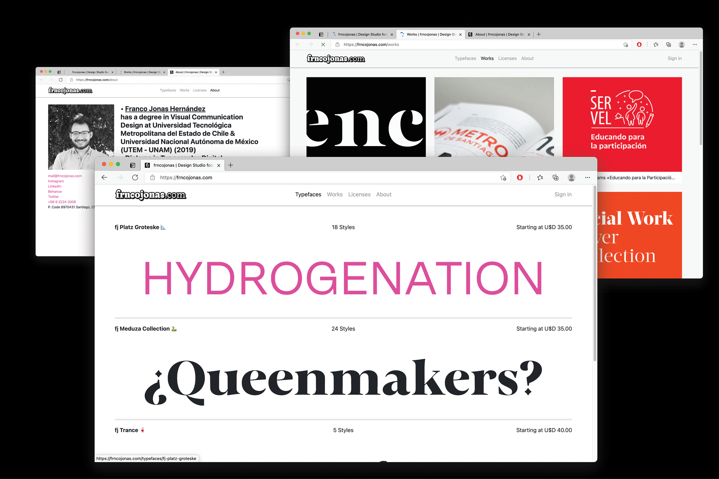
Explore FRNCOJONAS FOUNDRY and its activities:
FRNCOJONAS FOUNDRY Behance Twittter Linkedin Facebook Instagram
Editor
![]()
Szandra Peev
Szandra Peev has been working in the field of communications and marketing for almost a decade now. Her curiosity to explore new cultures and destinations took her to Asia where for five years she worked with some of the biggest multinational companies globally. Currently, Szandra is back in Europe, leading the communications and marketing efforts for localfonts.eu and contributing as a writer in print and online media outlets.


