Plovdiv is the first European Capital of Culture that uses the Cyrillic alphabet

Who is behind PUNKT studio and what was the process of creating the graphical identity of Plovdiv as a European Capital of Culture in 2019?
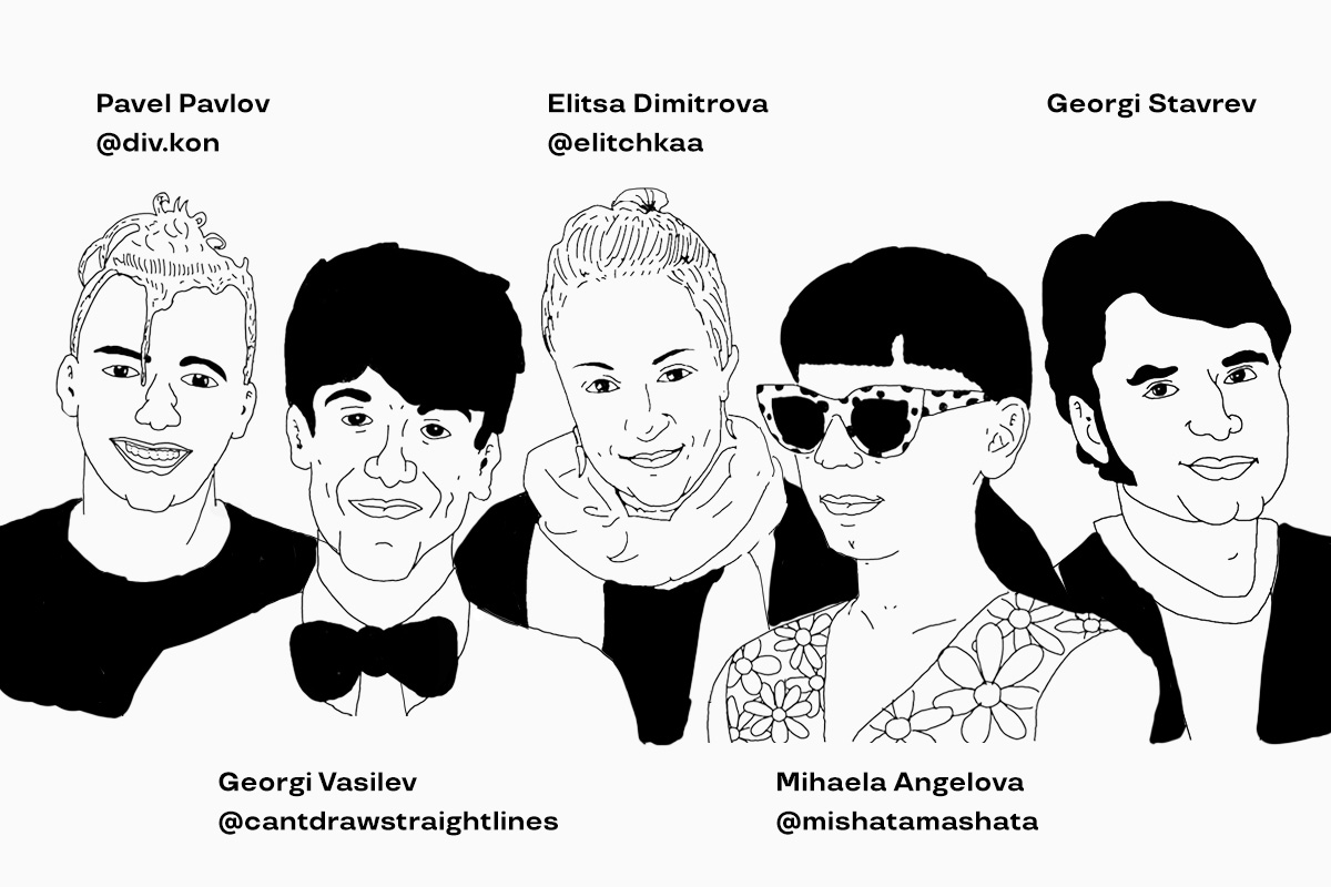
Georgi Lazarov: PUNKT studio is 13 years old already! I created the company in 2007 in Plovdiv. A few months later Krassimir Stavrev joined me as a partner in the company and since then we have managed the studio together. At the moment I live and work in Sofia while Krassimir is in Plovdiv. We have a team of seven people: Georgi Vassilev, Mihaela Angelova, Elitsa Dimitrova, Georgi Stavrev and Pavel Pavlov. All of them have the freedom to choose where they want to work from. They can choose between our offices in either Plovdiv or Sofia, their home, their country house or even from the seaside. It doesn’t matter as long as we are always connected to our group in Slack.
Krassimir Stavrev: Our portfolio is very rich – over the years we’ve worked on many visual identities for big and small companies and NGOs, we’ve worked on preparing layouts for books and of course we’ve also worked on numerous graphical projects for print and digital, to communicate in the best possible way the features of a product or service.
Creating the visual identity of Plovdiv as a European Capital of Culture in 2019 was one of our most important projects recently. It gave us the opportunity to present our ideas, to promote our city and of course to showcase the capabilities of our studio.
Plovdiv was one of the two European Capitals of Culture. How do you perceive the event now that some time has passed?
GL: Plovdiv, together with the Italian city of Matera were the two cultural cities of Europe in 2019, and I would say that we were very lucky that the event happened in 2019 and not this year. This year with the Covid-19 pandemic Plovdiv really lost its attractiveness as a cultural and tourist destination. Everything went wrong at the start of 2020 and this created a lot of obstacles to properly evaluate the effect of promoting the city last year. As a studio that has spent the last years focusing its efforts on creating the visual identity of events and festivals that are connected to audiences and people, this period of isolation is really hard for us.
You created the logo of Plovdiv as a European Capital of Culture and also the graphical identity of the event. Please share how the idea for the logo was born and why did you decide to participate in the competition to design it?
KS: Our participation in the competition was a challenge for us, because from all the studios that were invited, we had the strongest connection to Plovdiv. I believe that this inspired us and helped us to present our ideas about the city’s identity in an authentic and complete way. As far as I remember, during our presentation, the chosen logo was the last option that we showcased. It was created from a sketch that Zhorko (Georgi Vassilev) showed us on Skype one day. At that time, we used to work remotely, but not due to Covid-19. It was in the summer of 2017 when I was working from the seaside and was trying to combine work and holiday. Right from the beginning, it was a bit worrying that we did not have enough time to impose the new identity until the beginning of 2019. In the end, we accepted the challenge, we completely dived into the project and I dare to say that we managed it very well.

You represent the modern generation, active and young designers in Bulgaria. What is Plovdiv to you? How do you interpret Plovdiv as a European Capital of Culture in the graphic identity that you created?
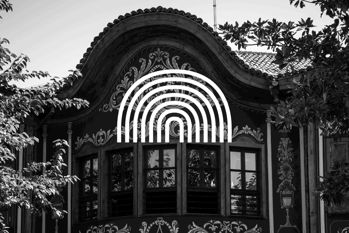
GL: Our idea was to create a very clear symbol that can be easily recognised and used in the hundreds of materials for the event.
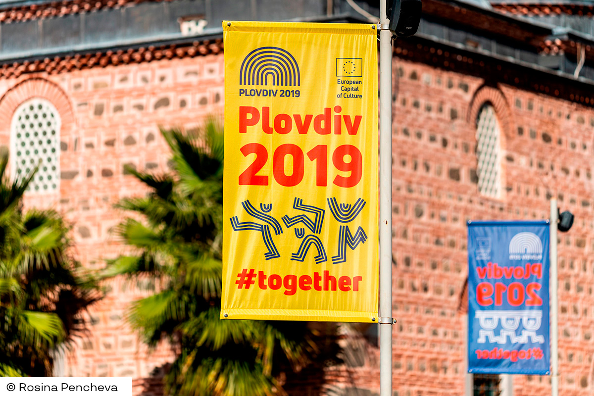
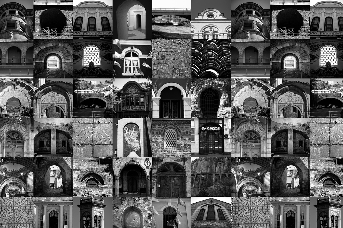
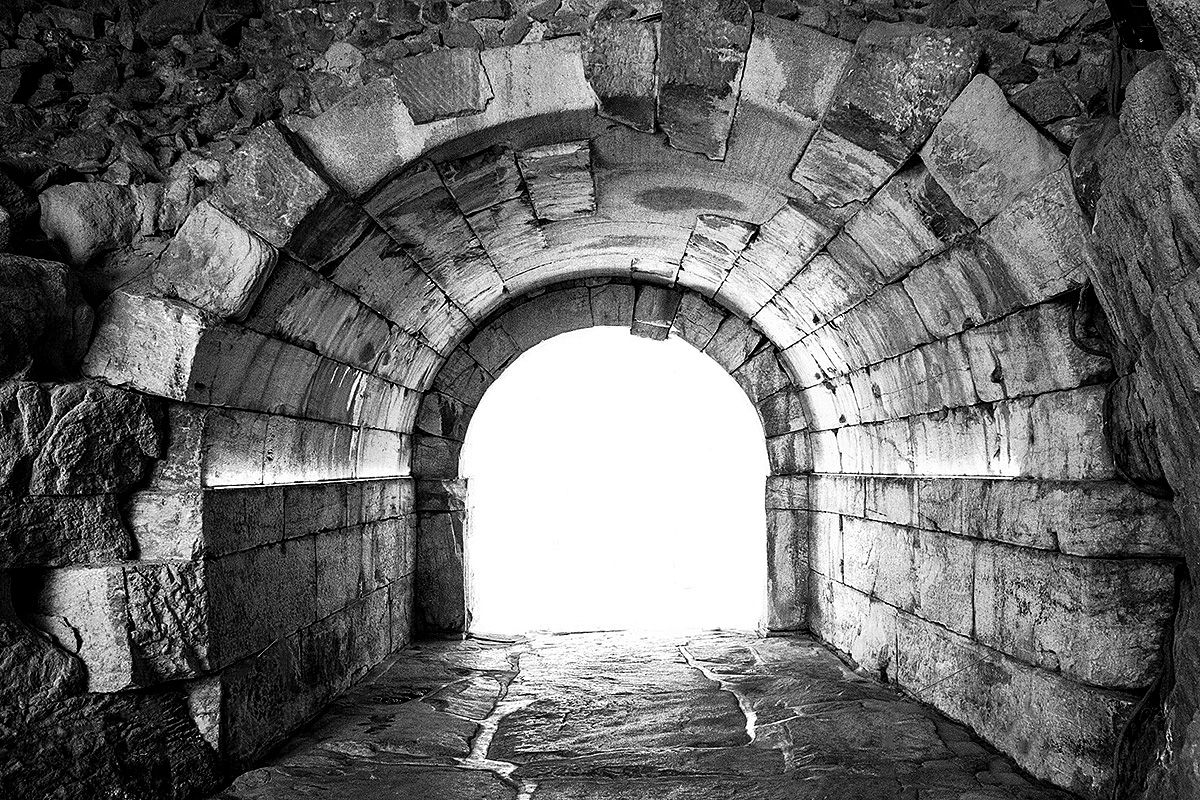
In the final version of the logo we successfully synthesized the most important symbols of Plovdiv – the seven arches symbolise the silhouettes of the seven hills in Plovdiv and mimic the famous vaults at the entrances of the Ancient Stadium and Ancient Theater. They also represent the shape of the theater from a bird’s eye view, they symbolize the letter P (in Bulgarian П) for Plodviv in our Cyrillic alphabet. We saw in these seven lines the curves of the Maritsa river, the hundreds of arc windows built during the Bulgarian revival period and the architectural boom of our city in the XIX century. There are a few more words that correspond with the spirit of Plovdiv – namely multi-layered, wide range, preserving and transformation, and last but not least a lot and together. The latter became the motto of the event for the whole year.
After the logo has been presented a lot of different interpretations occurred. We kept calm and after some time we realised that all the noise that was made around the logo of Plovdiv as the European Capital of Culture was not for nothing and in contrary saved us a lot of time and effort. The goal has been achieved. Everyone knew that Plovdiv has a new logo and the road in front was clear to unveil its whole identity. People were following what was happening with the new visual identity. Furthermore, people have seen in the logo an opportunity to interpret and develop it in their own way. We have seen some pretty good visualization of it on social media. Of course, everyone is interpreting it according to their own values and capabilities.
KS: As for the symbols that represent the logo, for me the strongest one is the idea of a gate, an entrance to a special year, filled with entertainment and unforgettable moments for the visitors and citizens of Plovdiv. The graphical representation of the logo is a well known design approach that allowed us to create a lot of communication elements.
By combining the Uni Neue font from FONTFABRIC, we created a beautiful composition and balance between the font and the sign. In the brand book that we created we showed a lot of flexibility in the compositions that made the usage of the graphical identity really easy for us and for the foundation and partners working on this massive project.
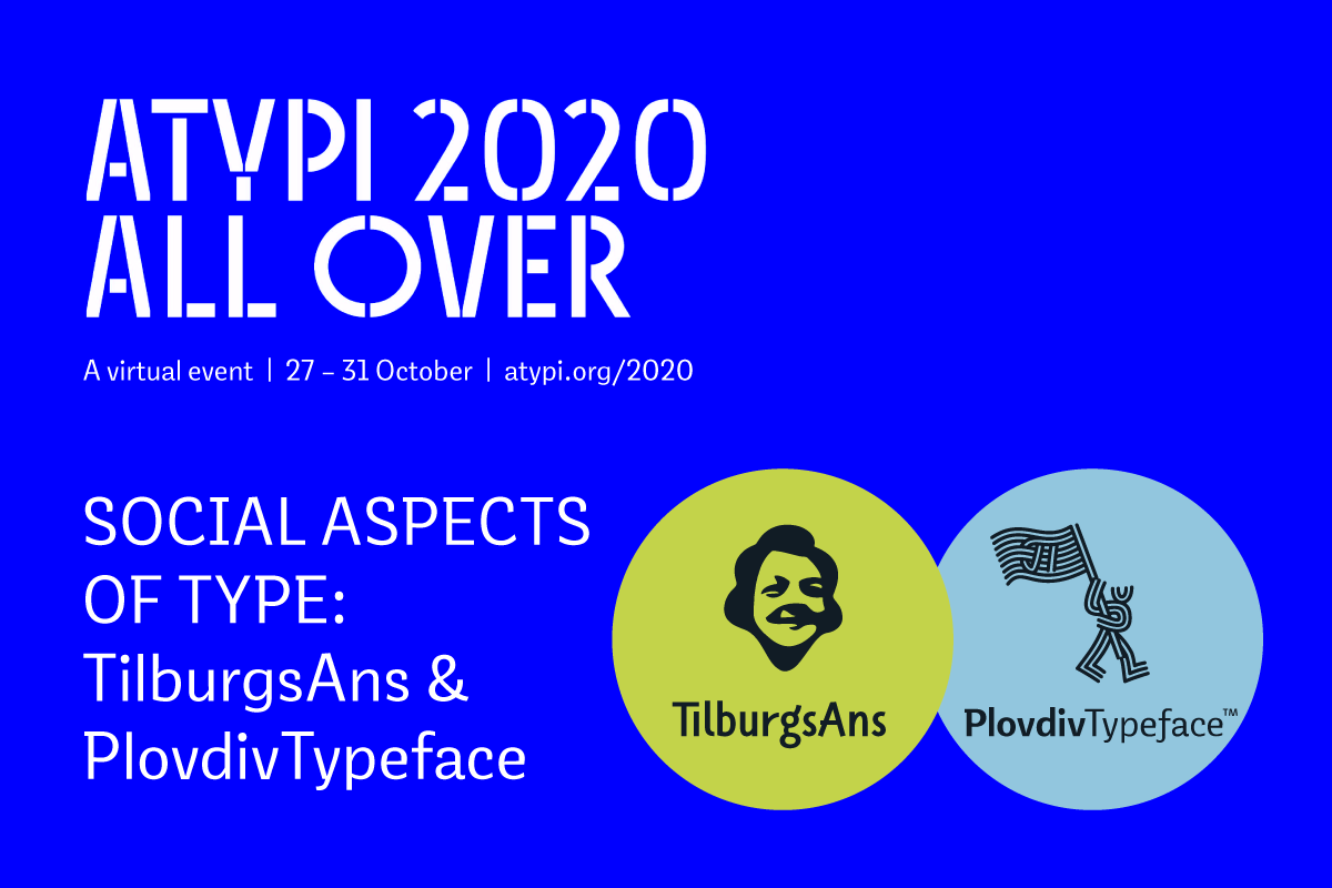
Without a doubt the most impressive artefact of Plovdiv 2019 was the creation of the hand written font Plovdiv, based on more than 3000 handwritings of Plovdiv citizens. Tell us more about this process and how did you execute the idea?
KS: PlovdivTypeface was officially launched on the 1st Nov 2019. I would like to highlight that we did not create only one font for the project, we created a whole font family under the name PlovdivTypeface. It includes the handwritten font Plovdiv Script, Plovdiv Display – a beautiful font that can be used for long texts and headlines (it exists in three variations – Light, Regular and Bold), Plovdiv Sans, a san serif typeface which complies with the proportions and principles of the above mentioned two fonts and is ideal for long legible texts. The font family also includes the font Plovdiv Pictograms and Plovdiv Maina Mode, which is maybe the funniest font as it allows the users to write with the “language” of the Plovdiv citizens.
Plovdiv is the first European Capital of Culture that uses the Cyrillic alphabet. The creation of the PlovdivTypeface font family is a landmark for our studio, but also a significant cultural heritage that will last for generations to come. I do not recall calling our fonts artefacts, but the PlovdivTypeface font family is exactly that – a cultural artefact.
GL: The main credit for the creation of the font family has to go to Pavkata (Pavel Pavlov) from our studio as well as Alexander Nedelev from Typedepot, our partners for this project. The font family would not have been created without the kind financial support of Plovdiv’2019 Foundation, without the unbelievable enthusiasm of all volunteers in this project as well as the citizens and friends of Plovdiv that participated with their handwriting that laid the foundation of the font.
For the promotion of the PlovdivTypeface family you created a website and a special exhibition. What is the fate of PlovdivTypeface after its presentation?
GL: Through the plovdivtyface.com website anyone can download the font family for free. We explained in a short PDF document how the fonts can be used and installed on a PC. To date the font has been downloaded more than 4000 times! We see more and more often how the font has been used, we have received a lot of positive comments and messages of appreciation for our work.
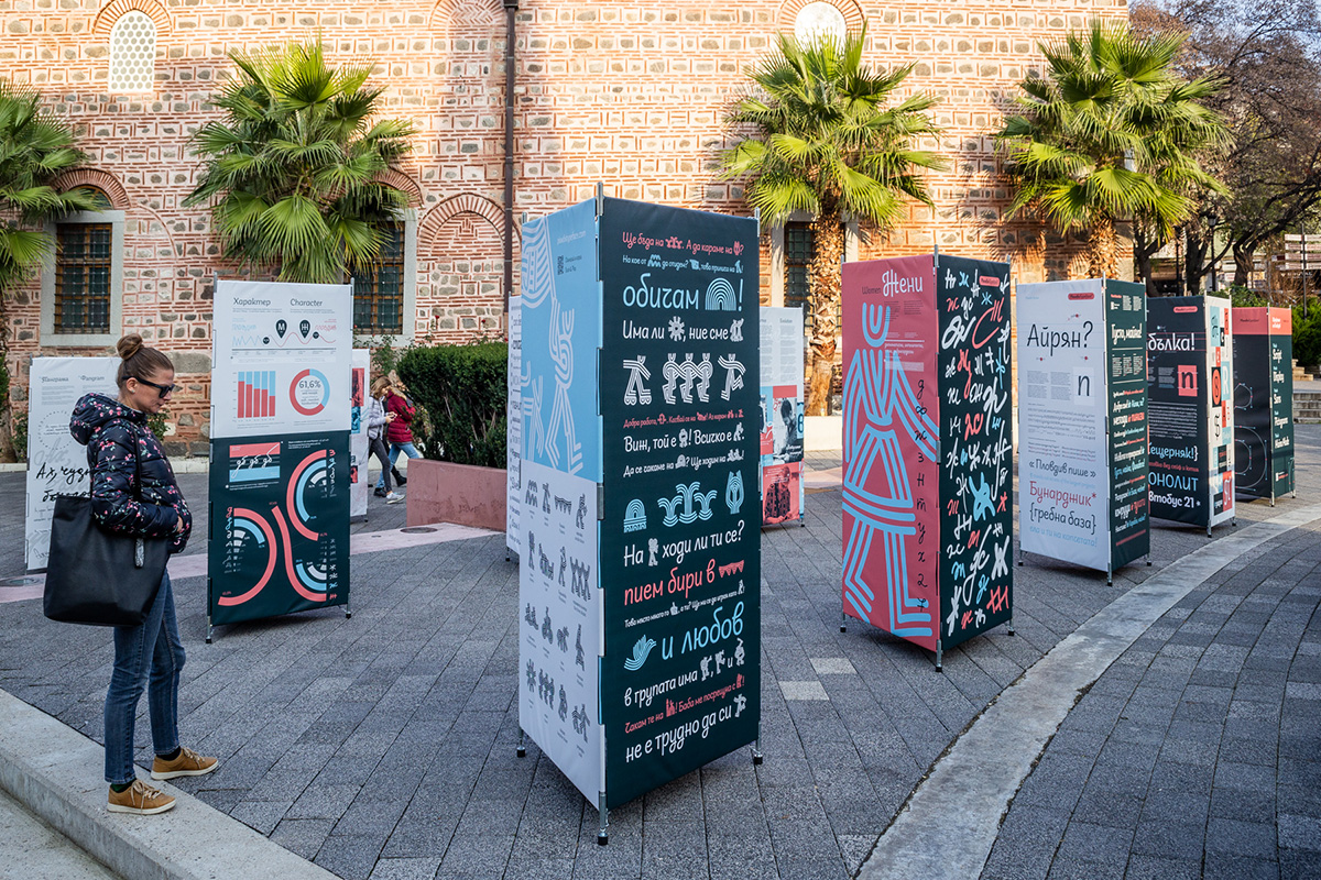
To reach more people we also created a travelling exhibition called Plovdiv Typeface. It shares the stages of the project, showcases the fonts separately and explains interesting statistics from our graphological research. Within a year the exhibition has changed to different locations within Plovdiv. It started as an open space exhibition at the Djumaya square, after that it moved to the Plovdiv Plaza Mall and then to the National Library “Ivan Vazov”. We are planning to change the location one more time before the end of this year.
KS: On the 29th of October this year we presented the PlovdivTypeface font family at the ATypI international typographic conference, which was held virtually this year. We had the opportunity to discuss with colleagues from different countries the social aspects of the font art.
Do you think that the brand identity competitions of the future European Capitals of Culture could become international and would you participate in such competition?
KS: We haven’t really thought about this, but why not?! It would be an honor for us, if we could contribute with our knowledge to the future cities of culture. It would be great to pass on the learnings to other colleagues that create brand identity for the next cities of culture in Europe.
We have been thinking about how a font would look like if we apply our system for evaluating handwritings for another city in another country. Would the statistical data about the main characteristics of a handwriting and the most common letter shapes be different from the ones that we have in Plovdiv? If there are different dialects in a country, would they affect the handwriting of people from the different regions? There are a lot of interesting questions for which we would be happy to find answers, when we find a partner in another city that is ready to embark on a journey with us.
What are the future projects of PUNKT studio?
GL: At the moment we are redesigning the visual identity of the Museum of Humor and Satire in Gabrovo. Soon we will announce the redesign of some other popular brands. It is interesting that our latest projects are focusing on the redesign of well known brands, which is an interesting process of evolving and modernizing a business. The challenges are very different from creating a visual identity of a start-up.
![]()
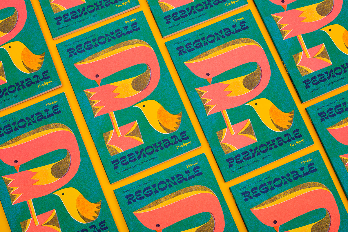
KS: We also dedicate time to continue an interesting project that we started in 2019 called Regionale – A Guide For Tourism and Culture. It is a bilingual book (in English and Bulgarian) with a road map. The set presents 30 festivals that are held every year in the Plovdiv region. Our aim is to create similar books for other regions in Bulgaria. At the moment we are considering various options to finance the project and we are researching potential partners with whom we could collaborate with.
Explore PUNKT and their activities:
PUNKT Behance Linkedin Facebook Instagram
Editor
![]()
Stefan Peev
graphic designer and typographer from Bulgaria


