A look at the Latin letter
A B C D E F G H I J K L M N O P Q R S T U V W Y X Z
a b c d e f g h i j k l m n o p q r s t u v w y x z
A look at the Cyrillic letter
А Б В Г Д Е Ё Ж З И Й К Л М Н О П Р С Т У Ф Х Ц Ч Ш Щ Ъ Ы Ь Э Ю Я Ѣ Ѥ Ѧ Ѩ Ѫ Ѭ Ѯ Ѱ Ѳ Ѵ Ѷ Ѹ Ѻ Ѽ Ѿ Ҁ ҂ ҃ ҄ ҅ ҆ ҇ ҈ ҉
а б в г д е ё ж з и й к л м н о п р с т у ф х ц ч ш щ ъ ы ь э ю я ѣ ѥ ѧ ѩ ѫ ѭ ѯ ѱ ѳ ѵ ѷ ѹ ѻ ѽ ѿ ҁ
Cyrillic Alphabets
Cyrillic Alphabets of Slavic Languages
Cyrillic Alphabets of Non-Slavic Languages
A look at the Diacritics
Your Font Fetish • YFF
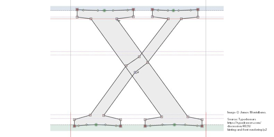
James Montalbano: “The lower left leg of the X needs to be move a bit further left. This optical illusion almost always occurs when a thin stroke crosses a heavier one. Add a few points to the thin stroke where it crosses the heavy stroke and move the entire lower leg to the left.”
Source: Typedrawers
Editor
![]()
Stefan Peev
graphic designer and typographer from Bulgaria


