By Andrew Johnson
Extract
Our job is to give users the best experience possible—whether they’re viewing the design on a low-end mobile device, a laptop with high resolution, or distant digital signage. Both poorly selected and slowly loading fonts hinder the reading experience. With CSS @fontface as a baseline, fonts can be progressively enhanced with interpolation where appropriate. Users on less capable devices and browsers are best served with standard @fontface fonts.
After the first interpolation and render, we can set a series of thresholds where re-renders are triggered, to avoid constant recalculations for insignificant changes (like every single change in width as the browser is resized). Element queries are a natural fit here (pun intended) because they’re based at the module level, which is where type often lives within layouts. Because information for interpolation is stored with JavaScript, there’s no need to load an entirely different font—just the data required for interpolation. Task runners can also save this interpolation data in JavaScript during the website or application build process, and caching can be used to avoid font recalculations when a user returns to a view a second time.
Another challenge is rendering interpolated type quickly and smoothly. Transitioning in an interpolated font lined up with the original can minimize the visual change. Other techniques, like loading JavaScript asynchronously, or just caching the font for next time if the browser cannot load the font fast enough, could also improve perceived performance.
As noted by Nick Sherman, all these techniques illustrate the need for a standardized font format that wraps everything up into a single sustainable solution. Modifying live files with JavaScript serves only as an inroad for future font formats that can adapt to the widely varied conditions they’re subjected to.
By Luc(as) de Groot
Extract

When producing large type families with multiple stroke weights, a certain degree of automation is not only agreeable (as a way to avoid tedious work), it may even be necessary (for making it feasible at all to generate such a huge number of fonts). Interpolation is a common method for doing this: to generate intermediate weights between two basic values, after which, of course, the automatically produced fonts are fine-tuned by hand.
Type designers are often inclined to establish intermediate weights by drawing, as it were, a straight line between the boldest and lightest versions of a family and then choose the intermediate weights somewhere along that graph.
Interpolation theory
As early as 1987, when developing intermediate versions of an existing typeface during an internship, Luca(as) realized that the optically correct in-between weights are on a hollow curve that produces values which are lower than those on the straight line of the “average values”. In other words: if the verticals of the Regular weight have a value of 40 units and those of the Bold weight 70, then the SemiBold verticals should not be 55 units wide but slightly less, in order to give the optical impression of being exactly “in the middle”.
Luc(as)’s tests resulted in a formula and a graph that precisely define the optimum value for any possible intermediate weight.
By Nick Sherman
Extract
Choosing typefaces for use on the web today is a practice of specifying static fonts with fixed designs. But what if the design of a typeface could be as flexible and responsive as the layout it exists within?
The glass floor of responsive typography
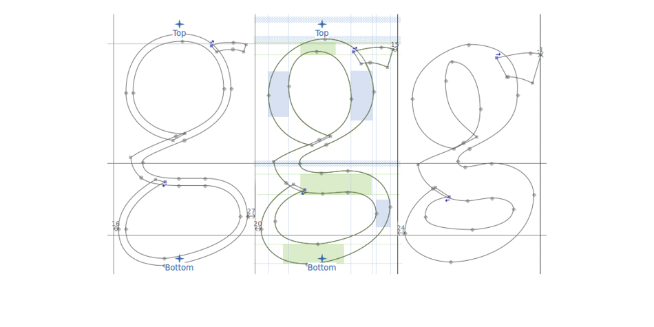
Except for low-level font hinting and proof-of-concept demos like the one Andrew Johnson published earlier this week, the glyph shapes in modern fonts are restricted to a single, static configuration. Any variation in weight, width, stroke contrast, etc.—no matter how subtle—requires separate font files. This concept may not seem so bad in the realm of print design, where layouts are also static. On the web, though, this limitation is what I refer to as the “glass floor” of responsive typography: while higher-level typographic variables like margins, line spacing, and font size can adjust dynamically to each reader’s viewing environment, that flexibility disappears for lower-level variables that are defined within the font. Each glyph is like an ice cube floating in a sea of otherwise fluid design.
By linusromer
Extract
Steminterpolation is a Java Swing application which helps you to calculate the stem widths for a font family from thin to black.
The program is being developed in NetBeans with OpenJDK and is based on a discussion from a TypeDrawers thread. The executable JAR file can be found inside the dist folder.
Discussions
Dave Crossland opened a discussion on Typedrawers: Live Font Interpolation on the Web
Further readings
Glyphs: Interpolate
Marek Jeziorek: Different interpolation between Glyphs.app and MutatorMath
Video turorials
Thomas Phinney: Multiple Masters for Bigger, Better Font Families. FontLab Studio 5
FontForge: FontForge interpolation
Dave Crossland: FontForge Simplepolator


