

In this exclusive interview Peter Biľak shares why there are no marginal languages, which Bulgarian designer inspired him to start creating fonts with a Bulgarian form of Cyrillic and is the Bulgarian form of Cyrillic just an upright italic. He also talks about his latest plans and projects with South Asian languages.
For more than 20 years you are managing Typotheque type foundry and you have a rich font collection. One of the distinctive properties of this collection is its multilingual orientation. How did you develop your interest towards creating multilingual fonts?
Peter Biľak: When I was a graphic design student, back in Czechoslovakia, I realised that most of the available fonts didn’t support the Central European languages. We had to copy paste accents, or draw our own diacritics. I realised how important it is to pay attention to seemingly marginal languages, and made it an integral part of our work. I actually feel it is our obligation to pay attention to smaller languages.
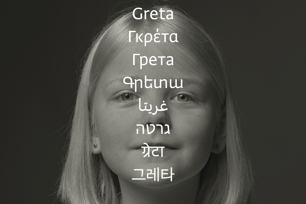
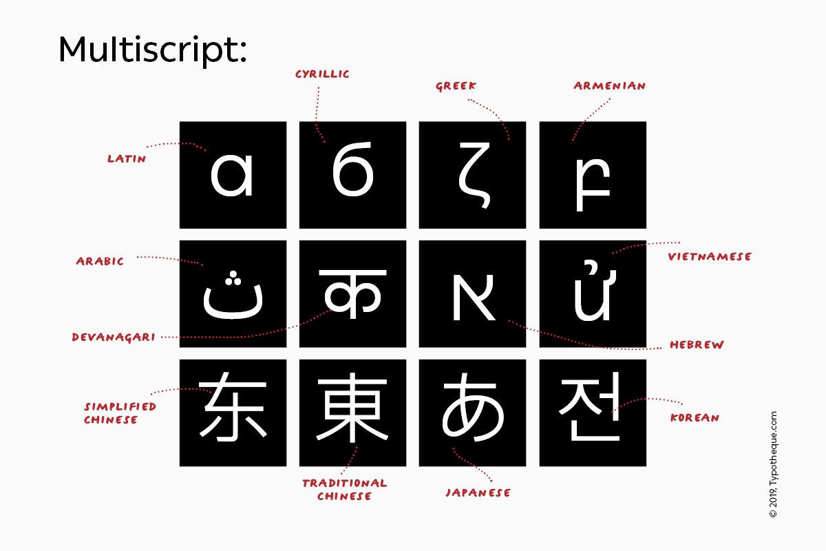
In the early 2000, we started working with closely related writing scripts — Cyrillic and Greek. Twenty years later, we basically work with all living languages. In the last two years, we have been working intensively with all writing scripts of the Indian subcontinent, which are some of the most complex writing scripts, because of the complicated shaping rules and reordering.
In most of your fonts you are including local versions of Cyrillic – in the first place for Bulgarian, Serbian and Northern Macedonian languages. When did you first see for the first time the modern Bulgarian type form of the Cyrillic alphabet and what was your first impression about it?
PB: I teach at the Postgraduate course Type & Media at the Royal Academy of Arts, in The Hague. In 2003, we had a Bulgarian student — Krassen Krestev. With Krassen, we have discussed the differences between Russian/international and Bulgarian cyrillic, and since then we started drawing the localised versions of all our Cyrillic fonts.
Since type design is a lasting discipline, I was interested to understand if this is just a fleeting trend, or a natural evolution of the script. I collected samples to understand where it all came from and by now it seems that what once used to be a novelty is a widely accepted preference in Bulgaria.
For some experts the modern Bulgarian Cyrillic type form is just an upright italic, others see it as latinizing the Cyrillic alphabet. Is the modern Bulgarian Cyrillic type form lacking identity and can it be distinguished from the Latin type form and the international Cyrillic type form?
PB: It is clear that Bulgarian Cyrillic is influenced by cursive writing and in a way bridges the large gap between the upright and italic, which exists in Russian Cyrillic. The fact that Bulgarian preferred forms contain more ascenders and descenders make it livelier in text. Cyrillic is historically influenced by other writing scripts, first by Greek, and after its reform by Peter the Great also by Latin, so it would be incorrect to say that Bulgarian Cyrillic has been latinised. It is only natural that related and neighbouring scripts influence each other.
Which of your fonts have the Bulgarian Cyrillic type form?
PB: I believe that all our Cyrillic fonts have Bulgarian Cyrillic. In some of our earlier fonts, we missed the capital variants, such as El, De, and we included just the lower case letters. We are now correcting those and publishing them as an update. You can see our full collection of Cyrillic fonts here.
What challenges does a font designer face when he/she is working on localizing different Cyrillic fonts?
PB: The challenge is to be misled by similarities of shapes and automatically chose for the identical shapes such as K. Or on the other hand to automatically draw archaic Cyrilllic shapes. With every project we open a discussion how the Cyrillic should relate to Latin and how to translate the ideas, and purpose of the typeface, rather than looking at shapes only. In some projects, we made the Cyrillic more progressive than the Latin shape, to better establish the intention of the design — for example in Charlie, we choose for asymmetric serifs in Cyrillic, to translate the idea of a dynamic slab serif.
Which are the main unsolved problems of the modern Cyrillic alphabets – both the international Cyrillic and its local forms?
PB: I would say lack of documentation, lack of books, lack of education — these are the factors that supported the Laitn script, and often lack in other scripts, including the Cyrillic.
What is the next challenge you’ve lined up for 2021? What are the goals of Typotheque for next year?
PB: As I mentioned, we work on a large project for the South Asian scripts (Devanagari, Bangla, Gujarati, Gurmukhi, Tamil, Malayalam, Odia, Meetei Mayek, Ol Chiki, Sinhala, Kanada, Telugu) and besides the design focus, we are proposing new practices for engineering such fonts, creating open source documentation that hopefully will also allow others to work with these scripts. Besides this project, we work on an open source database of languages, scripts and glyphs, which helps us with research of marginal languages. Imagine you work on a Cyrillic typeface that should support Kirghiz or Bashkir and you want to be sure you understand the context and history of these languages. We always looked for such information, and in the end decided to create such database ourselves.

Editor
![]()
Szandra Peev
Szandra Peev has been working in the field of communications and marketing for almost a decade now. Her curiosity to explore new cultures and destinations took her to Asia where for five years she worked with some of the biggest multinational companies globally. Currently, Szandra is back in Europe, leading the communications and marketing efforts for localfonts.eu and contributing as a writer in print and online media outlets.


