Adys font was created during the master’s degree “Font” in the National Academy of Arts throughout the academic period covering the years from 2014 until 2016.
Usage and designation
Designed to help people who suffer from dyslexia in minor stages. However, it does not
create any discomfort for people who do not have any specific symptoms. This is what makes it suitable for widespread use.
Key points
that Adys aims to solve:
~ the exchangement of graphemes on the basis of visual graphic closeness
~ the difficulty of following the beginning and ending of a sentence
~ the difficulty of following the lines in a paragraph
~ the difficulty of following the lines in a paragraph
Characteristics
“Adys” has some unique differences that are more appliable for the specific needs of the reader.
Non-modular construction:
The use of different constructive elements for the construction of common visual signs. These give individuality to the signs. Allowing the sufferers from dyslexia to differentiate signs from one another, which in standard fonts have visual similarity.
Underlining the individual elements of the graphemes:
Allows for the easier differentiation of signs and imparts diversity in the text’s rhythm.
Open signs
Open signs give the text a wider extent and they increase the readability.
Better expressed ascenders and descenders:
The typical ascenders and descenders allow for the easier and point-blank recognition of the signs. This breaks down the monotony of reading. The average reader reads through the model of recognition of the form of the word. When the form is clearly expressed from more typical higher and lower lengths puts the reader at ease and this leads to the quicker recognition of words. For a dyslexic person reading through the form of a word is a process, which is hard to form, even impossible in some cases.
Bigger distances between the letters in the word and between the words:
A bigger distance between the letters in a word allow the eye to easily intake the empty space within the sign, which is one of the main preconditions for the recognition of the grapheme. Furthermore the increase of the spacing between the words imparts more air in the paragraph and does not close the eye of the reader.
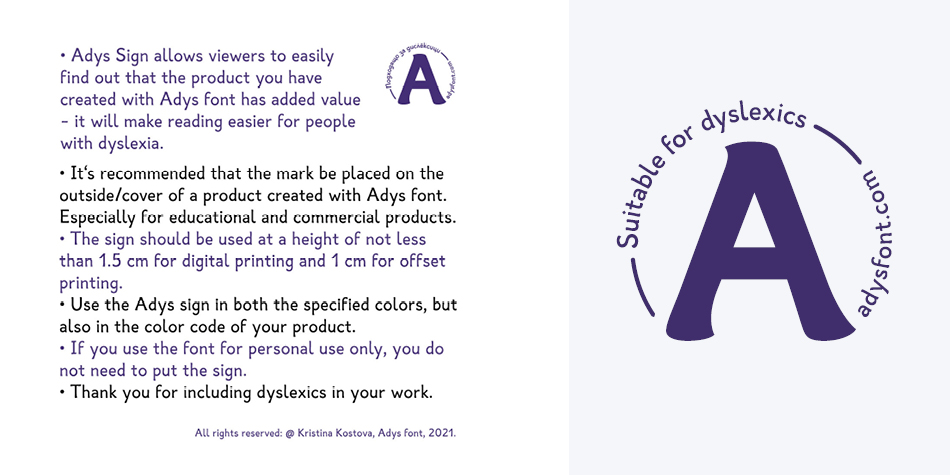
Design, Publisher, Copyright, License
Design: Kristina Kostova
License: Creative Commons Attribution-NoDerivatives 4.0 International License
Download: Language Support (PDF)
Adys in Use
Free License
Download v.5.001: Adys | Google Drive
Commercial License
Where to buy: Adysfont


