

Fontfabric thrives as an independent digital type foundry dedicated to crafting premium typefaces for over 12 years now. Drawing inspiration from both analog and digital typography practices, a compact team of talented designers aims to create future-proof fonts for exceptional projects and leave a legacy for generations to come.
Fontfabric’s story begins in 2008 – a year after Bulgaria becomes a member of the European Union and the efforts to solidify the Bulgarian form of the Cyrillic alphabet as part of the national identity of our country in the EU fall through. Why, in your opinion, was this attempt unsuccessful? What did the Bulgarian form lack, in order to be officially established both locally and internationally?
PM: Perhaps, the cultural and economical weight needed to prove the legitimacy of our intentions wasn’t authoritative enough. Our goal is to revive and continue the life work of Vasil Yonchev, Vasil Barakov, Stefan Kanchev, Boris Angelushev, Kiril Gogov – artists who’ve dedicated themselves, so we can reach our current state of development. We would like to establish the oval Cyrillic as a lasting and sustainable form of our national identity.
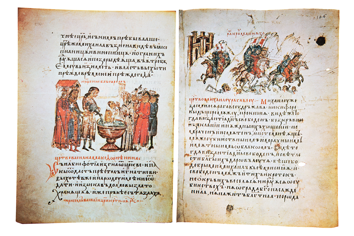
PM: Bulgaria takes pride in its rich history and key role in the emergence and development of the Cyrillic alphabet. It is only natural that we contribute as much as possible. Let us not forget that it was Naum and Clement (the two prominent disciples of Cyril and Methodius) who worked hard on the new script with the blessing of the then Bulgarian ruler Tsar Boris I.
PM: Unfortunately, the government does not express its strong support for this endeavor. It seems there’s no apparent political will. We cannot expect international cabinets to pay attention to the Bulgarian culture if we ourselves do not stand behind these ideas initially. Take the time and visit the website of the Ministry of Culture of Bulgaria and explore its organization and design. Needless to say, all you’ll find is the traditional Russian form of the Cyrillic alphabet, not the Bulgarian.
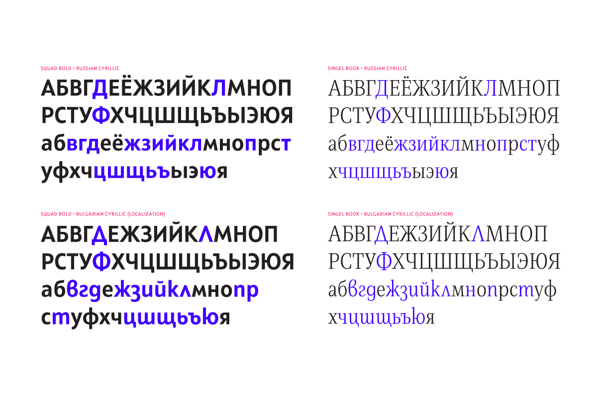
Nonetheless, the oval shape of the Cyrillic alphabet proves to be gaining popularity among designers and developers. More and more printed publications and websites use the Bulgarian form. Additionally, we are regularly asked questions about it and its design features.
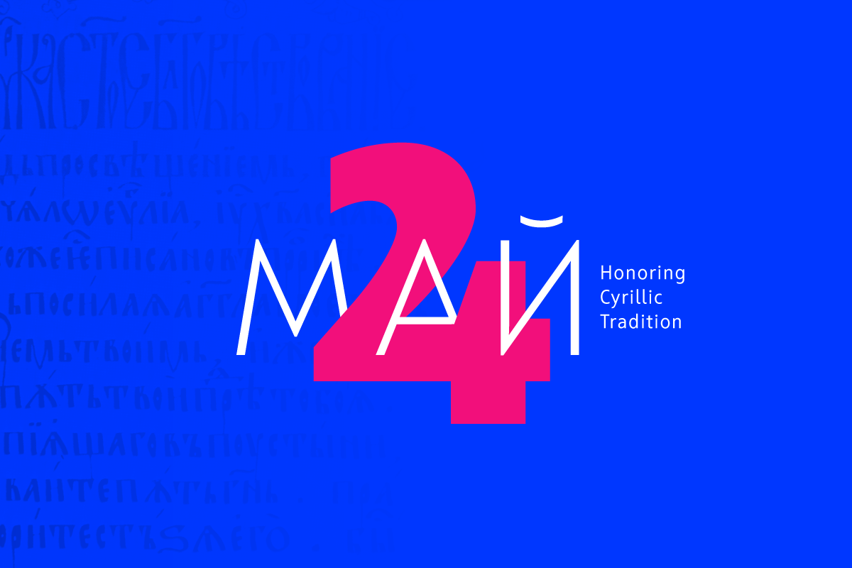
We’ve taken it as our mission to do everything in our power to promote it. Consider taking a look at our brief historical reference dedicated to the Cyrillic alphabet.
SS: I believe that initially, everything follows the “from the inside out” principle. All we have to do is observe where our own country stands in relation to Europe and the rest of the world in the geopolitical context, and we’ll have our answer.
Do we feel courageous enough to put a foot down as a confident republic with a glorious history and infinite potential? If yes, then we would easily seal this identity with the official presence of our oval and aesthetically sound Cyrillic script. Let’s start appreciating ourselves so that we become respected and valued from the outside as well. Preservation and appreciation of our cultural heritage built with the help of the people listed above – that’s the meaning of national self-awareness and self-confidence. Prolonged neglect and indifference to the issue of establishing the Bulgarian form of the Cyrillic script will only take us back – where others are coming from.
Which wave in the history of type art in Bulgaria does Fontfabric represent? How would you situate Fontfabric in the context of type design history in Bulgaria?
PM: Fontfabric is an active participant in the digital revolution, which has affected the font industry irreversibly. The availability of software and market intermediaries such as MyFonts has made type art accessible to a global range of people. All the while, the incredible speed, and accessibility we have today has made type design public and has given designers a direct link to this form of art. Designers, who until recently believed it to be elitist and inaccessible.
SS: I can safely say that Fontfabric set the tone, inspiration, and beginning of the new wave of type designers and studios during the so-called “time of transition” for Bulgaria (the period that began after 1989), also referred to as the digital age, when viewed from a global perspective.
I situate Fontfabric as a bearer of the new, the current, and at times the non-standard. Everyone understands the fast-paced world we live in. The needs and demands of people and businesses change rapidly. Our focus has always been (and will continue so) to transform questions into answers that work in the most beneficial way – both aesthetically and functionally.
Fontfabric has become a kind of incubator for designers with a knack for typography. How do you explain this? Why don’t university graduates who major in related fields of study in Bulgaria look for a way to develop as professional type designers immediately after graduation?
PM: As a person who has recently gone through this exact system, I’ll let my experience answer this for me. Up until 5 years ago, there weren’t many opportunities for graduates to start growing in the field of type design confidently. Even if they had a master’s degree from the National Academy of Arts in Sofia, the path leading into the industry remained rather closed to the outside community.
Fontfabric reveals a successful business model of a Bulgarian company that is well-recognized on an international level. It seems to spark ambition and hope, and we get to meet an increasing number of people who try their luck. However, many do not pay attention to the fact that in order to be sustainable and grow, a company must organize its actions and priorities so that it can generate funds, work with customers, gain their trust, establish itself in the market, etc. This is an extremely difficult undertaking, but Fontfabric is an example that it is in fact possible – the light at the end of the tunnel is already shining upon us.
SS: The very fact that we have an influential brand in the global typography sector, comes quite naturally as a cause for national pride and self-confidence. Or at least that’s how I feel, looking at things from the sidelines now. And even higher in the grand scheme of things come our vision and goals that branch into two main directions – to preach the Cyrillic alphabet in its Bulgarian form, and to ignite the spark in the future generation of type designers. I know many people are looking up to us and this fuels us even further. Consequently, it affects all who are around.
The problem is that the knowledge and ability required to build a typeface is not sufficient to be successful and sell well. We all know that a good dish is cooked diligently and comes as a result of following the recipe with consistency and applying many techniques with precision. Well .. let’s just say that in Fontfabric we are quite the cooks 🙂
Do you have any recommendations you would like to address regarding the Bulgarian education in the fields of graphic and type design?
PM: Some of our current and former colleagues teach at the National Academy of Arts. I definitely believe that this is a place where one can develop, as long as one has the aspiration and the will. Good knowledge in the field of typography can also be acquired in universities such as the New Bulgarian University and SoftUni.
We are frequent guest lecturers in a number of Bulgarian universities. I want to emphasize that the mission is possible even if one learns from books, blogs, resources, and attends various workshops, such as the ones we organize every year. We are planning on more advanced programs related to training and type design, so make sure you follow our activities.

SS: My advice is, along with the traditional studies and the basics of typography, to offer more freedom to the individual artist – the one that lives in every single person. Let students be encouraged to find their way to more non-standard and unique letter shapes. Each new font carries its own spirit and personality. There are many and varied forms of letters that can be used as a basis of standard sans and serif designs, but also look different enough, interesting, and atypical. If there are five or ten type students, then let everyone start a graduation project in a different style. This way, they will enrich each other in the end – through their own experience and the paths taken from the others.
Fonts are business products, but they are also the embodiment of the cultural and aesthetic pursuits of the time. How do you view this complex relationship between the two aspects of the font? Aren’t we “overdesigning” typefaces today to make them more business-oriented? What is missing in the kaleidoscope of fonts in Bulgaria?
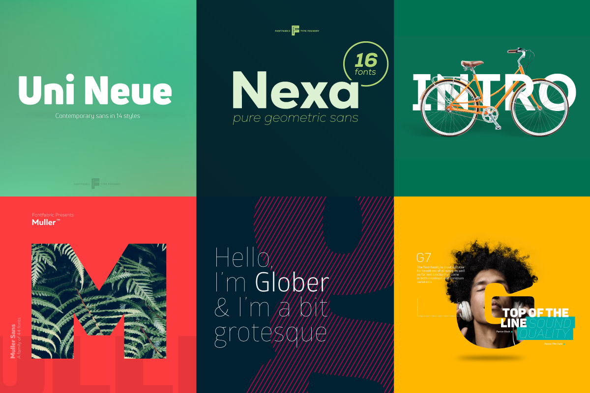
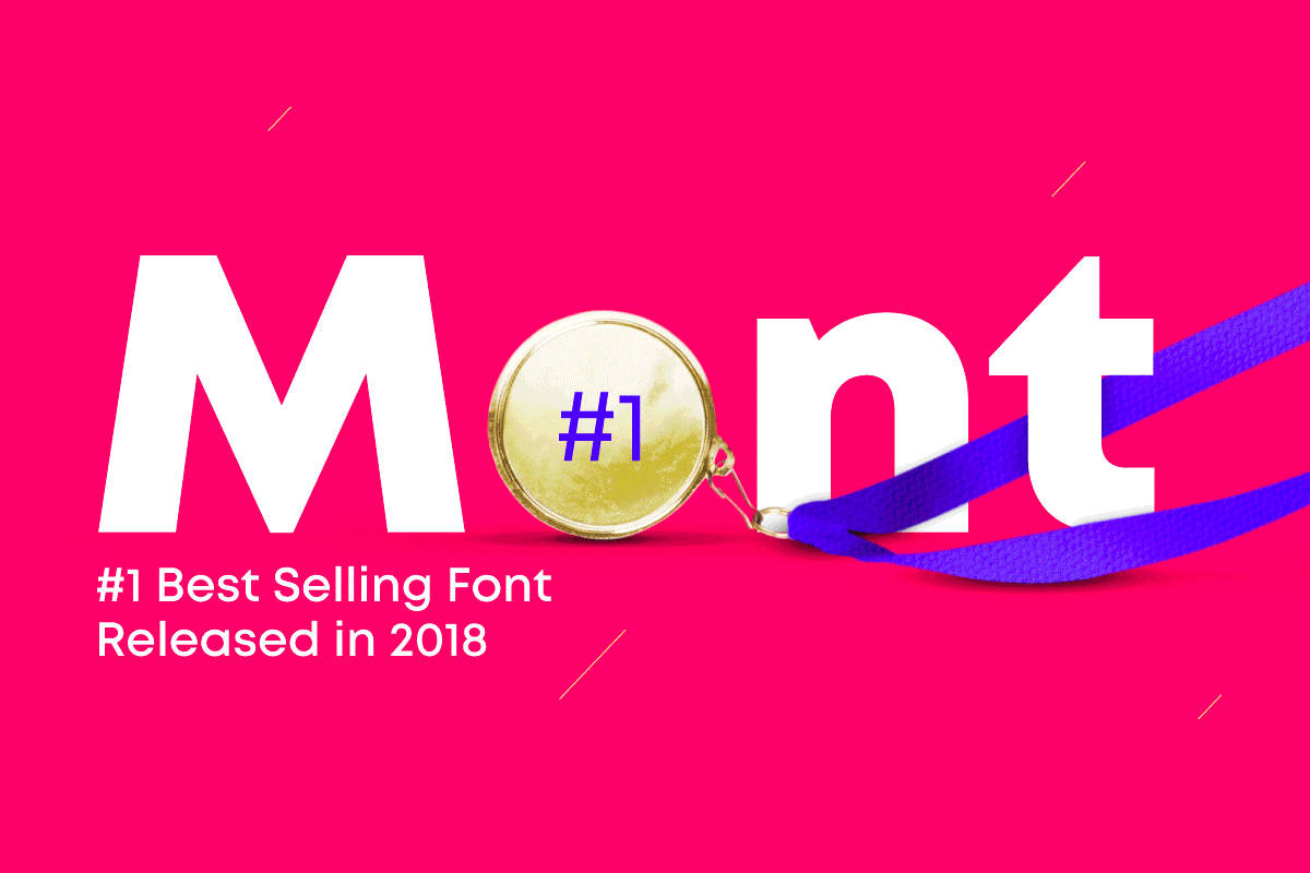
PM: The balance between business projects and ones with a more creative purpose is the essence of remaining relevant today. We execute both successful bestsellers like Nexa, Intro, Mont, and free RND projects like 36 Days of Type, Colus or Slovic, which was one of the first variable fonts of its time.
Many directions and opportunities are present for the development of fonts in our country. There has been a state of artistic weightlessness for about 30 years between the end of the XX century and the beginning of the XXI century. I’m missing revivals of original Bulgarian works. I encourage anyone who is willing to collaborate to contact us.
SS: This basic law will always lead and run a business – demand determines supply. Looking back at the path I have personally taken as an artist and designer, things have moved from unconventional and unique creative projects to increasingly commercial, functional, and usable typefaces that sell well. And there is nothing wrong with that. It’s what happens when a person chooses the type endeavor as his business and wants to build a solid team of professionals over time. It requires a stable business model and a good income, there’s no other way.
That said, one of my main goals and aspirations now is to make and produce a more non-standard and unique-looking, influential typography. Something that uses the power and capabilities of evolved technology, combining and transforming tradition, heritage, history in a modern and innovative way.

What are the future plans of Fontfabric? What medium-term and long-term goals are yet to be achieved?
PM: Fontfabric is transforming from a studio that designs and distributes typefaces into one that consults and works closely with its clients. We partner successfully with businesses, studios, and agencies from Bulgaria and abroad. These vary from corporations such as Telenor, Lipton, Polpharma, Axel Springer, to cultural institutions such as the House of Humor and Satire in Gabrovo.
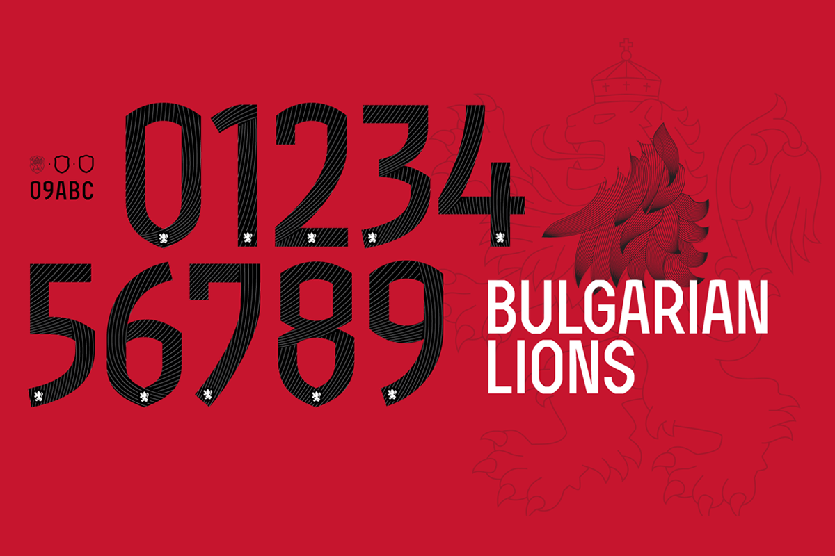
Recently we had the opportunity to design a font for the Bulgarian national football team. We send our gratitude to the marketing team of Cauza.bg and the Bulgarian Football Union for the trust.
In an even broader sense, Fontfabric is increasingly becoming a training platform. We aim to provide quality content on our blog as well as on our social networks.
We also run training workshops that attract a lot of interest and prove to be very successful. It’s definitely in our plans to develop this activity further. And we won’t be stopping there.
SS: More or less the answer lies in my previous statements. We grow and develop with each passing day. My dream is to one day see Fontfabric as the embodiment of everything we have always sought, thought, and imagined the studio will become. The bigger and more implemented this dream, the more reasons for inner satisfaction from a job well done and feeling that it was all worth it. Something that originated here in Bulgaria will be enjoyed and rediscovered by hundreds of thousands, even millions of people every day, and which we’ll leave as a testament to future generations.
Explore Fontfabric and their activities:
FONTFABRIC BEHANCE LINKEDIN FACEBOOK INSTAGRAM
Editor
![]()
Stefan Peev
graphic designer and typographer from Bulgaria


