(Vox-ATypI classification)
Classicals
Wikipedia
Extract
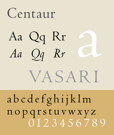
Humanist, humanistic, or humanes include the first Roman typefaces created during the 15th century by Venetian printers, such as Nicolas Jenson (hence another name for these, Venetian). These typefaces sought to imitate the formal hands found in the humanistic (renaissance) manuscripts of the time. These typefaces, rather round in opposition to the gothics of the Middle Ages, are characterized by short and thick bracketed serifs, a slanted cross stroke on the lowercase ‘e’, ascenders with slanted serifs, and a low contrast between horizontals and verticals. These typefaces are inspired in particular by the Carolingian minuscule, imposed by Charlemagne during his reign of the Holy Roman Empire.
Examples of Humanes include Centaur and Cloister.
Wikipedia
Extract
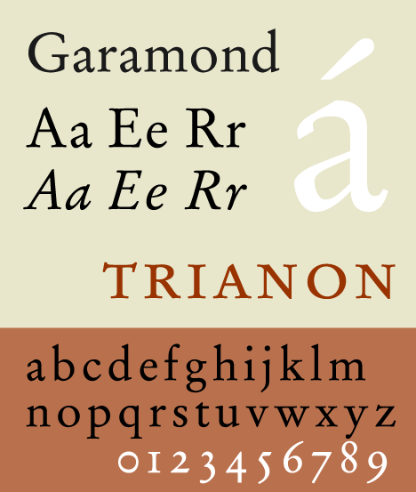
Also called Aldine, this group is named in homage to Claude Garamond and Aldus Manutius. In general, the garaldes have finer proportions than the humanists, and a stronger contrast between downstroke and upstroke. The weight of the garaldes are distributed according to an oblique axis. In France, under King Francis I, the garaldes were the tool which supported the official fixing of grammar and orthography.
Examples of Garaldes include Bembo and Garamond.
Wikipedia
Extract

The transitional, realist or réales are the typical typefaces of the traditional period, particularly embodying the rational spirit of the Enlightenment. Contrast between main and connecting strokes is marked even more than in the first two groups, weight is distributed now according to a quasi-vertical axis. The realists are the result of the wish of Louis XIV to invent new typographical forms, on the one hand to find a successor of the Garamond, on the other
Wikipedia
Extract

hand to compete in quality with the different printers of Europe. The term realist is unrelated to the artistic movement realism, and derives from the Spanish for “royal”, because of a typeface cast by Christophe Plantin for King Philip II of Spain.
Examples of realist typefaces include Baskerville, Times Roman, and other contemporary redesigns of traditional faces.
Moderns
Wikipedia
Extract
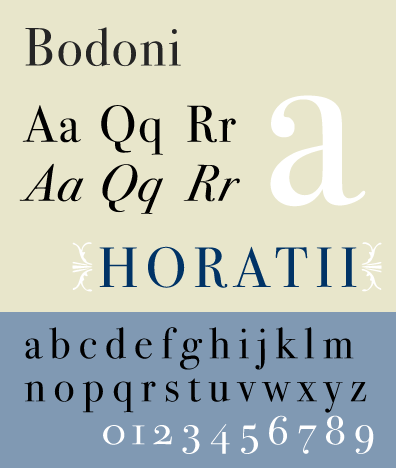
The Didones or modern typefaces draw their name from the typefounders Didot and Bodoni. These typefaces, dating from the end of the 18th and the beginning of the 19th century, make a very strong contrast between full and connecting strokes (the connecting strokes being extremely fine), the verticality of the characters and their unbracketed, hairline serifs. They correspond to the Didot of the Thibaudeau classification. The didones in particular made it possible for the First French Empire to employ typefaces very different from the typefaces used by the kings from the Ancien Régime.
Examples of Didones include Bodoni and Walbaum.
Wikipedia
Extract

Also called mechanical, slab serif, or mécanes, the name of this group evokes the mechanical aspect of these typefaces, which coincide with the Industrial Revolution at the beginning of the 19th century. The principal characteristics of these typefaces are a very low contrast and rectangular slab serifs. They correspond to the Egyptiennes of Thibaudeau classification. This category includes both typefaces with bracketed serifs (clarendons or ionics) and typefaces with square or unbracketed serifs (egyptians).
Examples of mechanical typefaces include Clarendon, Egyptienne, Ionic No. 5, and Rockwell.
Lineal
Lineals, or linéales, combine all typefaces without serifs (called sans-serif, gothic, or grotesque), all of which correspond to the Antiques of the Thibaudeau classification. The British Standard 1961 broke this group into 4 subcategories: Grotesque, Neo-Grotesque, Geometric, and humanist.
Wikipedia
Extract

Grotesque typefaces are sans serif typefaces that originate in the nineteenth century. There is some degree of contrast between thick and thin strokes. The terminals of curves are usually horizontal, and the typeface frequently has a spurred “G” and an “R” with a curled leg.
Examples of grotesque lineal typeface include Headline, Monotype 215, and Grot no. 6.
Wikipedia
Extract

Neo-grotesque typefaces are derived from the earlier grotesque faces, but generally have less stroke contrast and a more regular design. Unlike the grotesque, they generally do not have a spurred “G”, and the terminals of curves are usually slanted. Many neo-grotesque faces have a large degree of subtlety and variation of widths and weights to accommodate different means of production (Hot type, foundry type, phototypesetting, see History of typography, 20th century). “Realist sans-serif” is a commonly encountered synonym for neo-grotesque.
Examples of neo-grotesque lineal typeface include Helvetica and Univers.
Wikipedia
Extract

Geometric typefaces are sans serif faces constructed from simple geometric shapes, circles and/or rectangles. The same curves and lines are often repeated throughout the letters, resulting in minimal differentiation between letters.
Examples of geometric lineal typefaces include Eurostile and Futura.
Wikipedia
Extract

Humanist typefaces, instead of deriving from the 19th century grotesque faces, relate to the earlier, classical handwritten monumental Roman capitals and a lowercase similar in form to the Carolingian script. Note that the term “humanist” is being used here in combination with lineal to create a subcategory, and these typefaces only slightly resemble those in the humanist serif category.
Examples of humanist lineal typefaces include Gill Sans and Optima.
Calligraphics
Wikipedia
Extract

The glyphic, incised, or incise are typefaces which evoke the engraving or chiseling of characters in stone or metal, as opposed to calligraphic handwriting. They thus have small, triangular serifs or tapering downstrokes. There is usually a greater emphasis on the capital letters in glyphic typefaces, with some faces not containing a lowercase.
Examples of glyphic typefaces include Albertus, Copperplate Gothic, and Trajan.
Wikipedia
Extract
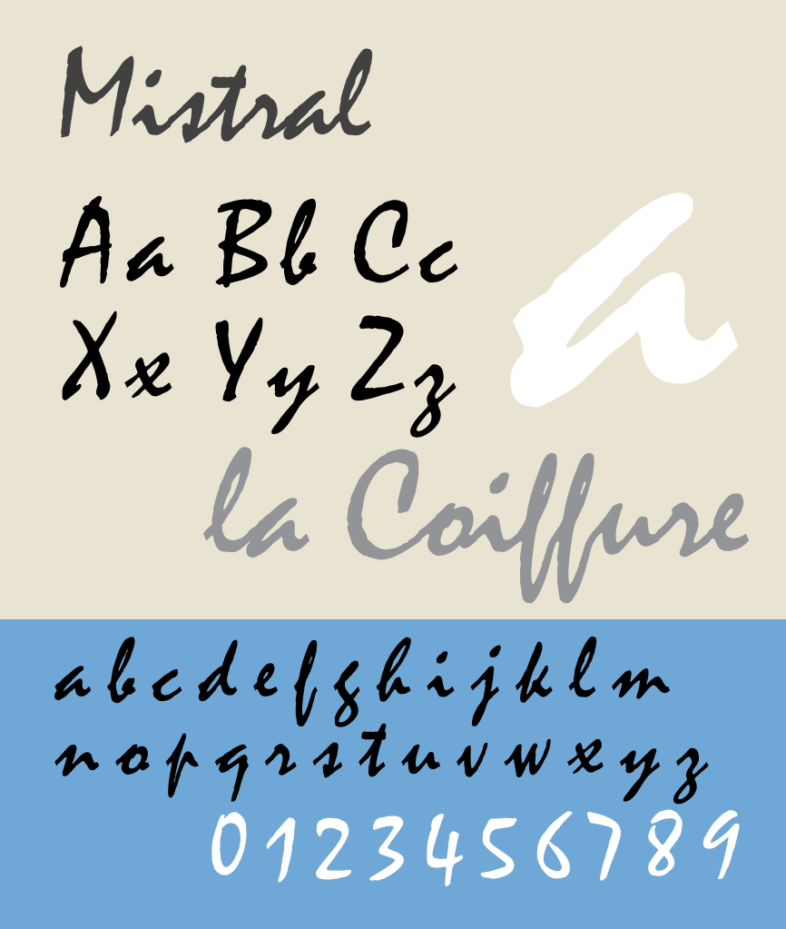
The scripts or scriptes include typefaces which evoke the formal penmanship of cursive writing. They seem to be written with a quill, and have a strong slope. The letters can often be connected to each other. Typefaces imitating copperplate script form part of this family. Scripts are distinct from italic type.
Examples of script typefaces include Shelley, Mistral and Francesca.
Wikipedia
Extract

The graphic, manual, or manuaires, are based on hand-drawn originals which are slowly written with either a brush, pen, pencil, or other writing instrument. These typefaces generally do not represent writing, and are not intended for body text, but instead display or headline purposes.[9] Vox originally included the blackletter and uncial faces in this categorization.
Examples of graphic typefaces include Banco and Klang.
Wikipedia
Extract

The original Vox classification contained the above 9 groups. ATypI added two more classifications, the blackletters and the Non-Latins. The blackletters or fractures, which Vox included in the graphics, are characterized by pointed and angular forms, and are modeled on late medieval hands written with a broad-nibbed pen.
An example of a blackletter typeface is Fraktur.
Wikipedia
Extract

Gaelic type was added to the classification at the AGM of the Dublin meeting of ATypI, on 12 September 2010.
Non-Latin
This heterogeneous family, not included in the original 9 Vox groups, gathers (without distinction of style) all writing systems not based on the Latin alphabet: Greek, Cyrillic, Hebrew, Arabic, Chinese, Korean etc. English printers traditionally called these exotics.


