

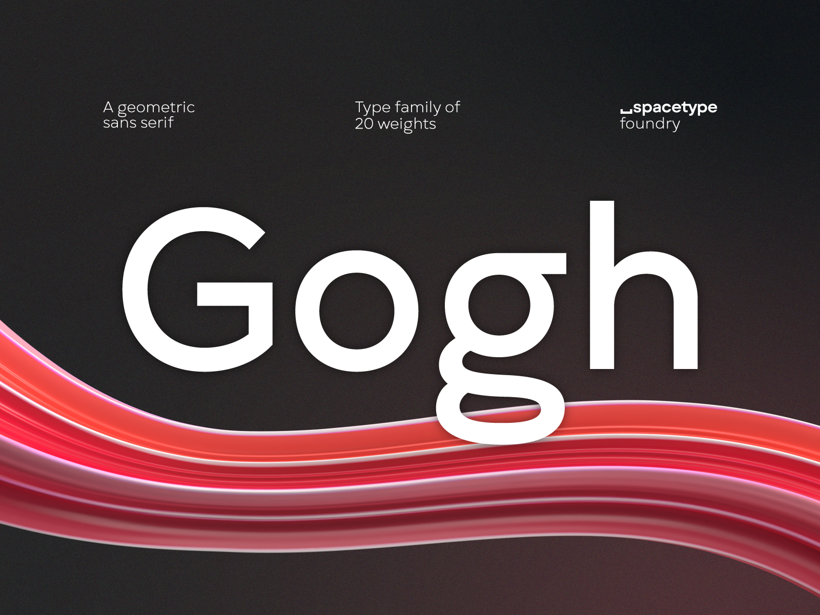
How is the Gogh font different from your other fonts and in what design context can be used?
SP: We believe that type designers need to create products that they themselves would use. As we work on many other projects, we wanted a font that can be easily used in many contexts. This is how the font idea was born. We wanted it to be easily readable and at the same time usable for headlines.
MB: We were inspired by the many similar fonts around the world and in Bulgaria. Gogh is our version of a geometric san serif font like Gotham, Gilroy, Futura, Nexa, Avenir. We wanted the typeface to be easily readable and at the same time to have a distinguishable character from the other fonts on the market.
We have developed one more stylistic set of Gogh, which will significantly change the appearance of the font and will make it suitable for contemporary display compositions.
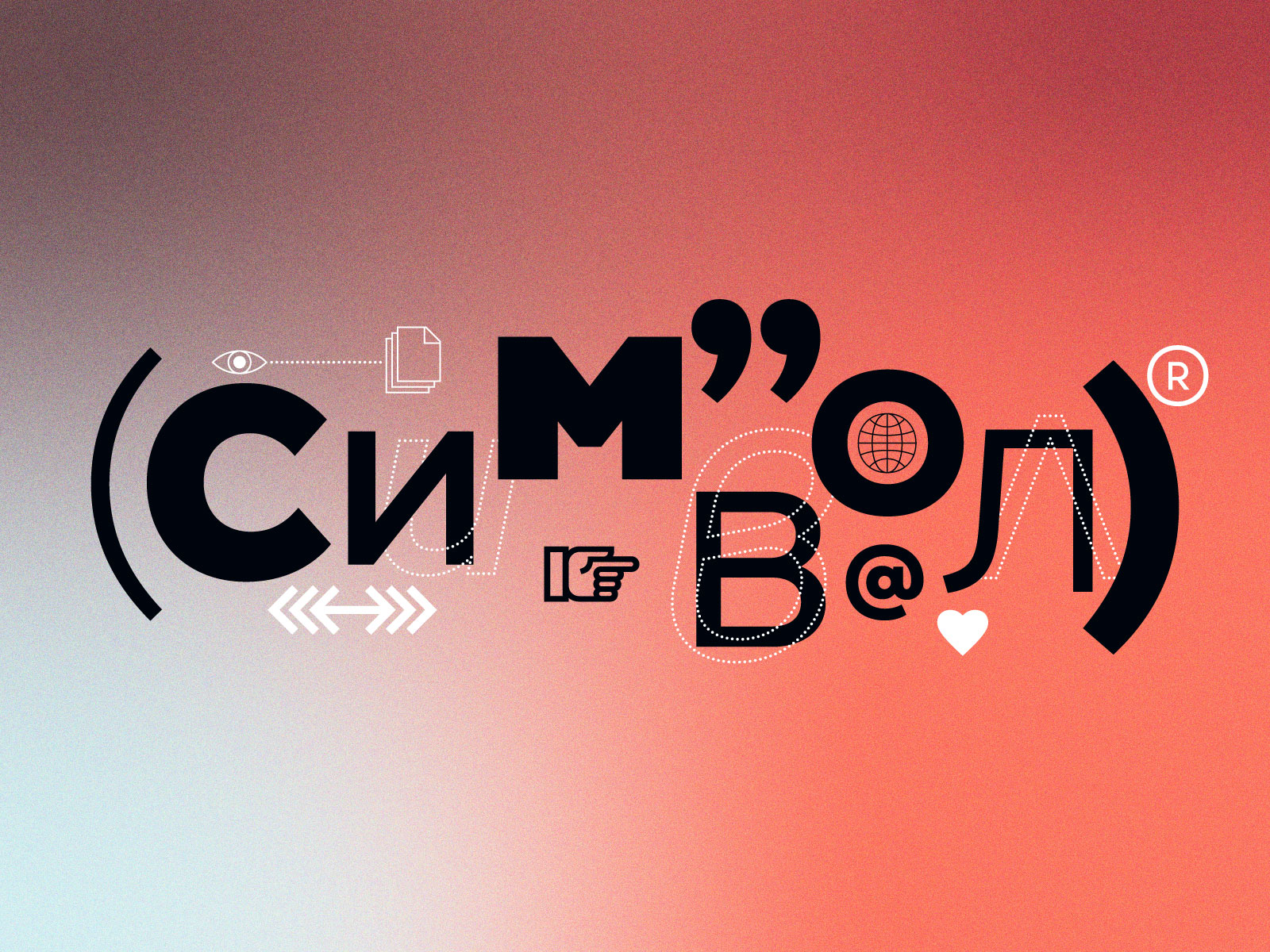
How do you evaluate the type font design and the Bulgarian Cyrillic type form at the beginning of our century?
SP: We believe that in general we are heading in a very positive direction. We see that the Bulgarian letterforms is something that people have started recognizing more and more, and there’s more interest amongst designers who are looking for fonts that contain the Bulgarian localization.
More and more type design studios are including the Bulgarian letterform in their glyph sets. We are happy that this trend is not something that we see only in Bulgaria, but also abroad.
MB: We are optimistic that with time the broader audience will also notice the difference between the Bulgarian letterforms and the Russian ones. For this to happen, the design community needs to be persistent.
How would you describe your type design philosophy – as a process, as a realization and as principles? What is the most important thing for a font?
SP: As with most things in life, the process is very subjective. We are trying to create fonts that we would use as designers.
Creating a font takes months, sometimes even years. Each project has a different purpose and we approach it differently, according to the desired final result.
In summary, for us, the most important thing is the product to be visually appealing and technically sound. Of course, having fun during the process is also essential for a successful result.
Is the font taste of the Bulgarian audience constantly changing? How do you see the usage of fonts in the packaging industry, creating commercial brands and corporate identity?
SP: The truth is that the mass audience does not have any specific opinion towards fonts. And I find this normal. In the end, the role of a typeface is not to be noticed, but to have more of a supportive role, to help the designer express the emotion of the text – serious, funny or neutral. It should attract attention, or on the contrary, completely merge with the paragraph.
In Bulgaria, there are examples of both successfully and not that successfully used fonts. We hope that in the future we will see less of the latter.
When do you consider a font not successful – what are the main most popular design errors that we should avoid when choosing a font for a project?
MB: First of all, the designer needs to make sure that a font has been used correctly. Does it convey the desired emotion that we mentioned above? We would advise people who do not have a lot of experience with fonts to look at its description, as often it contains useful information about the most appropriate usage of a font.
Are free fonts a threat for the development of type design?
MB: On the contrary, we believe that they are useful for type and graphic designers. Each font has its purpose and the free fonts are not an exception.
We also work on a few free fonts at the moment, which allows us to distract ourselves from the larger projects.
I would like to highlight that the free fonts are often not as well developed professionally as the paid ones.
What role does type design play in the development of the modern esthetic taste and feel?
SP: The formation of esthetic taste and feel is a multi-layered process. A well-chosen typeface would definitely improve the environment and would influence it positively. However, this is a long process that is unique for each nation. I think what is valuable in Bulgaria, is that a typeface could not only have visual characteristics but also carry within it history and identity – things that we are trying to develop and preserve.
Editor
![]()
Stefan Peev
graphic designer and typographer from Bulgaria


