Technique and Theory
- Should curved strokes end at the same height?
- Horizontal stroke in Latin Extended characters
- “French” apostrophe?
- Macron on Top
- The difference between Serbian and Macedonian Cyrillic Script
- Franc currency symbol
- It's not a perfect ellipse, why?
- Which letters to design first to base others off of it?
- Private Use Area for ligatures and alternates
- Giving PUA code points to alternate glyphs is bad practice
- Left alignment of accented Greek uppercase letters
- Extended Cyrillic breve form?
- Proper way of designing the “@” symbol
- Should designers care about typographic mistakes
- Tcomma and Tcedilla
- Units per em
- Which dot character to use in which context
- Positioning of the diaeresis/tréma/umlaut
- Thorn and eth: how to get them right
- Notes on type design
- Some type designs
- Positioning the traditional cedilla
- Cedillas and commas below
- Problems of diacritic design for Latin script text faces
- Balancing typeface legibility and economy: Practical techniques for the type designer
- On diacritics
Multi-lingual / multi-script typefaces
Scott-Martin Kosofsky
As someone who works daily with books that involve as many as four or five scripts (and their weights and italics and small caps, where applicable), I can tell you that using fonts in which multiple scripts have been loaded can create more problems than they solve, and take more time than when the fonts are individual. This is especially true when one of the scripts is right-to-left and another is left-to-right.
A very long glyph palette can be clumsy and tiring to use, and switching text direction and keyboard layout is more time consuming than switching fonts. This is especially true when the scripts are combined within single paragraphs.
If the work at hand is typesetting, say, food contents labels, working with a clumsy overloaded font is a chore you can live with, but with more extensive work, such as a book, it can be a curse. Having a Latin set along with another script is often a necessity, but you needn't use it as your primary Latin. In a structured document, in which good use is made of paragraph and character style sheets, switching fonts is no problem at all, and keeping the fonts separate makes editing much easier and faster.
Moreover, I find that most makers of multi-script fonts make decisions regarding relative character height based on ignorance or convenience (e.g., hinting zones), not on what more knowledgeable people might consider best typographic practices, and so the purported advantage of equal weights by size (which is not always desirable) becomes a false one in the end.
Source: TYPEDRAWERS
x-height + descender = cap height
John Hudson
For traditional text faces, I use a simple rule: x-height + descender = cap height. Ascender height is basically stylistic, i.e. it can vary pretty freely depending on the style of type and the effect one wants to achieve in text. But the relationship of x-height and descender height to cap height is foundational. Interestingly, I didn't start from this idea, but realised it after noting that my inverted exclamation mark always fit perfectly into the x-height and ascender: I was doing it intuitively.
Source: TYPEDRAWERS
FontLab Error: invalid first character in name (text was ".null")
Karsten Luecke
If you generate OTF fonts (with PostScript outlines): only '.notdef' must be present, but not '.null' and 'CR'.
If you generate TTF fonts (or OTF with TT outlines): '.notdef', '.null' (unicode '0000'), 'CR' ('000D') and 'space' ('0020') should be the first four glyphs in your font, in this order. To reorder them, set the Font Window to Index Mode, then pull the glyphs the the correct place.
What I meant was, make sure '.null' is not mentioned in any feature.
Source: TPHL
Glyph Naming Conventions
OpenType.tools
In order to have a glyph included in a feature, make sure you name the glyph with an appropriate suffix or ending. For example, to have your small capital glyphs used as replacements for lowercase letters in the smcp feature, name your glyphs a.smcp, b.smcp, c.smcp, etc. Suffixes containing multiple feature tags are supported and processed as best as possible. For example, a glyph named R_A.dlig.swsh would generate a rule under the swsh feature to substitute it for R_A.dlig as well as a rule under the dlig feature to substitute it for R.swash A. The table below shows what suffixes and endings are recognized by the system and used in generating OpenType features.
Source: OpenType.tools
Source: Typedrawers: Collecting (glyph name) suffixes
Source: Font Development Best Practices: Glyph Naming
Online Font Testing Tools
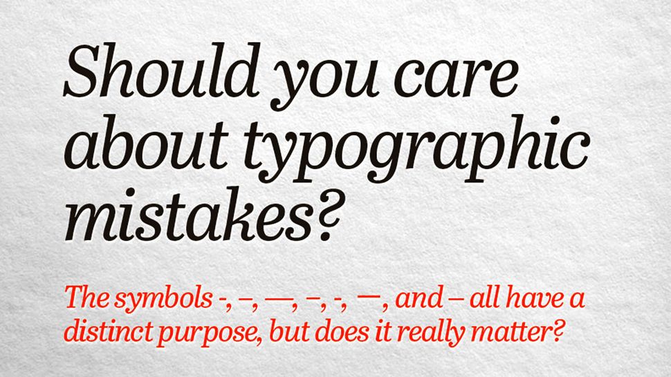
Should designers care about typographic mistakes?
By Christopher Phin
Extract from an article
Regardless, people might choose to use a simplified system of typography. Smart quotes, for example, will of course break HTML (another score for Markdown, which doesn’t use quotes in its syntax). It’s also not unheard of for coders to denigrate richer typography even in content (as distinct from the back-end that powers it) and for them to brow-beat writers and editors into adopting simplified typography. That’s either because they don’t understand or value typography, or because they’re not motivated to support rich character sets such as UTF-8, despite it being part of the HTML spec since 1997’s 4.0 declaration.
Ultimately, though, the gradual abandonment of some of the established typographic conventions isn’t down to technological constraints. It’s because many people aren’t even aware they’re doing things ‘incorrectly’. After all, Unicode, a global perspective, the increasing pressure on foundries to make fonts with rich character sets, and capable tools mean that we can do proper typography with relative ease these days. But if you don’t know that you should write £29·99 instead of £29.99, that 90º is wrong but 90° is right, or that there’s a proper character for inches – 12″ rather than 12″ – then even though modern systems make it possible to enter them, you won’t.
There are fewer old hands around to educate, and with a move away from print to the brisk, throwaway nature of much of the internet, not only are typographic traditions being abandoned but fewer and fewer people even realise it.
So what? you might ask. Like with grammar, even if it’s wrong, your meaning is usually clear; nobody will think ‘90º’ doesn’t mean ‘ninety degrees’ just because it uses the wrong symbol, just as “I ain’t done nothing” can be clearly understood even though it technically means the opposite of what it says it does.
Maybe so. But quite apart from the satisfaction that comes from doing things right, there is a cost in the future, too. Good typography, like good grammar, isn’t a frivolous decoration, there to constrain your meaning. It’s there to make your meaning unambiguous. Take, for example: 3 1/2″. It’s supposed to say three and a half inches, and since we humans are good at decoding the world we can read it as such, but you could also read the numbers as ‘three, space, one or two’. And that mongrel of a double-quote glyph could signify any manner of things. Write 3½″, however, and not only is it easier to read now, but it will be easier to read in the future, by computers, which lack our intuition and fuzzy logic, as well as by humans.
Honouring typographic conventions like this is thus a kind of metadata, and “metadata is a love note to the future”.
ITSVERYHARDTHESEDAYSTOREADTEXTWHICHISSETLIKETHIS. But mix robust standards such as UTF-8 with established, hard-working typographic conventions today, and as well as looking beautiful and honouring the traditions of typography, you’ll ensure text is readable long into the future.


