
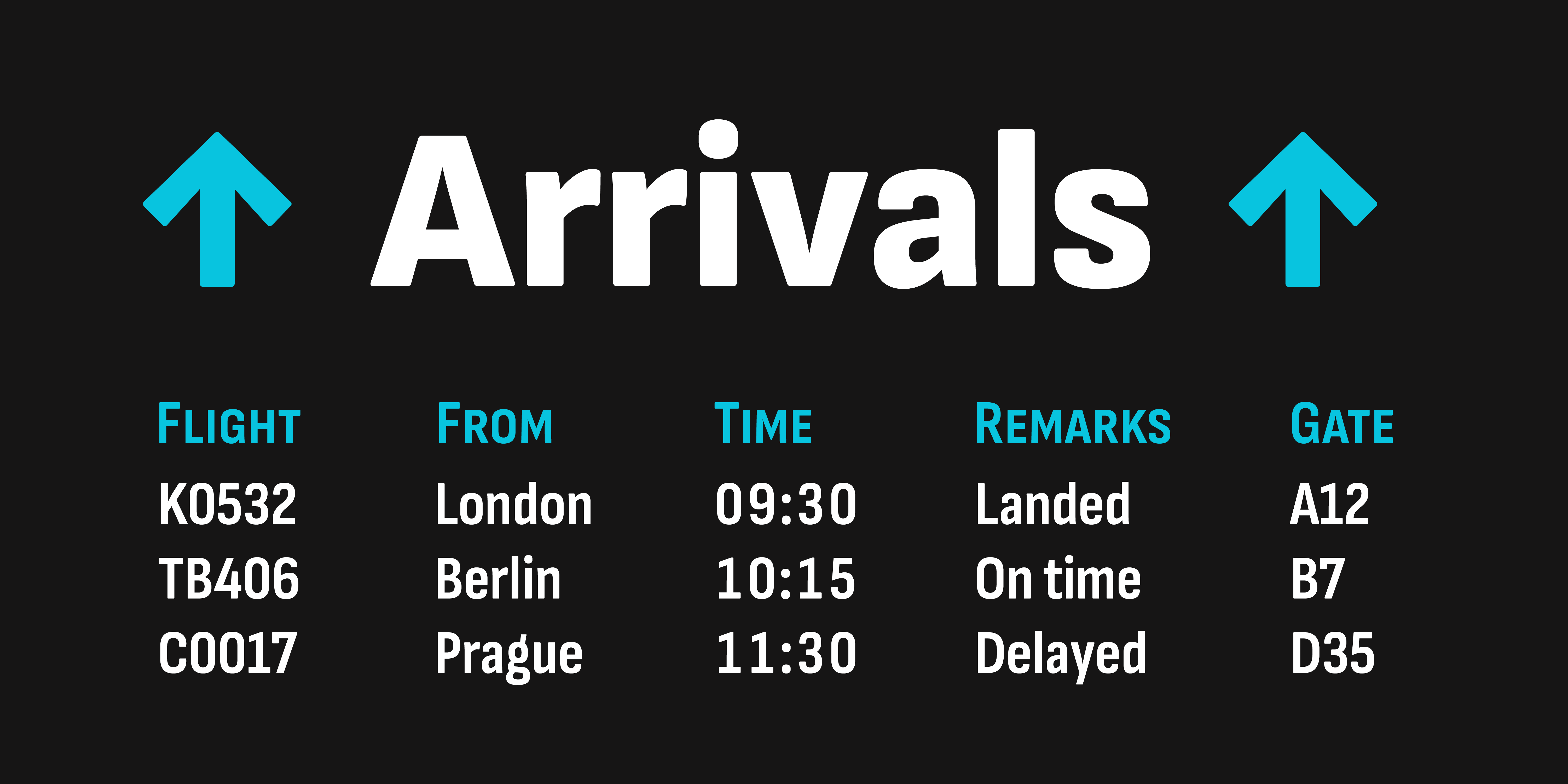
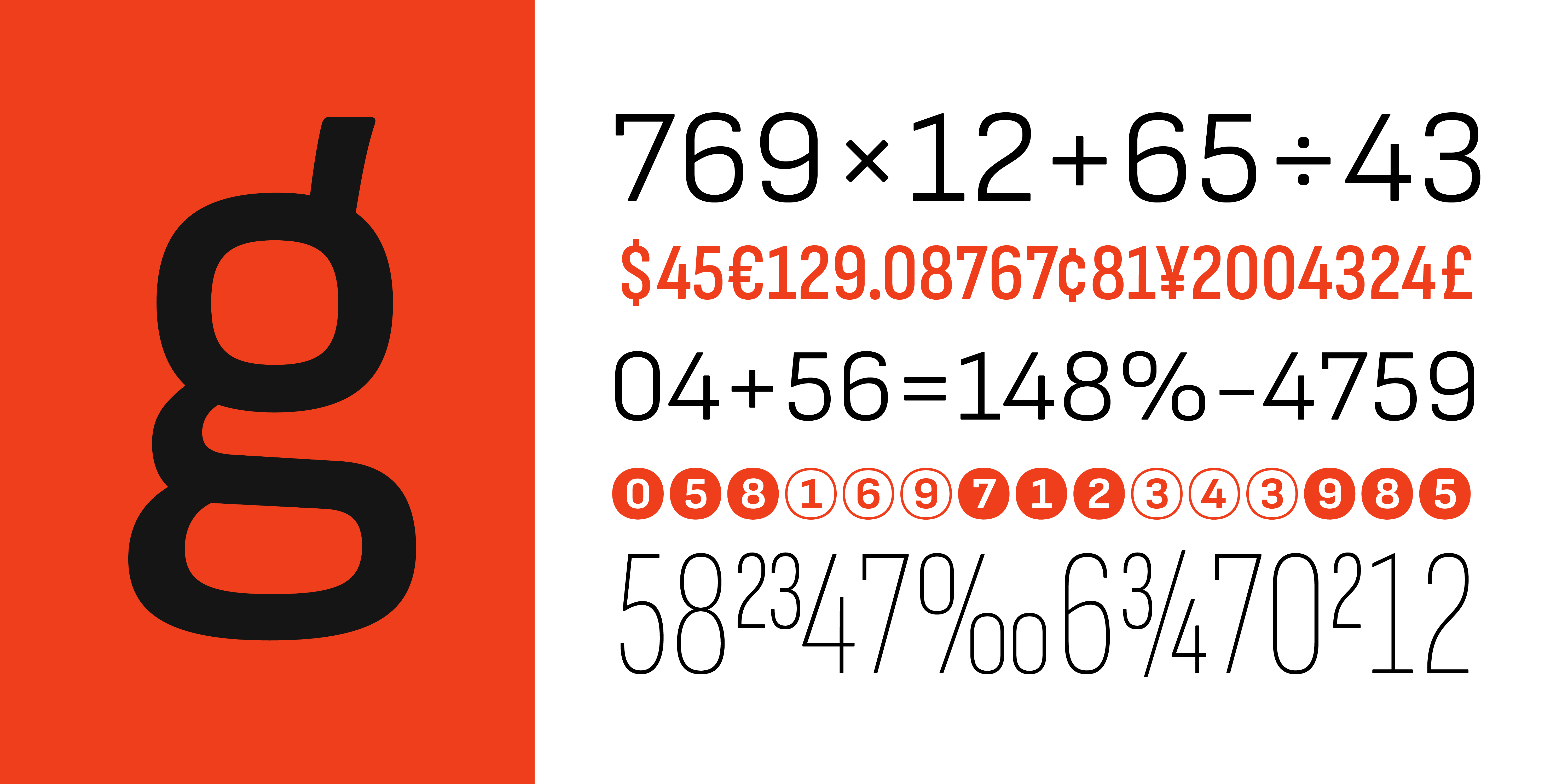
The story of Sofia Sans started with a phone call from Filip Boyadjiev, a colleague of ours and Ani Petrova’s former fellow student at the National Academy of Art Sofia. At the tail end of 2017, Boyadjiev informed us that his studio Fullmasters had been hired to develop a wayfinding system for helping visitors navigate Sofia’s tourist sights and attractions. That year, the Bulgarian capital had reached second place in tourism growth among European cities. The wayfinding system required a feature-rich OpenType family with a large character set including small caps, several figure styles, arrows, numerals in circles, etc. Most importantly, the fonts needed to offer support for Bulgarian Cyrillic, as all text was to be set in both Latin and Cyrillic.
Because of the modest budget and short deadline, creating a new type family from scratch for this purpose was not feasible. Fortunately, we had a viable candidate that we could expand to meet the project’s requirements: Attractive. The story of this humble font began with another phone call and a simple question. Earlier in 2017, my Bulgarian colleague Ani had asked me: “Why don’t we make a free font? A nice one, not a quick and dirty one! And let’s share it with the world.” A tiny seed was planted, but little did we know how big the project eventually would grow.
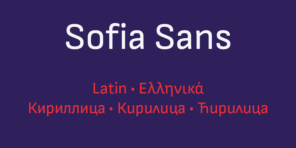
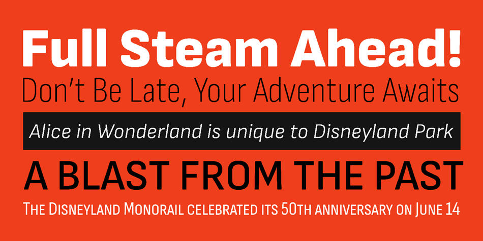
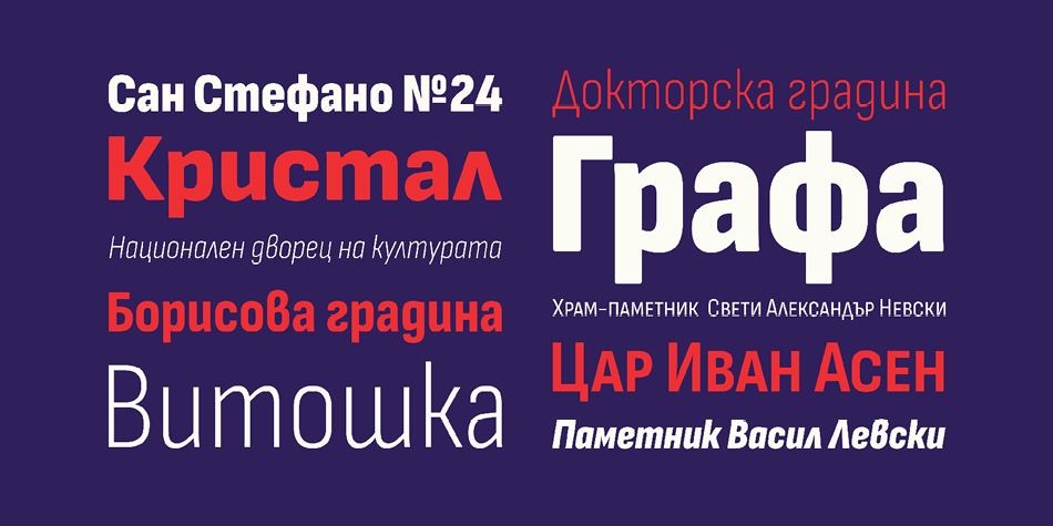
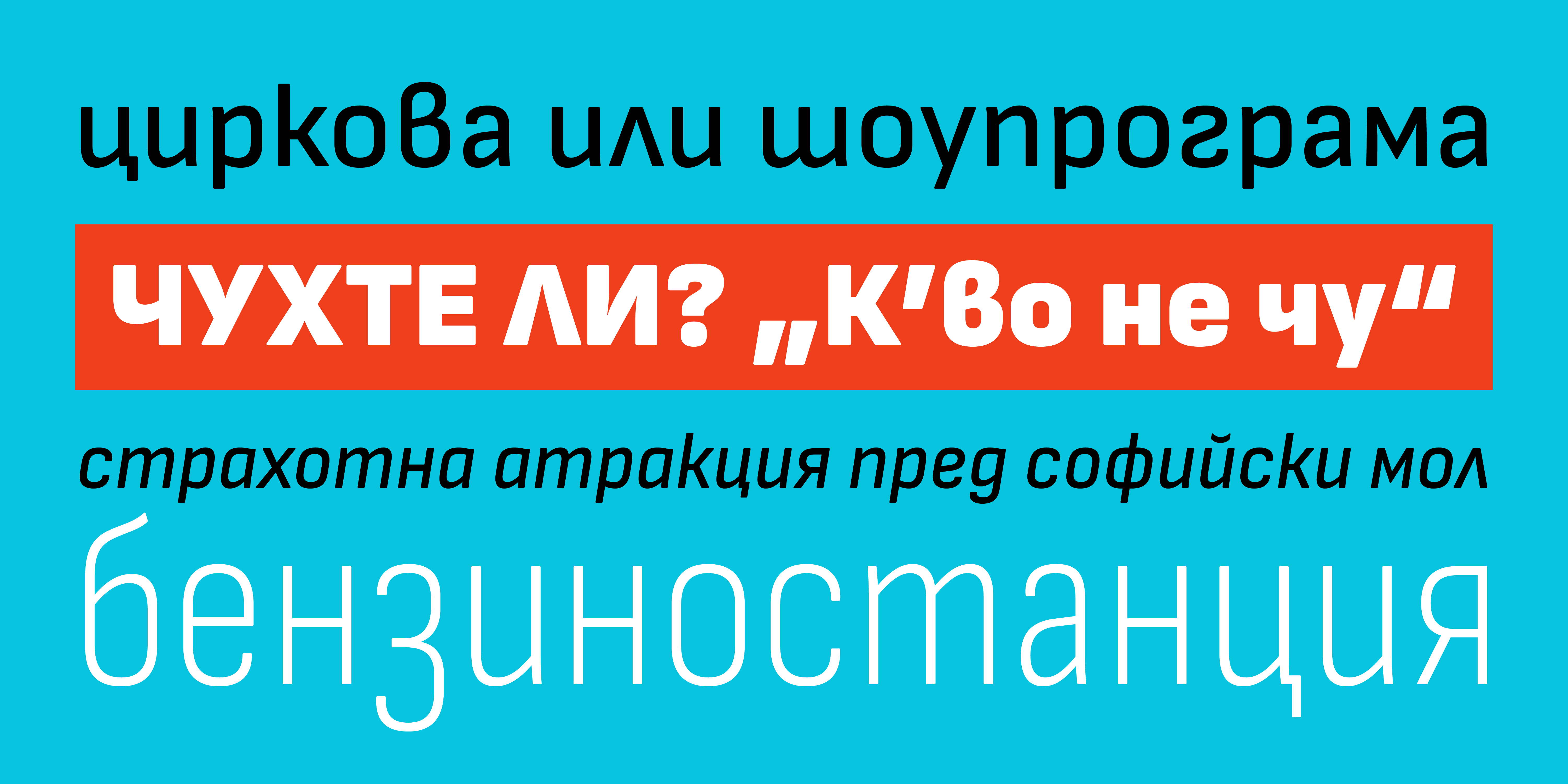
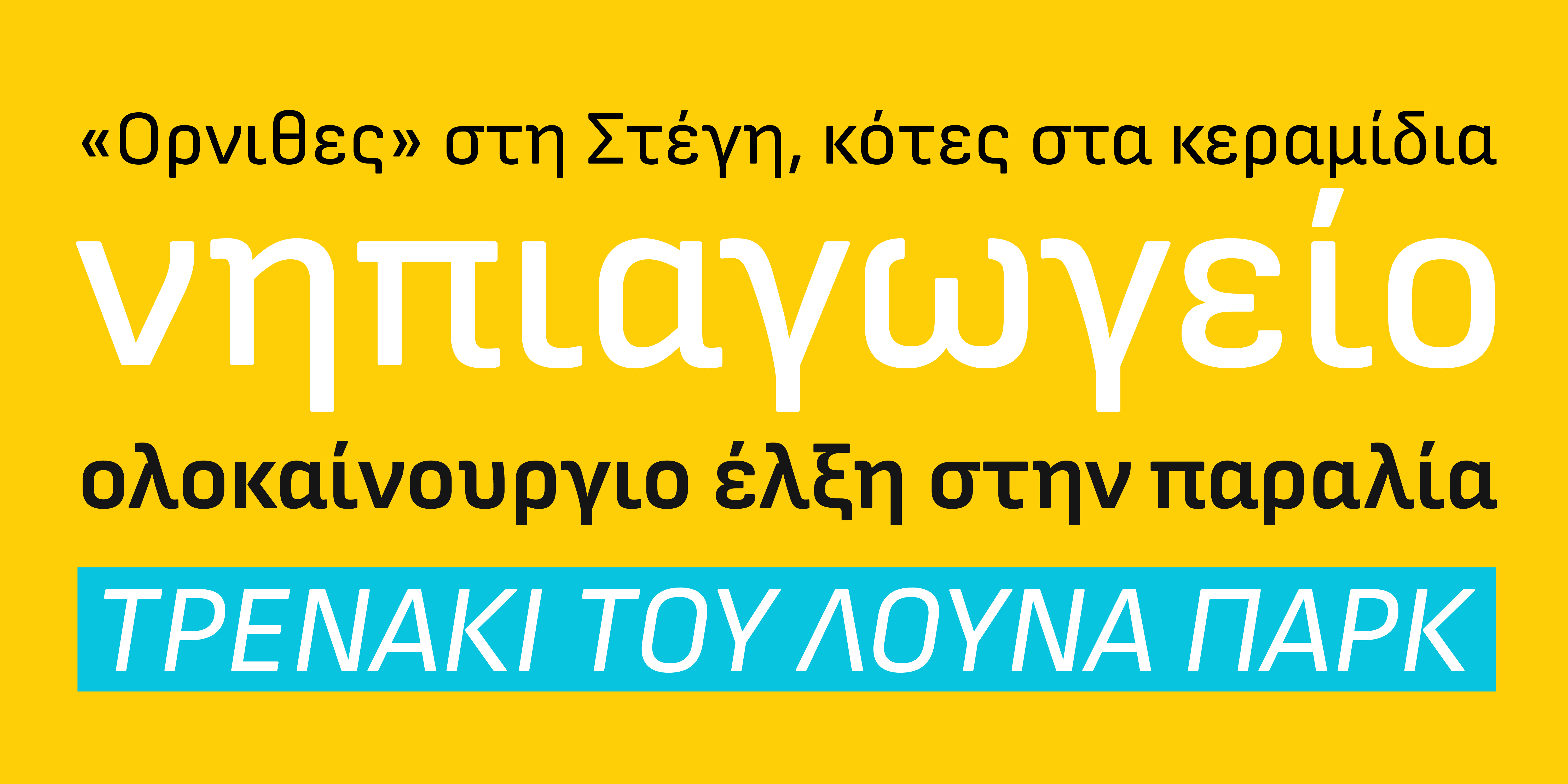
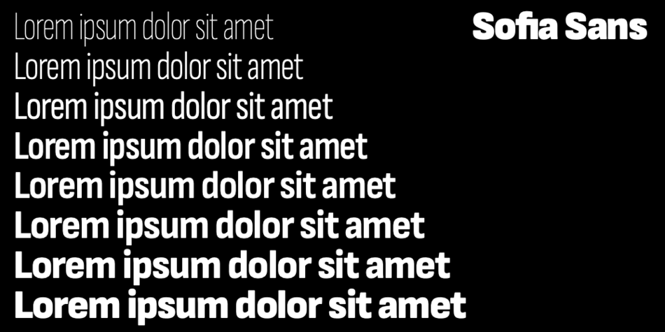
First, we needed to decide which kind of typeface to create. Going through potential type styles, we settled on a straight-sided sans. The inspiration for our design came from early-twentieth-century so-called technical sans serifs—typefaces with confident letterforms, a pronounced vertical impetus, and tense curves. We aimed to create a universally useful font family. With narrow proportions and a generous x-height, we drew a space-saving workhorse that would work well in very diverse environments: from large to small, for display and immersive reading, on-screen and in print. When looking for a name, we went back to that original question and christened our typeface Attractive.
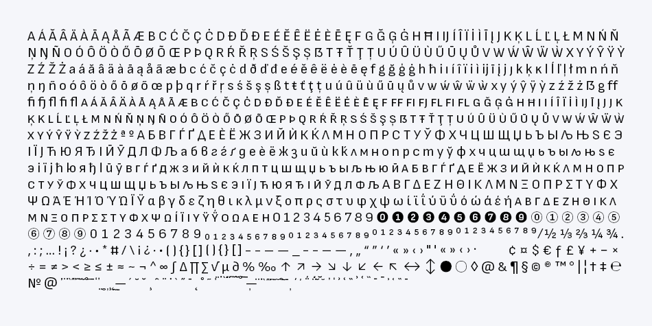
Back to Sofia’s wayfinding system—Attractive only existed in two styles—one single weight in upright and italic—and had a limited character set. Still, it provided an excellent jumping-off point for developing an extensive type family. Fullmasters’ concept consisted of three types of elements: large and small totems containing text, directions, and map information, and signboards when only a minimum of information was necessary. We soon concluded that the typeface needed to have condensed widths too, to accommodate the different sizes of the two totems and the signboards. We also had to take into consideration the varying lengths of the names of streets, squares, parks, buildings, monuments, and other tourist sights featured on the signage. Eventually, we ended up planning a comprehensive type system in four widths with extended language support. It needed to cover Extended Latin as well as the Greek and Cyrillic alphabet because we wanted the fonts to support all three scripts used in the European Union.
Read the full story of the Sofia Sans at author’s web site LETTERSOUP
Design, Publisher, Copyright, License
Design: Botio Nikoltchev, Ani Petrova
Publisher: Lettersoup
Copyright 2019 by The Sofia Sans Project Authors. All rights reserved.
License: SIL OPEN FONT LICENSE
Botio Nikoltchev
![]()
Botjo Nikoltchev, b. 1978, Sofia, Bulgaria. Botio studied graphic and type design in Potsdam. He is living and working as a freelance designer in Berlin. He studied communication design at the University of Applied Science Potsdam and took type design classes with Luc(as) de Groot. After his studies Botio worked with Ole Schäfer (Primetype) on the Cyrillic characters of PTL Manual, PTL Manual Mono and PTL Notes. Since 2010 he has been collaborating with Ralph du Carrois and Erik Spiekermann as type designer and art director at Carrois Type Design, focusing on Cyrillic, Greek and Arabic language extensions and CI projects. In 2014, he set up the commercial typefoundry Lettersoup.
Web:
Typefaces: Sofia Sans, Milka, Milka Free, Ropa Mix Pro, Ropa Soft Pro, Ropa Sans Pro, Quasimoda
More… Botio Nikoltchev
Ani Petrova
![]()
Type designer, b. 1988, Sofia, Bulgaria, who works at Fontfabric, Svetoslav Simov’s typefoundry. She completed her Bachelor’s degree at The National Academy of Art in Sofia. In 2014 she obtained a Master’s degree in type design.
Web:
Typefaces: Intro Rust Complete, Intro Rust, Head, Script, Intro Script R H2 Base, Intro Head R Base, Mixa, Sofia Sans, Mozer, Milka, Uni Sans, PH, Nexa Script
More… TYPE DESIGN INFORMATION | Ani Petrova
Free License
Download v.4.000: Sofia Sans | Google Drive
Get permission to open a file on Google Drive
• Open the file.
• On the “You need permission” page, click “Request access”.
• The admins of the site will receive your request to access the file you want to download.
• After they approve your request, you’ll be notified by email.
Where to look for the latest version: GitHub