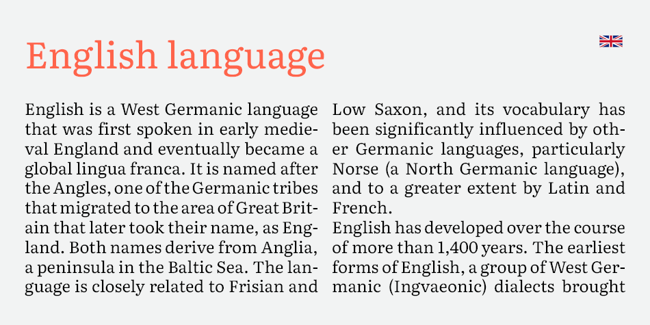
(EN) The quick brown fox jumps over the lazy dog. (NL) Op brute wijze ving de schooljuf de quasi-kalme lynx. (CS) Nechť již hříšné saxofony ďáblů rozezvučí síň úděsnými tóny waltzu, tanga a quickstepu. (HU) Jó foxim és don Quijote húszwattos lámpánál ülve egy pár bűvös cipőt készít. (RO) Înjurând pițigăiat, zoofobul comandă vexat whisky și tequila. (RU) Разъяренный чтец эгоистично бьёт пятью жердями шустрого фехтовальщика. (BG) Огньове изгаряха с блуждаещи пламъци любовта човешка на Орфей. (SR) Фијуче ветар у шибљу, леди пасаже и куће иза њих и гунђа у оџацима. (EL) Ταχίστη αλώπηξ βαφής ψημένη γη, δρασκελίζει υπέρ νωθρού κυνός. Type your own text to test the font!
Description
In April 2014, the TypeTogether design team, led by Veronika Burian and José Scaglione, started work on a brand new tailored type family for the overhaul of the Google Play Books application. Google’s brief for the project was exhaustive in its requirements. A new book typeface was needed that would provide an outstanding reading experience on a whole range of devices and high resolution screens running different rendering technologies. Additionally, the new Play Books type family was meant to establish a recognisable visual identity for Google’s native eBook app and stylistically distinguish itself from other eReader competitors. Literata satisfied every requirement and is now the default type family on all works from Google Play Books.
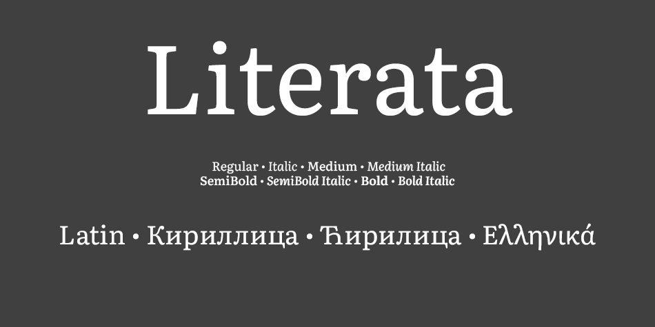
Literata is an old-style serif typeface commissioned by Google and designed by the independent type foundry TypeTogether. It was released in 2015 and is the default font family in Google Play Books, since version 3.4.5. The typeface was intended to establish a unique visual identity for the Play Books app, suitable across a wide variety of screen sizes, resolutions, and rendering software. The designers went back to the old-style Roman and Scotch typefaces for inspiration.
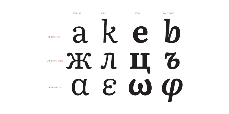
Literata initially included two different weights (regular and bold) and corresponding upright italicised variations. Version 2.1 named Literata Book added an additional two different weights (medium and semibold), small caps and made cap-height numerals the default.
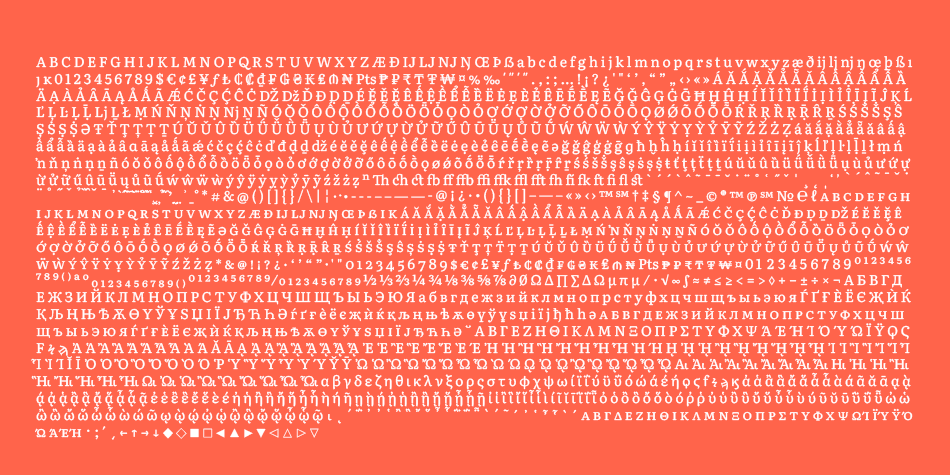
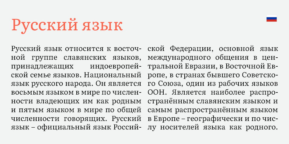
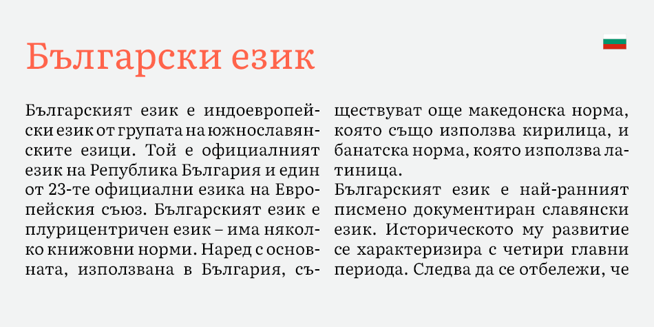
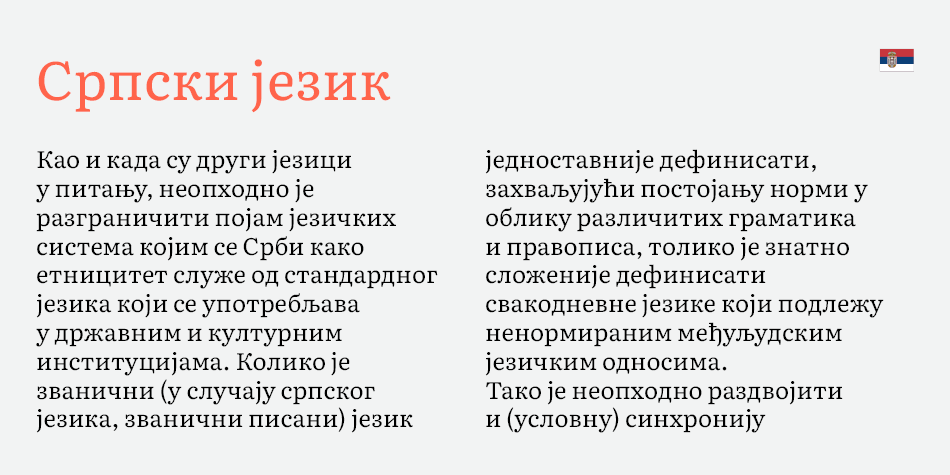
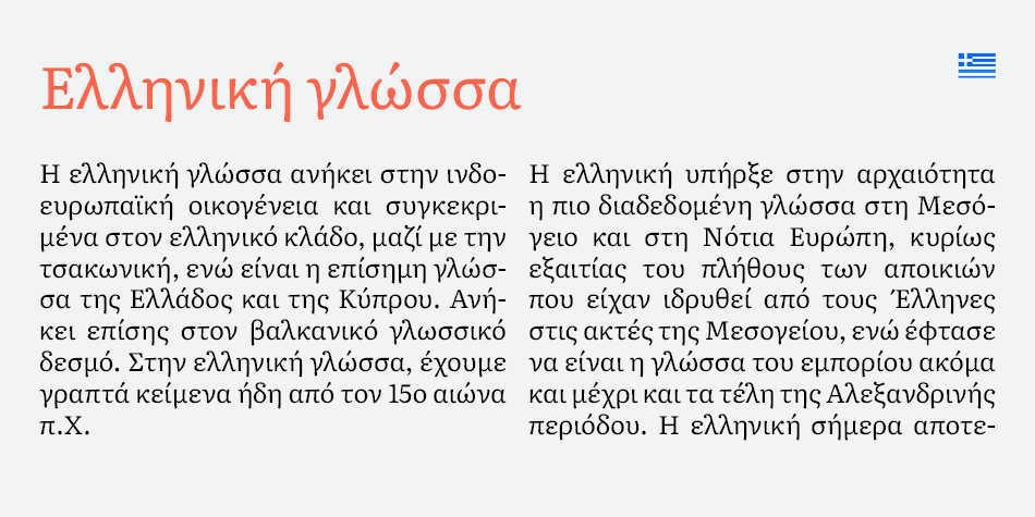
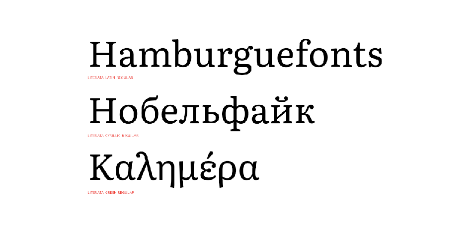
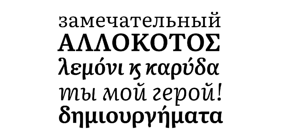
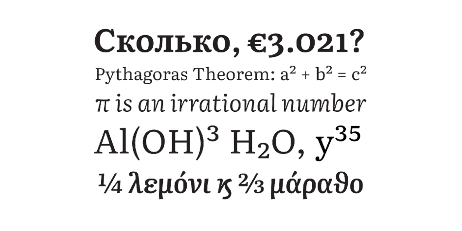
It includes support for full extended Latin, Polytonic Greek, and Cyrillic scripts. Compared to Play Books’ former default font Droid Serif, Literata has a lower x-height and higher ascenders.
On 7 December 2018, Literata was open-sourced under the SIL Open Font License and released on GitHub.
Design, Publisher, Copyright, License
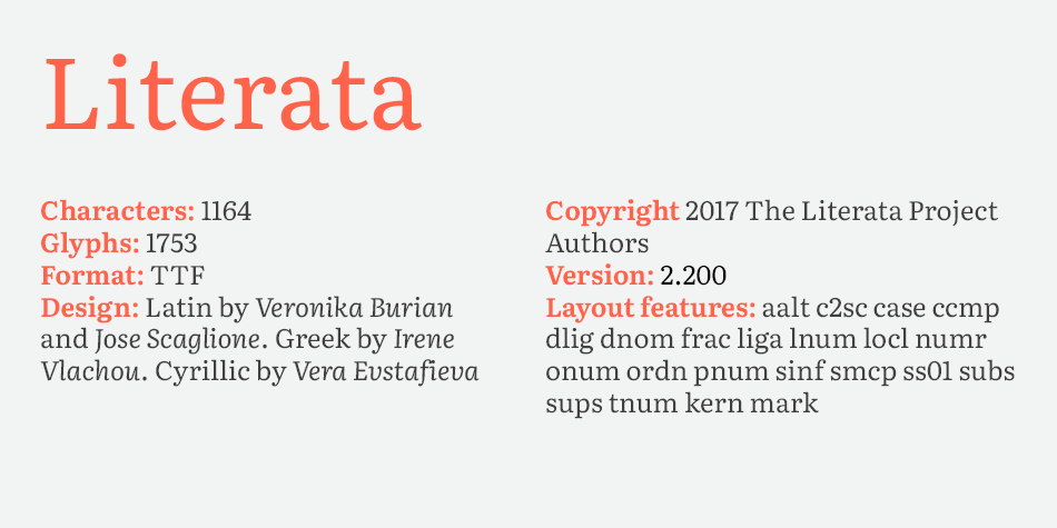
Design: Latin by Veronika Burian and Jose Scaglione. Greek by Irene Vlachou. Cyrillic by Vera Evstafieva
Publisher: TypeTogether
Copyright 2017 by The Literata Project Authors . All rights reserved.
License: SIL OPEN FONT LICENSE
Veronika Burian
Veronika Burian studied Industrial Design in Munich and worked in that capacity in Vienna and Milan over a few years. Discovering her true passion for type, she graduated in 2003 with distinction from the MA in Typeface Design course in Reading, UK. Veronika then worked as a type designer at DaltonMaag in London for a few years, spent some time in Boulder, Colorado, and then her hometown, Prague. She is now enjoying life in sunny Cataluña, Spain.
José Scaglione is a graphic designer, typeface designer, and co-founder of the independent type foundry TypeTogether with Veronika Burian, where they have published numerous award-winning type families. He teaches typography at the University of Buenos Aires, Argentina, and is frequently invited to lecture about typography and to lead workshops on typeface design at international conferences and academic institutions. José co-authored the book Cómo Crear Tipografías: Del Boceto a la Pantalla, and collaborated with Jorge de Buen Unna on his book Introducción al Estudio de la Tipografía.
Irene Vlachou or Eirini Vlachou. Graduate of of Vakalo School of Art & Design in Athens and the University of Reading, where she earned the nickname Miss Fontlab. Type designer at POPtype in Athens. In 2013, she joined Type Together as a senior type designer.
Vera Evstafieva is a type designer from Moscow, specialising in Cyrillic and Latin type design and lettering. She graduated from Moscow State University of Printing Arts, for which she received the TDC Scholarship Award. She is also a graduate of the Type & Media course at KABK in the Netherlands.
• Open the file.
• On the “You need permission” page, click “Request access”.
• The admins of the site will receive your request to access the file you want to download.
• After they approve your request, you’ll be notified by email.