


Sources
This gallery of font alternatives is based on Typecache list of alternatives.
By I Love Typography
Posted October 6, 2007
Every typeface, like every one of us, has its distinguishing features. You might be forgiven for thinking that some fonts are clones, or identical twins. However, closer inspection reveals subtle differences and nuances that simply escape casual perusal. Something that can really help heighten our sensitivity to those differences is getting out our magnifying glasses and really taking a closer look. If you’ve forgotten to bring your magnifying glass, then don’t fear for the Fontometer is here (we’ll get to that in a moment).
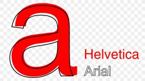
Today we’re going to de-robe two popular typefaces, namely Arial and Helvetica — faces that are often confused, and often the subjects of mistaken identity.
Helvetica
Designed in 1957 by Max Miedinger, Helvetica’s design is based on that of Akzidenz Grotesk (1896), and classified as a Grotesque or Transitional san serif face. Originally it was called Neue Haas Grotesque; in 1960 it was revised and renamed Helvetica (Latin for Switzerland “Swiss”).
Arial
Designed in 1982 by Robin Nicholas and Patricia Saunders for Monotype (not Microsoft), it’s classified as Neo Grotesque, was originally called Sonoran San Serif, and was designed for IBM’s bitmap font laser printers. It was first supplied with Windows 3.1 (1992) and was one of the core fonts in all subsequent versions of Windows until Vista, when to all intents and purposes, it was replaced with Calibri.
I’ve read in several places that Arial is closer in appearance to Univers than Helvetica. I don’t think so. In How to Spot Arial, the type designer Mark Simonson looks at the similarities between Arial and Grotesque 215 (one of Arial’s true ancestors); and when you consider the details — for example, the flat versus angled finials (e.g. “t”) — then Arial does appear to be more closely related to Grotesque 215; however, the one thing that does stand out is the greater variation in stroke width of Grotesque 215. Arial and Helvetica share a more consistent, even stroke width. I guess it depends on whether one is looking at the form or the appearance. What do you think?
Arial Vs. Helvetica, Can You Spot the Difference?
By Stacey Kole · Posted Mar. 29, 2013
It’s long been thought that Arial is to Helvetica what the ugly step sister is to Cinderella. Helvetica was designed in Germany in the 1950s to compete with Akzidenz Grotesk; Arial was designed in America in the early 1980s, believed by many to be a move by Microsoft to supply a Helvetica-like font as part of its TrueType specification without acknowledging or paying royalties to Helvetica.
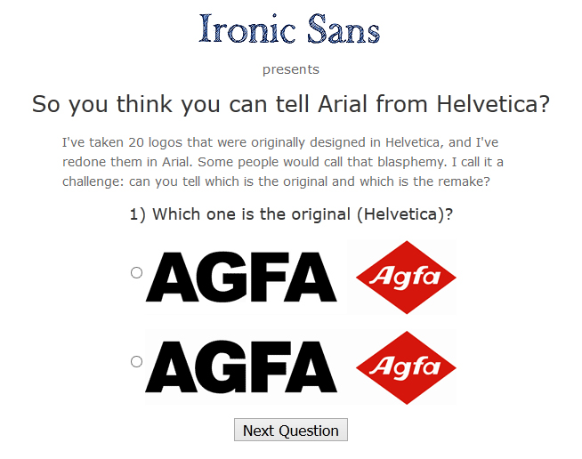
Be that as it may, to the untrained eye, the differences between the two fonts are negligible — largely due to the near identical widths. But to the savvy eye of the designer, there are dozens of subtle differences that leap off the page. For example, the ascender of Helvetica’s lowercase “t” is cut off straight, while Arial’s is cut at an angle; similarly, the terminals of the lowercase “s” and “c” in Helvetica run parallel to the baseline, whilst Arial’s run at near right-angles to the stroke. The simplest way to tell the difference is to look at the characters as a whole and picture them as suits from their respective periods: Helvetica is sharper, with formal details; Arial is looser and less controlled. But what would happen if everyday logos that were originally crafted in Helvetica were redone in Arial? Would the differences be easily recognizable or difficult to spot? To answer this question, David Friedman of Ironic Sans has devised a quiz featuring 20 popular Helvetica-based logos pictured side-by-side with an Arial version. Some differences are readily apparent, but others look shockingly similar.