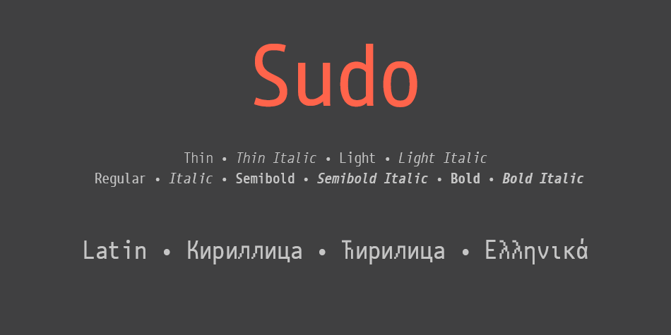
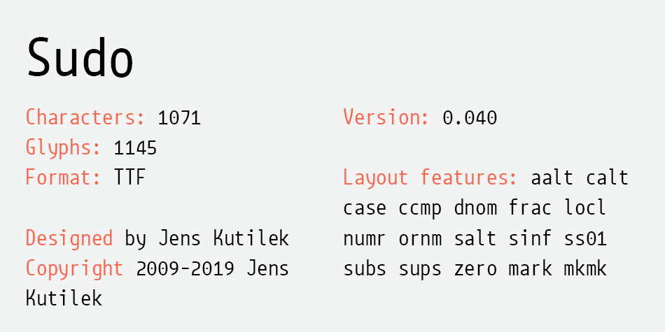

In 2009 I wasn’t satisfied with the available text editor fonts and decided to draw my own: Sudo. Over the last years I used it as my main font in the Terminal, as well as my text editor font for coding on Mac and Windows. Whenever something bugged me, I refined the design and could instantly evaluate if a change was an improvement. Sudo is a monospaced font designed for terminal and programming. Use at 16 pixels size for optimal results.
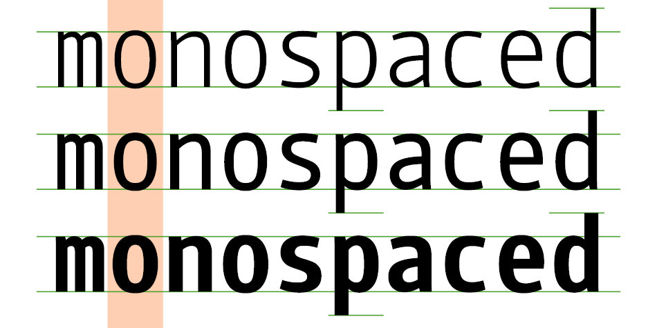
Sudo is monospaced
All letters have the same width across all weights. There are many reasons why most programmers still prefer monospaced fonts. All letters have the same width in all weights. Proportional alternates are available for some letters via OpenType layout features.
Sudo is legible
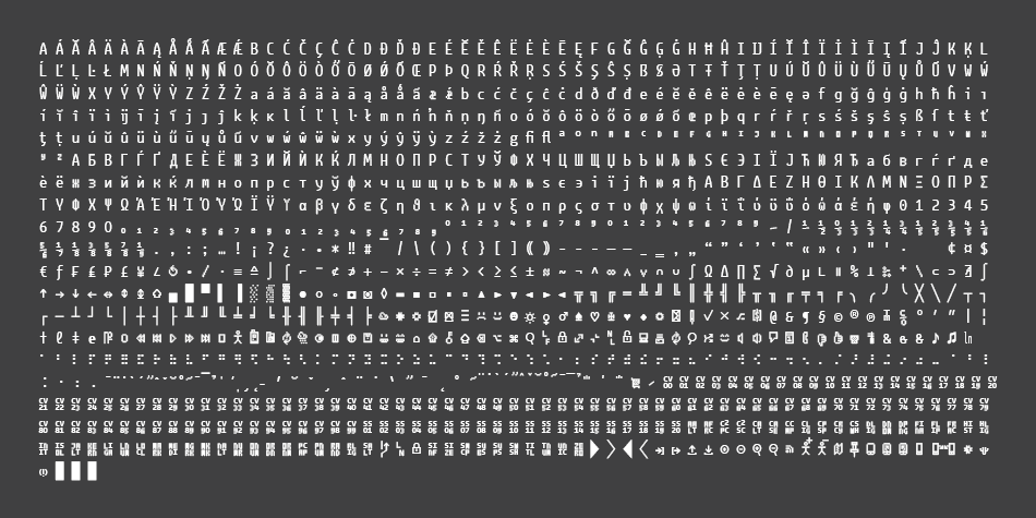
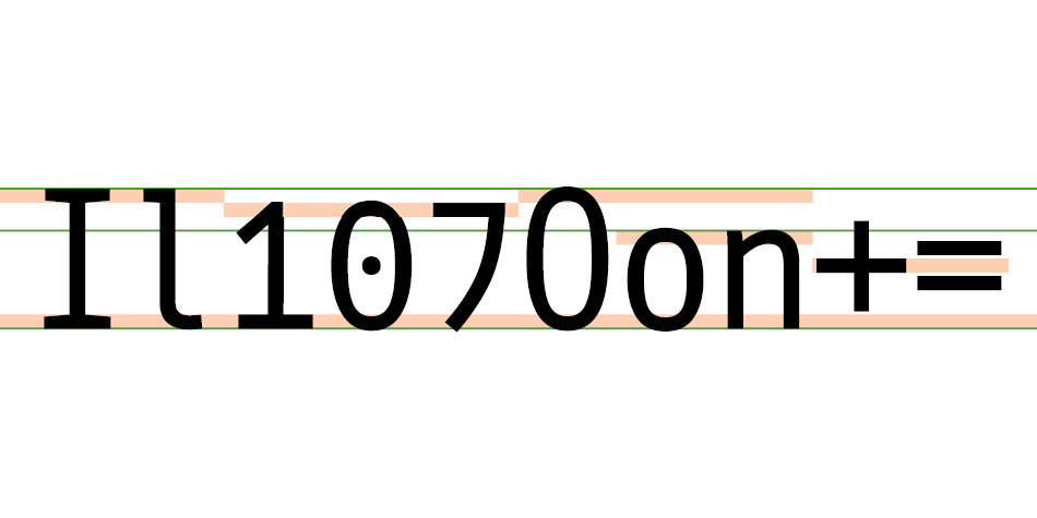
Different character categories are differentiated by height and alignment. Letters are easily discernable from numbers without resorting to dotted or slashed zeroes.
When some letter forms are ambiguous in prosa, we can easily read them because we know the context. But when coding, all characters have to be unmistakably recognizable. It is common to add serifs to an uppercase I or a hook to the lowercase l. I don’t care very much for dotted or slashed zeroes, so I decided to make all numbers one line width smaller than the uppercase letters. They still stand out enough because most code is in lowercase anyway.
From version 0.37, the default zero has a dot by popular demand. You can still wap it with a dotless 0 via OpenType feature ‘zero’ or with the included Python script ‘patch_dotted_zero.py’. The patcher requires an installation of the Python FontTools.
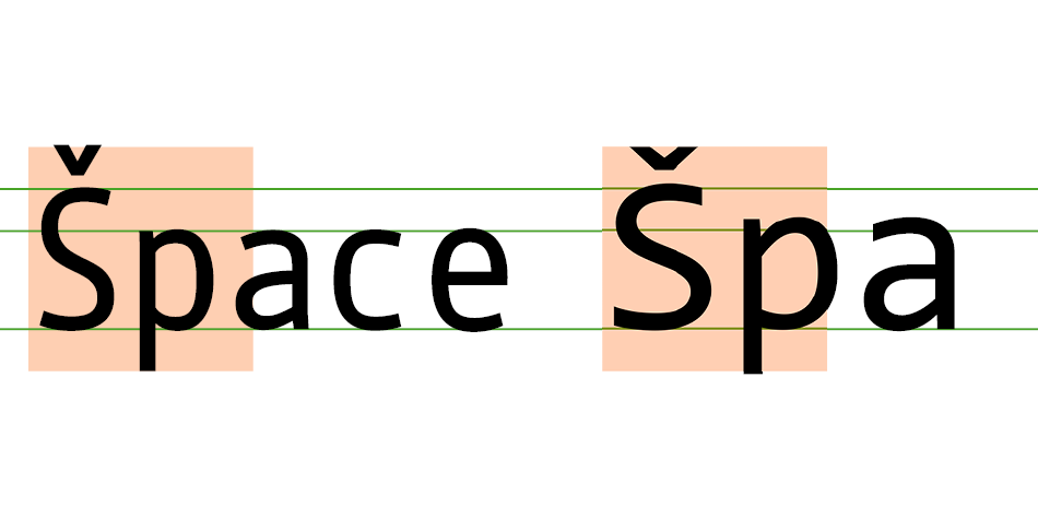
Sudo is space-efficient
Its letter width is only 44% of the font size. For comparison: Consolas (r.) has a letter width of 55%.
The width of all letters is 44% of the font size. This allows you to fit more code in the same space. For example, the character width in other fonts is between 55% (Consolas) and 60% (Courier).
Sudo has been designed on a pixel grid for a font size of 16 pixels, but works well in other sizes as well.
Sudo is unique
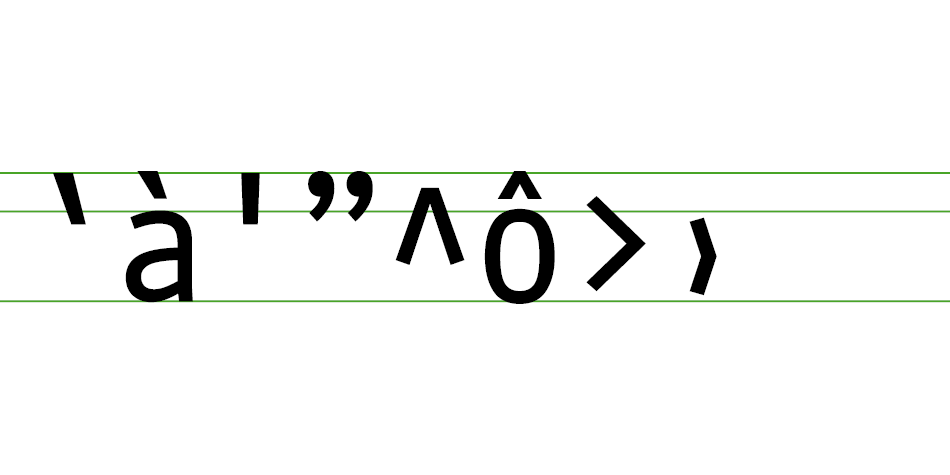
Coder’s quotes: Some programming languages use acute and grave accents in lieu of proper opening and closing quotes. In Sudo, the standalone accents are enlarged. Similar signs like ‘greater than’ and ‘single french quote’ are differentiated by size and alignment.
This is a first: As far as I know, Sudo is the first and only font to feature what I like to call ‘coder’s quotes’. Some programming languages use the acute and grave accents as a replacement for opening or closing quotes. The standalone accents in Sudo are much bigger than the ones on the accented letters and work well together with the straight and typographic quotes.
Sudo has bugs!
I designed Sudo strictly for my own needs. Completist as I am, I couldn’t resist adding Greek and Cyrillic letters, but a lot of these haven’t left the pixel design stage. For me they don’t have a very high priority, sorry. If you like to work on their design, please send me any additions via GitHub.
The Bold weight is far from finished. The basic alphabet is done, but lots of less common characters are still the same as in Regular. The Italic weights are just the upright styles slanted by 11.31° with partial corrections. The Thin masters are extrapolated from Regular and Bold, also with partial corrections. If you fix something, I’d like to get your pull requests.
Jens Kutílek
Design, Publisher, Copyright, License
Design: Jens Kutílek
Publisher: Jens Kutílek
Copyright: 2009–2019 Jens Kutílek. All rights reserved.
License: SIL OPEN FONT LICENSE
Jens Kutilek
![]()
Jens Kutilek. That’s an unlikely combination of a Scandinavian first name and a Czech last name. But I’m German and live in Berlin. A graphic designer by trade, my field of expertise is font technology and typeface design. I work as type engineer at LucasFonts.
Free License
Download v.0.069: Sudo | Google Drive
Where to look for the latest version: Github


