
In this exclusive interview we spoke with the creators of the Lidl corporate font family – Jürgen Huber and Martin Wenzel from Supertype foundry (Germany) about the process of creating a corporate font that is used in 29 European markets. The designers shared details about the start of the project, what were the challenges along the way and how did they create the localized versions of the corporate font.
We also spoke to Todor Todorov, Senior Marketing Consultant at Lidl Bulgaria who revealed how the Bulgarian Cyrillic corporate font was implemented on the Bulgarian market and what were some of the obstacles faced by the marketing team.
Tell us the story of Supertype foundry? How did you start it and who are the founders?
Martin Wenzel (MW): Jürgen Huber and I, Martin Wenzel, started working together almost 10 years ago. Before that we’ve been in touch about typographic projects and had already collaborated on a few bits. However, the real spark to start Supertype foundry came with an important project contract in 2011. We were assigned to design the typefaces for the German federal government. MetaDesign was responsible for updating the corporate design, and we were working on the matching typeface.
Your foundry creates fonts for a lot of brands like Lidl, BB Bank, MediaMarkt, The German Football Federation (DFB) to name a few. In 2020 you worked on Lidl’s new font family. How was this project different from the other projects you have worked on?
MW: Every design project is unique. The corporate typeface for Lidl was our first project which we did exclusively for the German market together with Peter Schmidt Group, and then continued for Lidl International with Superunion. Our initial briefing on what the typeface should express came from Hamburg and from there we developed Lidl’s international typographic style.
In this project we used an iPad almost exclusively to make digital sketches which we shared with the agency. We were under great time pressure and there were moments in which the entire project might have been put on hold. But as our sketches were already at an advanced stage, we were able to turn them into usable fonts which the agency could use in their designs.
Lidl’s new corporate font was introduced in 29 European countries in 2020. Tell us more about the process of creating the font. How did it all start and how long did it take to finish the project?
Jürgen Huber (JH): The design of a typeface must resemble the key values of the brand. This is the defining motto of our custom work, and it was the basis for our design this time as well.
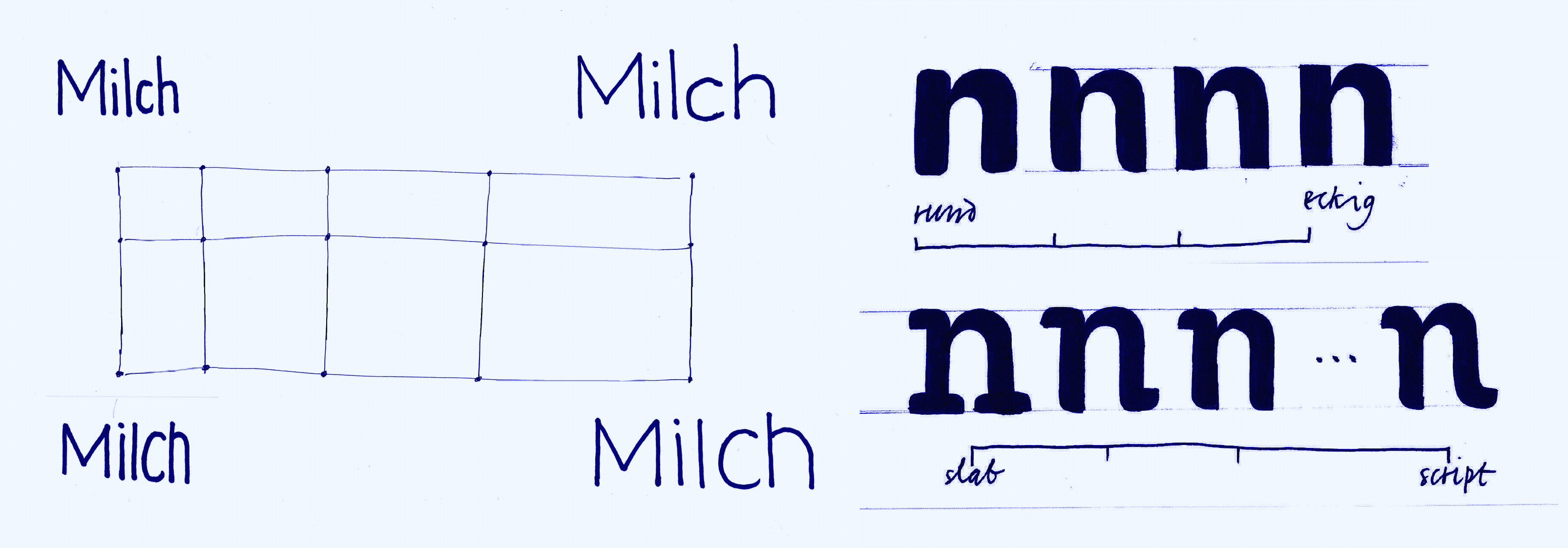
First, we made digital sketches in various directions, and aimed for a wide quantity. These clear visualizations presented a short-cut in deciding which designs worked well and which ones did not. Based on our selected designs, we were able to quickly draw preliminary versions of Regular and Bold, with mini character sets, and presented them as mockups to Lidl. At this early stage, we were already able to see how well the typeface was blending into the corporate design.
In addition to aesthetic considerations, when implementing a new corporate typeface, it’s necessary to consider the existing range of fonts and how they’re used in documents. If the new typeface is wider than the old one, it must be considered, and a decision needs to be made right away. For example, creating a Condensed version. Only after everyone agreed on the design, we started defining the number of weights and styles, and we fine-tuned the expansion of the character sets.
After Lidl Germany had started using the new fonts (7 fonts in total), Lidl International expressed interest in the “Lidl Font” in 2017. They then knocked on our door to ask if we would be interested in developing fonts for an international retailer, without knowing that we had designed the fonts for Lidl Germany a year earlier.
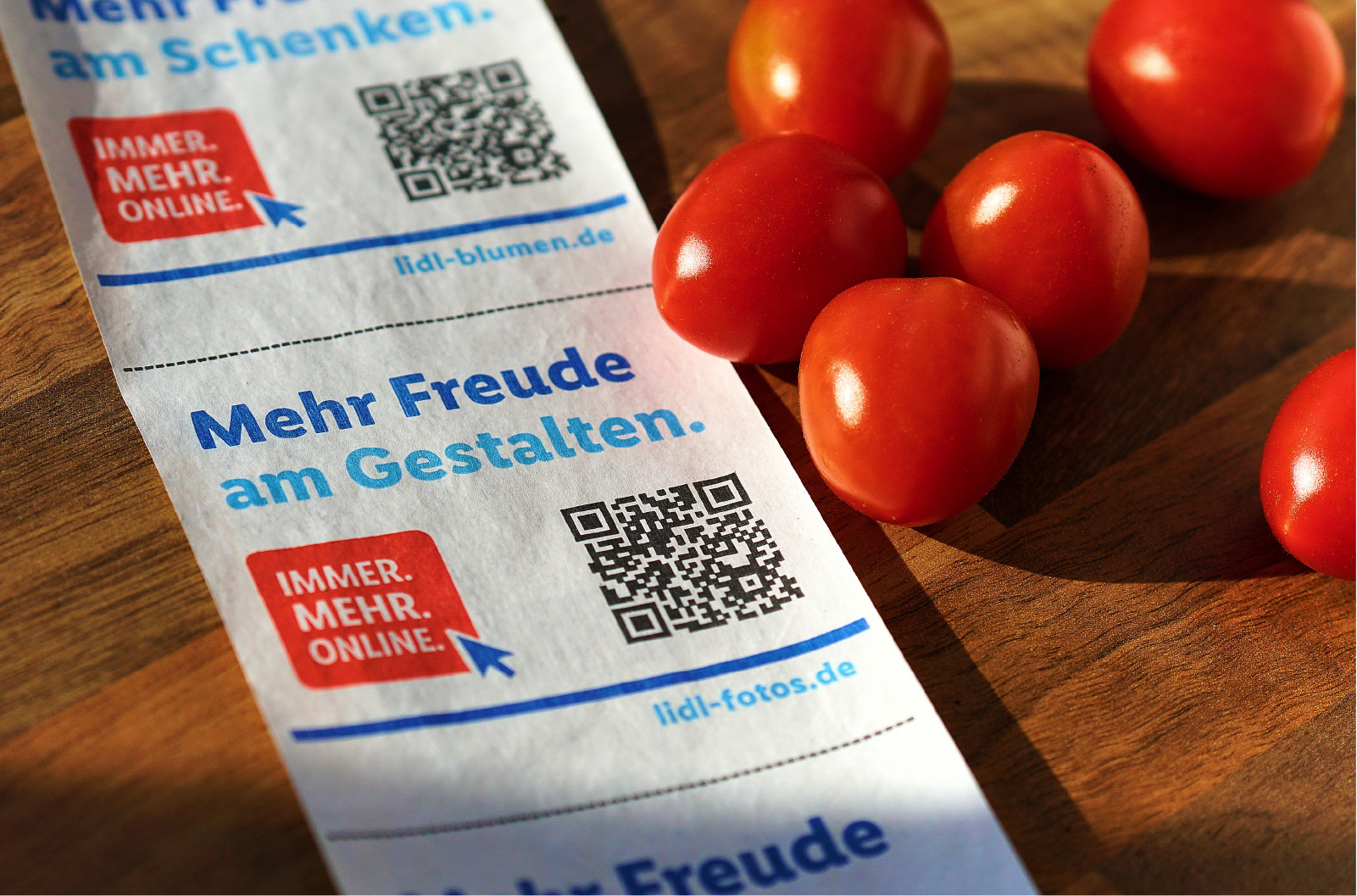
Lidl International’s requirements were, on one hand, to expand the linguistic typeface family and to improve the visual consistency internationally, and on the other hand, to expand the number of weights to better serve the various touchpoints such as printed brochures, websites, apps, point-of-sales information, analog and digital ads and banners.
The time required was manageable. As mentioned, we were able to quickly convert our sketches to preliminary fonts and present the first layouts just within a couple of days. The development of the first set of Latin fonts took about 3 months. We handed to Peter Schmidt Group the first beta versions in October 2016, and the first production-ready set the following year in January. For the next release we added Cyrillic and Greek, plus some additional extensions (localizations, country codes, symbols), which took another 3 months.
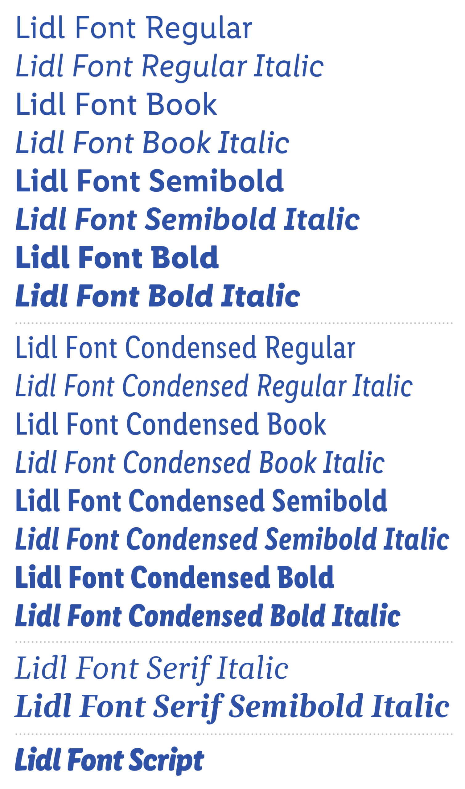
Designing a font with 13 weights that supports Latin, Cyrillic and Greek languages is not an easy task. What are some of the biggest challenges that you faced while working on the Lidl font family?
JH: The tricky part with projects like this is the implementation. The design is in some ways the easy part but coordinating more than 1000 glyphs per font consistently and error-free is the real challenge. Starting with the drawings of the basic glyphs of the different languages, through the sans-serif variants, multiple numeral sets and symbols, OpenType features, kerning, and the screen optimization. All these elements are part of a coherent system that needs to be organized. It’s just not enough to look carefully, you must automate as much as possible, with the help of Python scripts, only this way you can keep things consistent.
Where did the idea come from to create a Bulgarian Cyrillic version of the Lidl font? Could you share with us what font examples did you use to create the Bulgarian Cyrillic version and which fonts inspired you while working on this project?
Martin Wenzel (MW): The linguistic expansion with Cyrillic and Greek had to preserve the Lidl character, while also maintaining the integrity of the scripts. This requirement also dictated that we would co-design variants for Bulgarian from the beginning. So, as with the Latin, the designs were not based on another font but were drawn from scratch, including the Bulgarian character variants. Aleksandra Samulenkova took care of the creative translation of the Latin forms into Cyrillic and Greek.
Unfortunately, the integration of the Bulgarian glyphs alongside the Russian ones is still tricky today. In theory, switching between the different local variants is quite easy, but in practice it is not usable because this functionality is controlled by an OpenType feature (locl) and is not universally supported. For users in Bulgaria, separate fonts were simply the best solution. The feedback from Bulgaria was very clear on this. We received some critical comments regarding the design details of some characters. However, with the latest release we fixed the issues and managed to complete the requirements.
Tell us more about your future projects and what are you working on right now?
Jürgen Huber (JH): Generally, our work alternates between custom fonts for businesses and the creation of retail fonts. Since the custom type business is always deadline-driven, we work on the retail fonts in the meantime.
Now we’re working on a text version of the Cy that I drew two years ago, which is available in our store. Our latest release Adapt (also available as variable font) is getting a monospaced version.
Additionally, we teach at HTW Berlin, a technical university and trying to be more active on social media, we are on Instagram and Twitter.
Todor Todorov,
Senior Marketing Consultant, Lidl Bulgaria
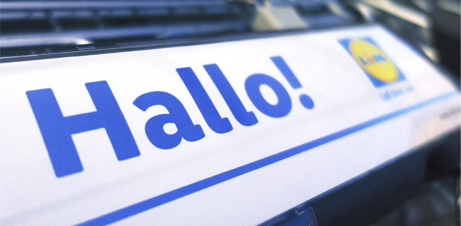
Lidl’s new corporate font was introduced in 29 European markets and it includes Bulgarian Cyrillic. Tell us how the new corporate font was presented in Bulgaria and how was it perceived by the employees?
Todor Todorov (TT): Lidl is present on more than 30 markets globally and the corporate font is one of the elements that represents the brand, that makes Lidl distinct and at the same time showcases the uniqueness of each market. By developing the Bulgarian Cyrillic form as part of the corporate brand, Lidl managed to keep its global focus and at the same time respect the specifics of the local market.
It is important to mention that since entering the Bulgarian market, Lidl has been always using fonts with Bulgarian Cyrillic form in its marketing communication. In this period, we have localized more than 300 glyphs and more than 100 fonts for which we have partnered with HermesSoft Ltd. On the design of the Bulgarian Cyrillic fonts, we have engaged Bulgarian font designers such as Kanio Kanchev and Boril Karaivanov.
In terms of perception – people rarely think about what type is the font they are reading. However, I believe that on a subconscious level our new corporate font brings them a sense of beauty and style.
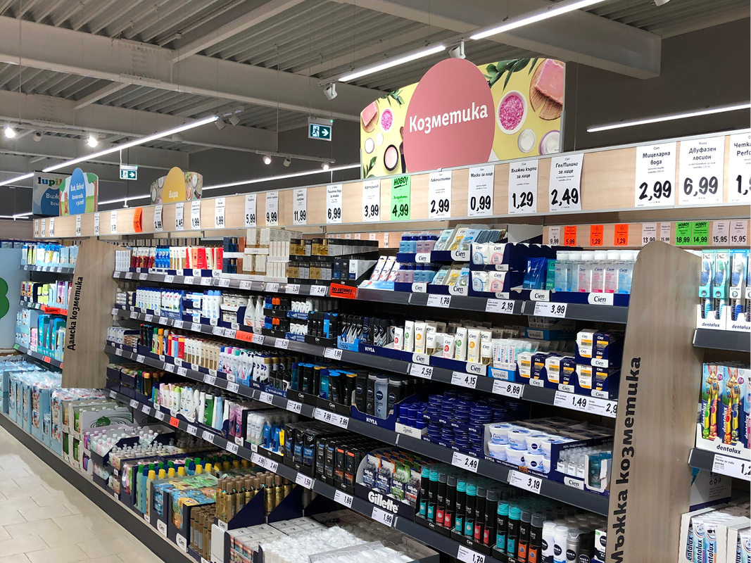
A retail brand that needs to frequently update signboards, promotional materials, brochures, a corporate website, etc. surely faces challenges in the implementation of the new corporate font. How did you overcome these challenges and how do you monitor the correct usage of the corporate font in the retail network across the country?
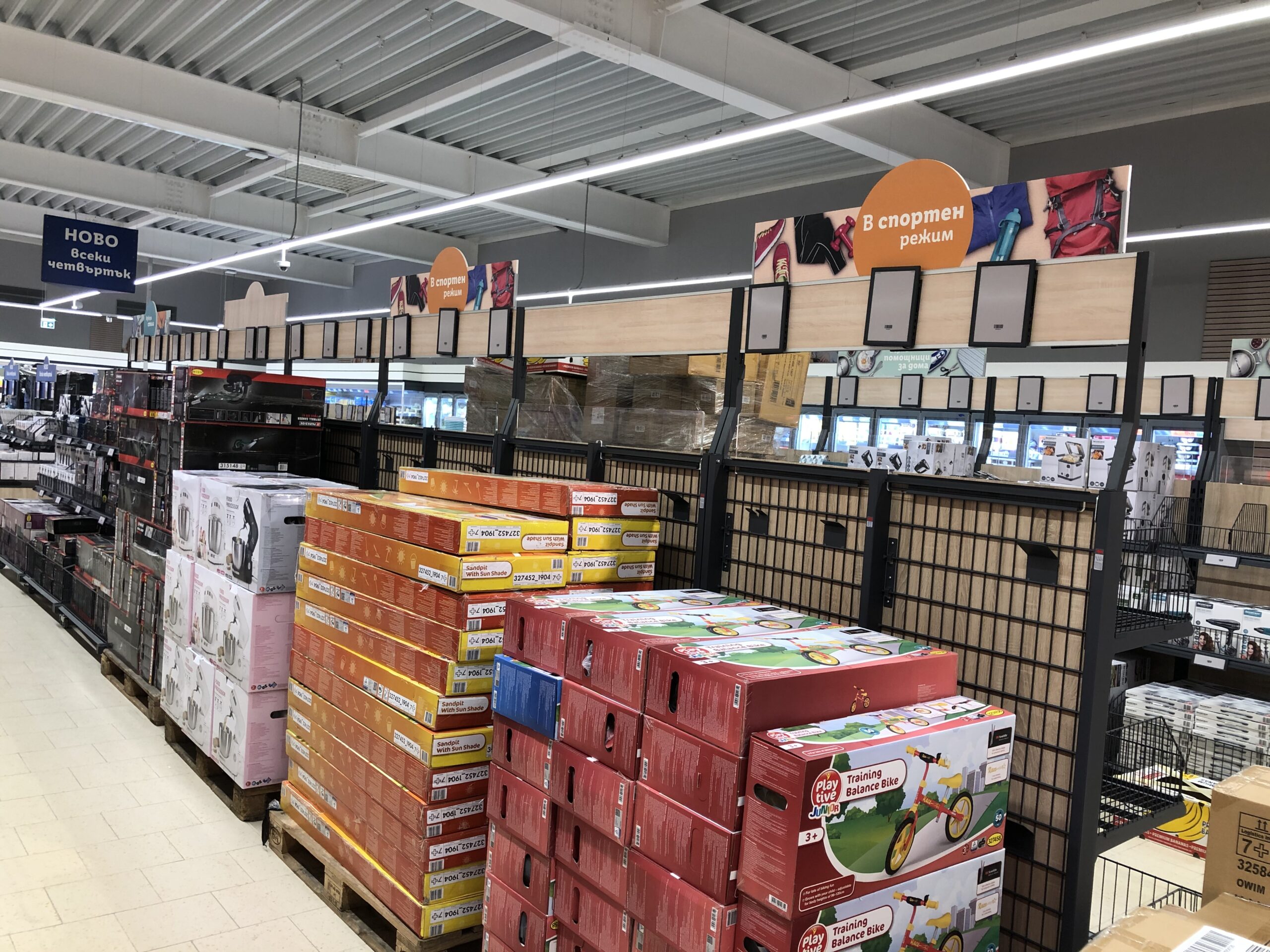
TT: The whole implementation process of a corporate font is a huge project – we went through the adaptation of the corporate website, all the internal communication channels and templates, changing the corporate elements in our stores like signboards, posters etc.
It is a big challenge to implement a new corporate font across all channels as we have quite a lot, especially when we are talking about the Bulgarian form of Cyrillic which is less known, compared to the Russian one.
We faced different challenges – from technical specifics like differences in the software and the operation system to the fact that we work with different external agencies, some of which are international.
However, our team is dedicated to work hard with all our partners to make sure that our Bulgarian Cyrillic corporate font is used correctly across our retail network.
Explore SUPERTYPE FOUNDRY and its activities:
SUPERTYPE FOUNDRY Twitter Instagram
Editor
![]()
Szandra Peev
Szandra Peev has been working in the field of communications and marketing for almost a decade now. Her curiosity to explore new cultures and destinations took her to Asia where for five years she worked with some of the biggest multinational companies globally. Currently, Szandra is back in Europe, leading the communications and marketing efforts for localfonts.eu and contributing as a writer in print and online media outlets.


