CIVIL TYPE AND KIS CYRILLIC (3 September 2013) and KIS CYRILLIC (24 January 2014), author Vladimir Yefimov. Here we give an extract from them. Vladimir Yefimov’s essays on the history of Civil Script and modern Cyrillic type are one of the best world researches.
Civil Type and Kis Cyrillic
In 2002, an English-language collection of articles about typefaces and alphabets from around the world was published under the title Language Culture Type: International Type Design in the Age of Unicode (compiled by John Berry). The book, which came out in the wake of the AtypI bukva:raz! competition, contained an essay by Vladimir Yefimov on the history of Civil Script and modern Cyrillic type based on historical forms—Civil Type and Kis Cyrillic. Today (3 September 2013), 10 years after release, the article is not only still relevant, but more capable than ever of rousing both professionals and those readers who are interested in the history of Cyrillic and Civil Type. Those who knew Vladimir will remember his talent for quietly and patiently, time and time again, talking about our letters as an asset, rather than the onerous legacy of Peter the Great. Allow us to introduce you to the first part of the essay on the controversial reform.
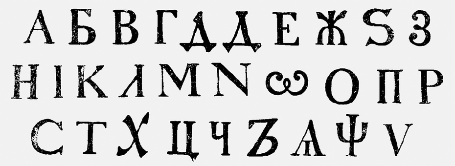
 he reform of Cyrillic type took place in Russia during the reign of Tsar Peter (1689–1725). The old poluustav type was preserved only for religious literature, while for all other publications, Peter introduced a new style that imitated the forms of contemporary Western type; in later days, the new type became known as Civil Type (grazhdanskiy shrift). The reform partially altered the structure of the Russian alphabet, too: the use of European (Arabic) numerals was introduced, and punctuation and caps usage were put in order. Thus, Cyrillic took on the form of roman serif type, in much the same way that Muscovy was dressed up in European clothes. In fact, the introduction of Civil Type meant the revision of the Cyrillic alphabet’s structure and the restyling of its letterforms based on the shapes of Western (Latin) letters. Nevertheless, from the point of view of modern type design, the reformed Cyrillic type introduced by Peter could have been of a higher quality, had the developers of the Civil Type relied on the best examples of Western typefaces of the 17th and early 18th centuries.
Kis Cyrillic
Here is the second and final part of Vladimir Yefimov’s essay Civil Type and Kis Cyrillic. According to the author, the typefaces of Hungarian genius Miklós Kis (1650–1702) are the most striking example of Dutch old-style Antiqua. In this second part of the essay, Vladimir Yefimov gives a detailed account of how Cyrillic script for the Bitsream’s Kis—a contemporary version of Miklós Kis’s typeface—was created. One of the most beautiful Latin typefaces of the great Russian ruler’s era, in the author’s opinion, gives the answer to a very reasonable question—Could a Petrine typeface take a different form? The text is complemented with new illustrations and previously unpublished drawings from Yefimov’s personal archive.
 t is evident that the design of the new Cyrillic type was done at the amateur level, although this was probably the first attempt in Russia to use a modern approach to type design, including sketching, the creation of original drawings, the manufacturing of type punches and matrices, then the printing of tests, with successive proofreading and improvements to the type. We don’t know which of the roman faces was used as the starting point for the design of the new letters. It is most likely that there was no single prototype and that the structure of the Civil Type was not based on one particular roman font. The sketches were a kind of eclectic mixture of the different roman faces available in Peter’s time (from late Dutch old-style roman to Romain du Roi). As a result, the Civil Type became very distinctive, but in fact its distinction was just the stylised trappings of the roman style, an imitation of it.
Further Readings
- Николай Дубина. Шрифт в России от Петра до наших дней. Часть I. Петровская реформа
- Николай Дубина. Шрифт в России от Петра до наших дней. Часть II. XVIII век, Санкт-Петербург
- Николай Дубина. Шрифт в России от Петра до наших дней. XVIII век, типография Московского университета
- Николай Дубина. Шрифт в России от Петра до наших дней. Шрифты в государственных и частных типографиях XVIII века
Sources
- Петровская книга. Российская национальная библиотека
- Разговоры дружеския. Эразм Роттердамский (1469-1536); Erasmus Roterodamus. Окт. 1716. Российская национальная библиотека
- О платеже подушных денег. 27 мая 1727. Российская национальная библиотека
- О коронации императора Петра II. 12 окт. 1727. Российская национальная библиотека
- Божиею милостию мы Петр Вторыи, император и самодержец всероссиискии. И протчая, и протчая, и протчая. 15 мая 1727. Российская национальная библиотека
- О подаче прошений в Верховный Тайный Совет по субботам. 1 нояб. 1727. Российская национальная библиотека
- Разговор у адмирала с капитаном о команде. или. Полное учение како управлять караблем во всякия разныя случаи. : Начинающим в научение от части знающим в доучение; а не твердо памятным в подтверждение. Зотов, Конон Никитич (1690-1742). 16 авг. 1724. Российская национальная библиотека
- Ведомости. 1710, №11/12 (31 мая) : 1710, №11/12 (31 мая). 1710. Российская национальная библиотека
- Петровские ведомости. 1710. Российская национальная библиотека
- Книги XVIII века на западноевропейских языках. Российская национальная библиотека
- Законодательные акты Российской империи. Российская национальная библиотека
- Газеты. 1700–1770. Российская национальная библиотека
- Журналы. 1700–1770. Российская национальная библиотека
- Азбуки, буквари, грамматики, словари XVI-XVII веков. 1500–1800. Российская национальная библиотека
- Азбука гражданская с нравоучениями. 1710. Президентская библиотека
- Азбука гражданская с нравоучениями. 1710. Library of Congress. Мировая цифровая библиотека

