741,447,158 speakers
88 languages
A | B | C | D | E | F | G | H | I | K | L | M | N | O | P | Q | R | S | T | V | X | Y | Z
ISO 15924 Basic Latin Alphabet – Uppercase and Lowercase
ISO 15924 Greek alphabet – Uppercase and Lowercase
120,000,000 speakers
12 language specific characters
ISO 639 code: DEU
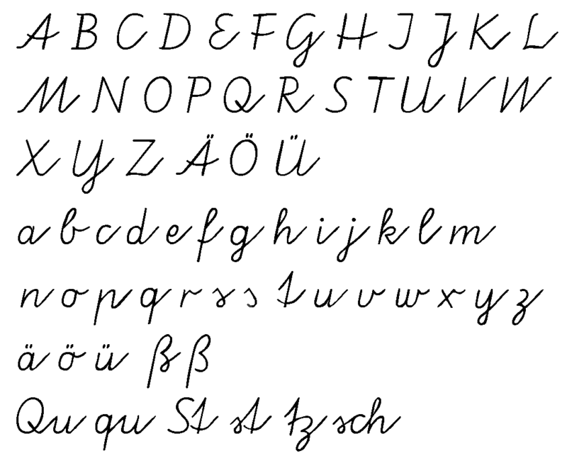
The modern German alphabet consists of the twenty-six letters of the ISO basic Latin alphabet. German uses three letter-diacritic combinations (Ä/ä, Ö/ö, Ü/ü) using the umlaut and one ligature (ẞ, ß (called Eszett (sz) or scharfes S, sharp s)) which are officially considered distinct letters of the alphabet.
The Capital ẞ was declared an official letter of the German alphabet on 29 June 2017.
In the past, long s (ſ) was used as well, as in English and many other European languages.
Sharp s
The eszett or scharfes S (ẞ, ß) represents the unvoiced s sound. The German spelling reform of 1996 somewhat reduced usage of this letter in Germany and Austria. It is not used in Switzerland and Liechtenstein.
As the ß derives from a ligature of lower-case letters, it is exclusively used in the middle or the end of a word. The proper transcription when it cannot be used, is ss (sz and SZ in earlier times). This transcription can give rise to ambiguities, albeit rarely; one such case is in Maßen (in moderation) vs. in Massen (en masse). For all caps usage, an uppercase ß was added to the German alphabet on 29 June 2017; however, the former version SS is still allowed as an alternative. In 2008, it was included in Unicode 5.1 as U+1E9E, and since 2010 its use is mandatory in official documentation when writing geographical names in all-caps.
Although nowadays substituted correctly only by ss, the letter actually originates from two distinct ligatures (depending on word and spelling rules): long s with round s (“ſs”) and long s with (round) z (“ſz”/”ſʒ”). Some people therefore prefer to substitute “ß” by “sz”, as it can avoid possible ambiguities (as in the above “Maßen” vs “Massen” example).
Incorrect use of the ß letter is a common type of spelling error even among native German writers. The spelling reform of 1996 changed the rules concerning ß and ss (no forced replacement of ss to ß at word’s end).
Long s
Wachstube and Wachſtube are distinguished in blackletter typesetting, though no longer in contemporary font styles.
In the Fraktur typeface and similar scripts, a long s (ſ) was used except in syllable endings (cf. Greek sigma) and sometimes it was historically used in antiqua fonts as well; but it went out of general use in the early 1940s along with the Fraktur typeface. An example where this convention would avoid ambiguity is Wachstube, which was written either Wachſtube = Wach-Stube (IPA: [ˈvax.ʃtuːbə], guardhouse) or Wachstube = Wachs-Tube (IPA: [ˈvaks.tuːbə], tube of wax).
Umlaut diacritic usage
Although the diacritic letters represent distinct sounds in German phonology, they are almost universally not considered to be part of the alphabet. The diacritic letters ä, ö and ü are used to indicate the presence of umlauts (frontalizations of back vowels). In proper names and ethnonyms, there may also appear a rare ë and ï, which are not letters with an umlaut, but a diaeresis. To separate the au diphthong, as well as some others, which are graphically composed of potentially umlaut-holding letters, the acute accent is sometimes used (e.g. Saúdi-Arabien).
12 language specific characters
Further Readings
13,000,000 speakers
ISO 639-1: EL
ISO 639-2: GRE (B)
ISO 639-2: ELL (T)
Variously
ISO 639-3: ELL – Modern Greek
ISO 639-3: GRC – Ancient Greek
ISO 639-3: CPG – Cappadocian Greek
ISO 639-3: GMY – Mycenaean Greek
ISO 639-3: PNT – Pontic
ISO 639-3: TSD – Tsakonian
ISO 639-3: YEJ – Yevanic
The site of Geri Leonidas Greek type design is a hub for resources on Greek typeface design. There are texts to read, typefaces to study as examples, and links to resources for designers.
Beginners’ texts to read
Fundamental texts for typeface designers preparing for Greek.
Intermediate texts to read
Second-stage reading, for designers who want to go deeper.
Typefaces with Greek complements worth studying
Good contemporary examples, in a range of styles.
Polytonic typefaces of note
(This post in in Greek, but the typefaces are shown and identified clearly.)
Examples of ano teleia (and other punctuation) in texts
(Compiled to support a Unicode discussion.) Contains a historical overview of other Greek punctuation as well.
Writing and letter grouping
Material for the very first stage of designing Greek typefaces.
Texture and fitting
Material for making decisions for designing letter proportions, counters, and spacing and kerning Greek.
Monotonic case conversion
The absolute minimum needed to support case conversion in OpenType Greek fonts.
Greek alphabet
Α α Β β Γ γ Δ δ Ε ε Ζ ζ Η η Θ θ Ι ι Κ κ Λ λ Μ μ Ν ν Ξ ξ Ο ο Π π Ρ ρ Σ σ/ς Τ τ Υ υ Φ φ Χ χ Ψ ψ Ω ω
Further Readings
Unicode Glyph Mapping: Greek/Greek ELL
Unicode Glyph Mapping: Greek/Polytonic Greek PGR


