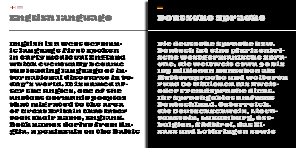
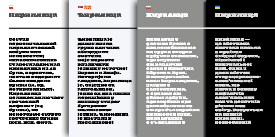
(EN) The quick brown fox jumps over the lazy dog. (NL) Op brute wijze ving de schooljuf de quasi-kalme lynx. (CS) Nechť již hříšné saxofony ďáblů rozezvučí síň úděsnými tóny waltzu, tanga a quickstepu. (HU) Jó foxim és don Quijote húszwattos lámpánál ülve egy pár bűvös cipőt készít. (RO) Înjurând pițigăiat, zoofobul comandă vexat whisky și tequila. (RU) Разъяренный чтец эгоистично бьёт пятью жердями шустрого фехтовальщика. (BG) Огньове изгаряха с блуждаещи пламъци любовта човешка на Орфей. (SR) Фијуче ветар у шибљу, леди пасаже и куће иза њих и гунђа у оџацима. (EL) Ταχίστη αλώπηξ βαφής ψημένη γη, δρασκελίζει υπέρ νωθρού κυνός. Type your own text to test the font!
Description
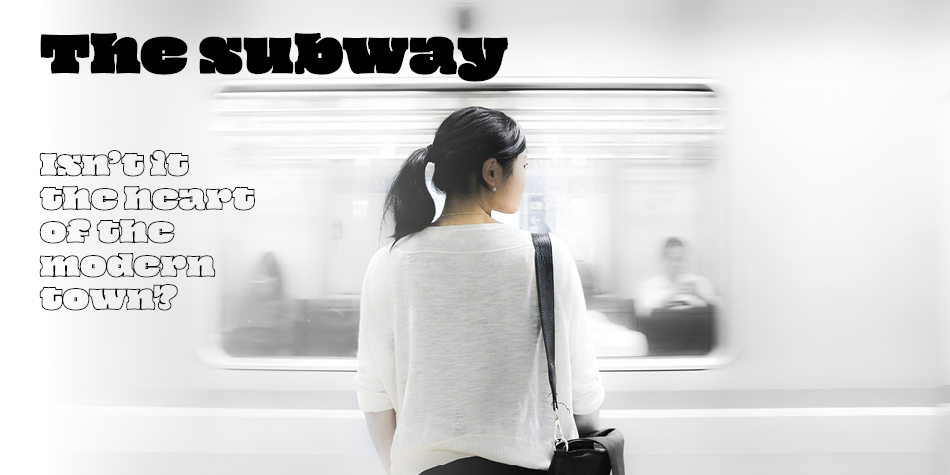
Oi is an ultra-fat display typeface that has its roots in grotesque slab serifs, most specifically the style that sprung with the release of Caslon’s Ionic in 1844 and Clarendon by Fann Street Foundry in 1845. The typeface is a free spirited twisted interpetation of the clarendonesques. With an unapologetic tendency for public shouting, it is a whimsical loudmouth attention seeker!
“Oi” is an interjection used in various languages. Its meaning varies, depending on the tone and abruptness of its use, from a simple “hi” or a call of attention to as far as a challenge to a fight.
Design, Publisher, Copyright, License
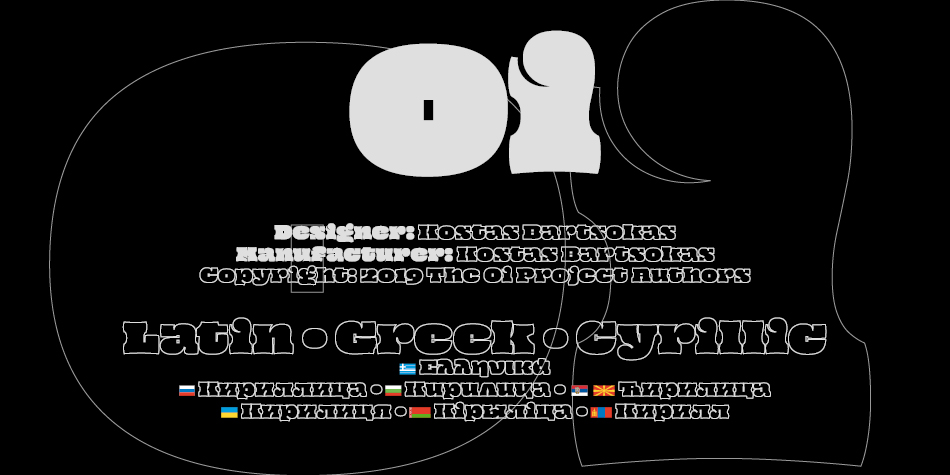
Design: Kostas Bartsokas
Manufacturer: Kostas Bartsokas
Copyright 2019 by The Oi Project Authors. All Rights Reserved.