Description
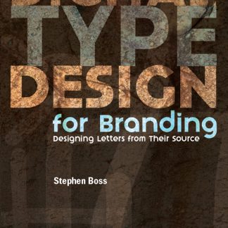
The approach will be to give visual aid (illustrated) and written reference to young designers who are either launching their careers or taking their first stab at designing letterforms for a logo, lettermark, signage, advertising or an alphabet. The book will focus on the roots of each letterform and give the designers the knowledge of why weight variations (stress) exist and how to correctly apply them to their designs.
Key Features
• A how-to resource for designers to referencee while designing letterforms.
• The designer will be left with a clear understanding of why letterforms look the way they do, and the method and order of letterform development, enabling the designer to draw on history when developing their glyphs.
• How-to illustrations will highlight the process and downloadable vectors will give the designer templates to begin their project.
• This book gives designers a solid footing when designing a series of characters without developing a complete alphabet.
• Custom typography is a growing trend and every newly minted designer should have a practical knowledge of the origins of letters and the method of building letterforms.
In The Press
“Probably the best biography of a cartoonist ever written, and is surely one of the best dozen or so books on comic art ever written . . . John Canemaker’s text is that great and most welcome rarity, a genuine work of scholarship about a cartoonist . . . a model for other books about comic art.” — Michael Barrier, The Comics Journal
“This is one book that anyone interested in our cultural heritage can’t afford to miss.” — Art Spiegelman, USA TODAY
“John Canemaker’s biography should go a long way toward putting McCay firmly back on the map . . . He satisfies your curiosity about McCay’s life, sets him in the context of his times, and comments perceptively on his art.” — John Gross, NEW YORK TIMES
“At Last! Winsor McCay has found his Boswell.” — Leonard Maltin, ENTERTAINMENT TONIGHT
About The Author
Stephen Boss began making letterforms as a child, using pencils, brushes and calligraphy pens; next, a mouse and Bezier points; and now a mixture of media when designing new fonts. While studying at the Center for Creative Studies, Detroit, in the days of hand rendering type, Stephen was fortunate to have Richard Isbell as his type instructor.
Interested in developing typefaces with a unique vernacular, Stephen started Emboss Fonts in 1995. He has consulted on type design project for Fairchild, JP Morgan Chase, Bumble & Bunble and Osh Kosh. He has also worked on more traditional design projects for the UN, Pfizer, Verizon, Walt Disney, Bank of America and many more.
His work has been internationally recognized in juried shows, and featured in such publications as Japan’s Timing Zero, Publish Magazine, and mass HiTech. He recently coatuhored the book The New Web Typography by CRC Press/Chapman & Hall.







Reviews
There are no reviews yet.