Description
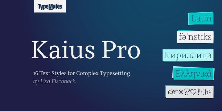
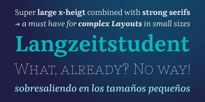
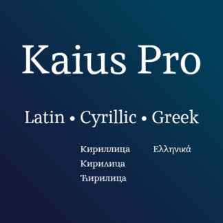
A sophisticated text typeface, Kaius Pro is an academic. Specialised for text in small sizes and complex layouts, Kaius is capable of handling demanding structure, language and character requirements with ease.
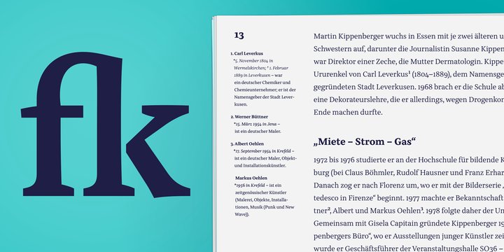
Kaius is not just a fresh alternative to classic text typefaces. With a generous x-height, open apertures and wide round letters, it’s also extremely readable. Sharp vertical serifs emphasise Kaius’s rhythm and are finely balanced with sturdy baseline serifs, which are so important for legibility. Together, these features create a reliable text structure.
Kaius combines analytical thinking with a modern exterior. The typeface’s outlines have more curved than straight lines, giving it an unconventional appearance close up. Zoom out, and Kaius brings a fresh feel to longform reading. Distinguished in distinction, Kaius is equipped with small caps, italics and 16 weights to style, structure and clarify complex information at every scale.
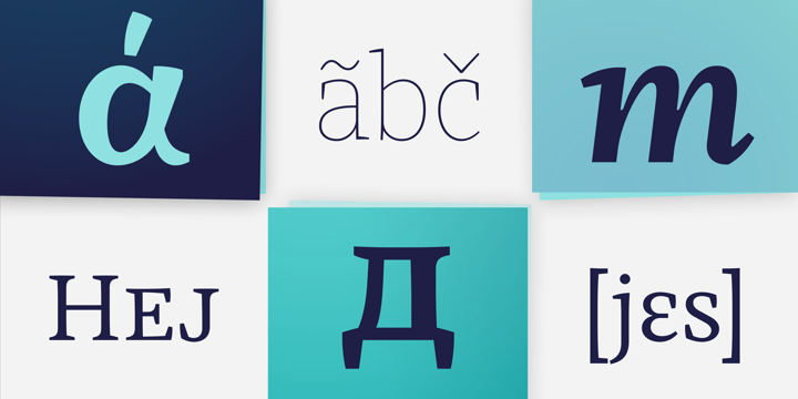
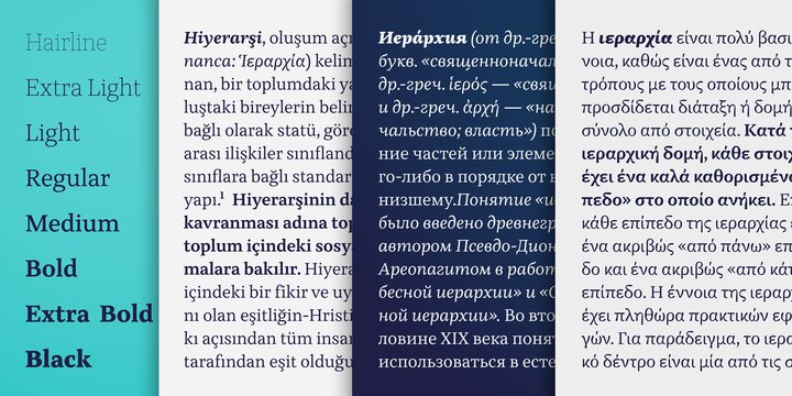
From the narrow, low contrast Hairline, to the softer, rounder Black, Kaius’s sixteen weights are complemented by lively italics. Their even rhythm and comparatively slight angle are contrasted by expressive cursive letterforms. Used in upright text, they harmonise; neither standing out too much nor blending in.
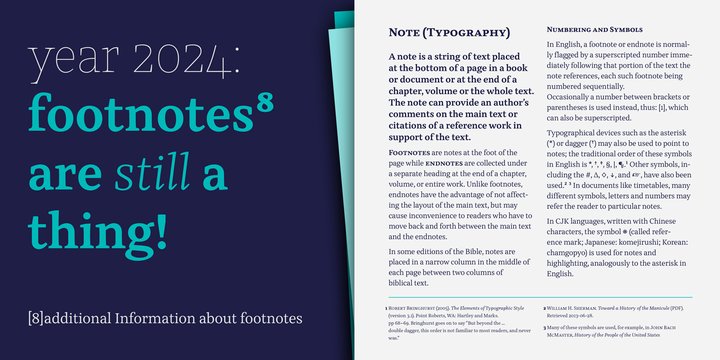
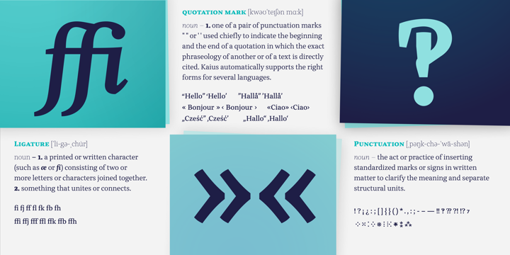
Whether all caps text, arbitrary fractions or tabular-ranging figures, setting five dot punctuation or accessing rare symbols like interrobangs and manicules, typographic excellence is no challenge for this scholar of complexity.
Kaius’s love of books makes it a friend of fine typography. Kaius expertly selects the correct dashes and quotation marks for different languages and has sets of punctuation and symbols carefully refined for use in uppercase and small-cap texts.
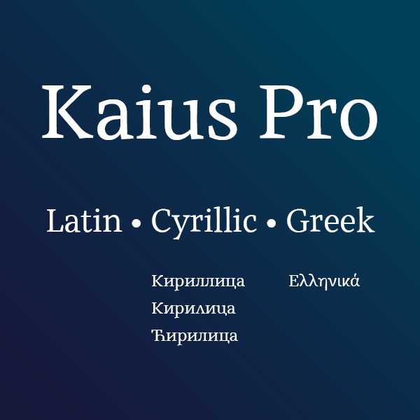
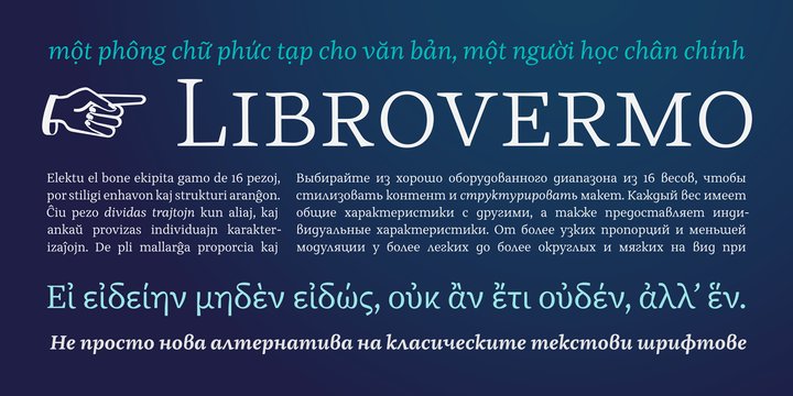
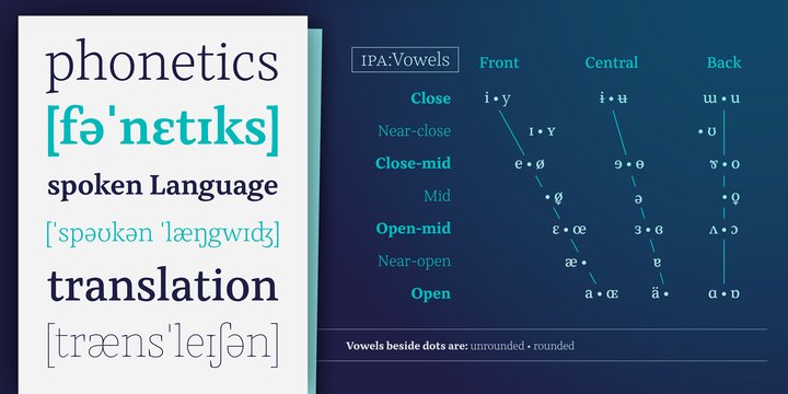
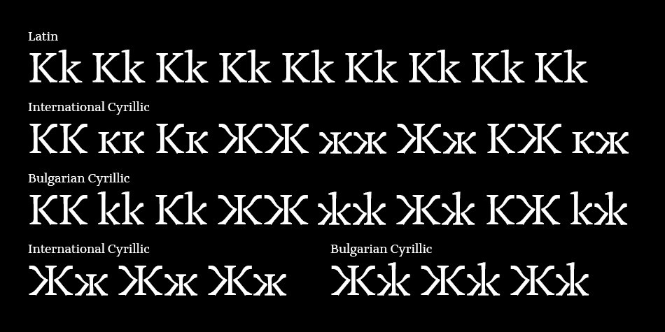
And Kaius is a linguistic enthusiast. Along with Greek and Cyrillic, it supports almost every language that uses the Latin alphabet, from Icelandic to Vietnamese. It’s attentive to localised forms, supports ancient Greek and historical Cyrillic letters, and is well-versed in the International Phonetic Alphabet and the many special characters used in academic and lexical typography. All in all, Kaius’s character set covers an extensive 2,500 glyphs. Whatever you might need, Kaius covers it.
Design, Publisher, Copyright, License
Design: Lisa Fischbach
Publisher: TypeMates
Copyright 2020 by TypeMates. All rights reserved.
License: COMMERCIAL
Specimen: Kaius Pro (PDF)
Lisa Fischbach
With expertise in type and graphic design, Lisa’s understanding of how type is made and used forms the cornerstone of her identity as a type designer. She studied the Bachelor at the Muthesius Academy of Fine Arts and Design in Kiel, where she specialised in graphic design with a clear focus towards typography. These studies were paired with an excursion into the fine arts during a semester at the University of Seville. She finished her bachelor’s with a latin typeface, Lobelia, that was nominated for the Muthesius Award and honored in the Museum of art in Kiel. After her bachelor studies Lisa worked for 2 years in the design agency Format Design Visual Identities in Hamburg. There she was mainly responsible for the creation and supervision of corporate designs and systemic concepts. To further develop her fascination for type, Lisa moved to England, where she successfully completed her Master’s in Typeface Design at the University of Reading in 2014. During the Master’s programme she was was introduced to the design of foreign script systems. Her master’s project, Kaius, speaks several languages, including Gujarati, Greek, Cyrillic, Latin and phonetic signs. After her master’s degree Lisa worked for 4 years in Hamburg as an independent designer for various clients in the field of type and graphic design. Since 2018 she has been working for the foundry as the third TypeMate.



Reviews
There are no reviews yet.