Description
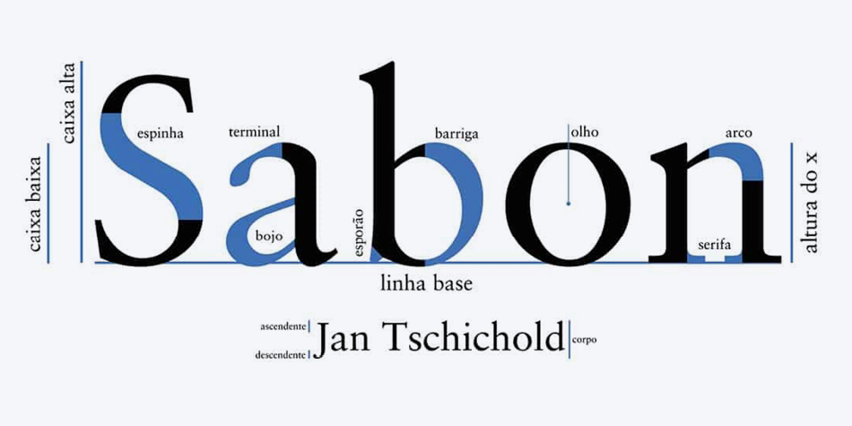
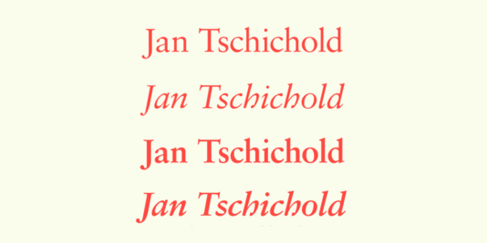
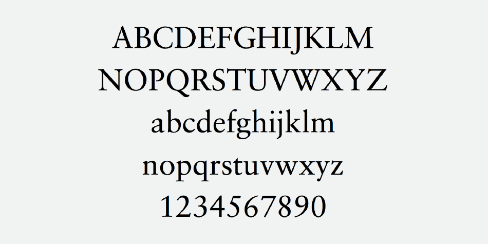
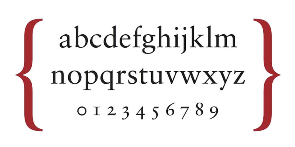
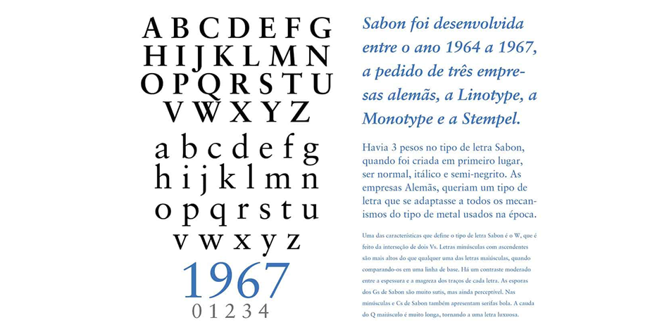
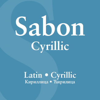
In the early 1960s, the German Master Printers’ Association requested that a new typeface be designed and produced in identical form on both Linotype and Monotype machines so that text and technical composition would match. Walter Cunz at Stempel responded by commissioning Jan Tschichold to design a new version of Claude Garamond’s serene and classical Roman. Its bold, and particularly its italic styles are limited by the requirements of Linotype casting machines, forcing the character widths of a given letter to match between styles, giving the italic its characteristic narrow f. The family’s name is taken from Jacques Sabon, who introduced Garamond’s Romans to Frankfurt. Sabon has long been a favorite of typographers for setting book text, due to its smooth texture, and in large part because Tschichold’s book typography remains world famous.
Design, Publisher, Copyright, License
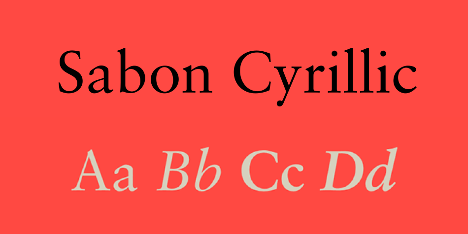
Design: Jan Tschichold, Claude Garamond, Aleksei Chekulaev, Hector Haralambous
Publisher: Linotype
Copyright 2000 by Linotype. All rights reserved.
License: COMMERCIAL.
Jan Tschichold
Jan Tschichold (born Johannes Tzschichhold, also known as Iwan Tschichold, or Ivan Tschichold; 2 April 1902 – 11 August 1974) was a calligrapher, typographer and book designer. He played a significant role in the development of graphic design in the 20th century – first, by developing and promoting principles of typographic modernism, and subsequently (and ironically) idealizing conservative typographic structures. His direction of the visual identity of Penguin Books in the decade following World War II served as a model for the burgeoning design practice of planning corporate identity programs. He also designed the much-admired typeface Sabon.









Reviews
There are no reviews yet.