Description
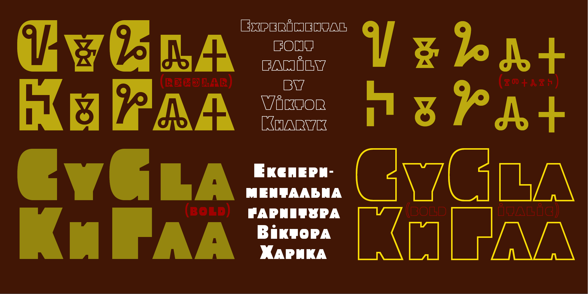
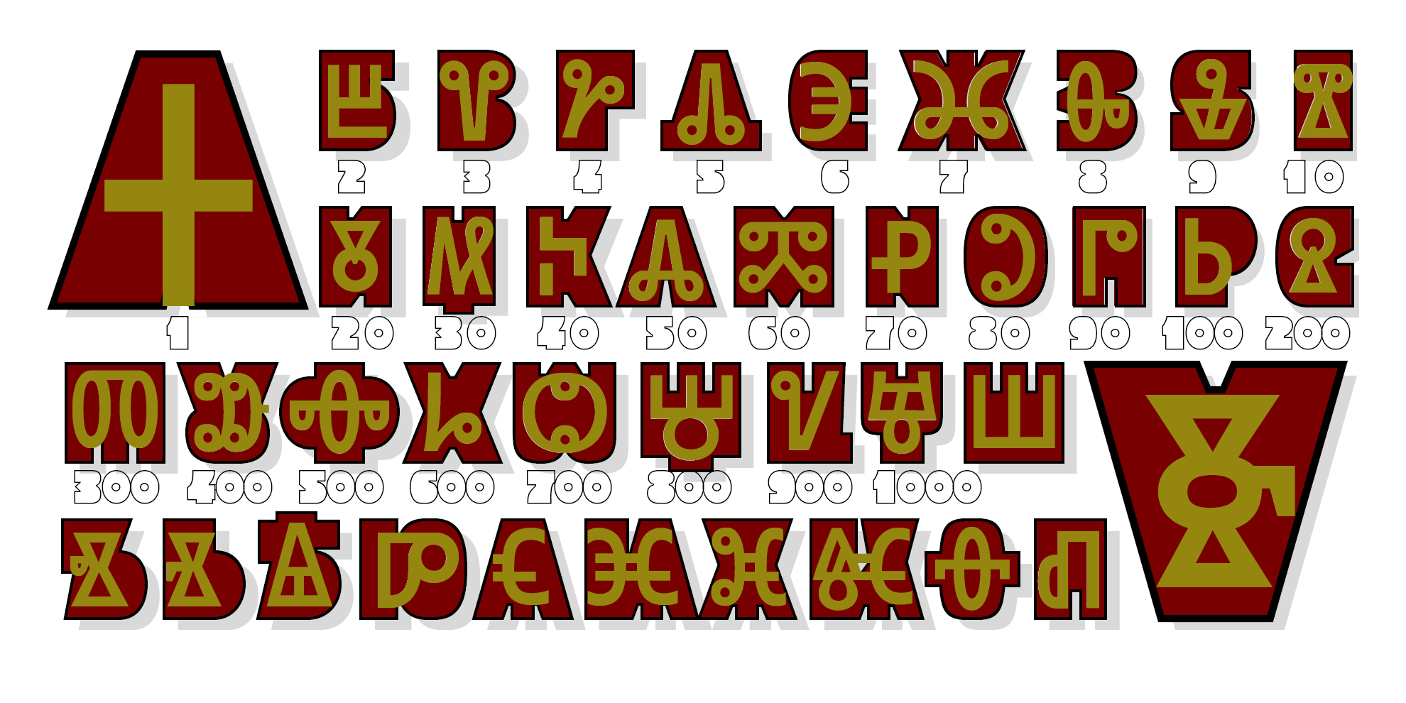
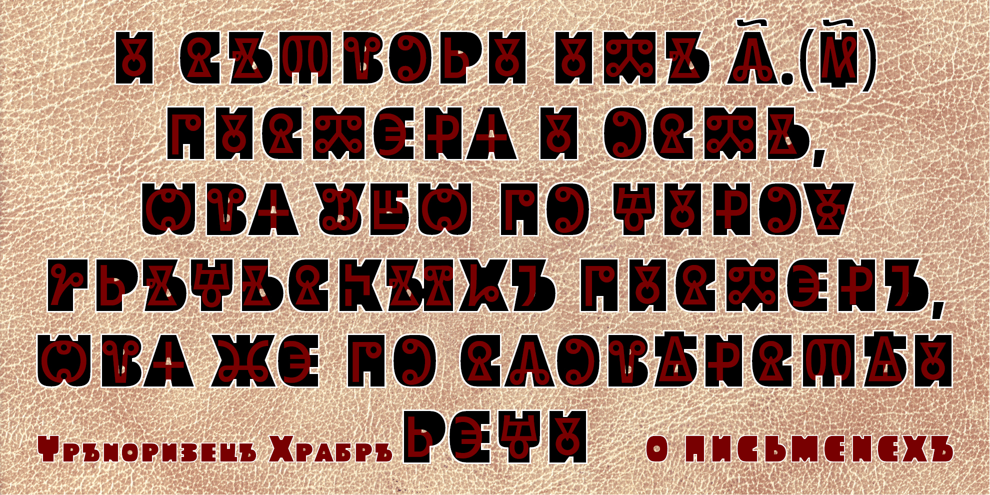
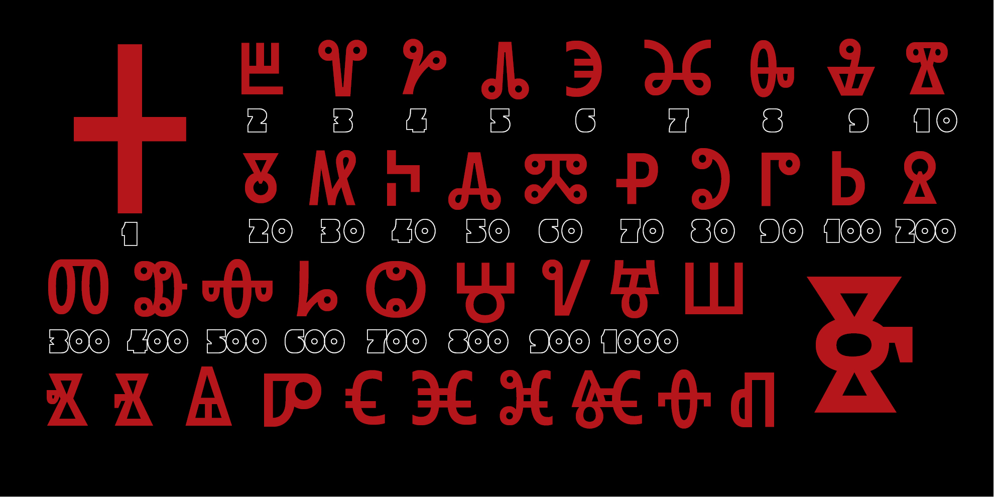
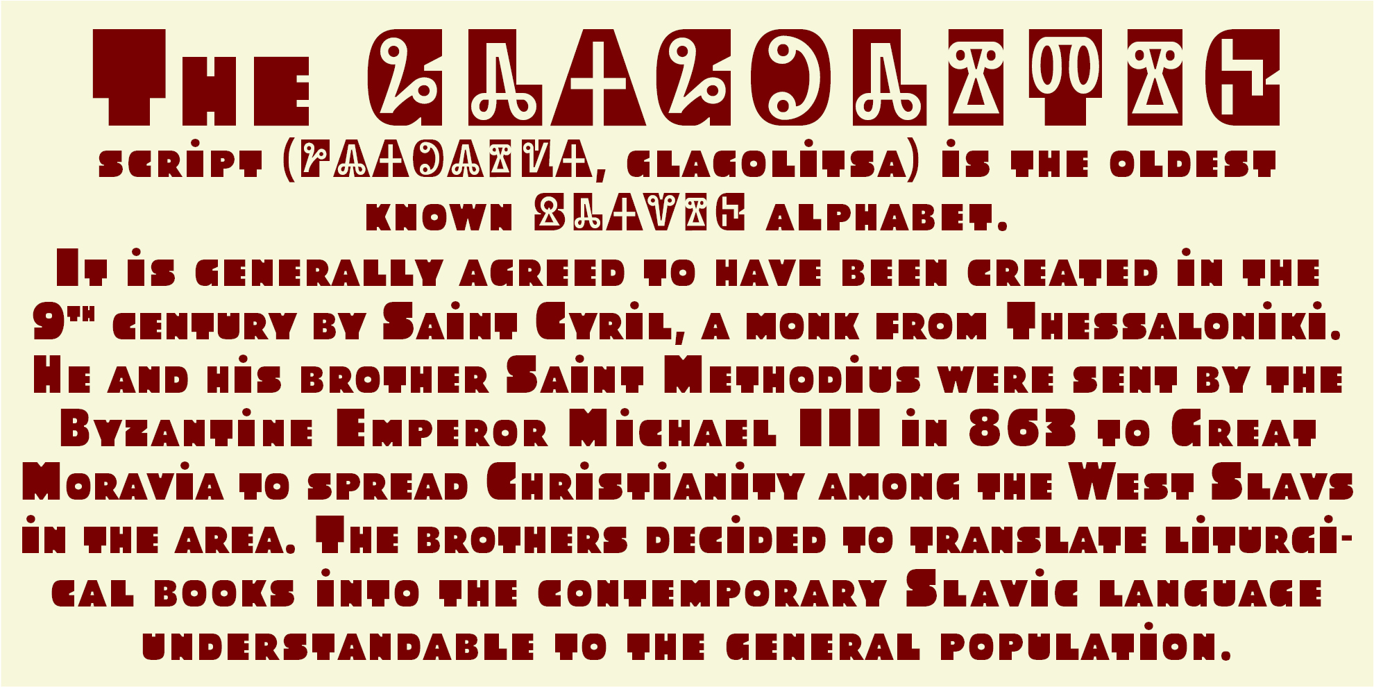
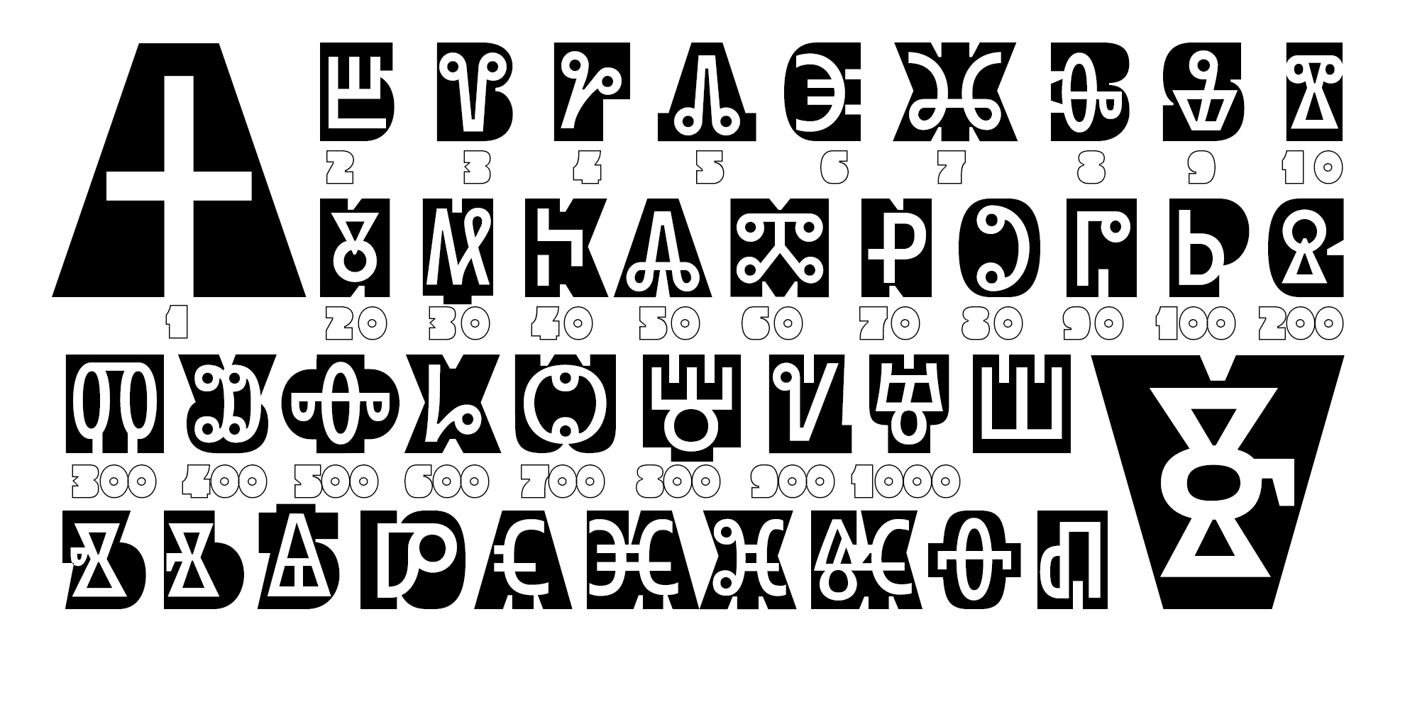
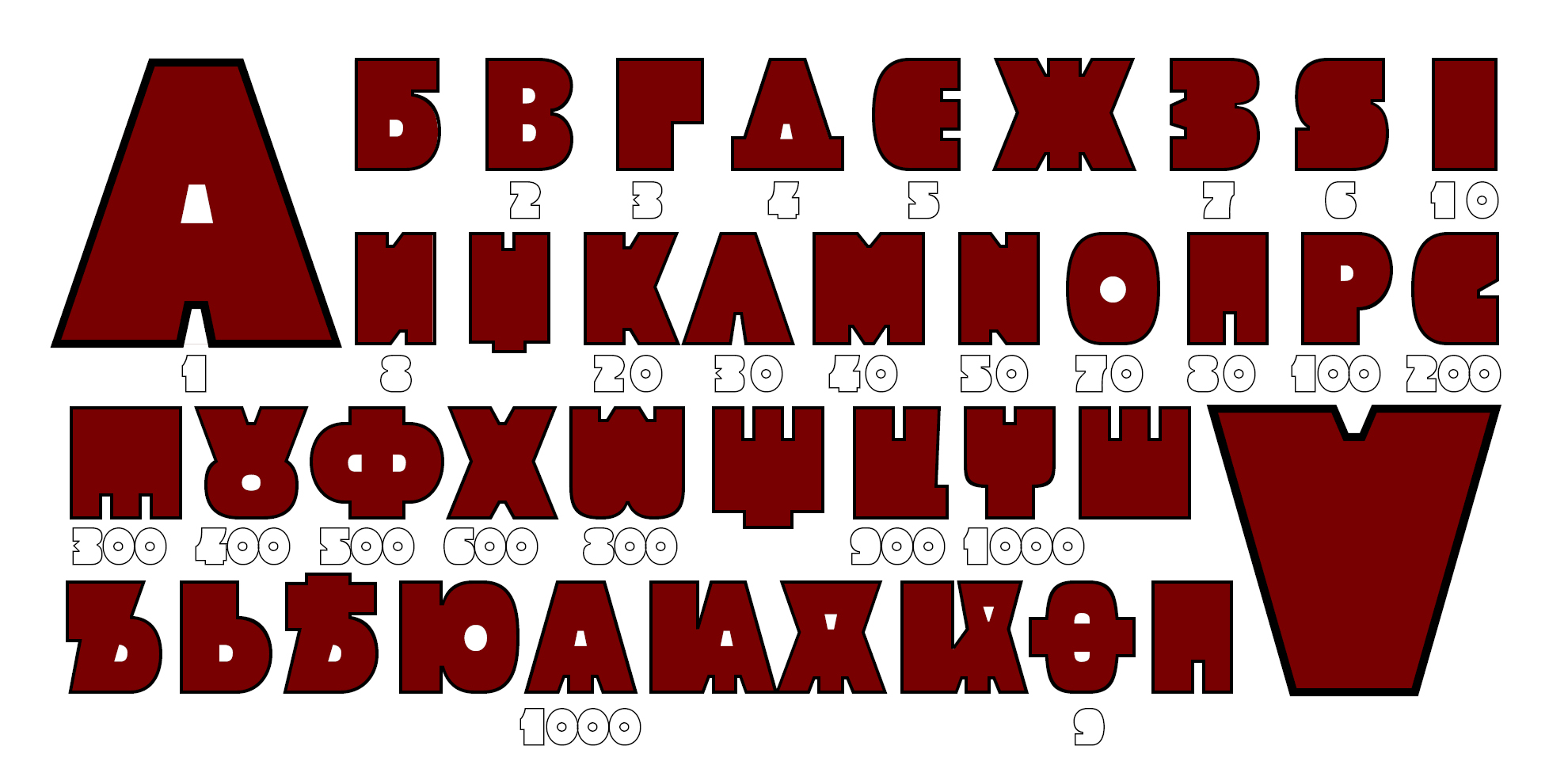
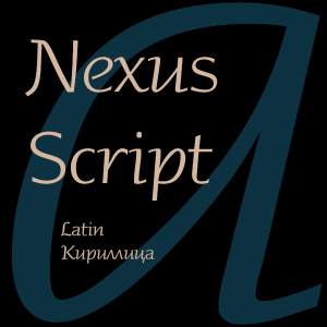
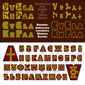
The experimental headset is designed to help visually realize the connection and mutual influence of the two Slavic alphabet and, among other things, facilitate the reading of the Glagolitic. The idea of such a font arose as a result of a reusable immersion in this intriguing topic and during visits to Bulgaria (who is interested, here is my 2007 report at the ATYPI conference in Brighton https://ua-typography.livejournal.com/162101.html). The vibrant is dedicated to the celebration on May 24 of the memory of saints Cyril and Methodius, which became the Day of Slavic Writing and Culture .. The basic inspection (regulator) was created by the imposition of a more light verb on the corresponding more fatty signs of the Cyrillic alphabet, similar to reading the signs of the Latin and the corresponding values. An additional inspection (encoded for convenience as an itik) contains only verbal letters, which are precisely applied to the base mark, and allows you to apply the second color. Two more additional drawings (Bold and Bold Italik – flooded and contour) do not contain a verb, allow them to combine them varied with the base and have independent value as decorative Cyrillic and dilated European Latin.
Viktor Kharyk
Viktor Kharyk is an Ukrainian designer, b. Kiev, 1957. Graduate of the Senior College for Print and Design in Kiev in 1982. Viktor became art director at Sphera in Kiev. Main type designer at Kiev-based company Unique GmbH in 1988-2001. In 2012, he cofounded Apostrof with Konstantin Golovchenko. He designs Armenian, Greek, Georgian, Devanagari, Hebrew, Cyrillic and Arabic fonts, and is particularly interested in revivals of ancient, forgotten, or historically important typefaces and writing systems.



Reviews
There are no reviews yet.