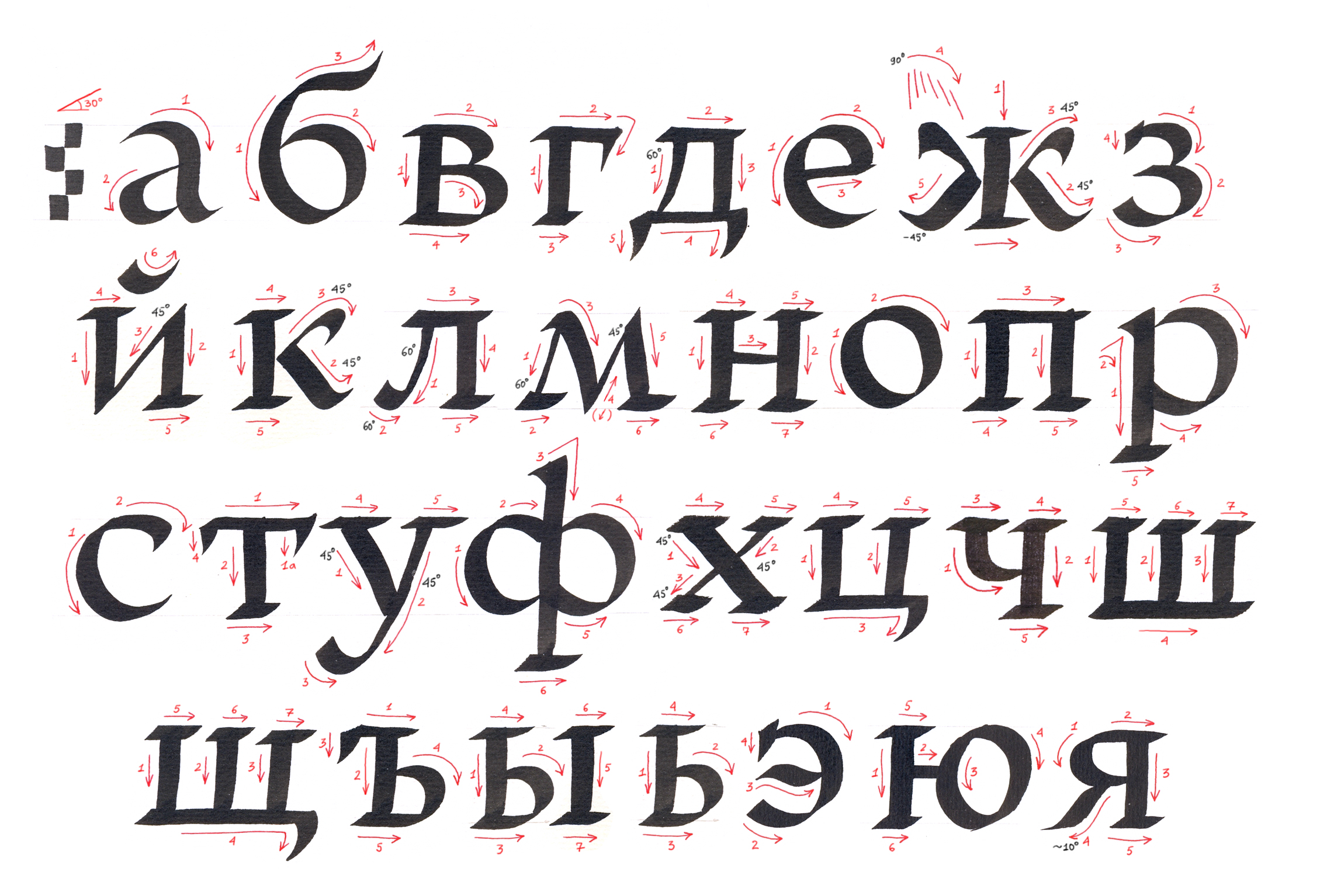
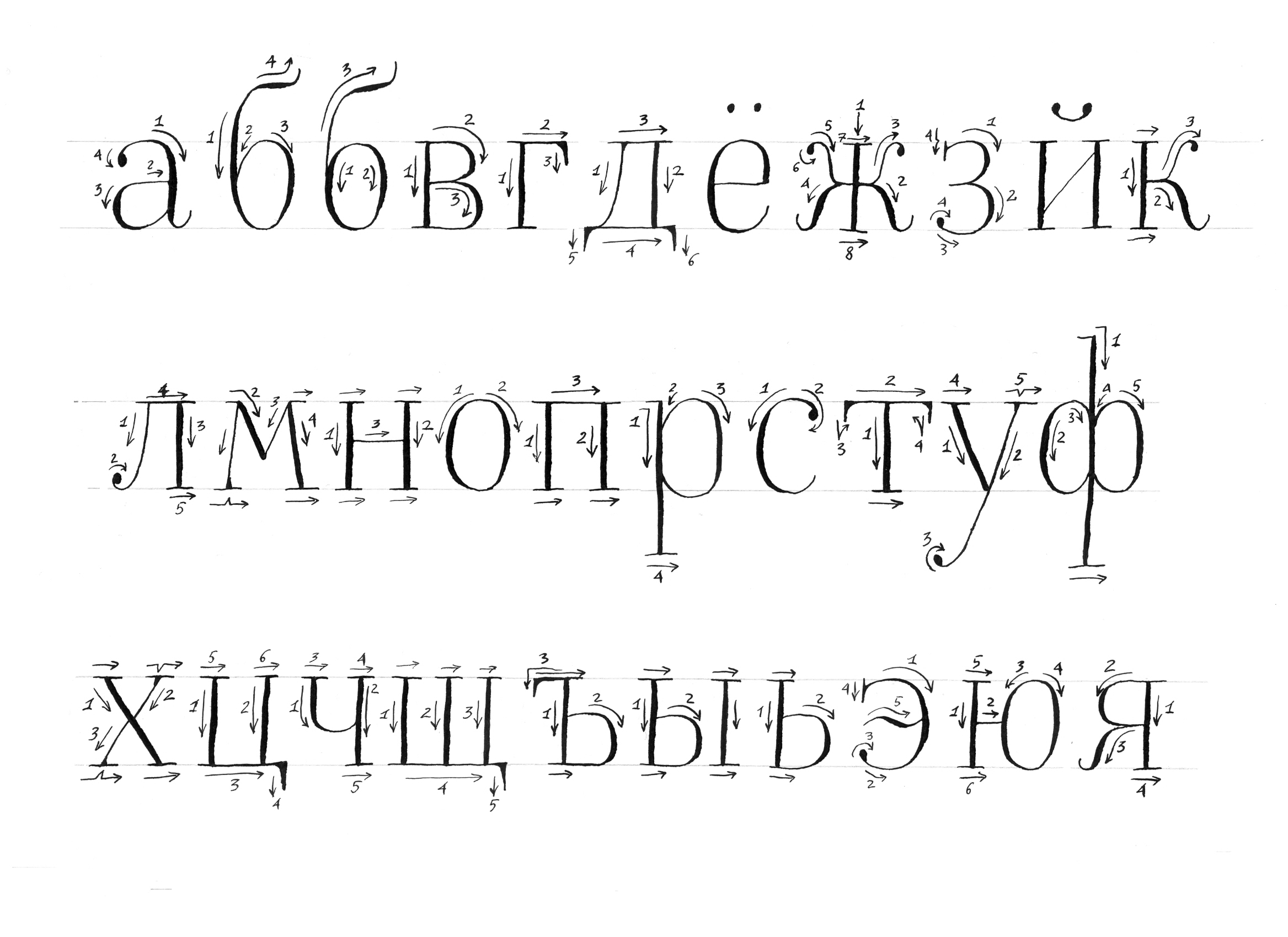
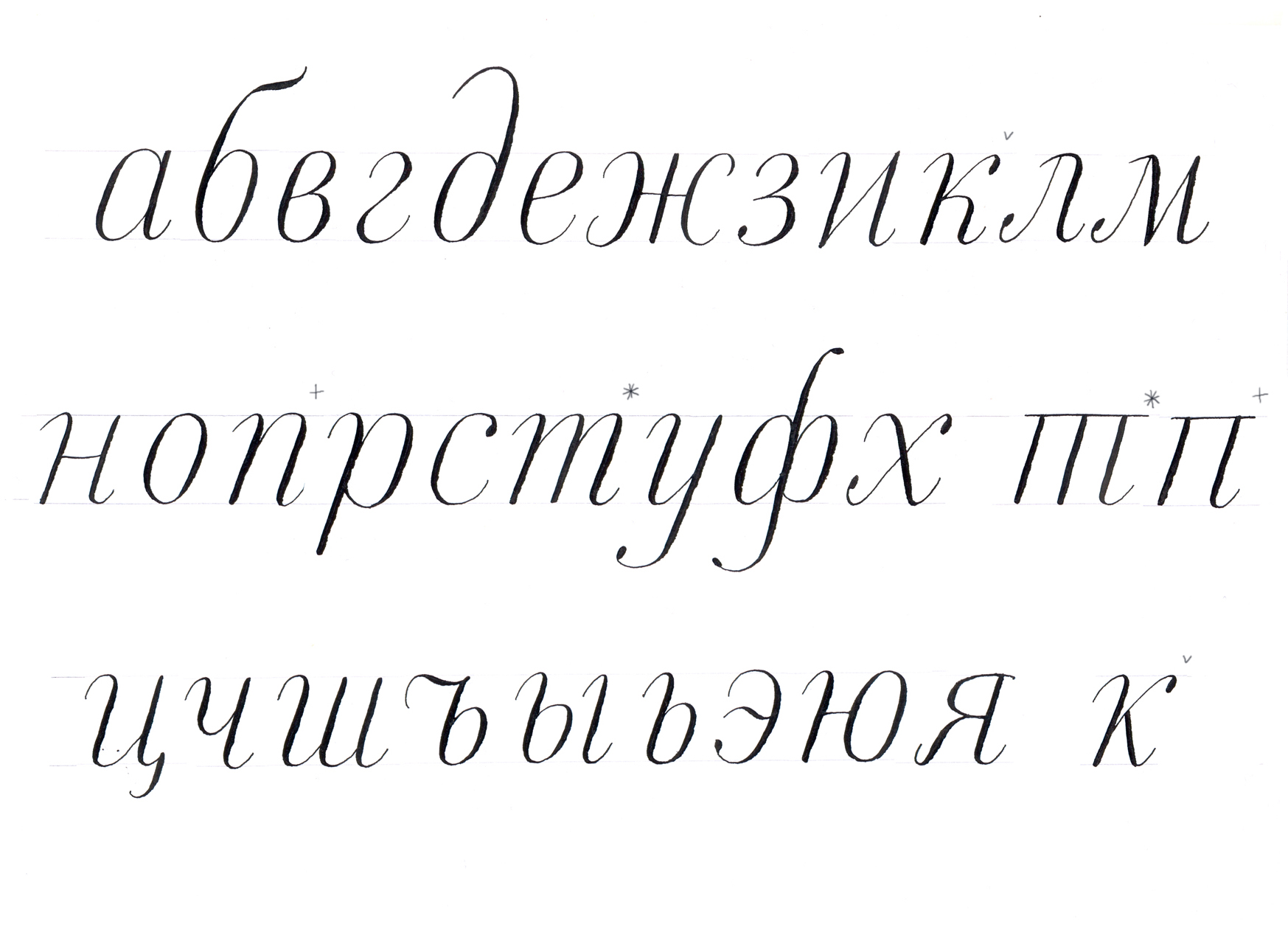
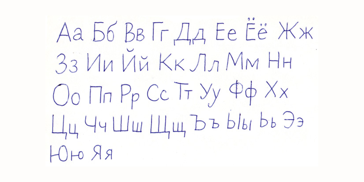
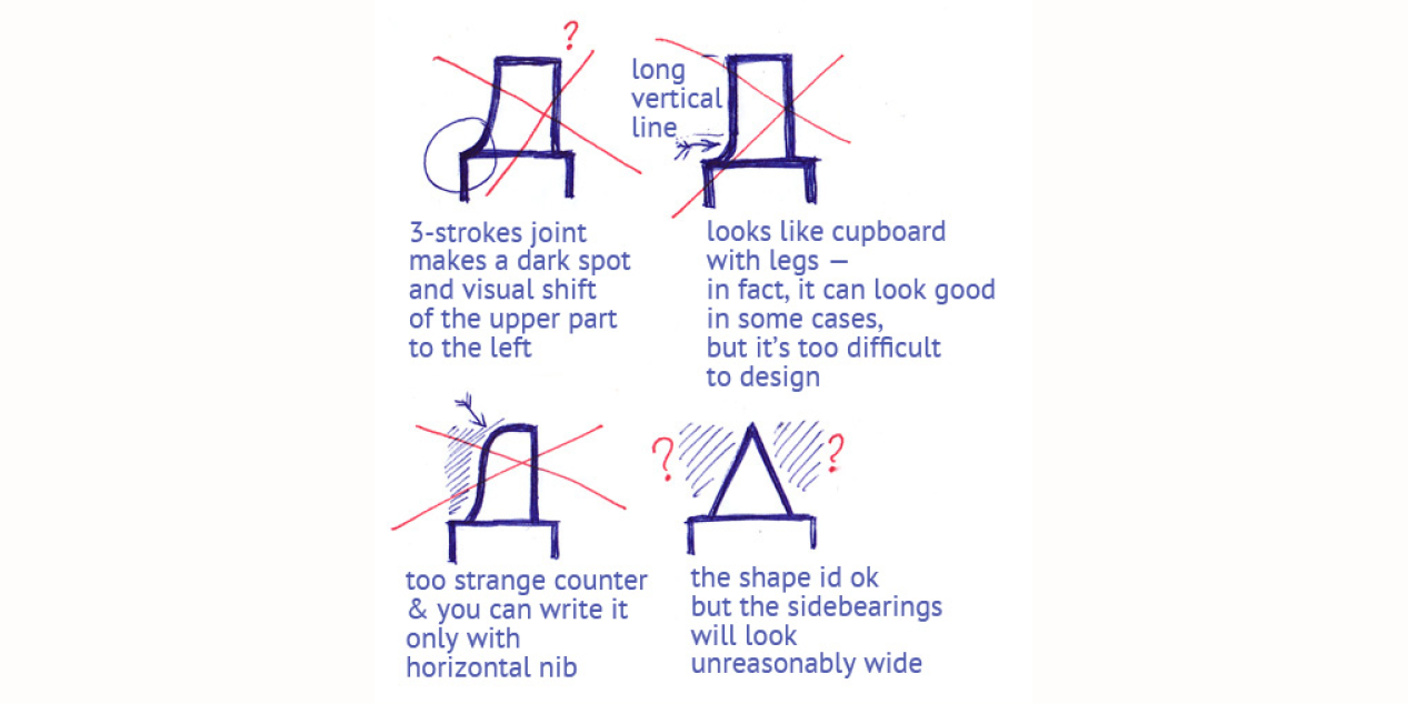
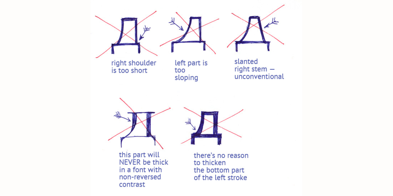
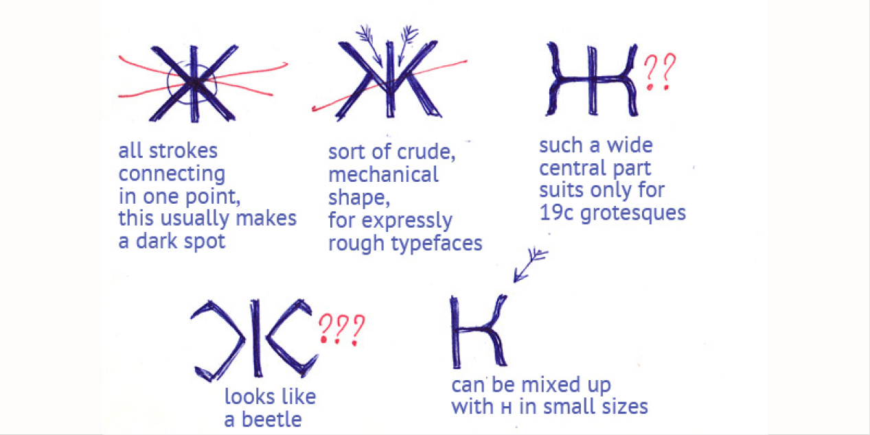
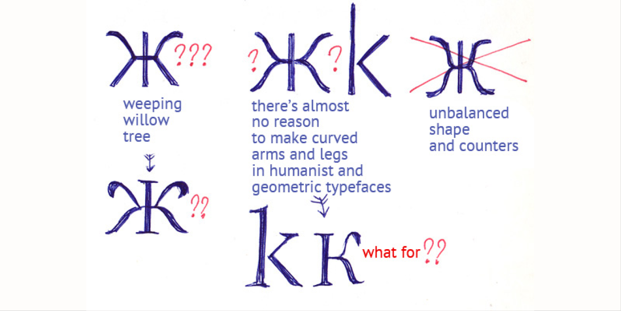
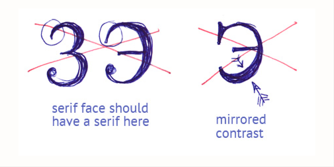
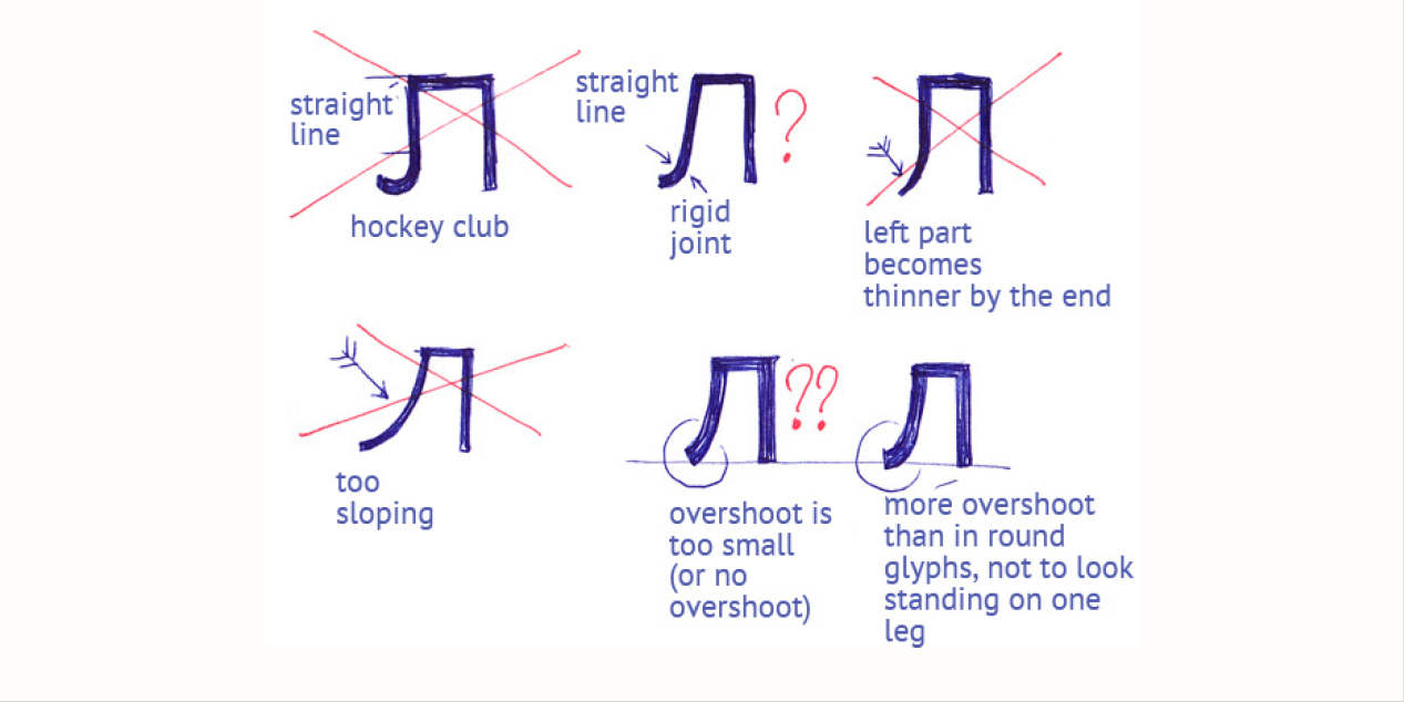
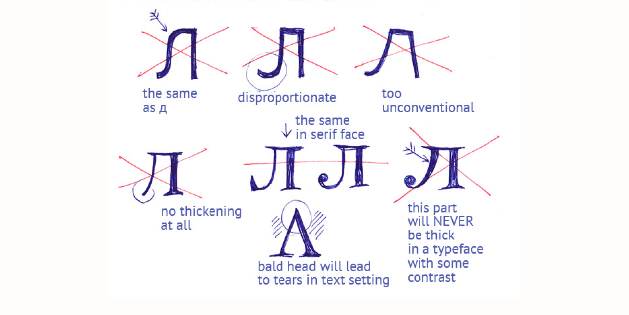
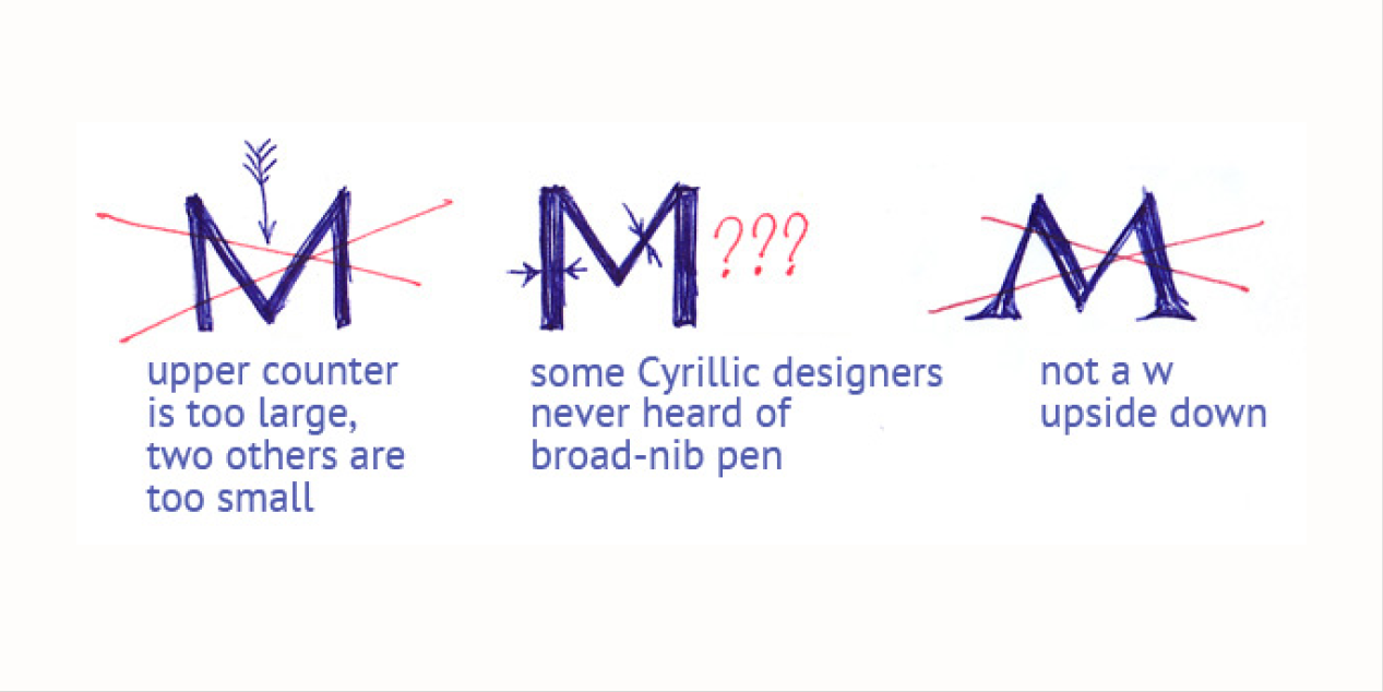
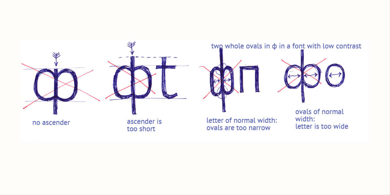
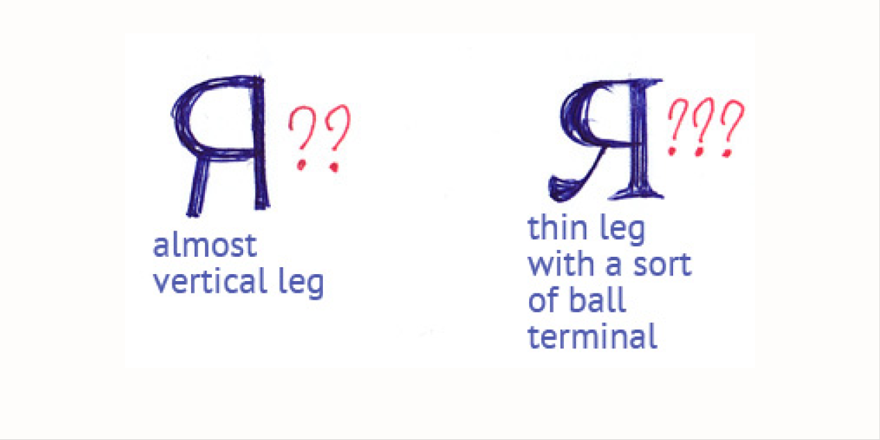
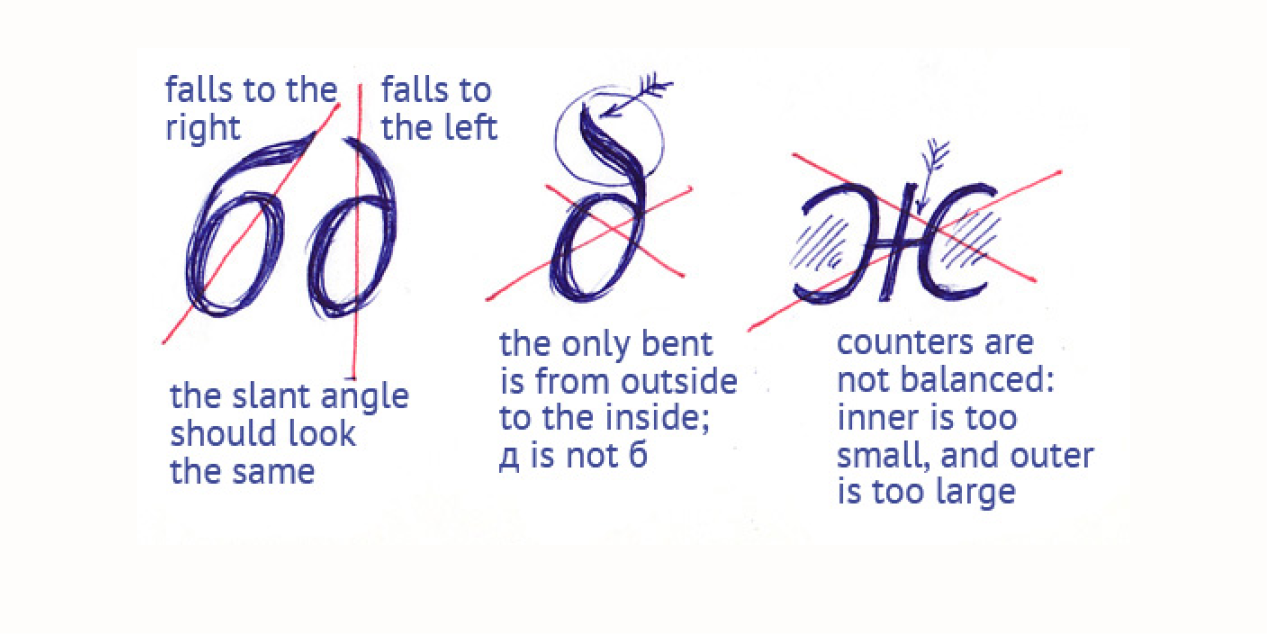
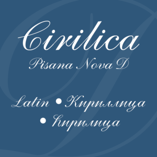
Cyrillic samples by Vera Evstafieva
Source: Learn Cyrillic
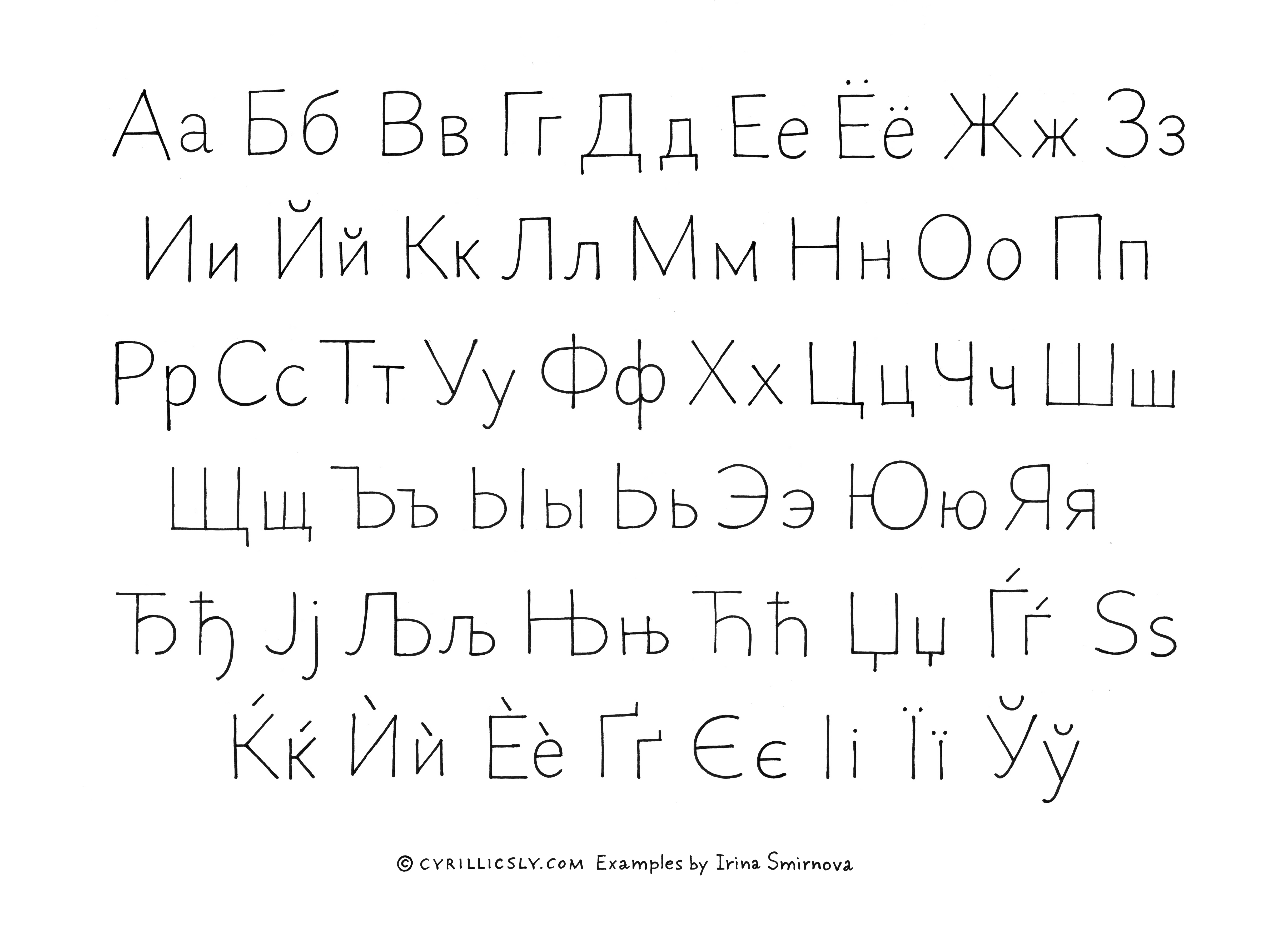
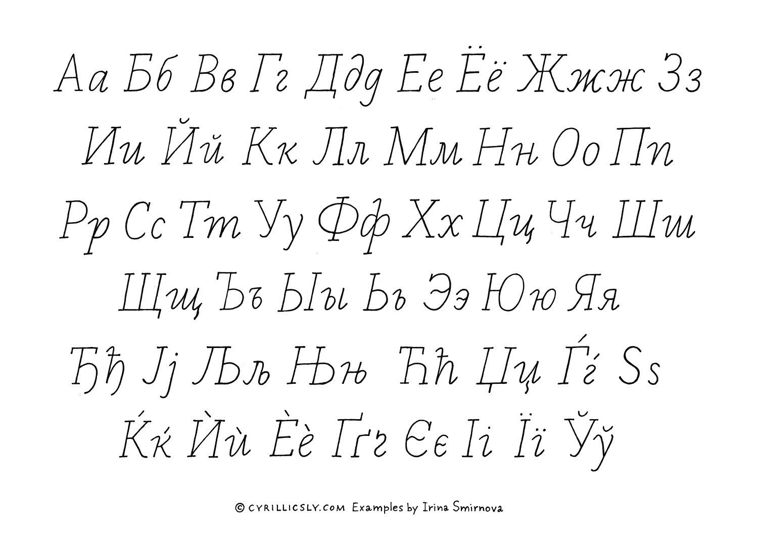
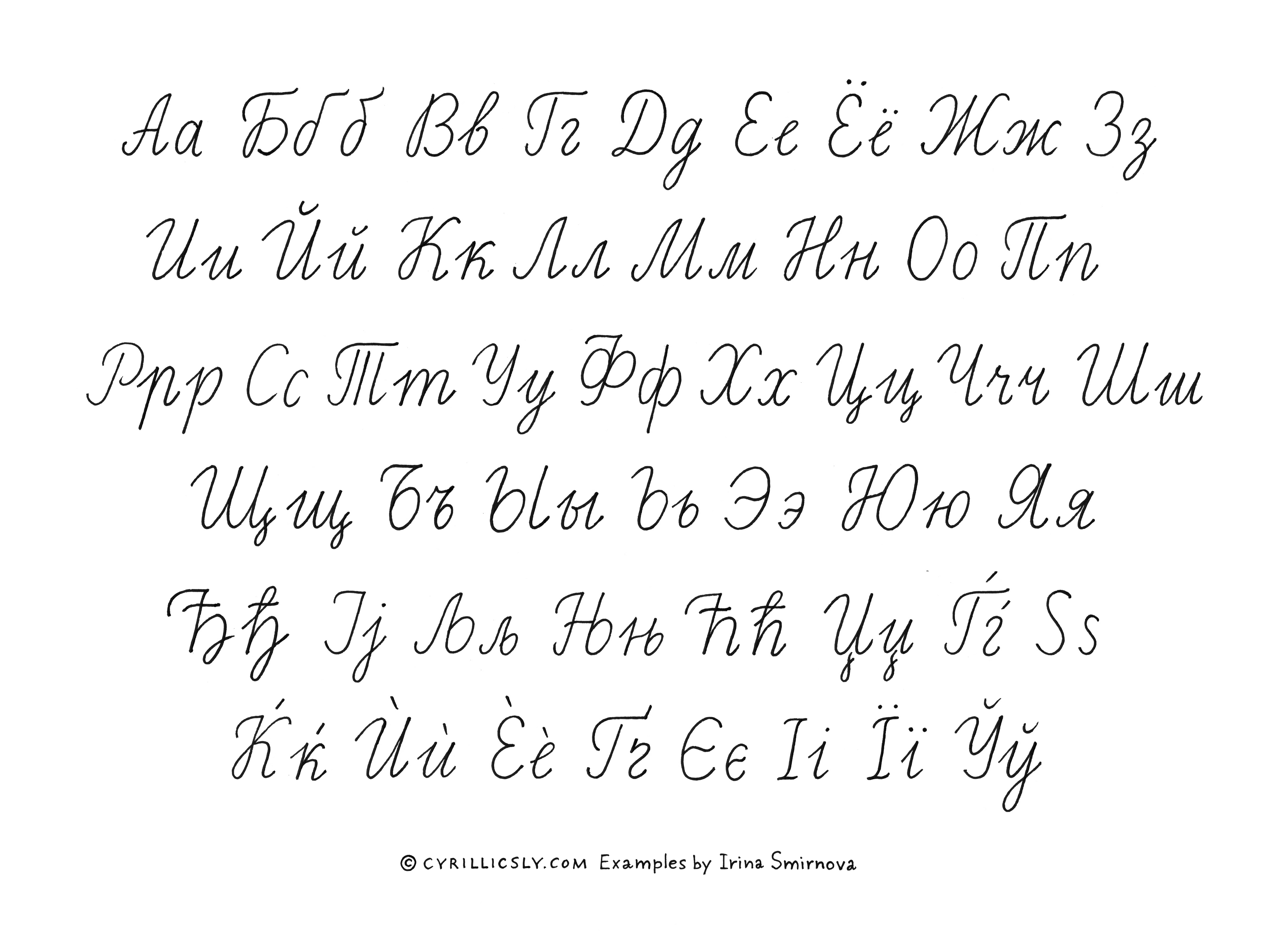
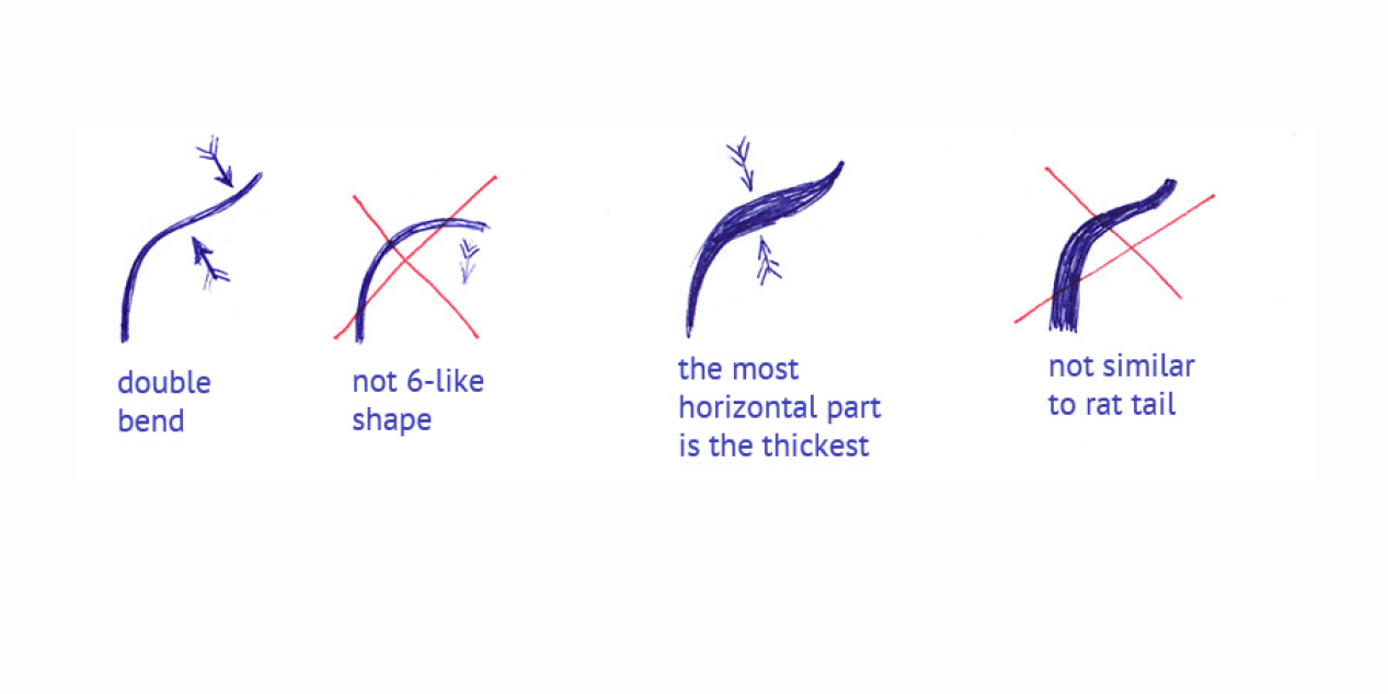
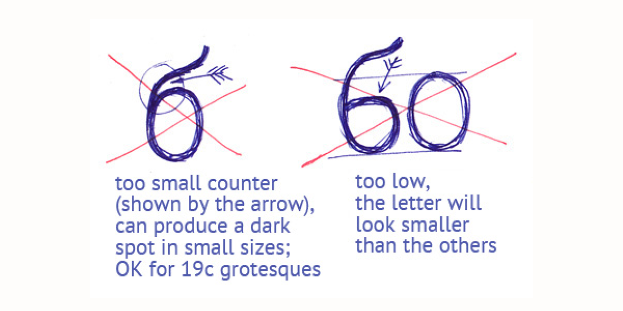
Cyrillic basic construction. Examples by Irina Smirnova
Source: cyrillicsly.com
Cyrillic – beginners guide by Alexei Vanyashin
Alexei Vanyashin – Why do we (still) use Cyrillic
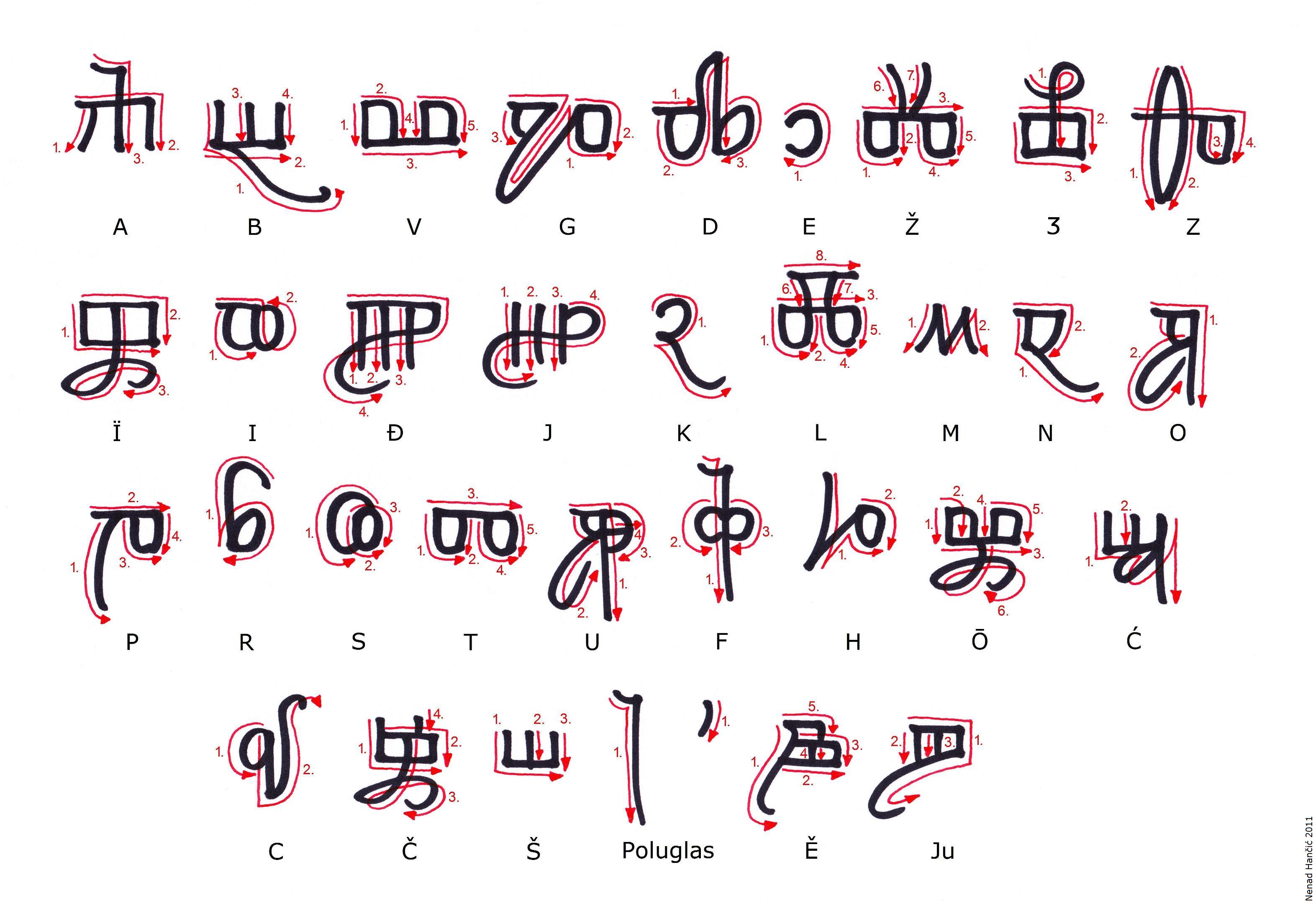
Italic Glagolitic Script
Drawing: Nenad Hančić
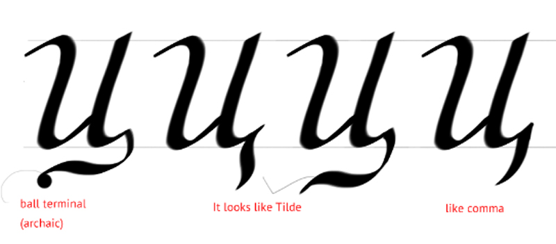
Cyrillic small letter „ц“ in italic
Drawing: Alexander Stetsiuk
Italic discussion at TYPEDRAWERS
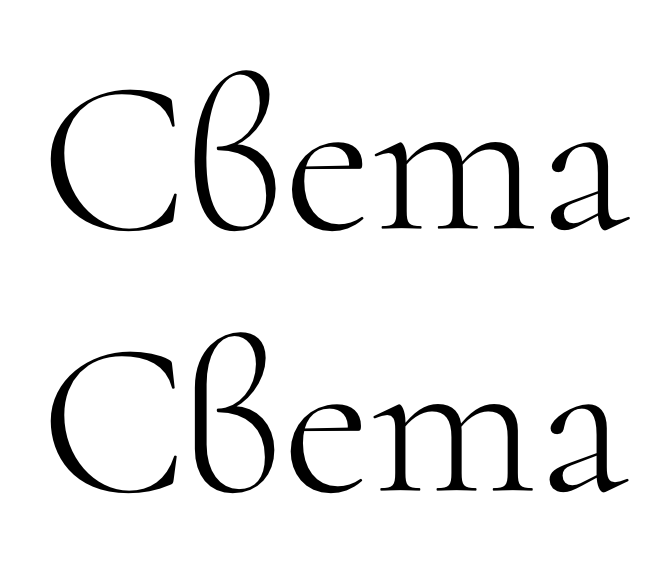
BTW, which is the better Bulgarian “в” /ve/
BTW, is this Bulgarian “в” /ve/ better?, asks Christian Thalmann, author of Cormorant font family
Drawing: Christian Thalmann
Modern Cyrillic discussion at GITHUB
Quality Cyrillic Script | Качество кириллицы в шрифте
Source: livejournal.com
And if you think about the Cyrillic type design don’t miss the issues of Alexandra Korolkova.
Alexandra Korolkova: “Relatively easy way to determine the quality of the Cyrillic font | Относительно лёгкий способ определить качество кириллицы в шрифте”
Alexandra Korolkova:“Нет предела совершенству | There is no limit to perfection”.
Dashes, Rules and Dot Leaders
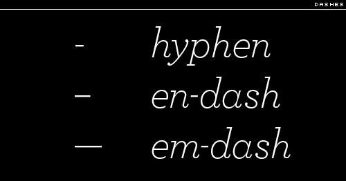
The smallest typographic line is the hyphen, the short dash used to link hyphenated words and for wordbreaks at the end of a line. Ems and ens return to help describe the other line dashes: the en dash, the width of an en space, and the em dash, a popular line the width of an em space.
Source: I Love Typography
As Alexander & Nicholas Humez, describe it in the book ABC Et Cetera, “The em dash is used to indicate abrupt transitions—What?—and quasi-parenthetical expressions—such as this one.” The two-em dash and the three-em dash are precisely as long as their names imply.
The two remaining character-size lines are the underscore or understrike (_), and the increasingly popular pipe, also known as a vertical or a vertical bar (|). Incidentally, the grids created using vertical bars and understrikes, open at the top, for the filling-in, letter by letter, of information are known as combs.
Larger typographic lines are referred to as rules, which is perhaps not surprising in a field as traditional as typography. A hairline rule is a particular fine line; other rules are defined by width as measured in points. At some undefined point a wide rule becomes a bar. Bar width is also measured in points. Cutoff rules are used to distinguish the width of columns of type, and a leader of dashes sometimes carries the eye across a column of information, linking, for instance, a chapter title to a page number. A dot leader is a row of periods or midpoints set for the same purpose.
Read more: I Love Typography
Italics. Optical correction after slanting
Source: Vassil Kateliev. YouTube
Further Readings
Thomas Phinney: Phinney on Fonts
Thomas Phinney: Font Detective
Adam Twardoch: Polish Diacritics – How to? Kreska – not exactly acute
Maria Grilo: A typography workshop
Ulrik Hogrebe: What You Need to Know When Making Cyrillic Typefaces (an interview with Aleksandra Samulenkova)
Eugene Sadko: There Is No Cyrillic
Silnrsi: Font Development Best Practices
Gunnlaugur SE Briem: Type Design
DigitalArts: How to design a font
Jake Rocheleau: The Ultimate Guide on How to Create a Font
Simon Cozens: Fonts and Layout for Global Scripts
Joep Pohlen: Letter Fountain
FontForge: Design with FontForge
Font Development Best Practices: Technical Guidance Regarding Font Development And Production
Simon Cozens: Fonts and Layout for Global Scripts
Victor Gaultney: Designing italics

