A look at the Latin letter
A B C D E F G H I J K L M N O P Q R S T U V W Y X Z
a b c d e f g h i j k l m n o p q r s t u v w y x z
A look at the Cyrillic letter
А Б В Г Д Е Ё Ж З И Й К Л М Н О П Р С Т У Ф Х Ц Ч Ш Щ Ъ Ы Ь Э Ю Я Ѣ Ѥ Ѧ Ѩ Ѫ Ѭ Ѯ Ѱ Ѳ Ѵ Ѷ Ѹ Ѻ Ѽ Ѿ Ҁ ҂ ҃ ҄ ҅ ҆ ҇ ҈ ҉
а б в г д е ё ж з и й к л м н о п р с т у ф х ц ч ш щ ъ ы ь э ю я ѣ ѥ ѧ ѩ ѫ ѭ ѯ ѱ ѳ ѵ ѷ ѹ ѻ ѽ ѿ ҁ
Cyrillic Alphabets
Cyrillic Alphabets of Slavic Languages
Cyrillic Alphabets of Non-Slavic Languages
A diacritic – also diacritical mark, diacritical point, or diacritical sign – is a glyph added to a letter, or basic glyph. The term derives from the Ancient Greek διακριτικός (diakritikós, “distinguishing”), from διακρίνω (diakrī́nō, “to distinguish”). Diacritic is primarily an adjective, though sometimes used as a noun, whereas diacritical is only ever an adjective. Some diacritical marks, such as the acute ( ´ ) and grave ( ` ), are often called accents. Diacritical marks may appear above or below a letter, or in some other position such as within the letter or between two letters.
The main use of diacritical marks in the Latin script is to change the sound-values of the letters to which they are added. Examples from English are the diaereses in naïve and Noël, which show that the vowel with the diaeresis mark is pronounced separately from the preceding vowel; the acute and grave accents, which can indicate that a final vowel is to be pronounced, as in saké and poetic breathèd; and the cedilla under the “c” in the borrowed French word façade, which shows it is pronounced /s/ rather than /k/. In other Latin alphabets, they may distinguish between homonyms, such as the French là (“there”) versus la (“the”) that are both pronounced /la/. In Gaelic type, a dot over a consonant indicates lenition of the consonant in question.
In other alphabetic systems, diacritical marks may perform other functions. Vowel pointing systems, namely the Arabic harakat ( ـِ ,ـُ ,ـَ, etc.) and the Hebrew niqqud ( ַ◌, ֶ◌, ִ◌, ֹ◌, ֻ◌, etc.) systems, indicate vowels that are not conveyed by the basic alphabet. The Indic virama ( ् etc.) and the Arabic sukūn ( ـْـ ) mark the absence of a vowel. Cantillation marks indicate prosody. Other uses include the Early Cyrillic titlo ( ◌҃ ) and the Hebrew gershayim ( ״ ), which, respectively, mark abbreviations or acronyms, and Greek diacritical marks, which showed that letters of the alphabet were being used as numerals. In the Hanyu Pinyin official romanization system for Chinese, diacritics are used to mark the tones of the syllables in which the marked vowels occur.
In orthography and collation, a letter modified by a diacritic may be treated either as a new, distinct letter or as a letter–diacritic combination. This varies from language to language, and may vary from case to case within a language.
In some cases, letters are used as “in-line diacritics”, with the same function as ancillary glyphs, in that they modify the sound of the letter preceding them, as in the case of the “h” in the English pronunciation of “sh” and “th”.
The website is an educational tool or guideline for dealing with diacritic marks in most common languages throughout the world. It is a coherent solution that should help to make it easier to design diacritic marks in various languages. Instead of text descriptions, all solutions are shown by visual examples. The user can simply select a typeface similar to his design and follow – copy – the suggested processes and solutions.
The aim of this website is not to show any specific solutions of the project. The main purpose of this website is to inform about the project, to clarify the approach to problem and to describe the research process.
The Polish alphabet contains 32 letters originally used in Polish language plus 3 letters used in foreign words. 9 letters are so-called diacritics: they are used to express sounds not found in most other languages. It should be mentioned that many sounds are expressed by letter pairs e.g. sz, cz, ch.
The current shape of the Polish characters has been mostly established by the Cracow printer Jan Januszowski (yahn yahnushovsky) and his ortography, which he had published together with ortographies of Łukasz Górnicki and Jan Kochanowski in 1594 as “Nowy karakter polski”. The title was also the name of a new typeface which he had designed for this purpose. Nowy karakter polski is considered to be the first original Polish typeface.
Polish Kreska Language Feature
Localize Your Font: Polish Kreska
Ogonek is probably one of the most misunderstood and misshaped character elements ever. It all starts with the essentially wrong assumption that ogonek is an accent. No, it’s not. It’s much more a character element, just like a stem, a serif or a descent. In a vast majority of cases ogonek should be smoothly connected with the base glyph, it should be a part of the glyph.
Ogonek is used in Polish and Lithuanian. A similar shape can be also found in the Navajo and Tuchtone languages.
It should be noted that the Polish and Lithuanian traditions in drawing the ogonek differ. Again, OpenType language-sensitive glyph substitution would be a good solution here.
The word ogonek is a Polish diminutive. It means little tail or the stem of an apple.
Unfortunately, this is not the case in many fonts.
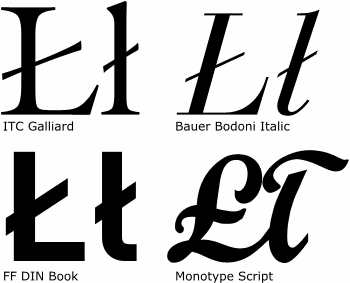
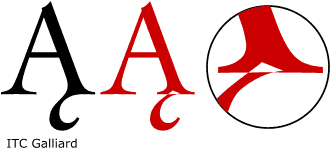
Kreska ukośna is appears only in the letter ł (lslash, barred l, pronounced ew). This letter should not be drawn like the British pound sign!
It is one of the most difficult and badly drawn characters ever, probably because of its illusional simplicity.
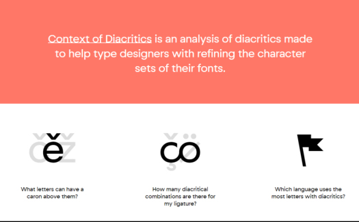
Context of Diacritics is an analysis of diacritics made to help type designers with refining the character sets of their fonts.
Because you should design fonts that support as many languages as possible. Let’s say your font contains an st ligature. Which variations of this ligature with diacritical marks should you make? Of course, you could create all possible combinations to be sure you don’t miss anything. Or you can check this database and find out which variations are actually used in real life.
Context of Diacritics is not scientific research. It is a result of a frequency analysis of articles from Wikipedia. The main goal of this project is TO LIST DIACRITICAL COMBINATIONS THAT EXIST IN REAL LIFE. Because of the methods used, all other data (absolute and relative frequency, position within words) is not and cannot be 100% accurate.
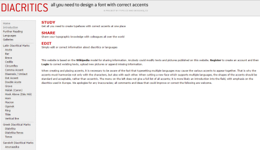
All You need to Design a Font
with Correct Accents
Get all you need to create typefaces with correct accents at one place. Share your typographic knowledge with colleagues all over the world. Simply edit or correct information about diacritics or languages.
This website is based on the Wikipedia model for sharing information. Anybody could modify texts and pictures published on this website. Register to create an account and then Login to correct existing texts, upload new pictures or append missing information.
When creating and placing accents, it is necessary to be aware of the fact that typesetting multiple languages may cause the various accents to appear together. That is why the accents must harmonize not only with the characters, but also with each other. When cutting a new face which supports multiple languages, the shapes of the accents should be standard and acceptable, rather than eccentric. The menu on the left does not give a full list of all accents; it is more likely an introduction into the field, with emphasis on the diacritics used in Europe. We apologize for any inaccuracies; all comments and ideas that could improve or correct the following are welcome.
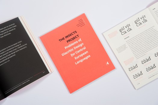
The Insects Project is a proud product of a collaborative research aimed at sharing knowledge about Central European typography and promoting design that is sensitive to the needs of all those who are unlucky enough to be native users of Czech, Hungarian, Polish and Slovak.
Perhaps few users of “diacriticless” languages (such as e.g. English) realise how lucky they are to be able to choose from literally thousands of typefaces. Central Europeans, on the other hand, are nowhere near as spoiled for choice, because many fonts available on the market still seem to overlook the specific needs of their knotty languages.
This book contains four articles by invited experts. Each of them presents a historical overview and a guide to good diacritic design practices in particular languages including examples of the most common design problems that were prepared using font samples from young Czech, Polish and Slovak typedesigners.
Download the book in PDF
Victor Gaultney’s (USA) dissertation focuses on the problems of designing diacritics and the techniques designers have used to address them. After a review of the definition, origin, and classification of diacritics, each problem is identified and analysed, with an emphasis on how they have been, or could be, overcome. The analysis concludes with a review of remaining problems, some recommendations, and comments on the future of diacritic design.
Download the dissertation in PDF

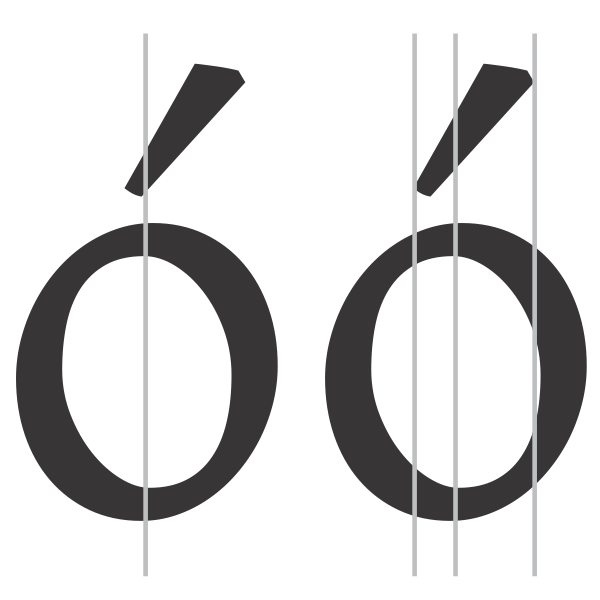
Kropka (dotaccent, dot above) ist the least problematic diactiric. Kropka can be placed above the small and capital Z (zdotaccent, Zdotaccent). In small zdotaccent (phon. zh), the kropka should be always identically shaped and placed as the dot above i. It should be always visually centered relative to the letter z.
If a typeface includes only capital letters (e.g.: Carol Twombly’s Trajan), the dotaccent should be shaped just as the dots in the diaeresis (umlaut), it may be a bit larger, though.
The Polish word kropka means dot. The diminutive kropeczka is sometimes used, too.
Other sources
David Březina: On Diacritics
Aleksandra Samulenkova: Diacritics as a Means of Self-Identification
Aleksandra Samulenkova: List of resources on designing diacritics
Donny Trương: Vietnamese Typography
Typefoundry: Esszet or ß
Christoph Koeberlin: The German Capital Letter Eszett
Typografie Info: Versal-Eszett (ẞ) – Bedeutung/Definition
Ralf Herrmann: Capital Sharp S designs. The good, the bad and the ugly
Ralf Herrmann: Capital Sharp S – Germany’s new character
TypeDrawers: Polish Kreska Language Feature
Glyphs: Localize Your Font: Polish Kreska
Wikipedia: Diacritic
Wikipedia: Acute accent
Wikipedia: Grave accent
Wikipedia: Ogonek
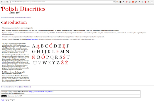
Adam Twardoch: Polish Diacritics – How to?
Adam Twardoch: Polish Diacritics – How to? Ogonek
Adam Twardoch: Polish Diacritics – How to? Kropka
Adam Twardoch: Polish Diacritics – How to? Kreska ukośna
Aleksandra Samulenkova: List of sources concerning diacritics and special characters of the Latin script
Victor Gaultney: Positioning the traditional cedilla
Eric Muller: Cedillas and commas below