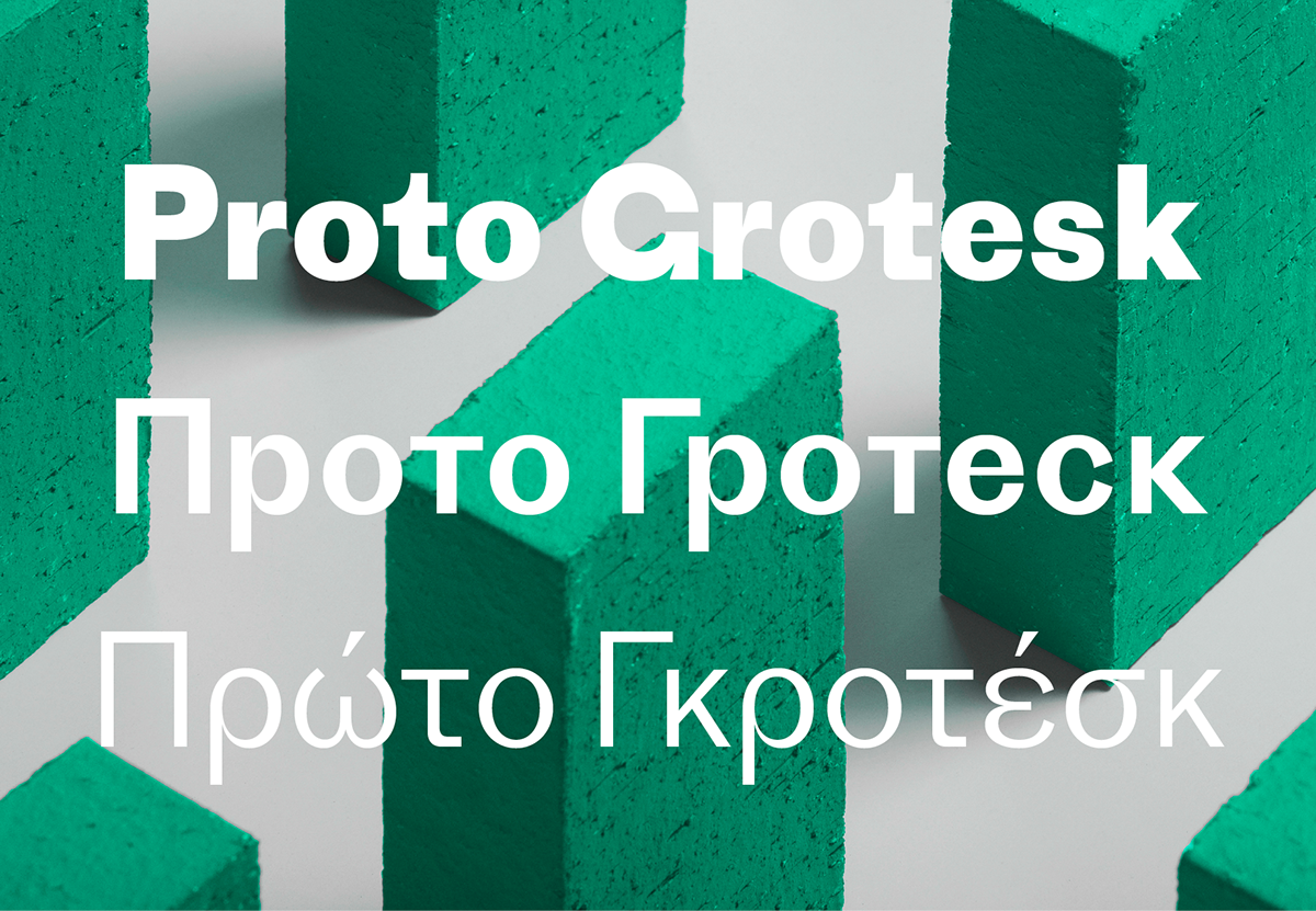
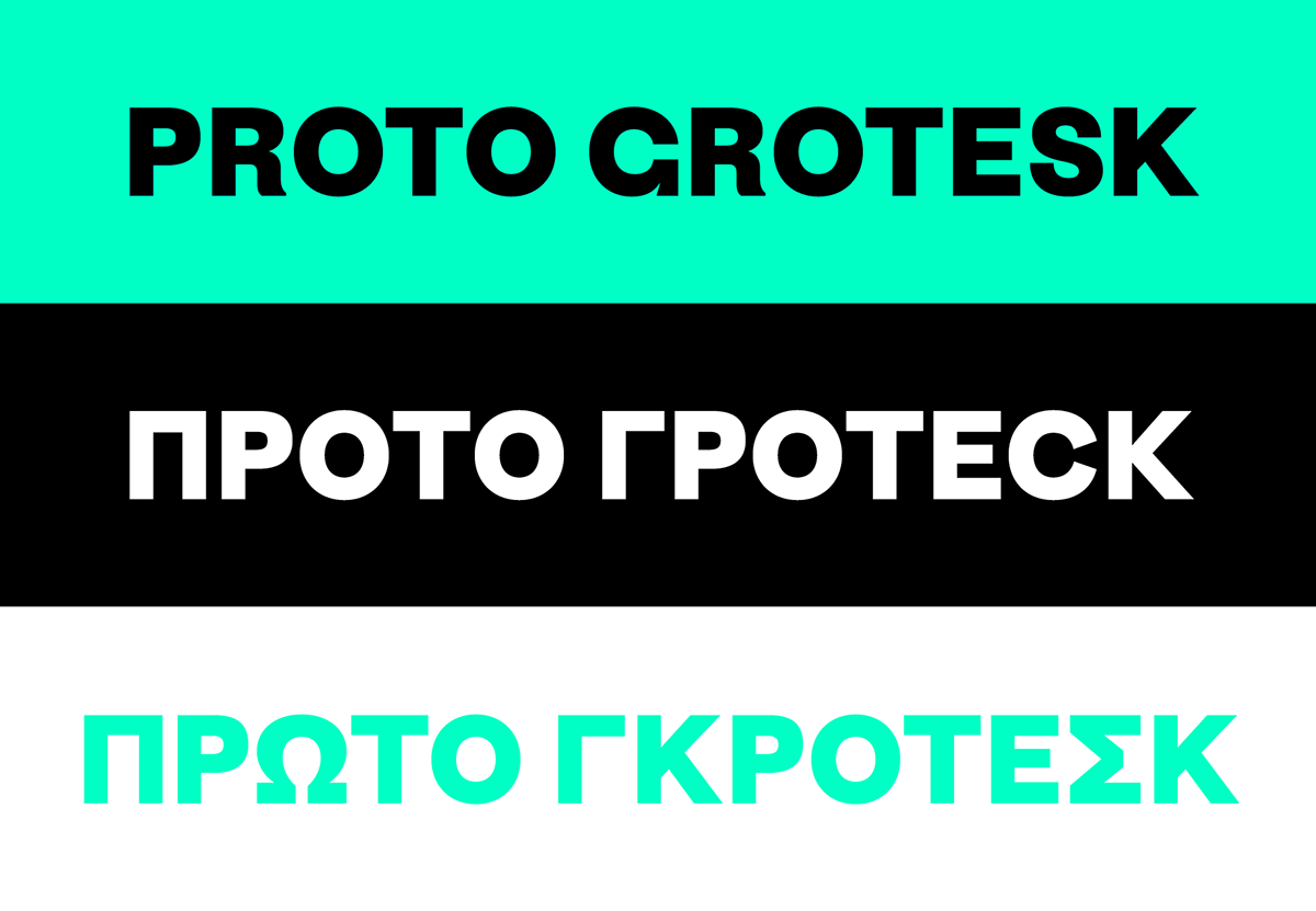
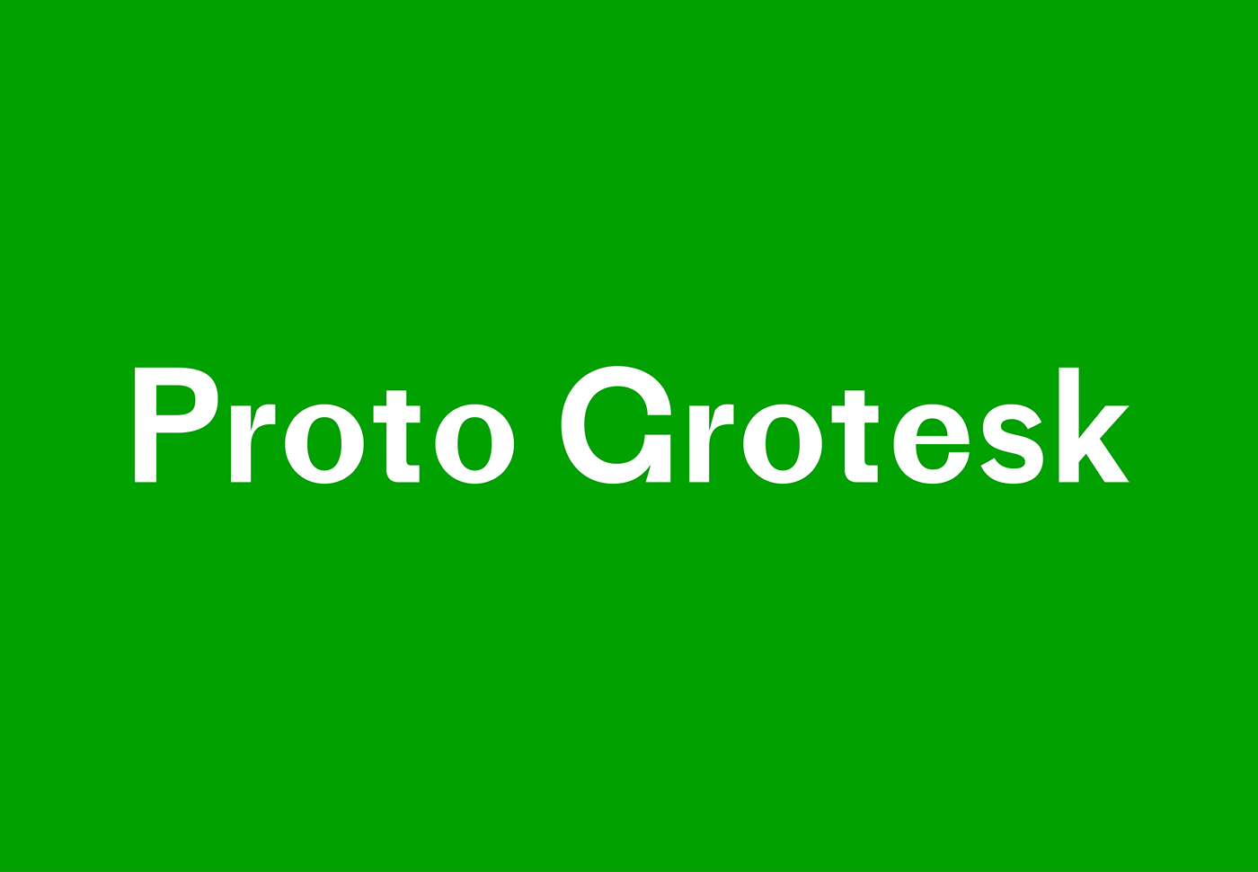
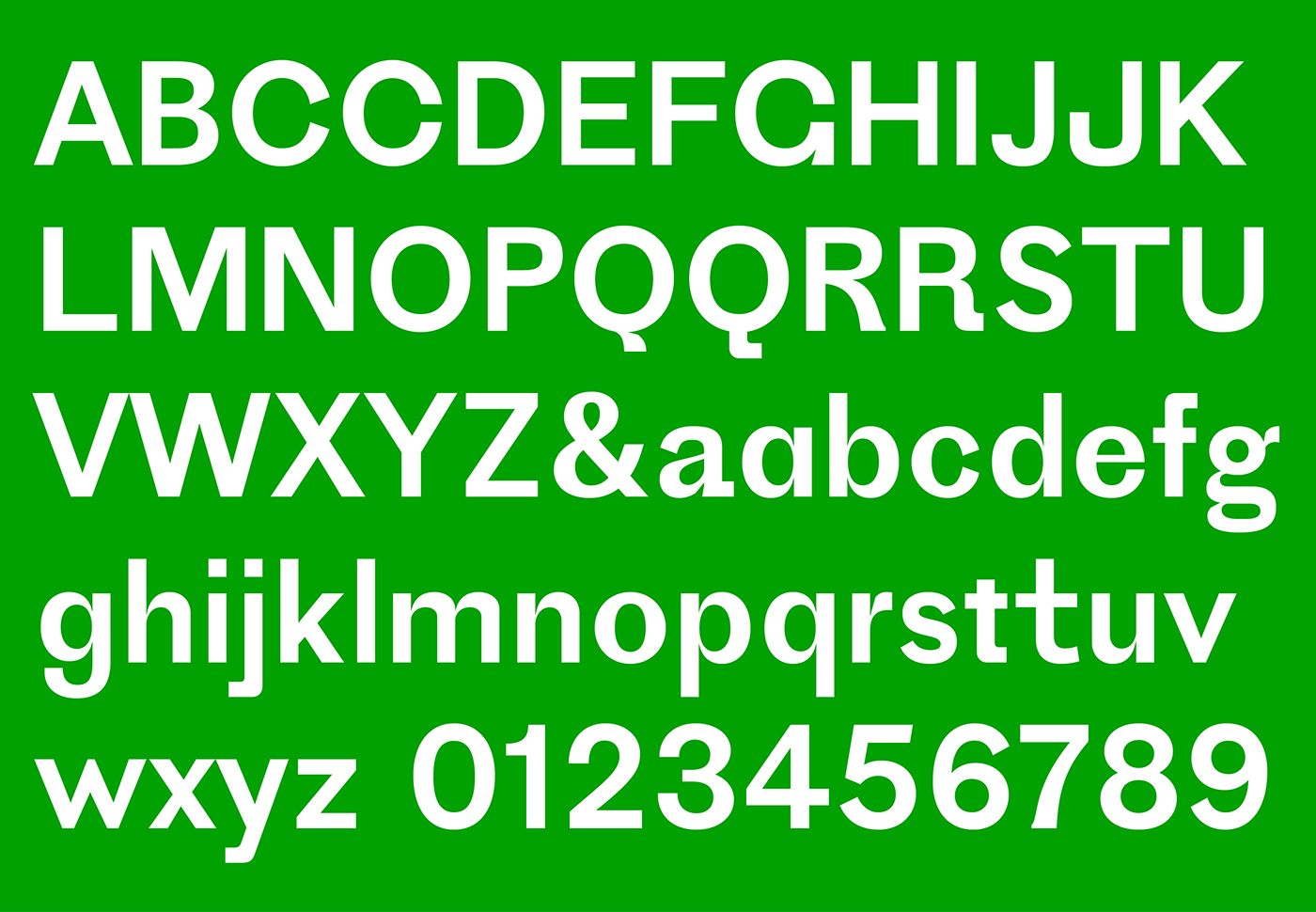

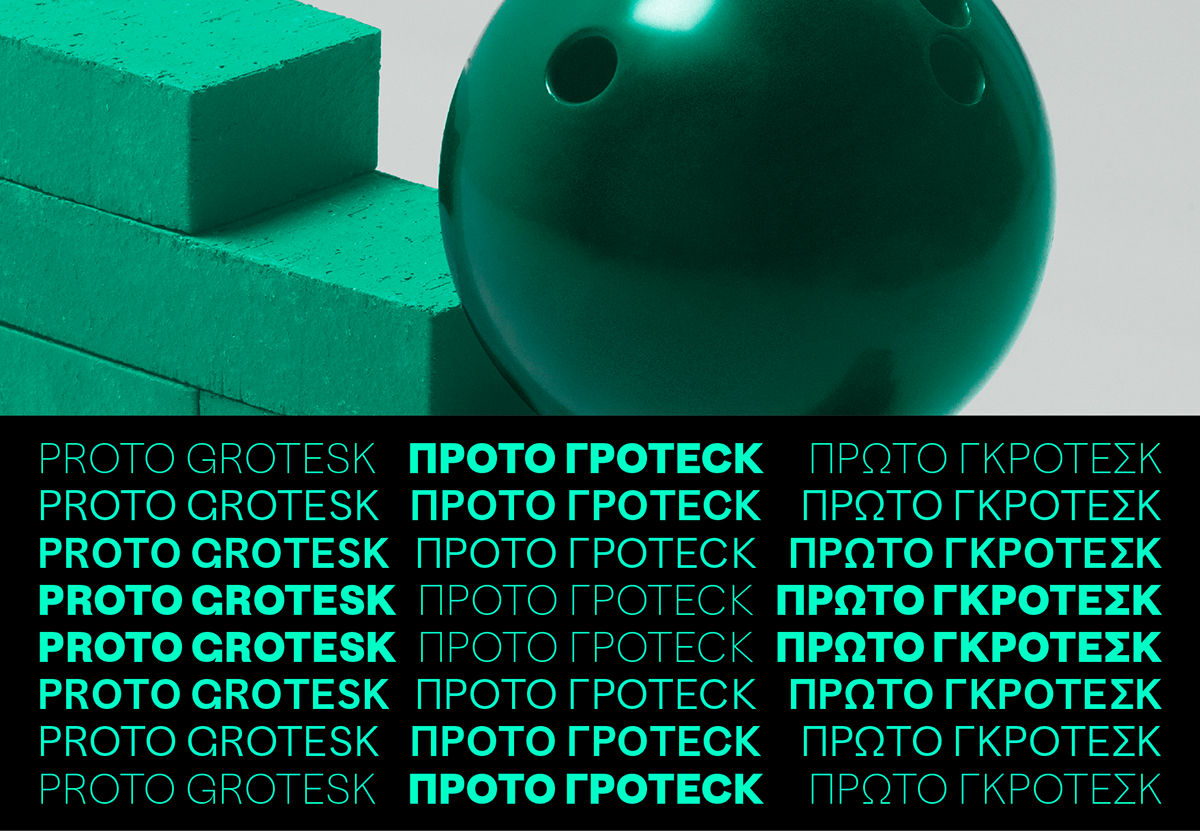
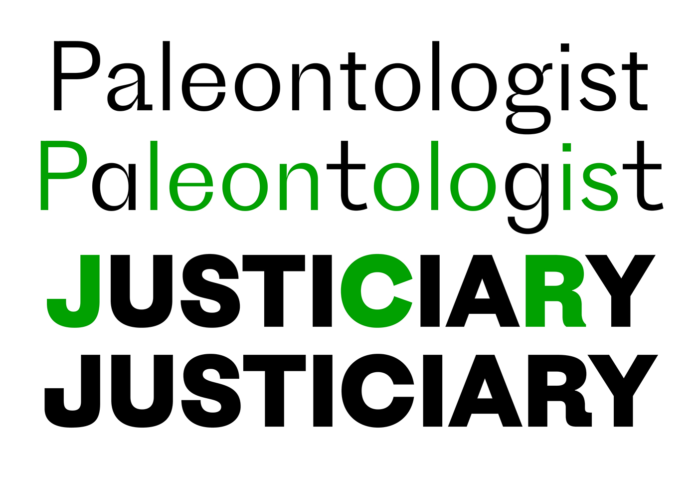
About: Over the last hundred years or so, utilitarian typefaces have shed most of their quirks and eccentricities on the way to becoming more versatile and universal. That makes some sense, but there’s no reason type can’t be both steadfast and peculiar. Drawing from an early German sans serif used for catalog text, Proto Grotesk revives an era when clunkiness was a virtue. Its pedigree is varied, vacillating between Egyptian and Modern, round and edged, even sans and slab. Despite these contradictions, its posture is nothing less than sturdy and forthright. Proto Grotesk is strange but steady.
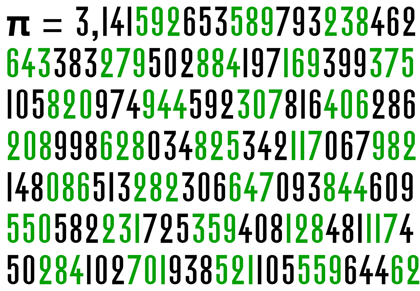
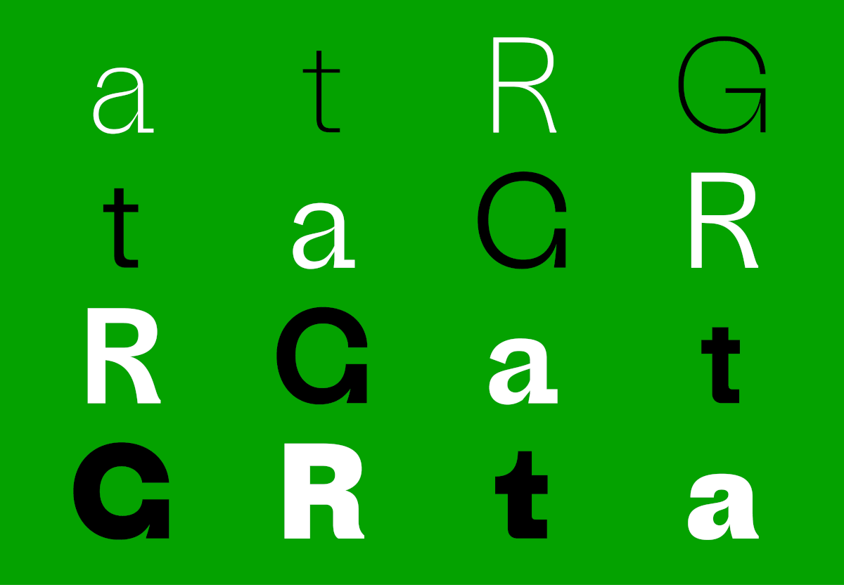
Features: Case sensitive forms, standard ligatures, proportional lining figures, tabular lining figures, ordinals, fractions, denominator, numerator, subscript / inferiors, superscript / superiors, slashed zero, ten stylistic sets
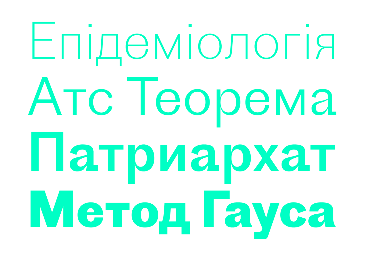
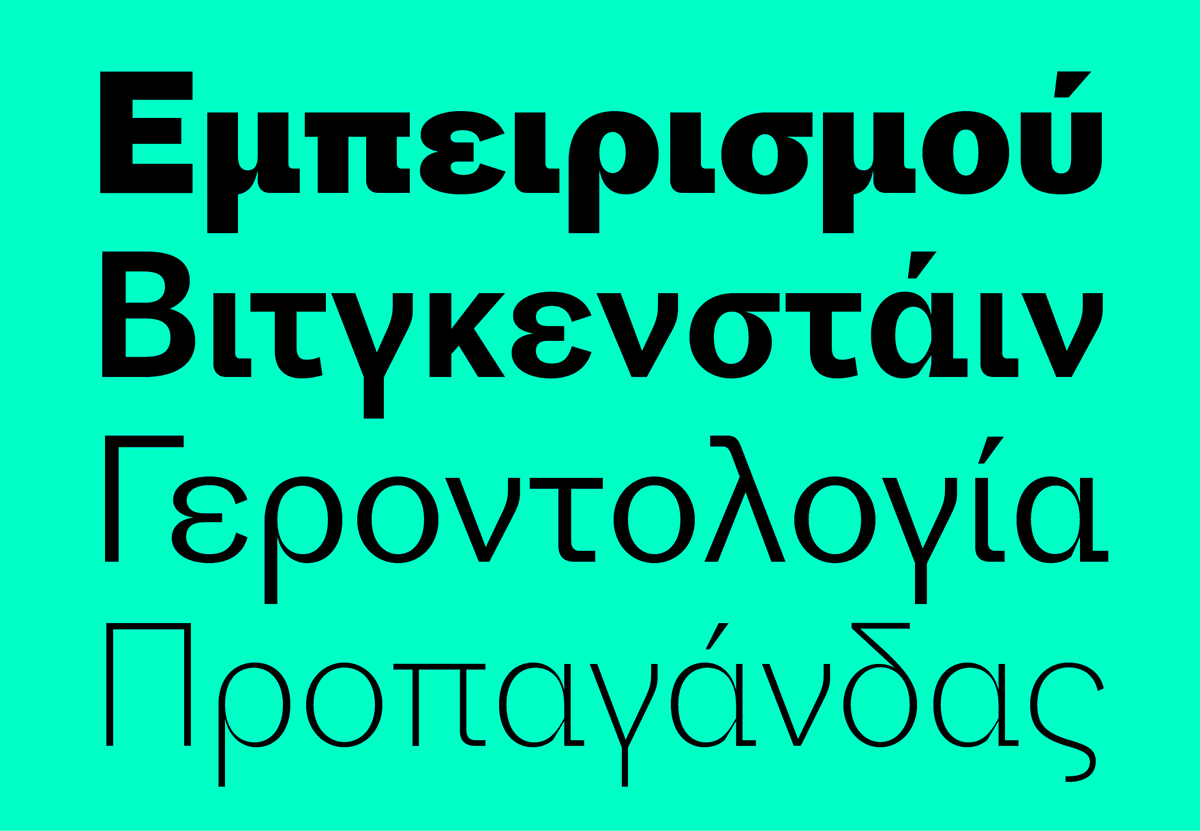
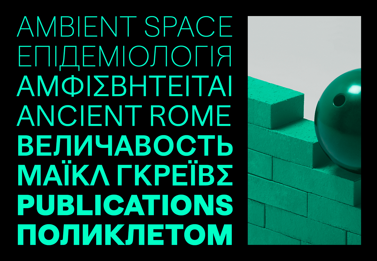
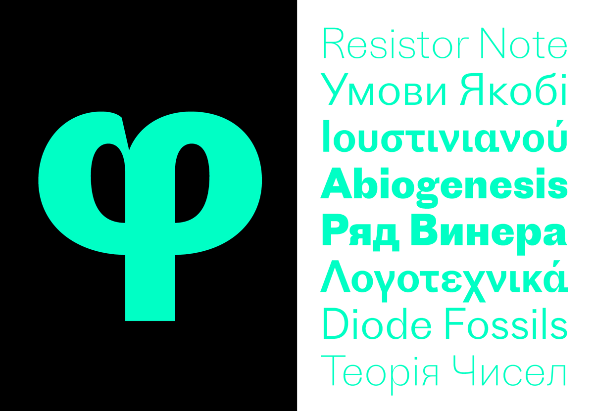
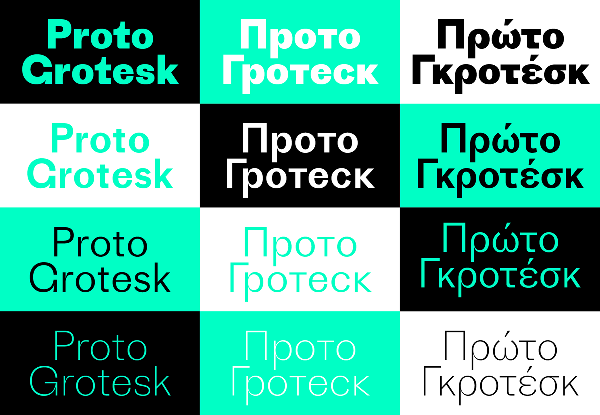
Languages: Afrikaans, Azeri (cyr), Azeri (lat), Bashkir, Belarusian, Bulgarian, Catalan, Chechen, Chuvash, Czech, Danish, Dutch, English, Esperanto, Estonian, Finnish, French, Gaelic (Irish), Galician, German, Hungarian, Icelandic, Ingush, Italian, Kazakh, Kurdish (lat), Kyrghiz, Latvian, Lithuanian, Moldavian (cyr), Mongolian (cyr), Mongolian (lat), Norwegian, Polish, Portuguese, Romanian, Russian, Serbian, Slovene, Spain, Swedish, Tadzhik, Tatar, Turkish, Turkmen, Ukrainian, Uzbek (lat)
Design, Publisher, Copyright, License
Design: Jean-Baptiste Levée (Production Type), Ilya Ruderman (CSTM Fonts) , Yury Ostromentsky (CSTM Fonts)
Team: Yoann Minet, Hugues Gentile, Emilios Theofanous
Copyright 2019 by Production Type. All rights reserved.
Specimen: Proto Grotesk (PDF, 633 KB)
Jean-Baptiste Levée
![]()
Jean-Baptiste Levée works methodically in a process where history and technology are approached altogether within the nuances of artistry. He manufactures functional, yet versatile digital platforms for designers to build upon.
Levée has designed over a hundred typefaces for industry, moving pictures, fashion and media. His work has won multiple awards and has been shown internationally in group and solo shows. It is featured in the permanent collections of the French national library (BnF), the Decorative Arts museum of Paris and the National Center of arts (Cnap); of the Newberry Library in Chicago, and several printing museums in Europe. He is a Vice-President at ATypI (Association Typographique Internationale), honorary counselor of the Letterform Archive (San Francisco), and consults as a design expert advisor for the French Public Investment Bank (BPI) where he is contributing to the spread of design in innovative businesses. He is a partner in tech startup Prototypo. Levée teaches typeface design at the EsadType program in Amiens.
More… Production Type | Jean-Baptiste Levée
Ilya Ruderman
![]()
Ilya Ruderman, a type and graphic designer and teacher, lives and works in Moscow. He is a graduate of the Moscow State University of the Printing Arts (2002), where his graduation project was done under the supervision of Alexander Tarbeev. He has a MA degree in type design from the Type & Media program at the Royal Academy of Art in the Hague (2005). After completing the program, he returned to Moscow, where he has collaborated for a number of media: Kommersant, Afisha, Moskovskiye Novosti, Bolshoi Gorod and Men’s Health Russia. In 2005-2007 he was art director for Afisha’s city guidebooks, following which he was art director for RIA-Novosti, a news agency, for several years. Since 2007 he has also supervised the curriculum in type and typography at the British Higher School of Art and Design in Moscow. He has been very active as a consultant on Cyrillic since 2008. In 2014 he founded CSTM Fonts with Yury Ostromentsky. Typefaces by Ilya Ruderman: BigCity Grotesque Pro, Kazimir, Permian (a typeface-brand for the city of Perm) and Cyrillic versions of: Austin, Dala Floda, Graphik, Marlene, Moscow Sans (as a consultant), Typonine Sans, Thema.
More… TYPE.TODAY
Yury Ostromentsky
![]()
Yury Ostromentsky is a type and graphic designer. He is a graduate of the Moscow State University of the Printing Arts (2002), where his graduation project was done under the supervision of Alexander Tarbeev. He has worked as a designer and art director for publishers and design studios. From 2004 to 2012, he served as art director of the magazine Bolshoi Gorod (Big City), for which he created several display typefaces as well as several original typefaces and Cyrillic versions of Latin fonts in collaboration with Ilya Ruderman. His typefaces were honored at the Contemporary Cyrillic 2009 and 2014 competitions. In 2004 he and Ruderman, Dmitri Yakovlev and Darya Yarzhambek created DailyType, a website. In March 2014, again with Ruderman, he founded CSTM Fonts. Typefaces by Yury Ostromentsky: RIA Typeface, Kazimir, Pilar, BestLife.
More… TYPE.TODAY
Commercial License Buy
Where to buy: Production Type
Where to buy: TYPE.TODAY


