By Vasil Stanev | October 10, 2017 |


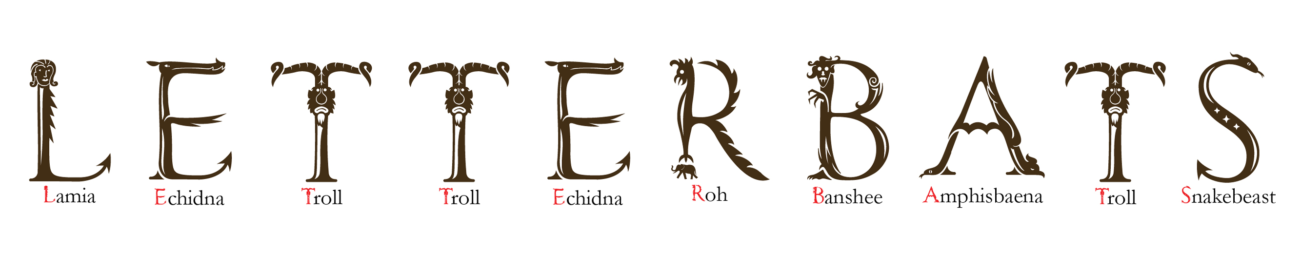
A union of fine and typographic art, these type of fonts are some of the rarest and hardest to create. The designer has to consider not only the typographic principles for each letter, but also those of the picture elements it consists of, like a strong silhouette; it should all work well in black in white. It is perhaps best if there are no more than three “puns” per letter.
 It is perhaps best if there are no more than three “puns” per letter. An example from Etymonster font by Vasil Stanev.
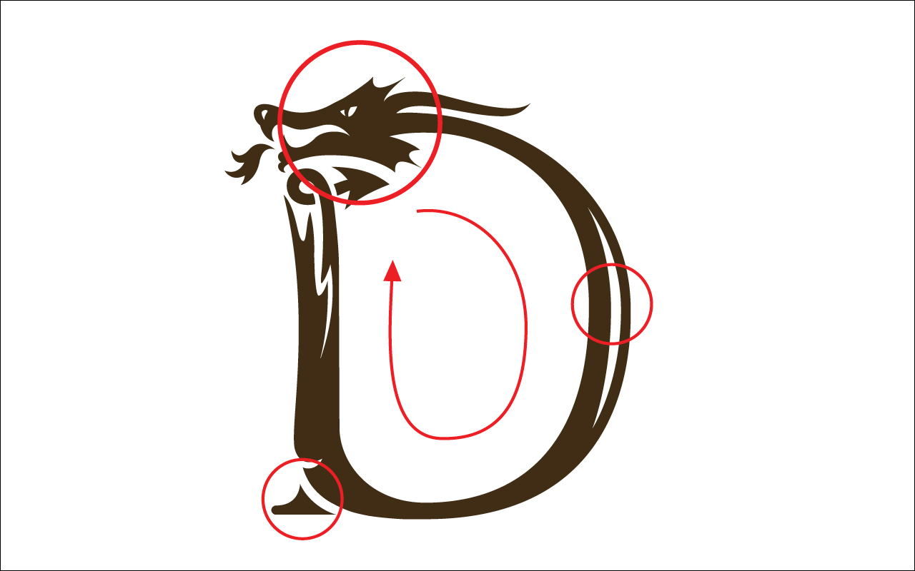
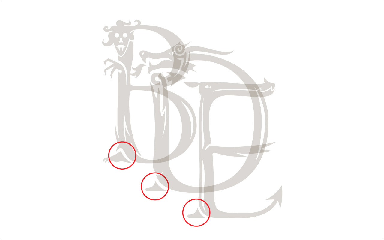
This term denotes the focus of a picture – if there are more than three, all screaming for attention, the eye may tire and the viewer lose interest. Usually, one of the puns is the leading one. It is good if it’s near the eyes, because this is what the viewer tends to look at first and most. Also, from an art side of view, any font, be it serif or sans-serif, can be likened to a series of drawings in the same style. This series works together because of stem thickness, serif style, tone and overall style, and the other no less important features of every glyph. And so the letterbat should also be drawn “on model” (as is the animation term). There should be no single players in the team, and the features should rhyme.
 There should be no single players in the team, and the features should rhyme. An example from Etymonster font by Vasil Stanev.
It is good to have a common (and solid) overall theme, like e.g. wood (Logger), critters (Critter), or monsters (Etymonster). A banana would immediately stand out in a font like Logger, but – and here’s the rub – so would a birch stump.
Letterbats are by their nature display fonts and should have bigger side bearings. They are also heavy on the file size, so keep the design as clean as you can. It is no use to painstakingly draw and trace the letters only to find out that the font crashes most or all of the time.

Remarks
![]()
Vasil Stanev is a graphic designer and typographer from Bulgaria. The gallery of examples above is based upon his font Etymonster.
Further Readings
TypeDrawers: Is this a font?


