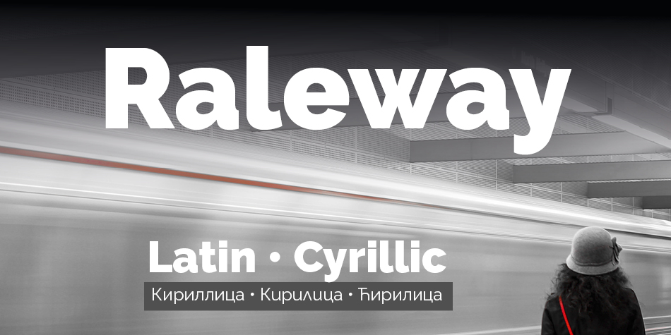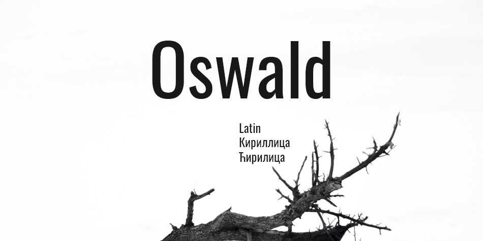
Oswald is a reworking of the classic style historically represented by the ‘Alternate Gothic’ sans serif typefaces. The characters of Oswald were initially re-drawn and reformed to better fit the pixel grid of standard digital screens. Oswald is designed to be used freely across the internet by web browsers on desktop computers, laptops and mobile devices.
Since the initial launch in 2011, Oswald was updated continually by Vernon Adams until 2014. Vernon added Light and Bold weights, support for more Latin languages, tightened the spacing and kerning and made many glyph refinements throughout the family based on hundreds of users’ feedback. In 2016 the family was updated by Kalapi Gajjar and Alexei Vanyashin to complete the work started by Vernon, and support languages that use the Cyrillic script. In January 2019, it was updated with a variable font Weight axis.
Design, Publisher, Copyright, License
Principal design: Vernon Adams
Design: Kalapi Gajjar, Alexei Vanyashin
Publisher: Vernon Adams
Copyright 2016 by The Oswald Project Authorss . All rights reserved.
License: SIL OPEN FONT LICENSE
Vernon Adams
![]()
Vernon Adams (born England, 1967) was a furniture restorer, woodcarver and typeface designer. On August 24, 2016 Vernon Adams passed away from injuries sustained in a scooter accident in May of 2014. New Typography was his type design site. Vernon graduated in 2007 with an MA in type design from the University of Reading and lived in San Clemente, California.
Web:
Typefaces: Seymour One, Nobile, Amatic SC, Nunito Sans, Pacifico, Oxygen, Oswald
More… TYPE DESIGN INFORMATION | Vernon Adams
Alexei Vanyashin
![]()
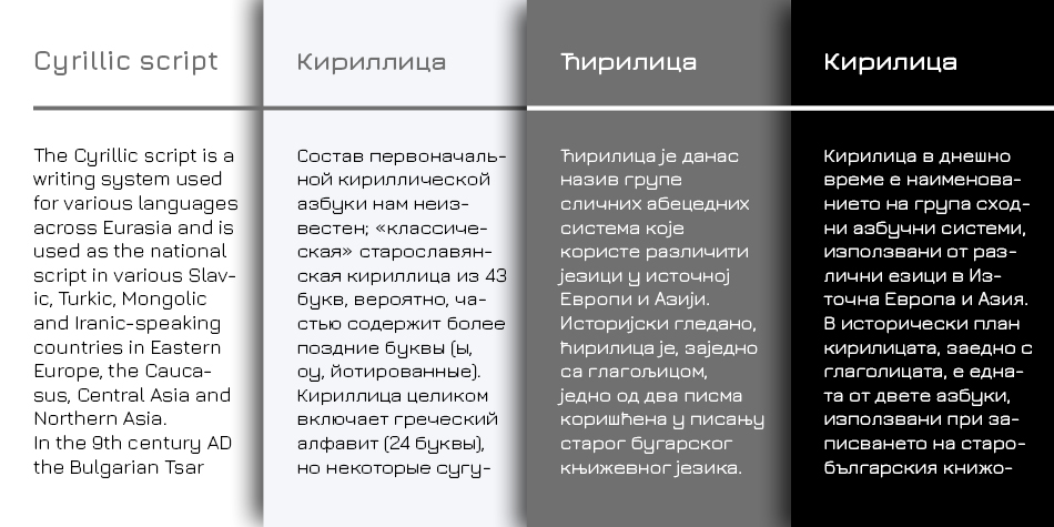
Alexei Vanyashin is a Russian typeface designer, typographic researcher and educator. He was born in Moscow, Russia in 1982, studied Graphic Design since 2000 at Moscow Stroganov University of Arts, and later type design at British Higher School of Art and Design, where he now teaches. He runs his own foundry Cyreal, and collaborates with Swiss Typefaces as a Cyrillic specialist. Among his many custom type projects are works for Red Dot holder Ermolaev Bureau, GEO, and Afisha magazines. LearnCyrillic.tumblr.com is Alexei’s recent effort to provide educational resources for Cyrillic learners.
Web:
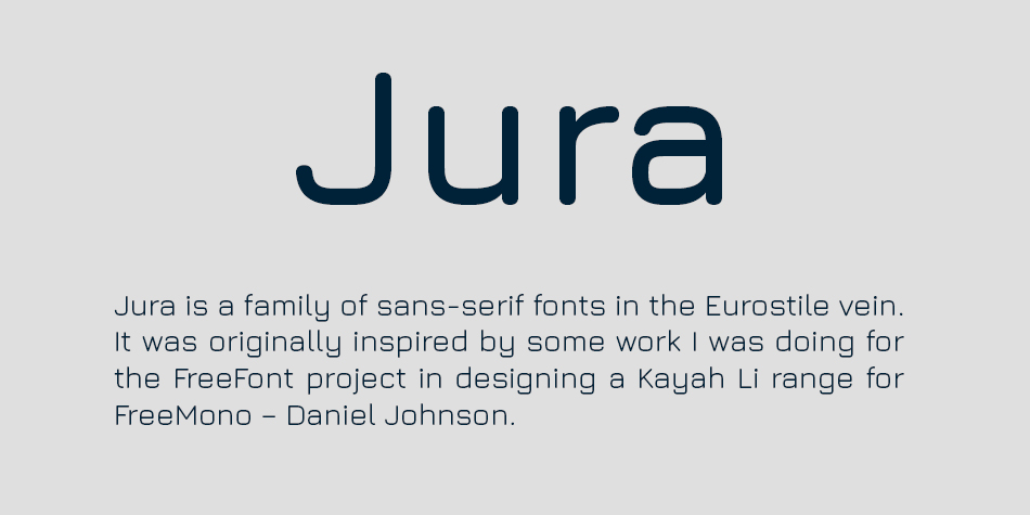
Typefaces: Jura, New Rubrik and New Rubrik Edge, Alice, Lobster, Nunito, Nunito Sans, Libre Franklin, Raleway, Lora
More… Identifont | Alexei Vanyashin
Reviews
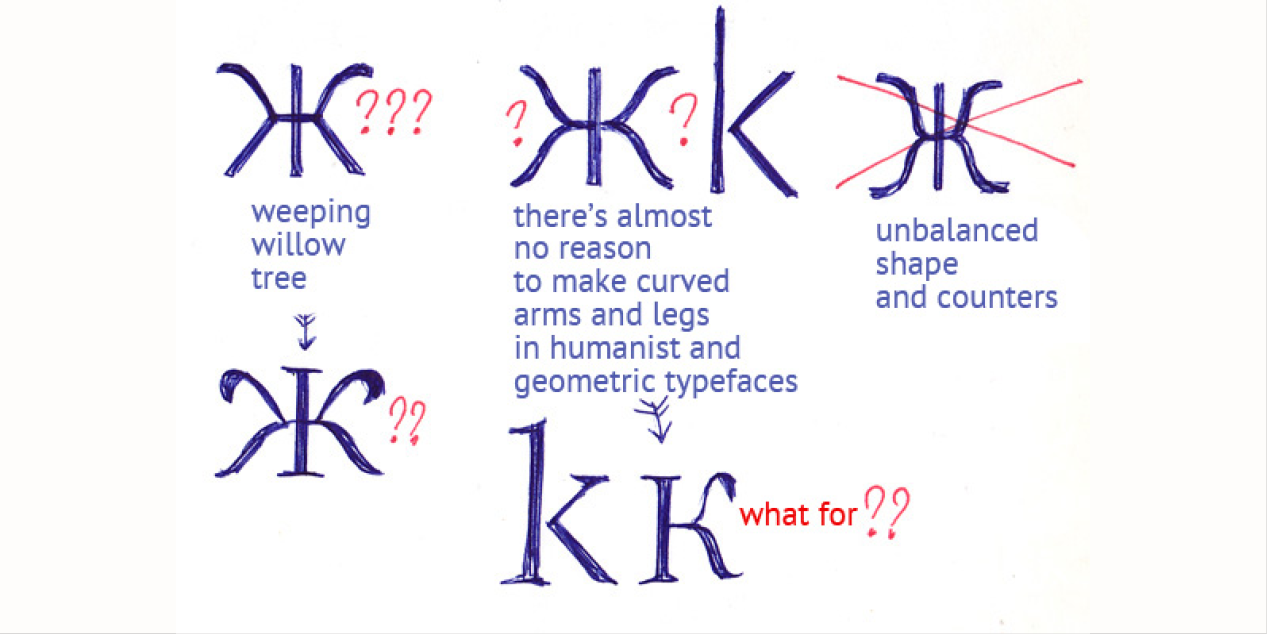
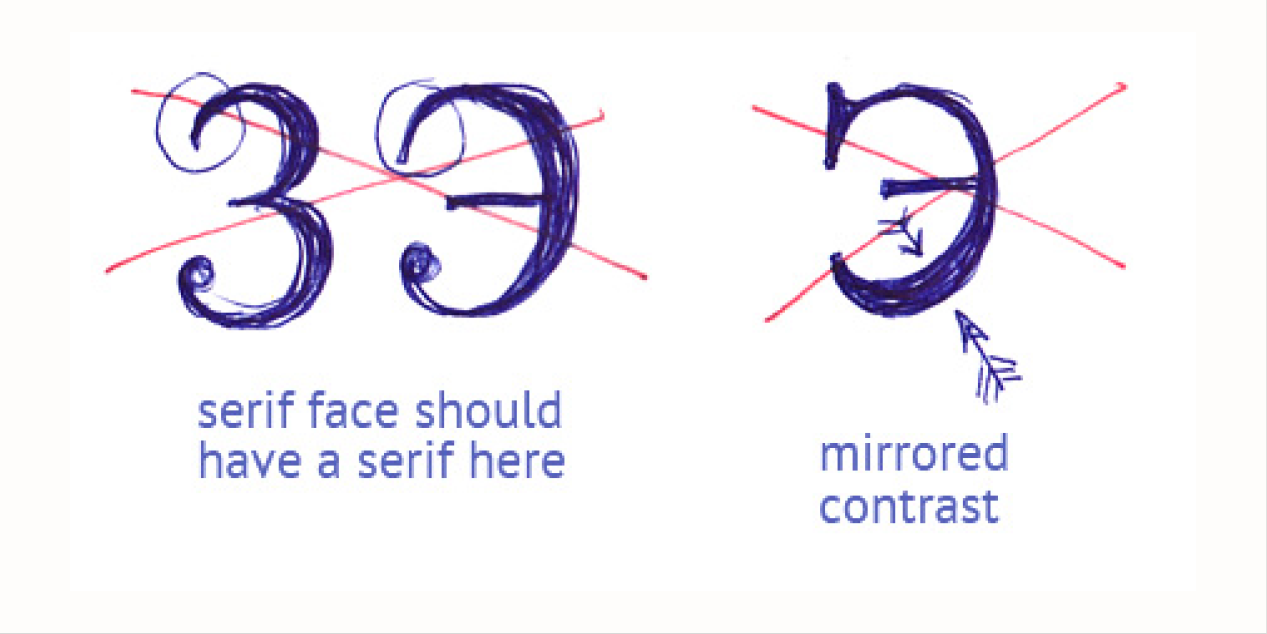
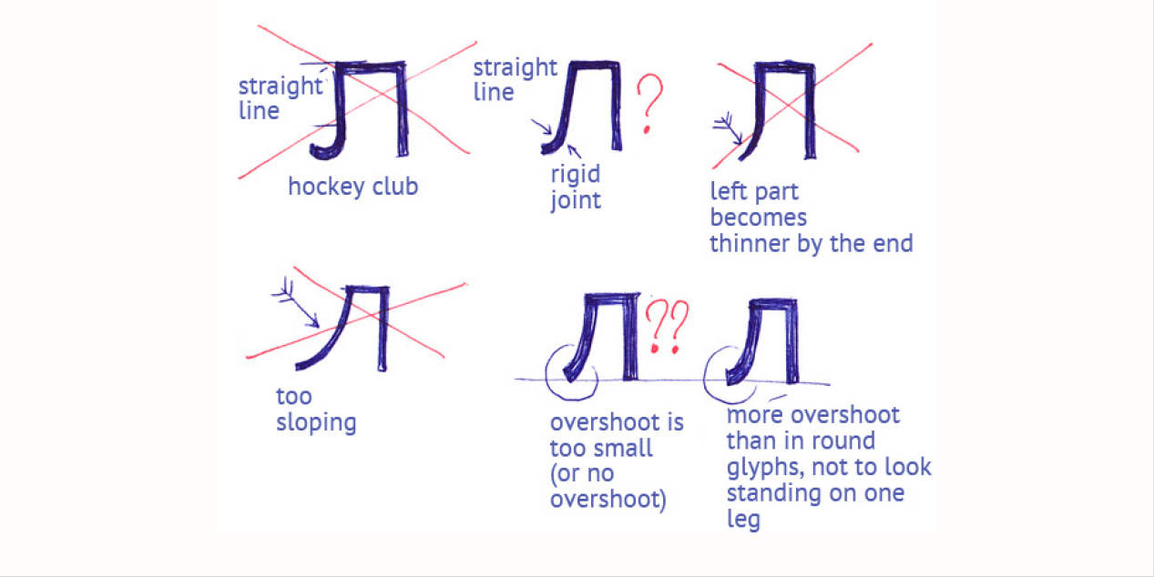
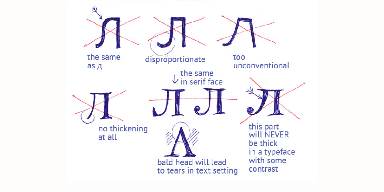
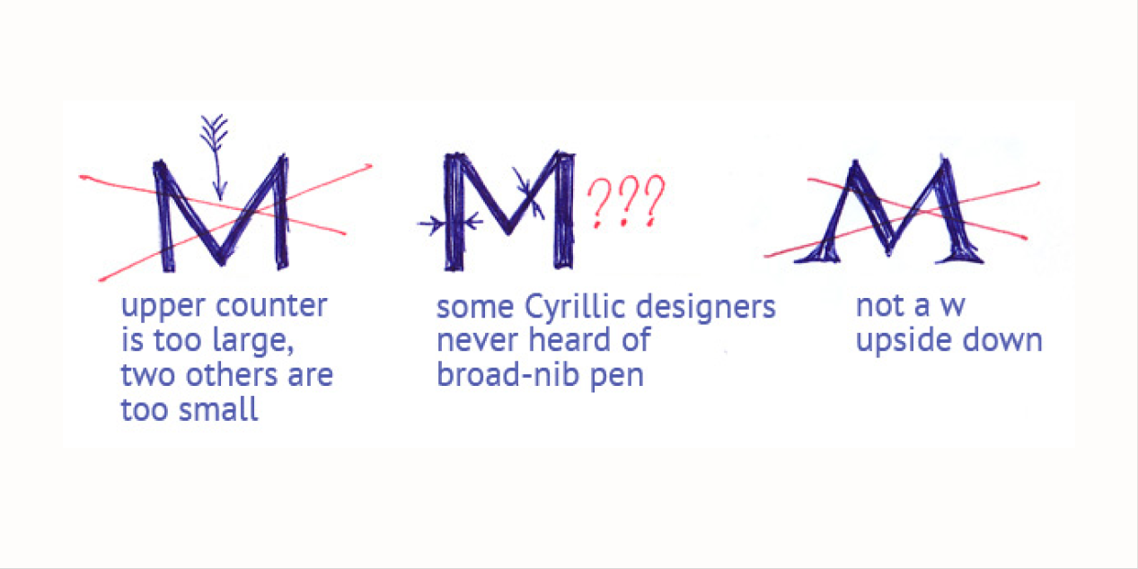
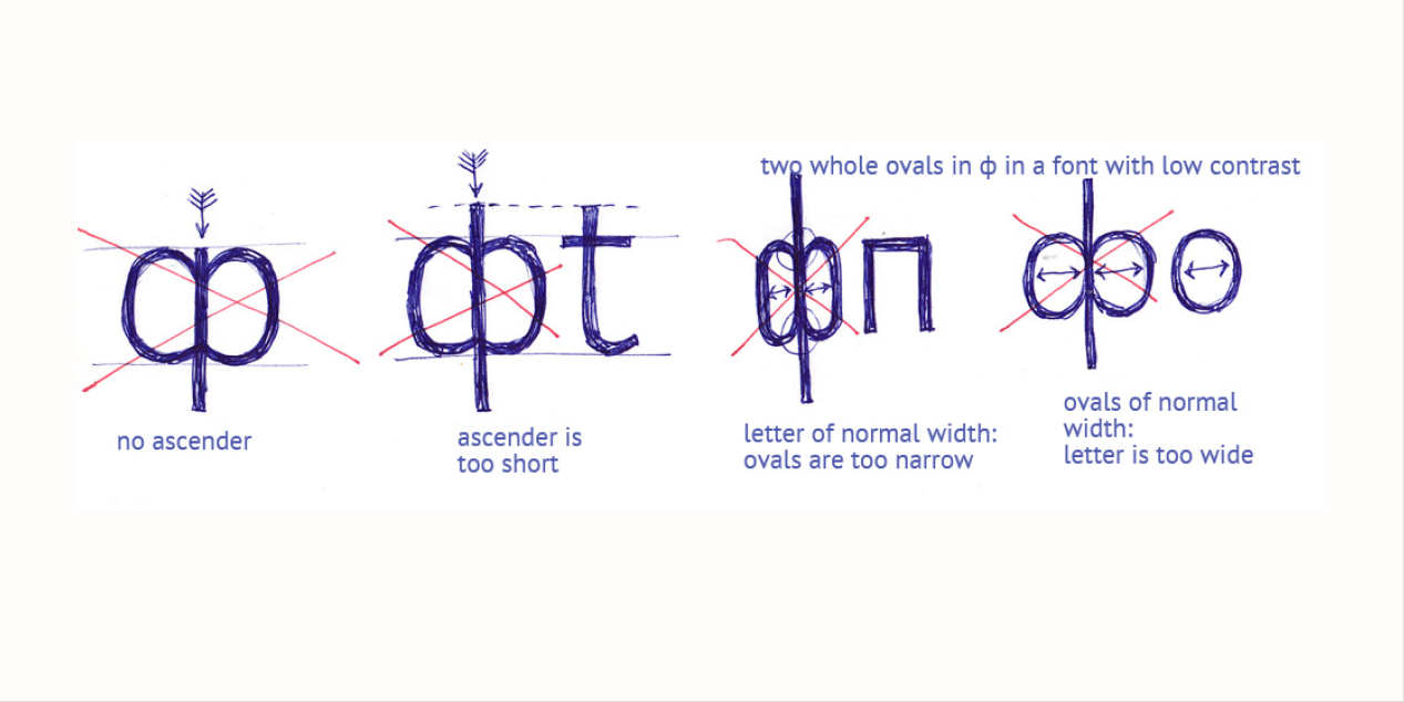
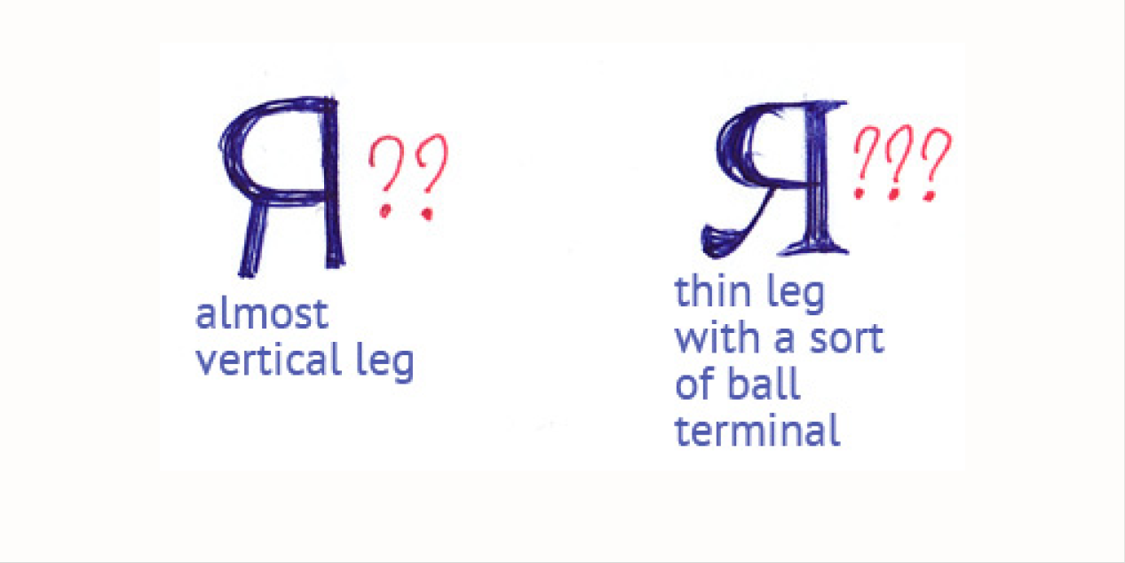
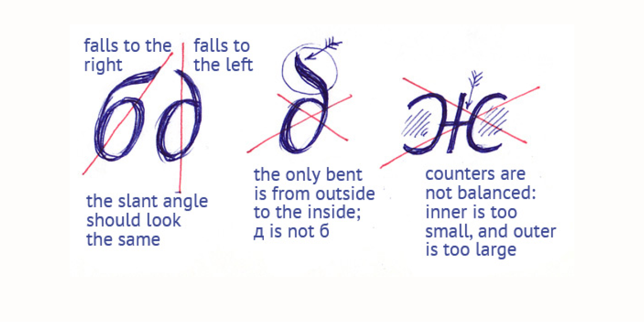
Despite the strong historical prototype and the popular type genre, the Cyrillic of Oswald has way too many problems to ignore. Sadly, it’s not worth using.
Mikhail Strukov, Ilya Ruderman, Yury Ostromentsky: Cyrillic on Google Fonts: Neo-Grotesques
Free License
Download v.4.100: Oswald | Google Drive
Get permission to open a file on Google Drive
• Open the file.
• On the “You need permission” page, click “Request access”.
• The admins of the site will receive your request to access the file you want to download.
• After they approve your request, you’ll be notified by email.