Description
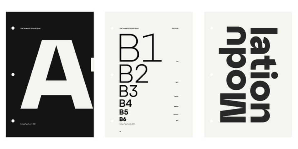
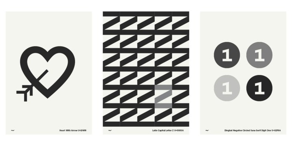
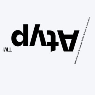
The sources of inspiration for the Atyp typeface are spread out widely both stylistically and chronologically. The basic proportions of the uppercase refer to the elementary geometric constructions of the Bauhaus. The subtle details in the drawing of the characters and the microscopic adjustments, which evoke the illusion of uniformity and mechanical purity, pay homage to the rationalism of the typefaces popular in the International Style. The increased contrast of the joints of the bowls and shoulders in the Display weight, which in certain diagonal curves transition into almost deconstructive permutations. For a change these take delight in doing things on purpose, teasing readability and breaking the rules of the new millennium’s typography.
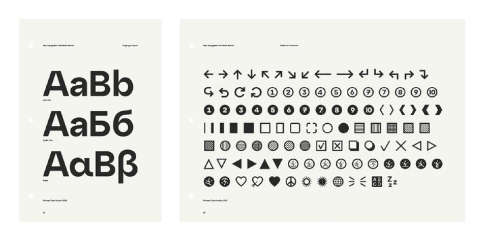
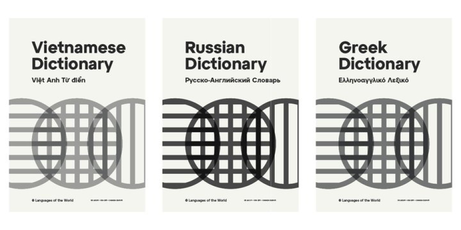
Atyp was created by adapting a typeface originally made for a commercial television station. The potential of the neutral grotesque, proven by its excellent readability on screens, gave the impetus for its preparation into an extremely wide character set with full support for three language scripts.
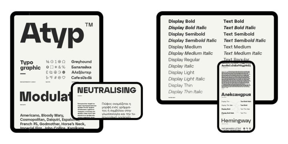
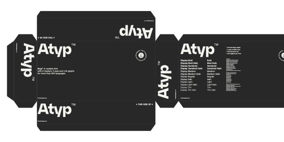
Coherence across all eight key masters lays the groundwork ideally for using the variable font format. The key benefits of this technology are a significant reduction in data consumption in the case of web fonts, as well as an unlimited access to the full range of styles, which in turn is a significant benefit in the area of responsive design.
Design, Publisher, Copyright, License
Design: Tomáš Brousil
Publisher: Suitcase Type Foundry
License: COMMERCIAL
Tomáš Brousil
Suitcase Type is a Czech foundry, est. 2003 by Tomas Brousil (b. 1975), who lives in Prague. He graduated from the Prague Academy of Arts, Architecture and Design (Type Design and Typography, MgA. 2009) where his graduation project was the 96-family Tabac typeface system, published in 2010. He teaches in the Type Design and Typography department of the Prague Academy of Arts, Architecture and Design.




Reviews
There are no reviews yet.