A look at the Latin letter
A B C D E F G H I J K L M N O P Q R S T U V W Y X Z
a b c d e f g h i j k l m n o p q r s t u v w y x z
A look at the Cyrillic letter
А Б В Г Д Е Ё Ж З И Й К Л М Н О П Р С Т У Ф Х Ц Ч Ш Щ Ъ Ы Ь Э Ю Я Ѣ Ѥ Ѧ Ѩ Ѫ Ѭ Ѯ Ѱ Ѳ Ѵ Ѷ Ѹ Ѻ Ѽ Ѿ Ҁ ҂ ҃ ҄ ҅ ҆ ҇ ҈ ҉
а б в г д е ё ж з и й к л м н о п р с т у ф х ц ч ш щ ъ ы ь э ю я ѣ ѥ ѧ ѩ ѫ ѭ ѯ ѱ ѳ ѵ ѷ ѹ ѻ ѽ ѿ ҁ
Cyrillic Alphabets
Cyrillic Alphabets of Slavic Languages
Cyrillic Alphabets of Non-Slavic Languages
A look at the Diacritics
Published initially by TYPEJOURNAL.RU
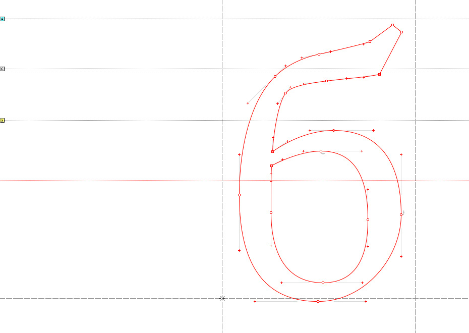
This is the first in a series of columns on letters from the Cyrillic alphabet. What can we say about a letter when we look at it? Only that its form implies an infinite number of variants. But what happens when we compare a letter with similar characters in a type system? The letterform begins to make sense. Type designer Gayaneh Bagdasaryan shares her opinion on shaping one of the trickiest letters in our alphabet. We should add that every professional has gone through much suffering over many years of practice to come to these conclusions, which means that they are subjective and can be the subject of debate.
Many designers of Cyrillic type believe that successfully drawing the letter б is half the battle. Indeed, б is a very complex letter, partly because historically its construction has not been firmly established. But since we’re in charge here, whatever we draw—goes. Besides, it doesn’t befit us Cyrillic type designers to complain about the shortcomings of our native alphabet. It’s better to be inspired by the fact that this imperfection gives us an incentive for new research and experimentation. Allow me to share my experiences, which I think have been rather successful.
For a long time, I’ve noticed that the letter б sticks out of the alphabet in many typefaces. Apparently, the issue is that it does not have any sharp edges and looks too soft or even spineless alongside the other Cyrillic characters, primarily made up of straight lines. This is especially distinct in clear-cut geometrical typefaces or those with a strict character:
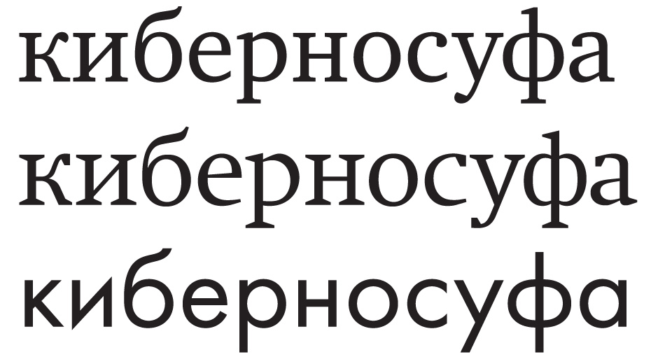

Do you see? The letter б is desperately asking her alphabetical sisters to let her come into the house and trying to convince them that they’re actually related. But the sisters just look at her warily and distrustfully through the peephole. And this is the case in a large number of Cyrillic typefaces. I deliberately chose well-known and high-quality typefaces by recognised masters to make it clear that we’re not talking about amateur or foreign Cyrillic here. It’s all about the lack of established form for the letter б. How can we help our little letter with its gentle nature and romantically flowing hairstyle?
To begin, we should explore the existing options for its structure. There are two of them. Or to be more precise, two and a half. The first (a) is, roughly speaking, a letter o with a branch attached to it. In the second variant (b), the bowl and branch have a common spine to which the right side of the bowl is firmly attached. Lastly, the second option has a subvariant (c) with a lighter joint between the right-hand side of the oval and the spine:
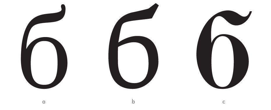
There is a separate handwritten form, but I’m not going to examine it in this article, because there’s nothing wrong with it. So, we have two basic types of б. Which option is preferable for a particular sort of typeface? There is no clear answer to this question, but it seems appropriate to look into the design choices of neighbouring letters and see how their ovals attach to the vertical bars: lightly or firmly? Chances are that the logical and natural choice would be to have the same type of joint:
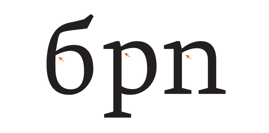
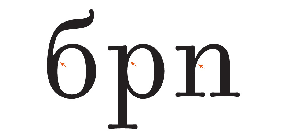
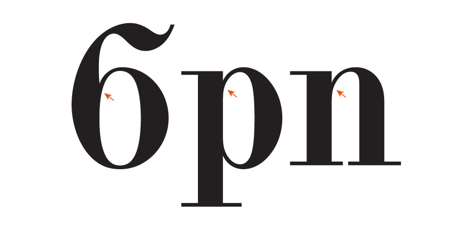
While ignoring this fact may make the sisters begin to doubt their relationship with their neighbour:
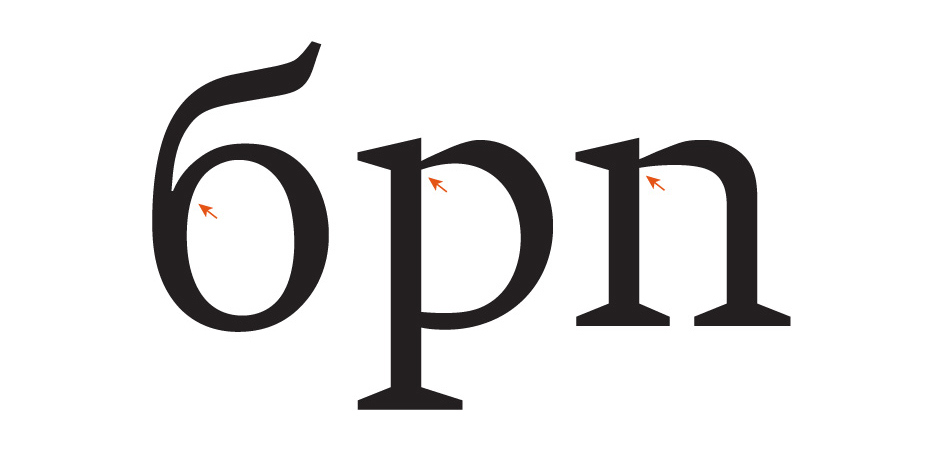
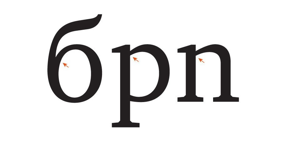
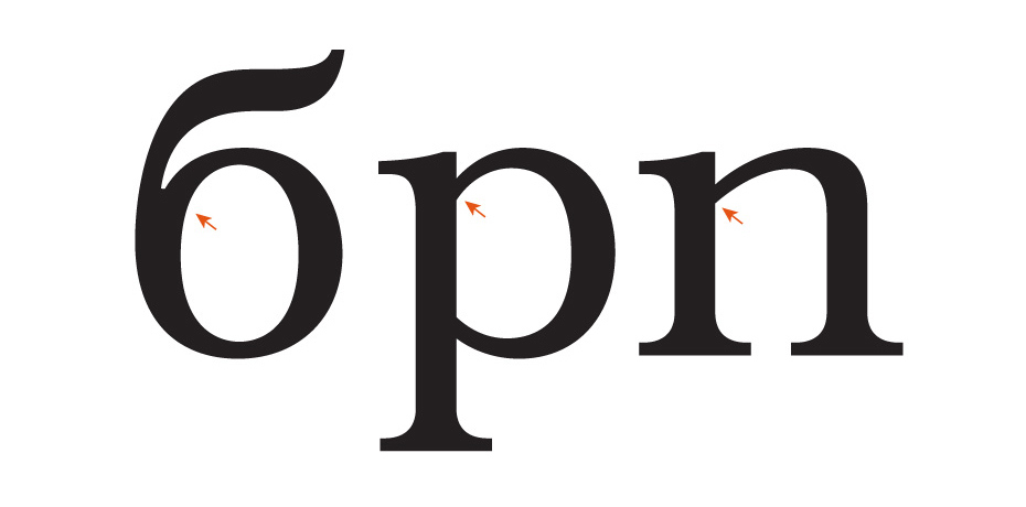
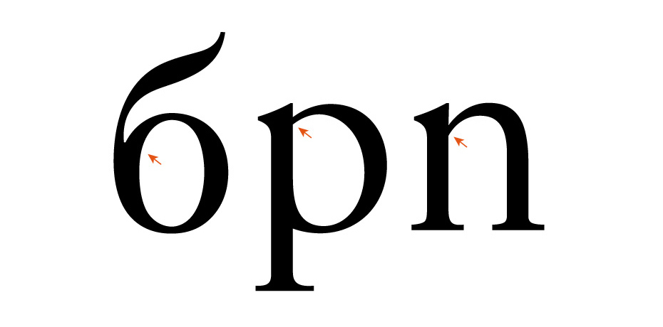
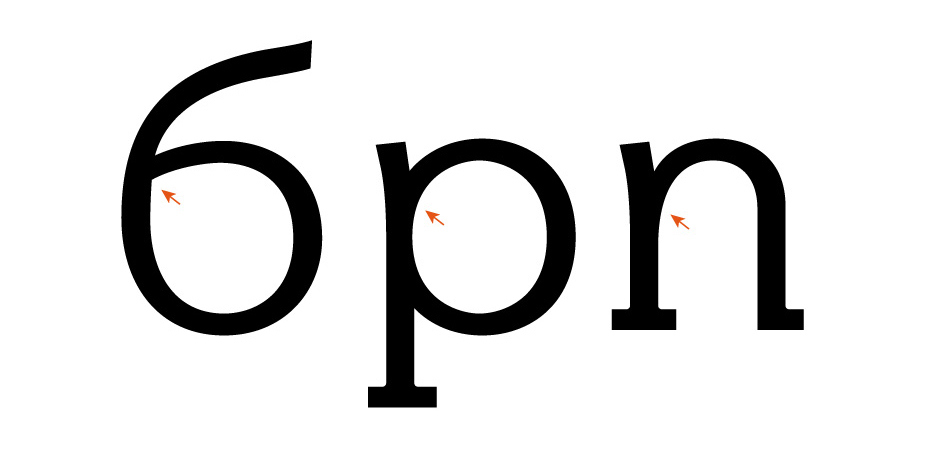
Despite the fact that many modern typefaces are very far removed from calligraphy, handwritten logic and a rhythmic link between the form of the character and the writing instrument can be found in the construction of most of their characters. If we roughly divide calligraphic tools into two large groups—broad and pointed nibs—we discover that the letter б with a solid spine is obtained by writing with a broad nib, whereas it’s easier to add the branch on a thin stalk with a pointed one.
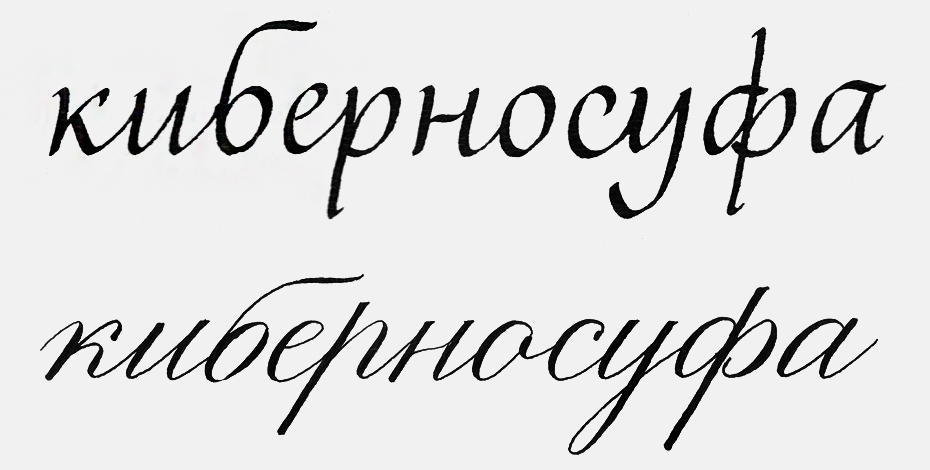
Of course, this doesn’t always work, due to the fact that the Cyrillic alphabet evolved in the era of printing, so the relationship between the form of its characters and calligraphy is not as distinct as in other writing systems. Nevertheless, taking into account the writing instrument gives us another argument in favour of the fact that the second design option is more appropriate in typefaces with rigid joints, while the first is a better fit for smoother attachments. This logic is often violated in favour of the first option, which is much more widespread and is selected, so to speak, by default, without much thought. Meanwhile, there is no reason to consider this form the traditional one (if it is at all correct to talk about traditions with regard to post-Petrine Cyrillic). This б appeared relatively recently:

This form did not exist in pre-Petrine handwriting either:

Therefore, the obvious numerical superiority in modern type design of the construction based on the letter о can be seen more as the result of stereotyped thinking than a meaningful choice. This construction has no corners, and although this isn’t the end of the world in typefaces with soft connections, the letter б looks distinctly spineless in the vicinity of rigid joints. There are quite a lot of font families with these joints—probably about half, including most dynamic typefaces. But at the same time the second type of letter б is rather rare. Even though it is much more structured.
The solid spine becomes a new element in typesetting—a vertical stroke with a unique form. A diversity of forms is an undoubted merit of any alphabet, and Cyrillic is obviously lacking in this. So the thoughtless choice of a letter б, based on o, only exacerbates the form monotony. This may be good for static typefaces, but dynamic ones need more drive.
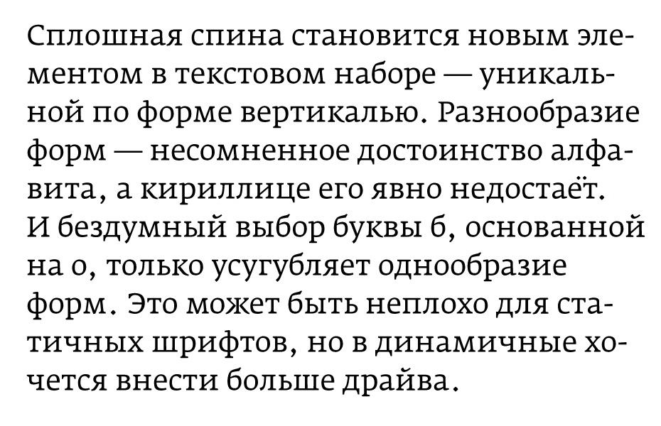
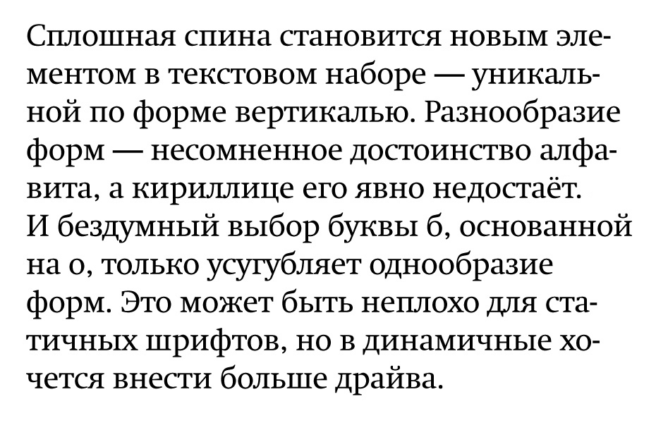
In addition, the solid spine plays the role of a bridge between the x-height and ascender zones. In the Roman alphabet, the ascenders of the letters b, d, f, h, k, l and t take on this function, while in Cyrillic there’s only б and ф. If we remove the б, ф will remain in a state of sad loneliness.
I seriously thought about all this for the first time when I was working on the cyrillisation of two Typotheque typefaces—Fedra and Greta—and resolutely chose the letter б with a solid spine. In my opinion, the result is rather harmonious:
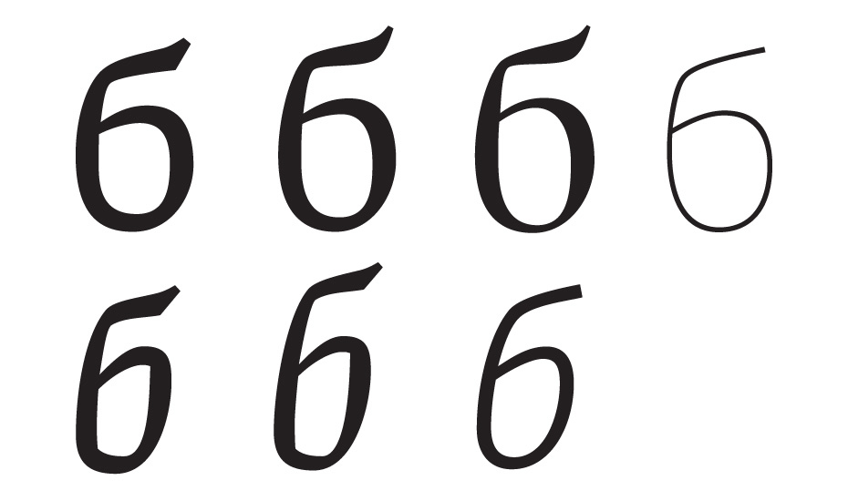
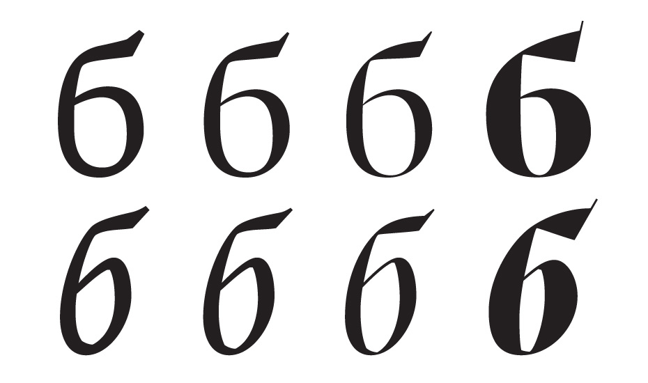
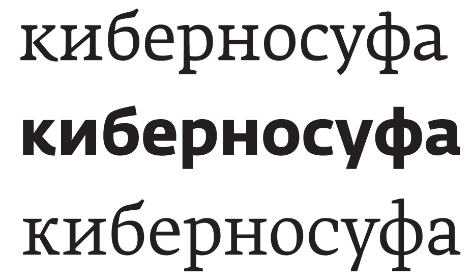
The reward, like a delicious design dessert, was the display styles of Greta, in which the letter б gained an unexpected decorative effect:
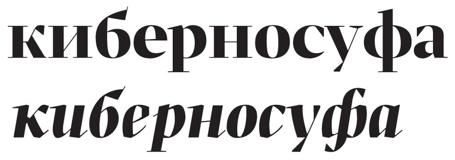
So I vote in favour of choosing this design in typefaces with rigid joints, but, of course, this decision should not be made recklessly.
And it goes without saying that the solid back in isolation is no guarantee of success—you still need to find the right form for it. The letter shouldn’t slouch, and the looker should understand where the vertical stroke ends and the horizontal one begins:
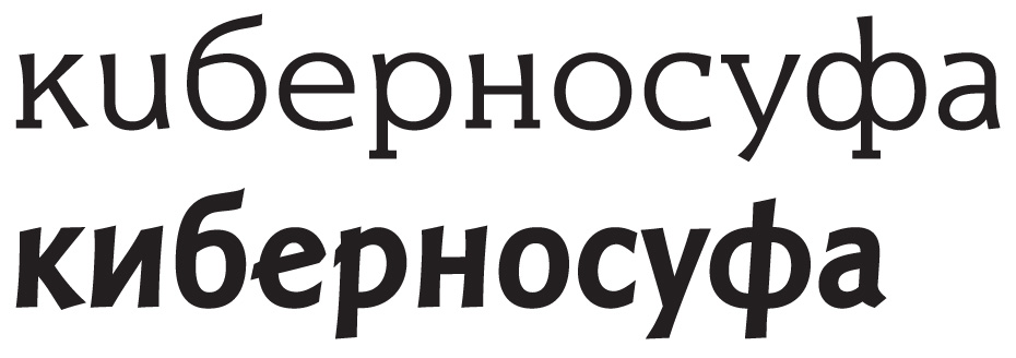
And that’s not all. The construction with a branch on a thin stem can be drawn in different ways too.
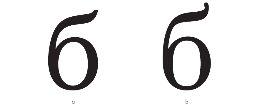
See the difference? In the second example (b), the branch has a clear structure and a rigid division into zones: the thin stalk bends sharply and turns into a clear-cut thick branch with one strict movement to the right and upwards. And the branch ends equally clearly with an accentuated serif of sufficient size. The first example (a) has none of the features described above. The branch’s division into zones is very arbitrary—it often doubts whether it’s growing in the right direction or not and has got into a complicated relationship with its serif. All this messing around does not give the letter any confidence, and as a result its more successful friends start to shun it. Compare the group dynamic in the first and second examples here:
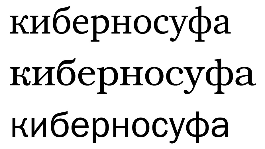
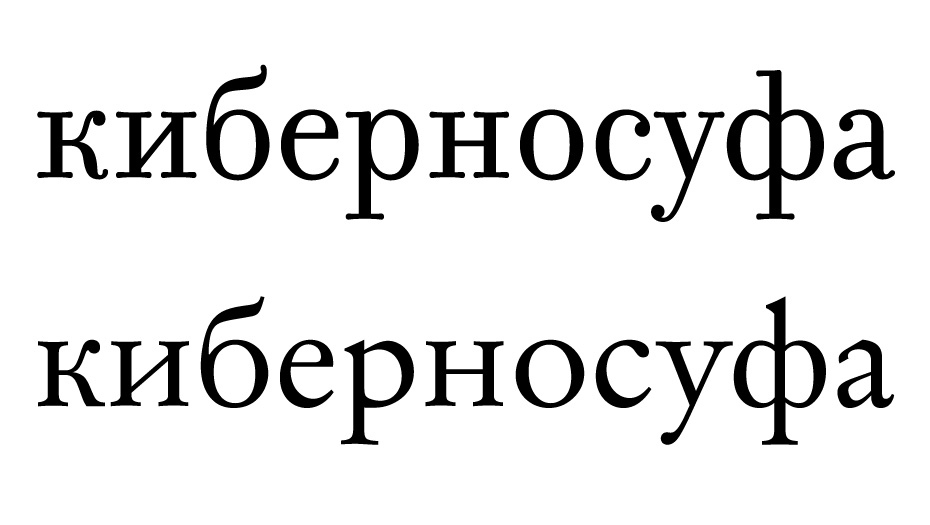
It looks like the latter ones have more fun.
Don’t be scared to end the branch with a serif, and treat it well—it’s no worse than the others:
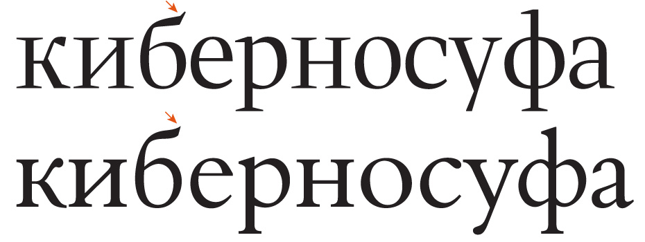
In the serifs, it’s important to pay attention to the harmony between the б branch and the legs of the к. I’m not saying they absolutely have to be similar and often draw them differently myself, but a complete disregard for the stylistic unity of these elements obviously doesn’t benefit a typeface. Typically, such a correlation can be seen in typefaces with soft к branches, which can’t be said of those with rigid legs, where more attention should be paid to this “rhyme”. The example on the right looks more logical:

Don’t demand obligatory softness from the branch, it has the right to be angular—just like the other ones:
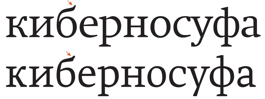
When it is stylistically justified, let the branch grow upwards energetically. Don’t force it to bend towards the ground in search of shelter:

Let it be as simplistic and geometric as its neighbours are:

If the branch doesn’t fit in to the confined space for ascenders, take some away from the bowl, but be sure to distribute the white space fairly and evenly:

Long story short, learn to love the letter б, and it will always be joyful, beautiful and cheerful.
Initial: Andrey Belonogov, Yana Kutyina.
Translation: Jon Reilly.


