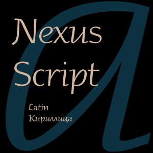
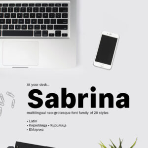
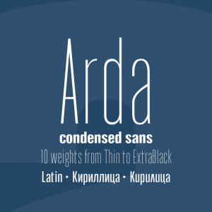
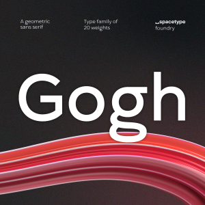
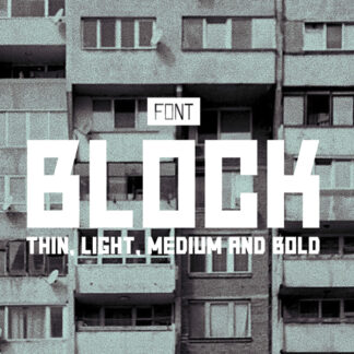
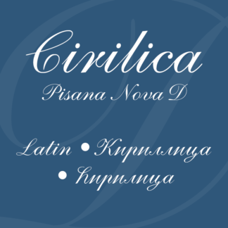
A look at the Latin letter
A B C D E F G H I J K L M N O P Q R S T U V W Y X Z
a b c d e f g h i j k l m n o p q r s t u v w y x z
A look at the Cyrillic letter
А Б В Г Д Е Ё Ж З И Й К Л М Н О П Р С Т У Ф Х Ц Ч Ш Щ Ъ Ы Ь Э Ю Я Ѣ Ѥ Ѧ Ѩ Ѫ Ѭ Ѯ Ѱ Ѳ Ѵ Ѷ Ѹ Ѻ Ѽ Ѿ Ҁ ҂ ҃ ҄ ҅ ҆ ҇ ҈ ҉
а б в г д е ё ж з и й к л м н о п р с т у ф х ц ч ш щ ъ ы ь э ю я ѣ ѥ ѧ ѩ ѫ ѭ ѯ ѱ ѳ ѵ ѷ ѹ ѻ ѽ ѿ ҁ
Cyrillic Alphabets
Cyrillic Alphabets of Slavic Languages
Cyrillic Alphabets of Non-Slavic Languages
A look at the Diacritics
Your Font Fetish • YFF
1 lesson on ‘S’ drawing with Kelvin Song
LyonsType
The letter ‘s’ is considered one of the hardest letters in the alphabet to design. It is utterly unrelated to any other letter we have designed so far. Most people can’t handwrite this letter and produce a passable print rendition.
If you are learning the latin script and are struggling with handwriting this letter, do not despair—most of us don’t have a firm grasp on its construction either. Most neat writers (mostly teenage girls) handprint the letter something like a number ‘2’ reflected vertically and rounded slightly. Some people overexaggerate the hooks of the ‘s’ to the point where it approaches a figure ‘8’, others render the letter like a mirrored ‘z’.
Kelvin Song | Glyph design: the trick to drawing the letter s


