Description
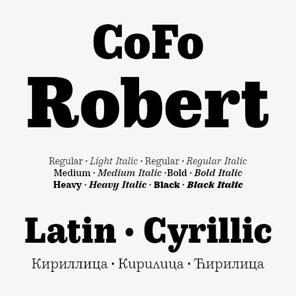
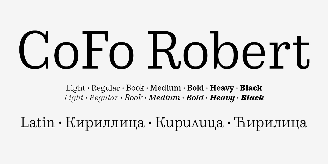
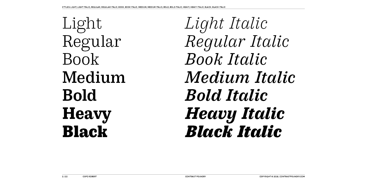
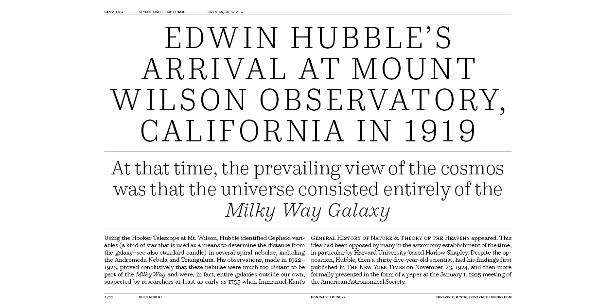
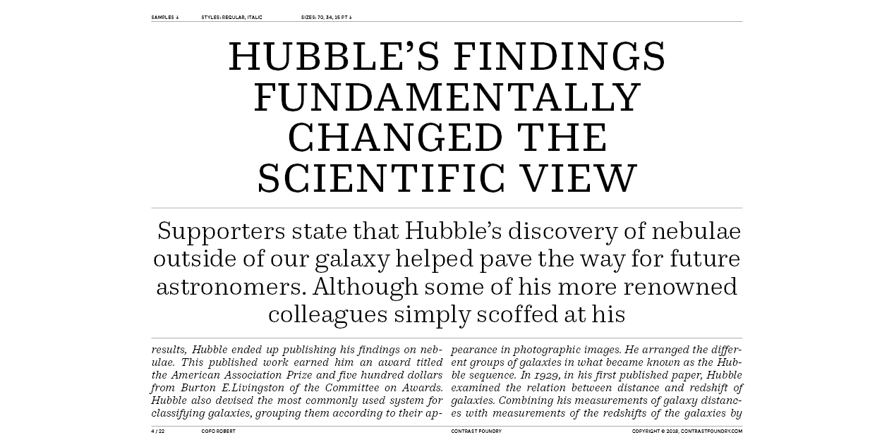
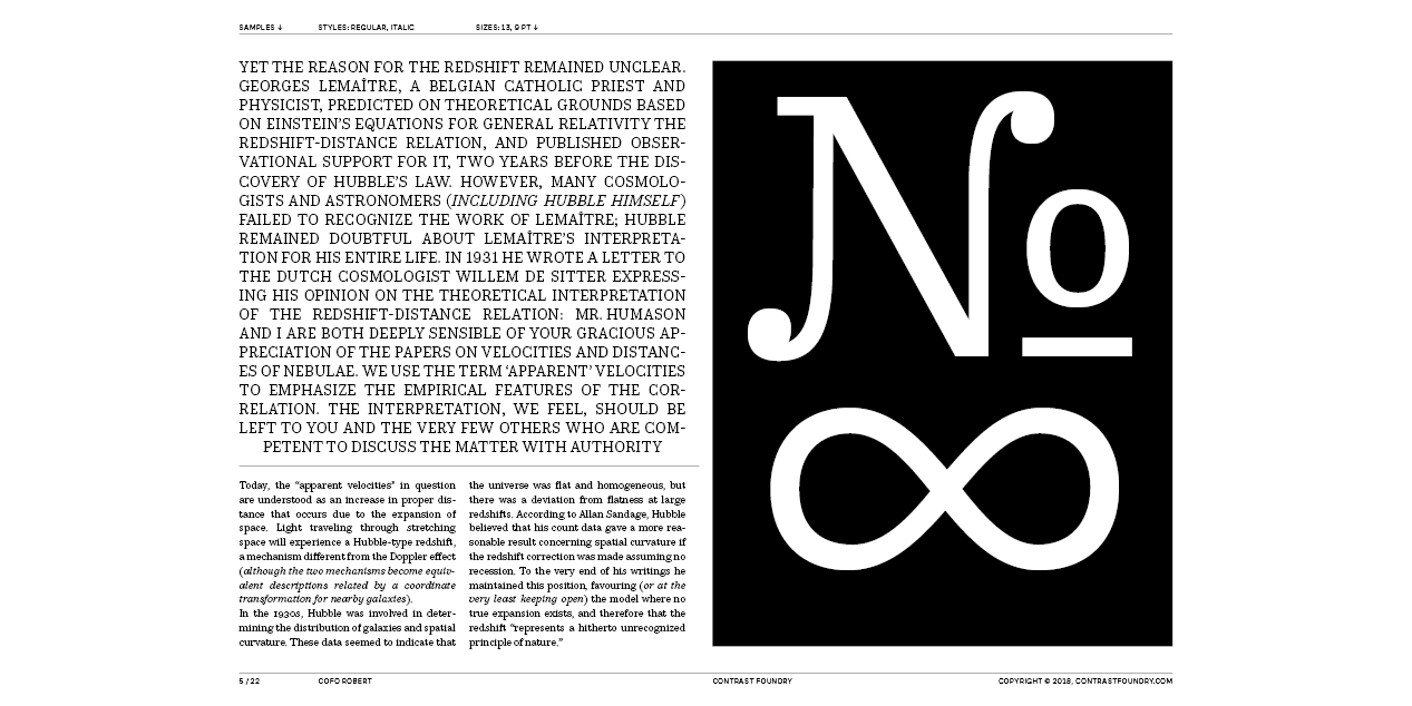
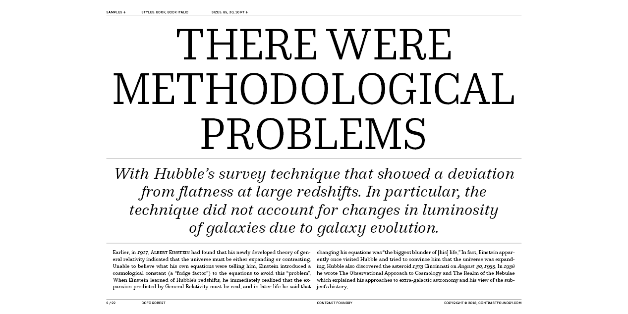
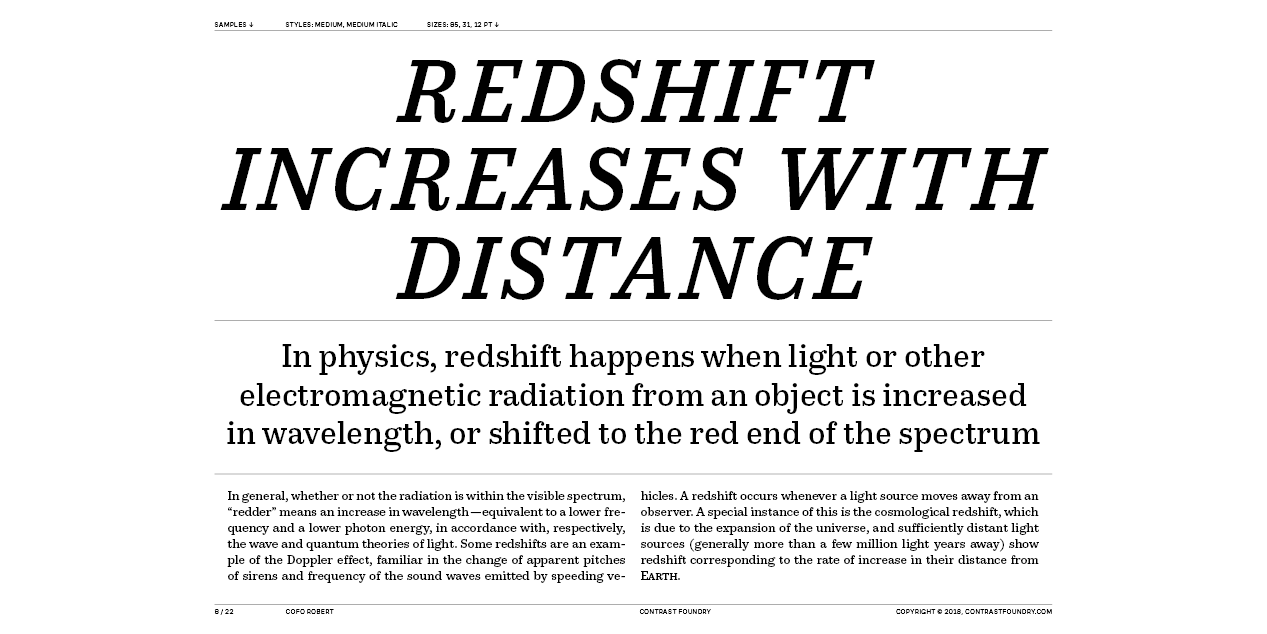
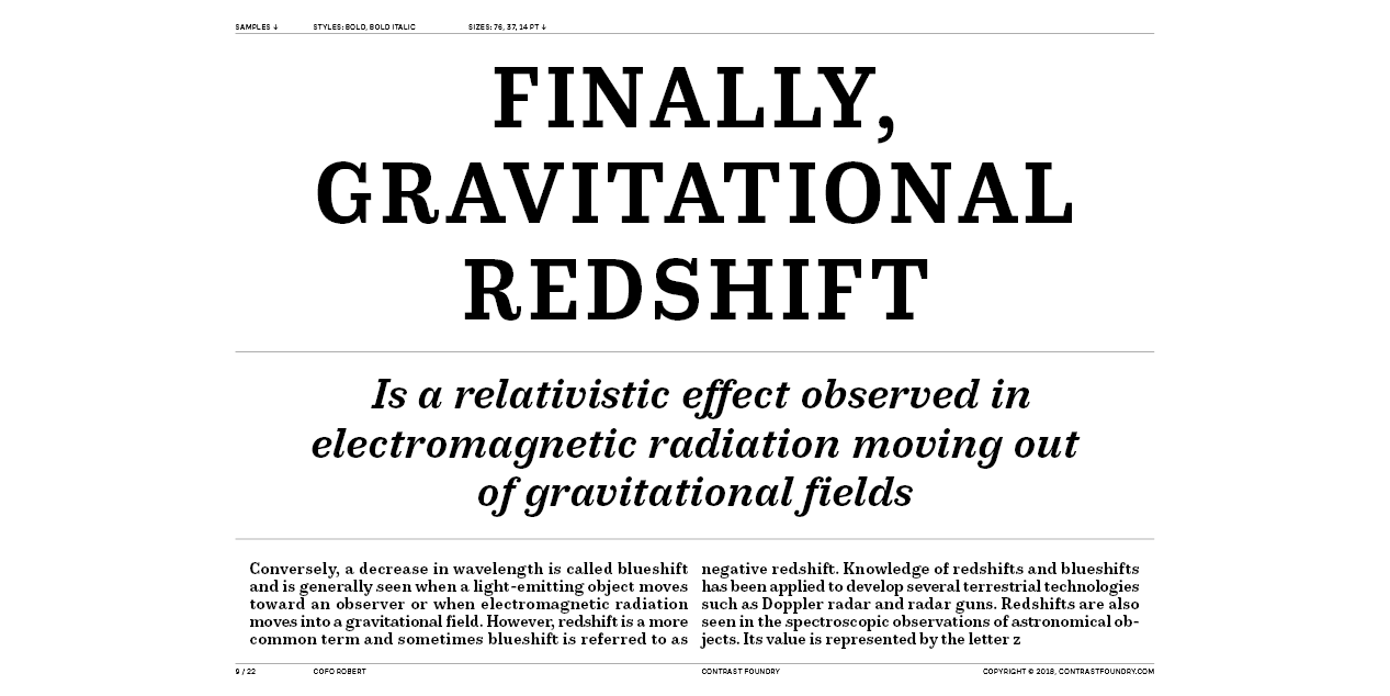
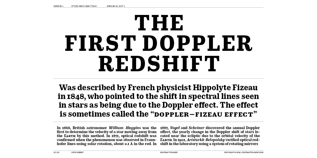
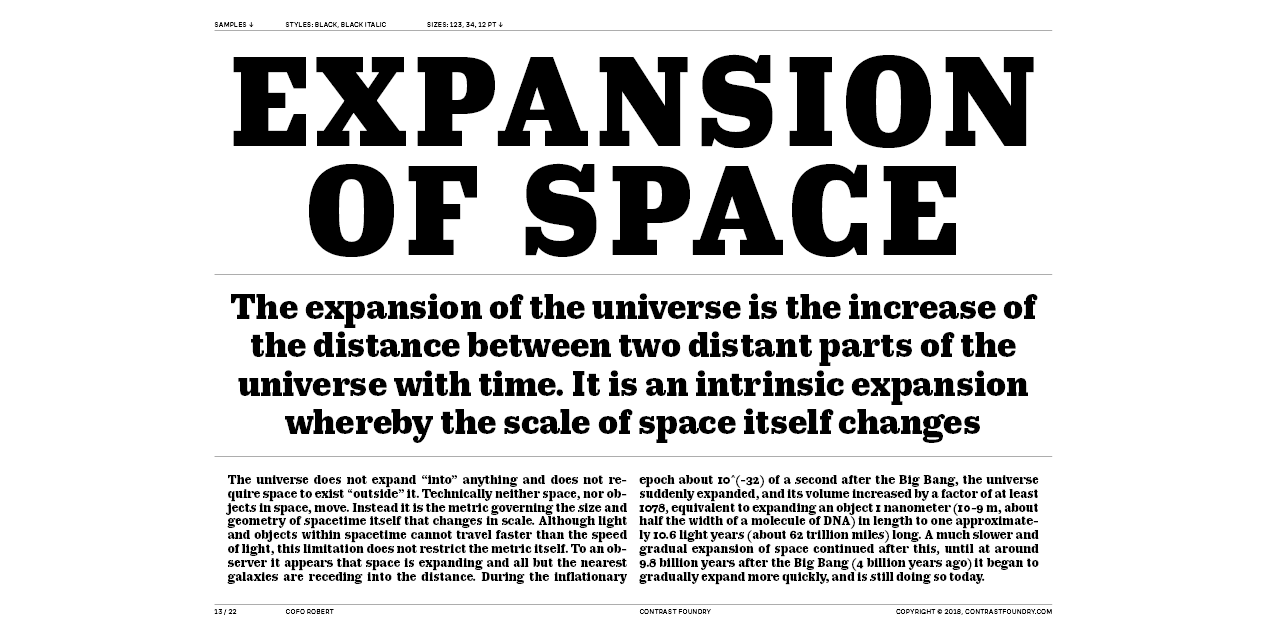
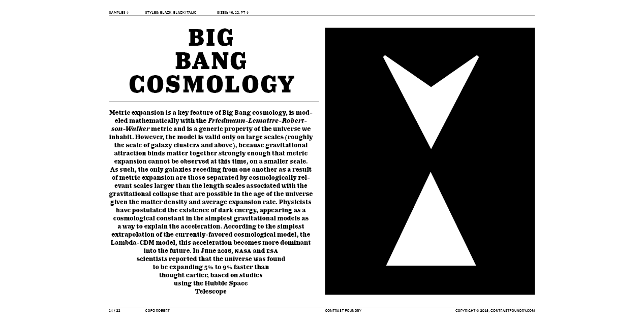
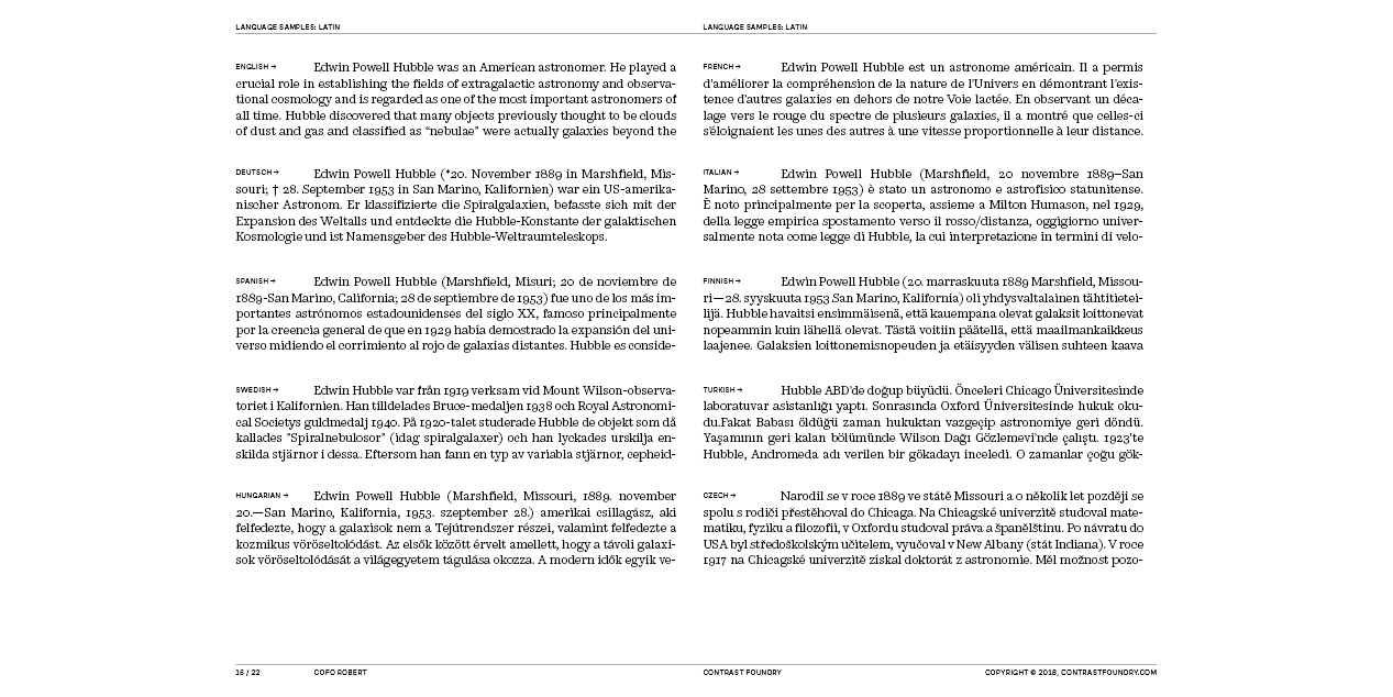
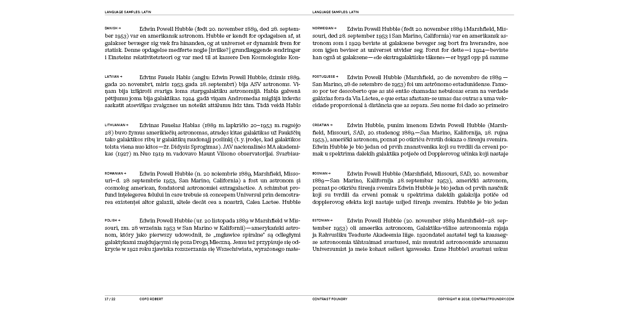
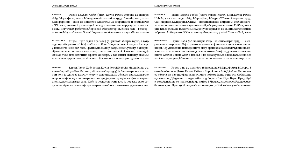
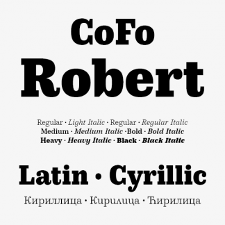
Robert is a modern twist of a classic. Named after Robert Beasley, the author of the first Clarendon typefaces, Robert takes inspiration from the chunky mechanical letters, created for the first time at the begin-ning of the 19th century for large display use. But look closely into the sharpness and carefully crafter curves and you’ll see that this is far from a historical revival. The expressive nature and the spirit of the Industrial Revolution are mixed with a hint of new technology and a powerful hu-man touch, to turn Robert into a rational multifunctional type family with authoritative Romans and expressive Italics in 7 weights.
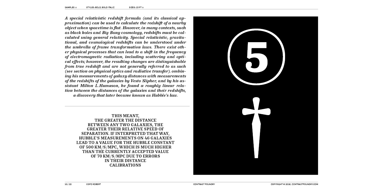
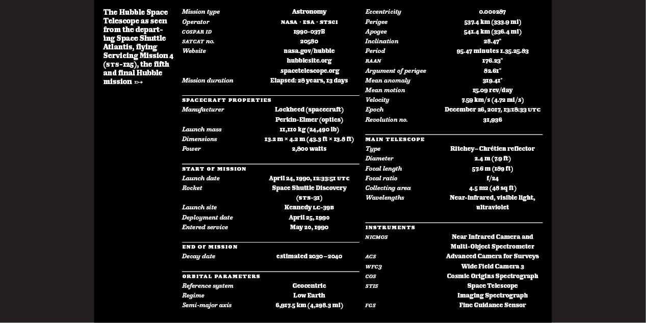
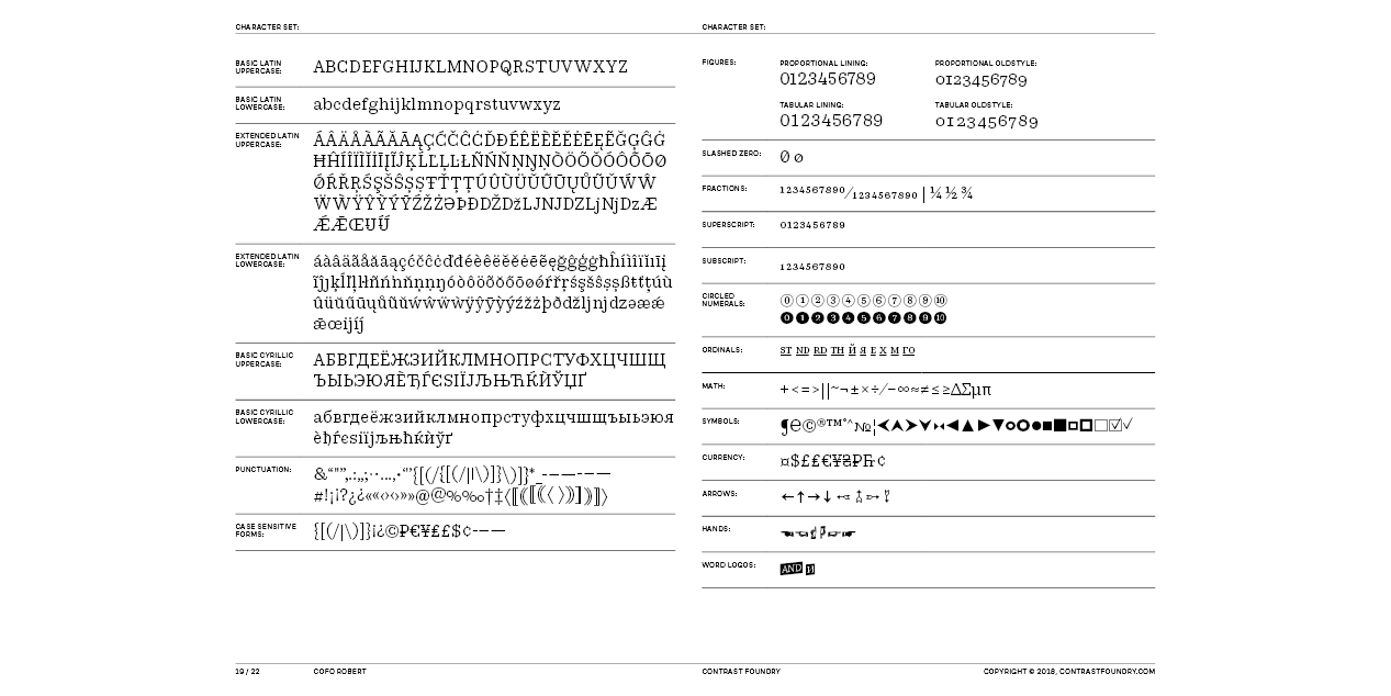
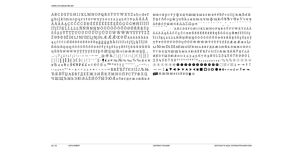
Robert is also packed with all the extras that designers dream of: several sets of decorative numbers, arrows, hands, bullets, small caps, supply-ing even more tools for creative freedom and making the possibilities of its usage limitless.
Design, Publisher, Copyright, License
Design: Liza Rasskazova
Copyright 2018 by LLC Contrast Foundry (LLC CoFo). All rights reserved.
Specimen: CoFo Robert
Liza Rasskazova
Liza Rasskazova is a CEO of Contrast Foundry. Joining CoFo in 2014, she has had a hand in most of the projects that the studio has produced ever since. Inspired by history and skillfully applying it to modern times, in 2018 she completed and published CoFo Robert, which gave her space for new exciting experiments and teaching.
Commercial License
Buy at: Contrast Foundry





Reviews
There are no reviews yet.