Description
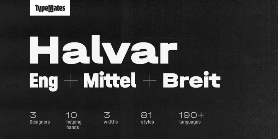
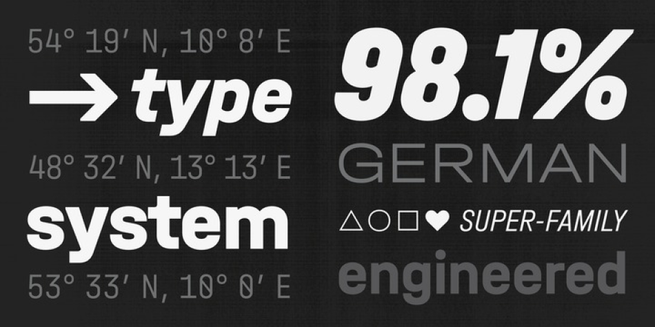
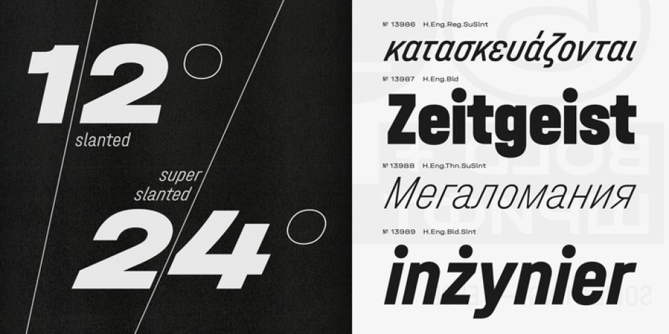
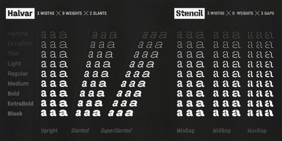
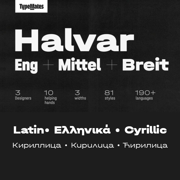
Halvar, a German engineered type system that extends to extremes. With bulky proportions and constructed forms, Halvar is a pragmatic grotesk with the raw charm of an engineer. A type system ready to explore, Halvar has 81 styles, wide to condensed, hairline to black, roman to oblique and then to superslanted, structured into three subfamilies: the wide Breitschrift, regular Mittelschrift and condensed Engschrift. Designed to be as adaptable in application as it is steady in appearance, this spectrum makes Halvar as ideal for complex corporate identity solutions as it is for particular ones. For industrial duties, a stencil display version is also available.
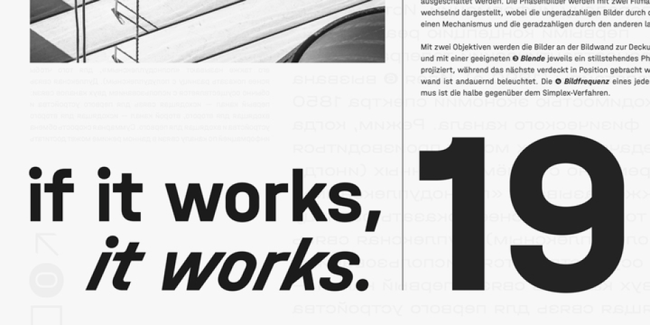
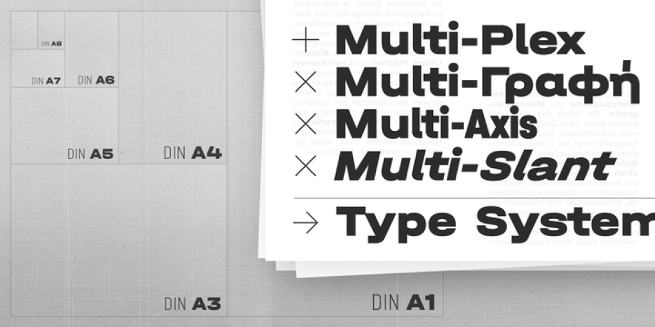
Halvar is not only built to be flexible, but technical. Apart from the SuperSlanted, all its font styles are multiplexed—a word in one Halvar’s roman or italic widths will occupy the same space regardless of weight—allowing for fine work in annual reports, interface design, or anywhere space is at a premium and the demands of reflow, rollover and animation need to be considered.
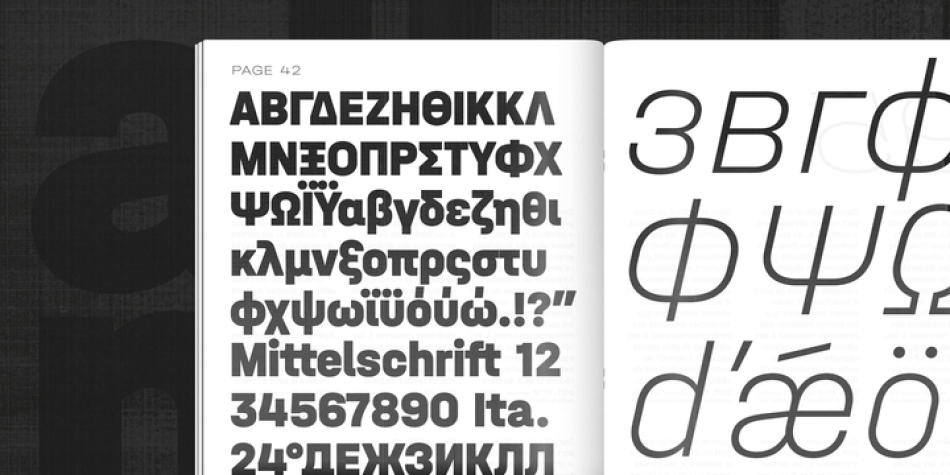
With a character set that includes extended Latin, Greek and Cyrillic and supports more than 190 languages, Halvar’s styles have German names and multilingual ambitions. Perfect for cross-market branding. To ensure TypeMates’ usual high standards throughout all glyphs, the Cyrillic and Greek letterforms were developed in consultation with native readers.
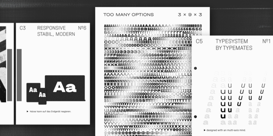
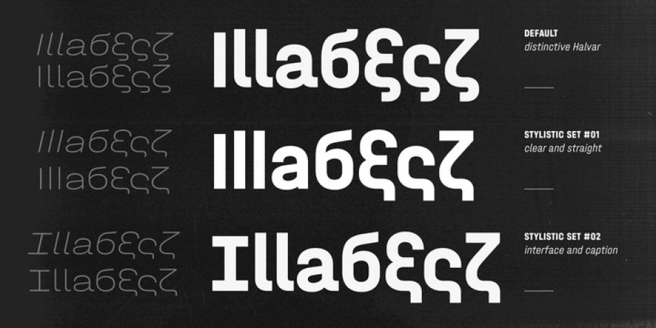
Needless to say, a font system this comprehensive is shipped with tabular figures, circled highlights, superscripts, as well as fractions. Alternate characters let Halvar toggle between two additional stylistic sets: one plain and functional, another distinct and digital.
With manual TrueType hinting and special attention to text styles, a stable x-height, contemporary proportions and a robust design, Halvar is optimised for screen performance and ready to meet any challenge in user interface typography.
Design, Publisher, Copyright, License
Design: Jakob Runge, Nils Thomsen, Lisa Fischbach
Publisher: TypeMates
Copyright 2019 by TypeMates. All rights reserved.
License: COMMERCIAL
Jakob Runge
![]()
Jakob Runge specialises in developing typefaces and custom lettering for corporate and editorial design. After studying communication design at the University of Applied Sciences in Würzburg (BA) and at Muthesius Academy of Fine Arts and Design in Kiel (MA), he is currently working in Munich as an independent type- and brand-designer and typographic consultant. For Jakob type design has become way more than passion; he believes that letters and typography are an essential basis of precise and coherent communication.
Web:
Typefaces: Cera Pro, Cera Condensed and Compact, Cera Round Pro, Cera Stencil Pro, Halvar
More… Jakob Runge
Nils Thomsen
![]()
Nils Thomsen (Hamburg, Germany) is a graduate of the Masters program in type design at KABK, 2010. Before that, he did a Bachelor of Arts in 2009 at Muthesius Academy of Arts and Design Kiel, Germany. From 2011 Nils Thomsen worked at Bureau Johannes Erler in Hamburg for two years.
Lisa Fischbach
![]()
With expertise in type and graphic design, Lisa’s understanding of how type is made and used forms the cornerstone of her identity as a type designer. She studied the Bachelor at the Muthesius Academy of Fine Arts and Design in Kiel, where she specialised in graphic design with a clear focus towards typography. These studies were paired with an excursion into the fine arts during a semester at the University of Seville. She finished her bachelor’s with a latin typeface, Lobelia, that was nominated for the Muthesius Award and honored in the Museum of art in Kiel. After her bachelor studies Lisa worked for 2 years in the design agency Format Design Visual Identities in Hamburg. There she was mainly responsible for the creation and supervision of corporate designs and systemic concepts. To further develop her fascination for type, Lisa moved to England, where she successfully completed her Master’s in Typeface Design at the University of Reading in 2014. During the Master’s programme she was was introduced to the design of foreign script systems. Her master’s project, Kaius, speaks several languages, including Gujarati, Greek, Cyrillic, Latin and phonetic signs. After her master’s degree Lisa worked for 4 years in Hamburg as an independent designer for various clients in the field of type and graphic design. Since 2018 she has been working for the foundry as the third TypeMate.


Reviews
There are no reviews yet.