Description
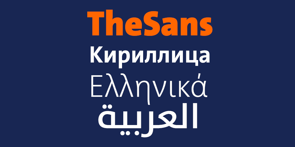
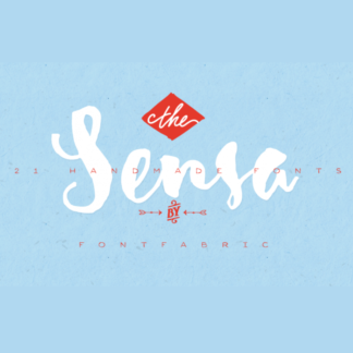
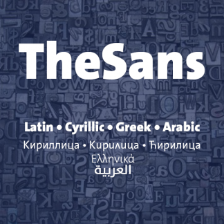
TheSans is part of the Thesis superfamily which Luc(as) de Groot first published in 1994. Over the subsequent decades, TheSans came to epitomize the useful-yet-friendly, all-purpose contemporary sans-serif. It has become the face of thousands of organisations, publications and web sites, making it one of the most widely used sans-serifs world-wide.
Thesis was conceived as a versatile typographic system of ambitious scope. It grew out of a dissatisfaction with the limited range of good typefaces available for corporate identity projects. It aims to fill that gap by providing the user with three compatible styles – TheSans, TheMix and TheSerif – in an optically harmonious range of eight weights, including real italics for each weight.
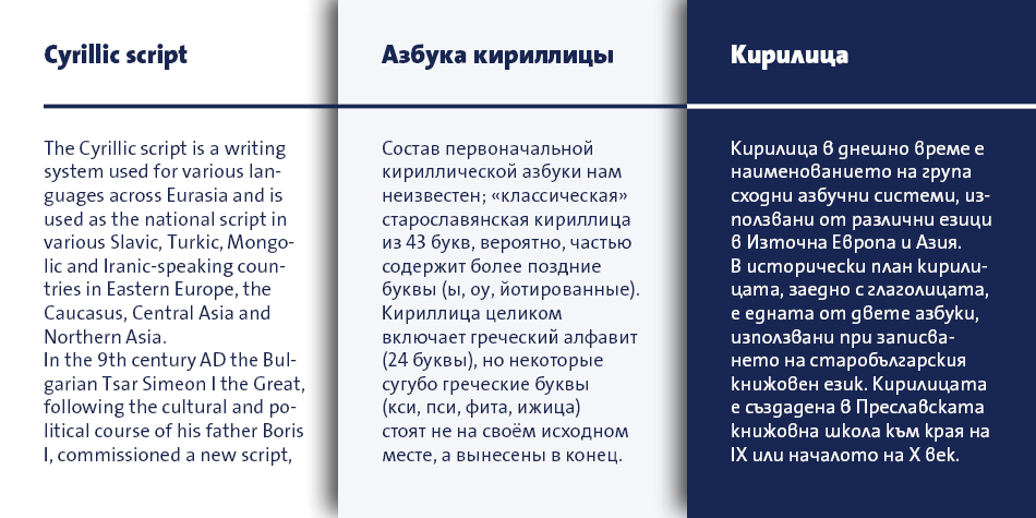
TheSans is a low-contrast typeface – i.e., the differences between thin and thick strokes are not very pronounced. Yet the reference to writing with the broad-nibbed pen is still present, giving the letters a diagonal stress and a forward flow that facilitates reading. The roman letterforms tend to have some characteristics of an italic or written construction. Yet the italic forms themselves are very distinctive: they were not derived from the upright but were individually designed while perfectly complementing the roman forms.
Design, Publisher, Copyright, License
Design: Luc(as) de Groot
Publisher: FontFabrik
Luc(as) de Groot
Berlin-based Dutch type designer Luc(as) de Groot is best-known for his superfamily Thesis: TheSans, TheSerif, TheMix, TheAntiqua, with monospaced and even Arabic variants. But his repertoire is much wider and his type became a subtle part of everyday life. Luc(as) has designed custom fonts for newspapers such as Folha de S.Paulo, Le Monde, Metro, Der Spiegel, taz.die tageszeitung, Freitag, Jungle World – in addition to creating corporate type for international companies including Sun Microsystems, Bell South, Heineken, Volkswagen and Miele. He developed two font families for Microsoft: the monospaced font family Consolas, as a successor for Courier, and Calibri, the new default typeface in MS Word.
Commercial License
Buy at: LucasFonts


Reviews
There are no reviews yet.