Description
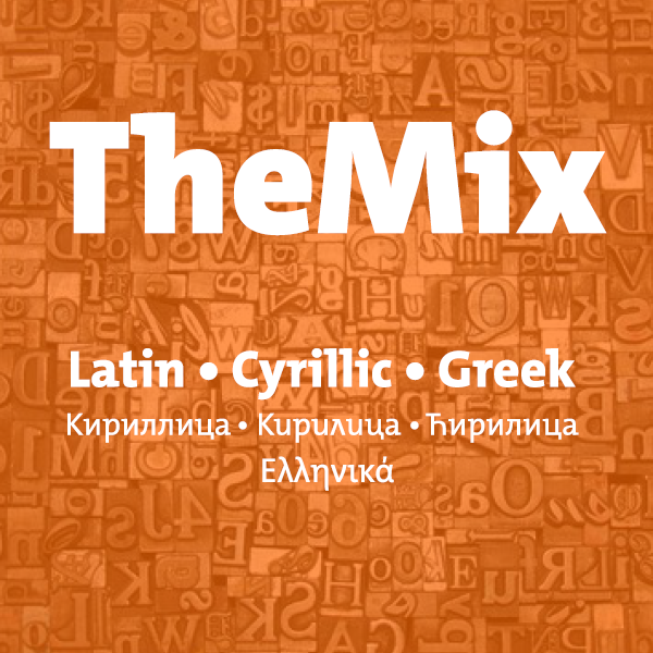
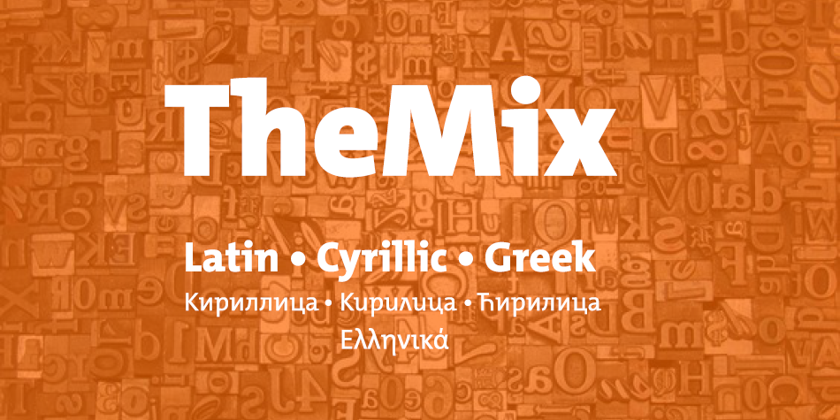
TheMix is part of the Thesis superfamily that Luc(as) de Groot first published in 1994. TheMix originated as an alphabet for the logotypes of the Dutch Ministry of Transport, Public Works and Water Management drawn by Luc(as) while working at BRS Premsela Vonk in Amsterdam. The alphabet later became the starting point of the entire Thesis system.
At the time of its first release, TheMix was highly original. The asymmetric serifs had been placed to obtain an optically even rhythm, without relying on any rigid system. The result was a typeface that combined excellent legibility with a youthful and unorthodox character. It became the corporate typeface to numerous international companies and institutions and was used for advertising and image campaigns aimed at young audiences. TheMix is ideal for multi-lingual projects, such as information-rich magazines or annual reports. It has also proved to perform extremely well in logos or in advertising.
Design, Publisher, Copyright, License
Design: Luc(as) de Groot
Publisher: FontFabrik
Luc(as) de Groot
Berlin-based Dutch type designer Luc(as) de Groot is best-known for his superfamily Thesis: TheSans, TheSerif, TheMix, TheAntiqua, with monospaced and even Arabic variants. But his repertoire is much wider and his type became a subtle part of everyday life. Luc(as) has designed custom fonts for newspapers such as Folha de S.Paulo, Le Monde, Metro, Der Spiegel, taz.die tageszeitung, Freitag, Jungle World – in addition to creating corporate type for international companies including Sun Microsystems, Bell South, Heineken, Volkswagen and Miele. He developed two font families for Microsoft: the monospaced font family Consolas, as a successor for Courier, and Calibri, the new default typeface in MS Word.
Commercial License
Buy at: LucasFonts




Reviews
There are no reviews yet.