Description
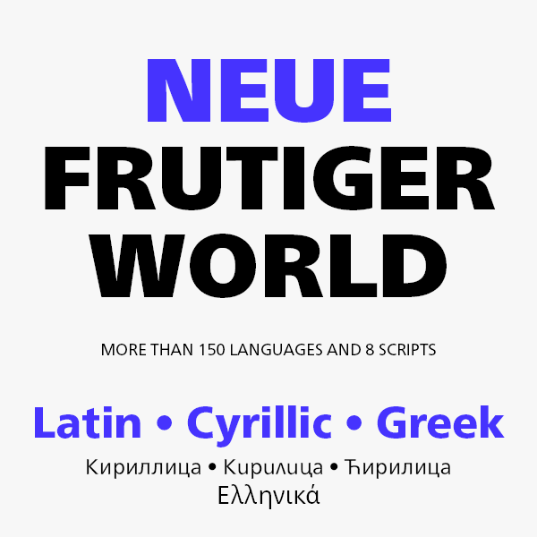
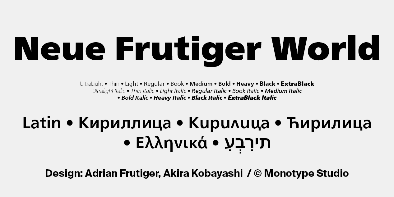
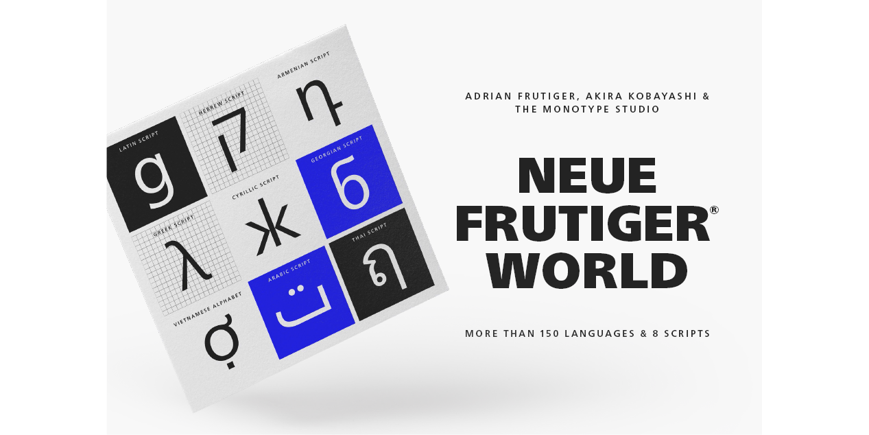
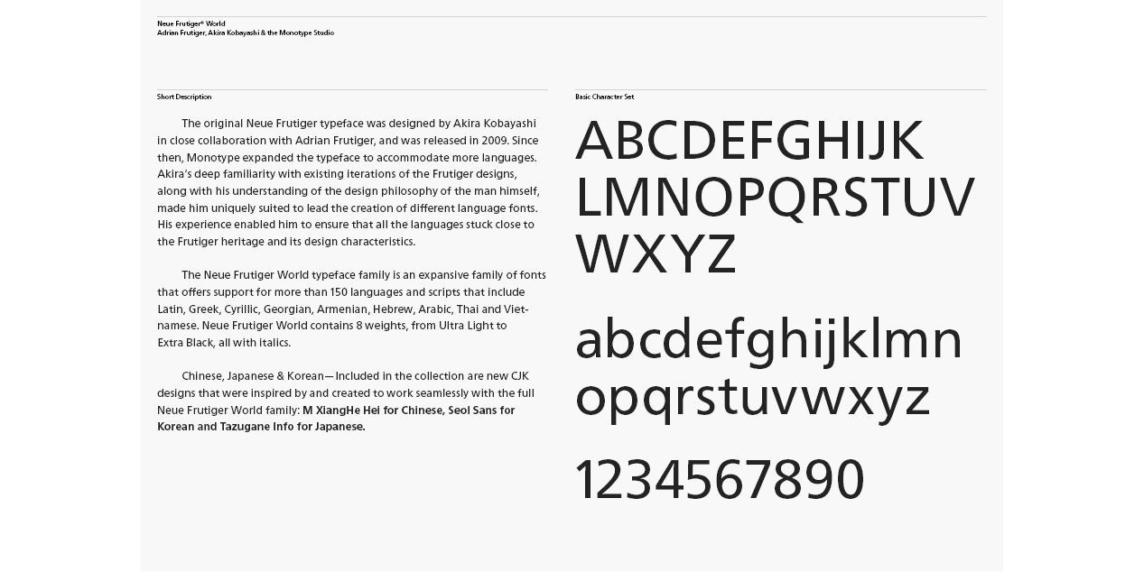
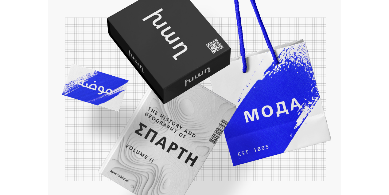
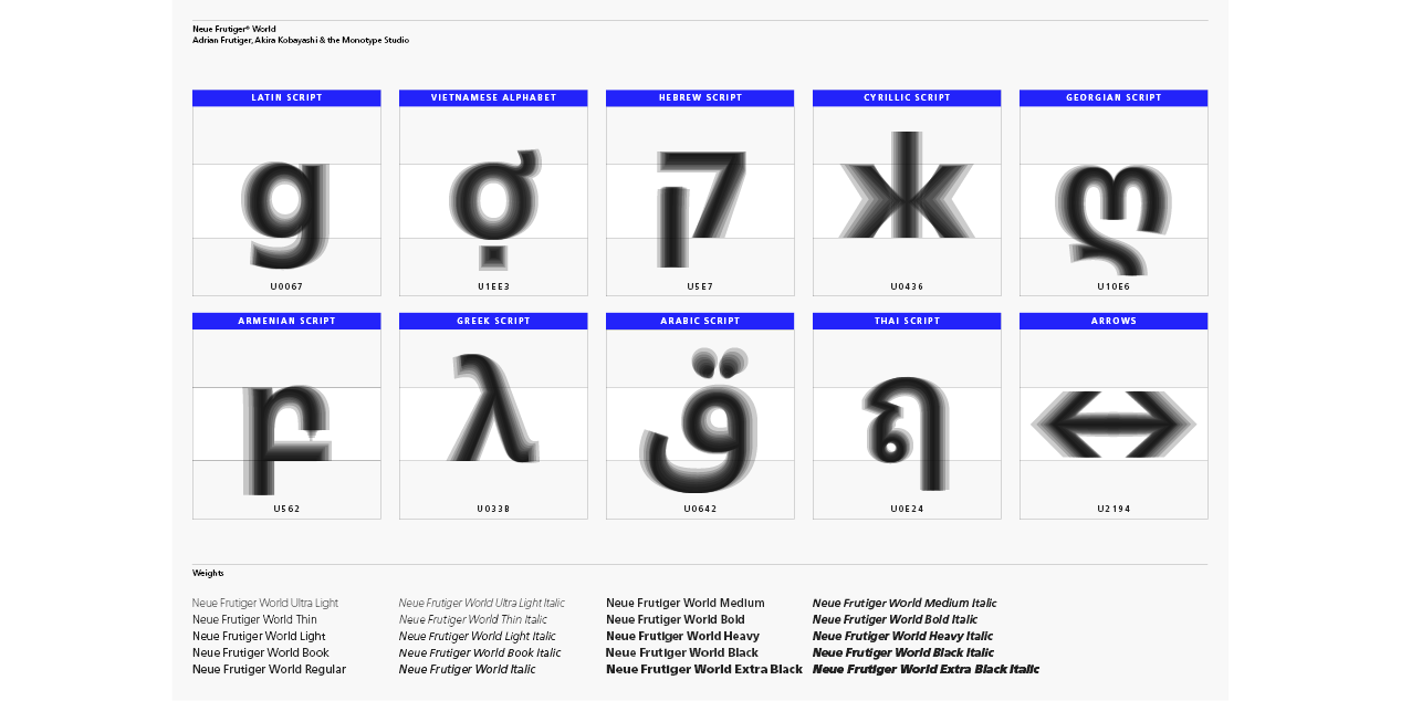
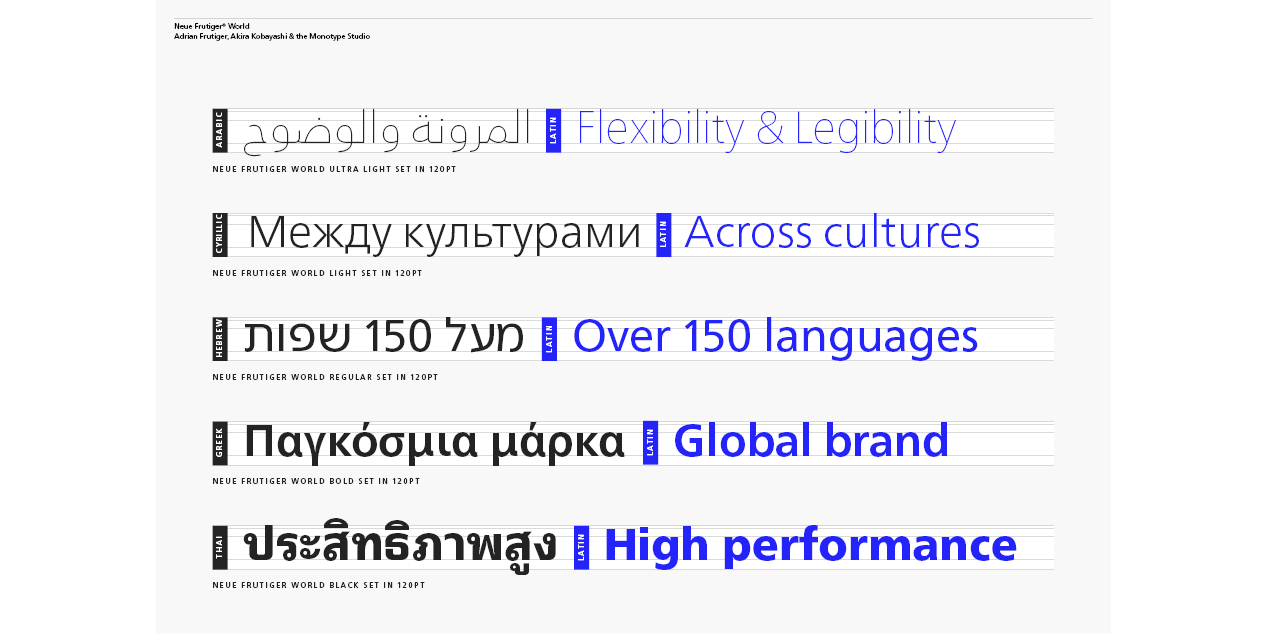
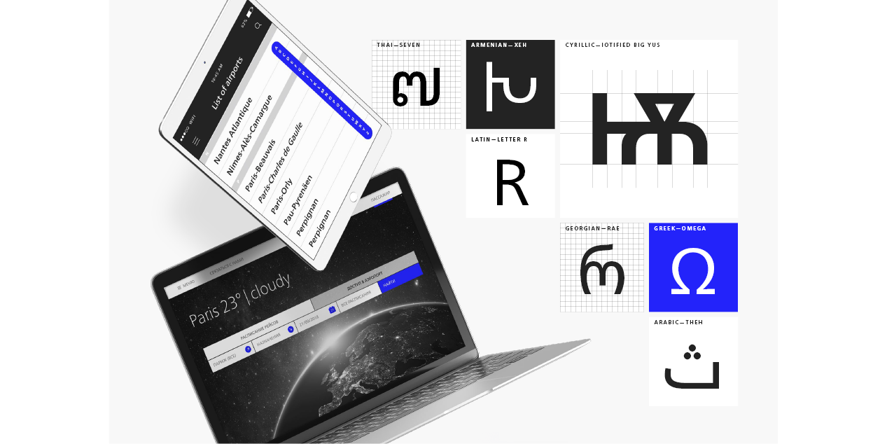
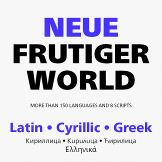
Neue Frutiger World is designed for global use with an impressive range of 10 weights, from Ultra Light to Extra Black, with matching italics. It embodies the same warmth and clarity as Adrian Frutiger’s original design, but allows brands to maintain their visual identity, and communicate with a consistent tone of voice, regardless of the language. Neue Frutiger World supports more than 150 languages and scripts including Latin, Greek, Cyrillic, Georgian, Armenian, Hebrew, Arabic, Thai and Vietnamese.
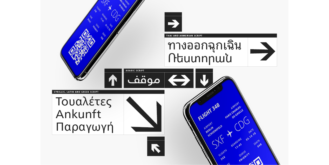
“Before Neue Frutiger World it was not an easy task for western brands to find families in Arabic, Hebrew, Thai and Vietnamese which match with their Latin,” says Monotype type director Akira Kobayashi, who led the Neue Frutiger World project. “They may find a type with closer expression, but there was no guarantee if the bold version in the non-Latin family matches the bold in their Latin. Neue Frutiger World offers a better solution.” In addition to Neue Frutiger World’s linguistic versatility, it works hard across environments – suited to branding and corporate identity, advertising, signage, wayfinding, print, and digital environments.
“Before Neue Frutiger World it was not an easy task for western brands to find families in Arabic, Hebrew, Thai and Vietnamese which match with their Latin,” says Monotype type director Akira Kobayashi, who led the Neue Frutiger World project. “They may find a type with closer expression, but there was no guarantee if the bold version in the non-Latin family matches the bold in their Latin. Neue Frutiger World offers a better solution.” In addition to Neue Frutiger World’s linguistic versatility, it works hard across environments – suited to branding and corporate identity, advertising, signage, wayfinding, print, and digital environments.
The Neue Frutiger World fonts can be paired with Monotype’s CJK fonts: M XiangHe Hei (Chinese), Tazugane Gothic (Japanese), Tazugane Info (Japanese), and Seol Sans (Korean). These were all designed to address brands’ needs to expand into Asian cultures and solve for global typographic challenges.
Design, Publisher, Copyright, License
Design: Adrian Frutiger, Akira Kobayashi, Monotype Studio
Copyright 2018 by Monotype Imaging Inc. All rights reserved.
Specimen: Neue Frutiger World
Adrian Frutiger
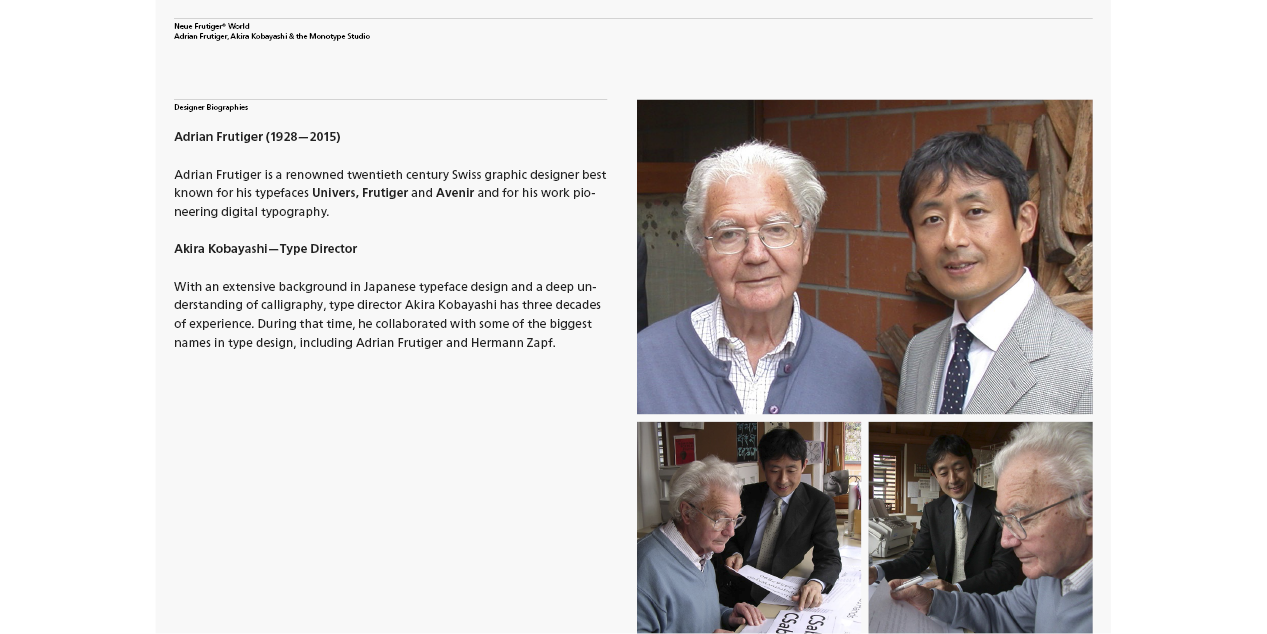
Adrian Johann Frutiger (24 May 1928 – 10 September 2015) was a Swiss typeface designer who influenced the direction of type design in the second half of the 20th century. His career spanned the hot metal, phototypesetting and digital typesetting eras. Until his death, he lived in Bremgarten bei Bern.
Frutiger’s most famous designs, Univers, Frutiger and Avenir, are landmark sans-serif families spanning the three main genres of sans-serif typefaces: neogrotesque, humanist and geometric. Univers was notable for being one of the first sans-serif faces to form a consistent but wide-ranging family, across a range of widths and weights. Frutiger described creating sans-serif types as his “main life’s work,” partially due to the difficulty in designing them compared to serif fonts.Typefaces: Neue Frutiger World, Avenir Next Cyrillic, Avenir Next World
More… WIKIPEDIA | Adrian Frutiger
Akira Kobayashi
With an extensive background in Japanese typeface design and a deep understanding of calligraphy, type director of Monotype Akira Kobayashi has three decades of experience. In that time he’s collaborated with some of the biggest names in type design, including Adrian Frutiger and Hermann Zapf.
After studying at Musashino Art University in Tokyo for four years, Akira Kobayashi accepted his first job at phototypesetting manufacturer Sha-Ken Co., where he was involved in the lengthy and intricate process of designing Japanese fonts. After leaving this role he studied calligraphy at the London College of Printing, worked as a freelance type designer, and has been a type director since 2001. In 2002 Kobayashi released Optima Nova – a modernization of Hermann Zapf’s Optima design – and in 2009 he partnered with Adrian Frutiger to update his eponymous typeface family. More recently Kobayashi directed the development of Tazugane, Monotype’s first original Japanese typeface. Responsible for the design over 50 font families including DIN Next, Akko Pro and Neue Frutiger. Closely collaborated with Hermann Zapf to release Zapfino Extra and Palatino Nova – expanded and updated versions of of the original families. Developed typefaces for major brands including Sony, UBS and Panasonic.Typefaces: Neue Frutiger World, Avenir Next Cyrillic, Avenir Next World
More… Monotype | Akira Kobayashi
Commercial License
Buy at: FontsCom



Reviews
There are no reviews yet.