(EN) The quick brown fox jumps over the lazy dog. (NL) Op brute wijze ving de schooljuf de quasi-kalme lynx. (CS) Nechť již hříšné saxofony ďáblů rozezvučí síň úděsnými tóny waltzu, tanga a quickstepu. (HU) Jó foxim és don Quijote húszwattos lámpánál ülve egy pár bűvös cipőt készít. (RO) Înjurând pițigăiat, zoofobul comandă vexat whisky și tequila. (RU) Разъяренный чтец эгоистично бьёт пятью жердями шустрого фехтовальщика. (BG) Огньове изгаряха с блуждаещи пламъци любовта човешка на Орфей. (SR) Фијуче ветар у шибљу, леди пасаже и куће иза њих и гунђа у оџацима. (EL) Ταχίστη αλώπηξ βαφής ψημένη γη, δρασκελίζει υπέρ νωθρού κυνός. Type your own text to test the font!
Description
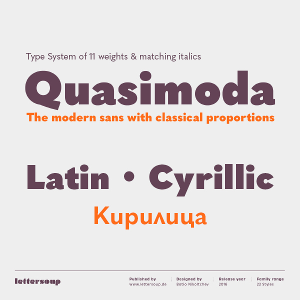
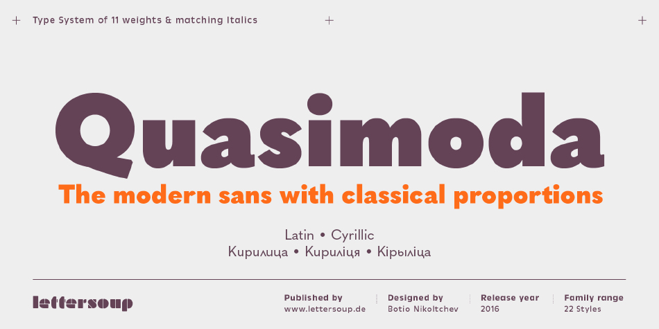
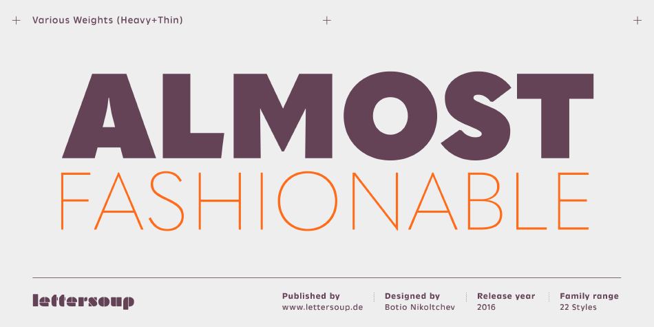
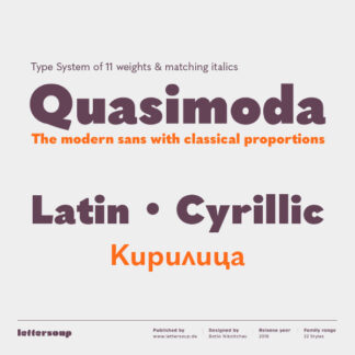
Quasimoda is the “almost fashionable” sans serif family with 11 weights and matching italics.
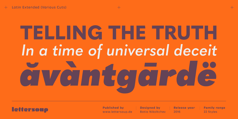
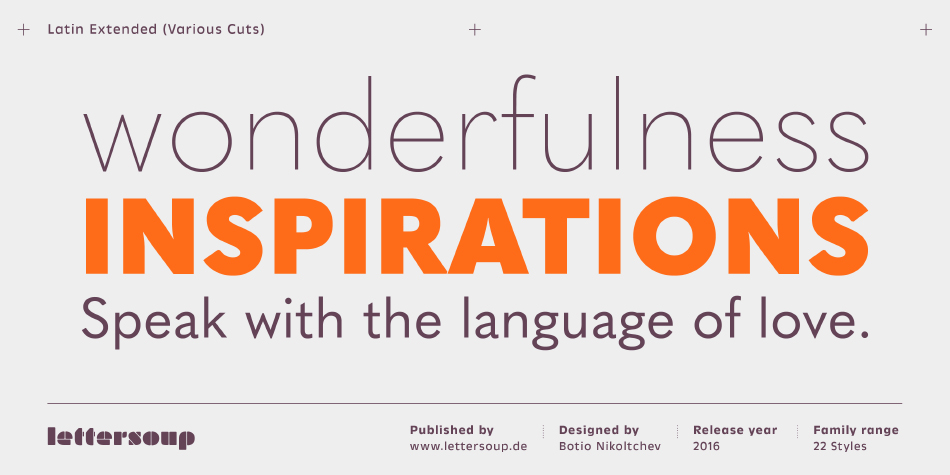
It combines fashionable geometric forms with old-fashioned classical proportions. Berlin-based Botio Nikoltchev (Lettersoup) designed Quasimoda so that the lighter weights give off a fresh, modern feel, the middle weights provide excellent readability and elegance for longer texts, while the boldest weights introduce a slightly antiquated flair. Partly geometric, partly grotesque, Quasimoda is a versatile beast. It follows the current fashions but does not completely give into them, retaining classical proportions and the slight ugliness of the 19th-century grotesques. With its long descenders and its small x-height, Quasimoda combines well with Renaissance serif fonts such as Garamond’s, or it can serve itself as a leading body font for longer texts, as well as a variety of branding, headline and display purposes. Quasimoda includes characters for more than 80 Latin-script languages, and several sets of figures available as OpenType features.
Design, Publisher, Copyright, License
Design: Botio Nikoltchev
Publisher: Lettersoup
Copyright 2016 by Botio Nikoltchev. All rights reserved.
Botio Nikoltchev
Botjo Nikoltchev, b. 1978, Sofia, Bulgaria. Botio studied graphic and type design in Potsdam. He is living and working as a freelance designer in Berlin. He studied communication design at the University of Applied Science Potsdam and took type design classes with Luc(as) de Groot. After his studies Botio worked with Ole Schäfer (Primetype) on the Cyrillic characters of PTL Manual, PTL Manual Mono and PTL Notes. Since 2010 he has been collaborating with Ralph du Carrois and Erik Spiekermann as type designer and art director at Carrois Type Design, focusing on Cyrillic, Greek and Arabic language extensions and CI projects. In 2014, he set up the commercial typefoundry Lettersoup.


Reviews
There are no reviews yet.