Description
Aperçu was started in December 2009, and was trialled & tested throughout a number of design commissions. The conceit behind Aperçu was to create a synopsis or amalgamation of classic realist typefaces: Johnston, Gill Sans, Neuzeit & Franklin Gothic. Becoming, a sum of parts, building upon its initial reference points to create an extensive and usable family.
Since its release in August 2010, Aperçu quickly found its position in the market, being used across a variety of different media and sectors around the world across a multitude of touchpoints. Utilised by leading visual institutions such as MOMA,Burberry, De Wiels, Zeit Magazine and the Walker Art Centre amongst many others.
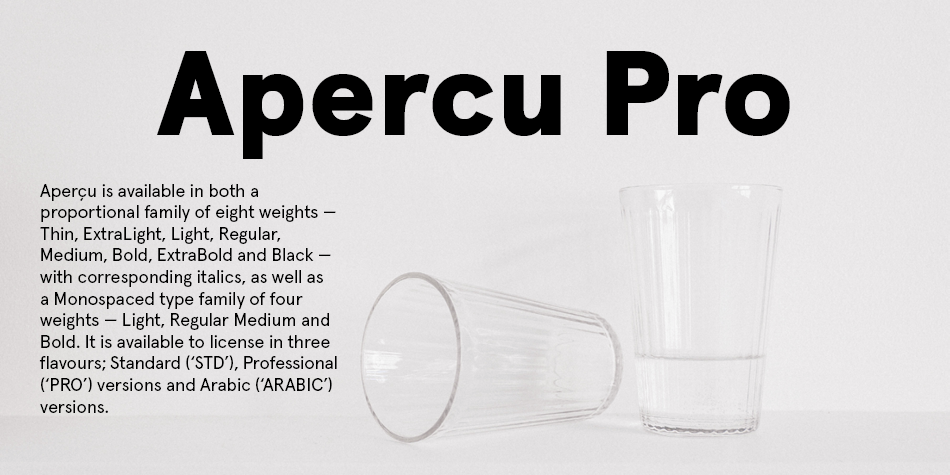
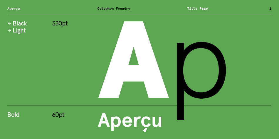
Aperçu is available in both a proportional family of eight weights — Thin, ExtraLight, Light, Regular, Medium, Bold, ExtraBold and Black—with corresponding italics, as well as a Monospaced type family of four weights — Light, Regular Medium and Bold. It is available to license in three flavours; Standard (‘STD’), Professional (‘PRO’) versions and Arabic (‘ARABIC’) versions.
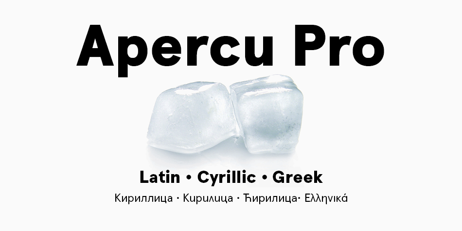
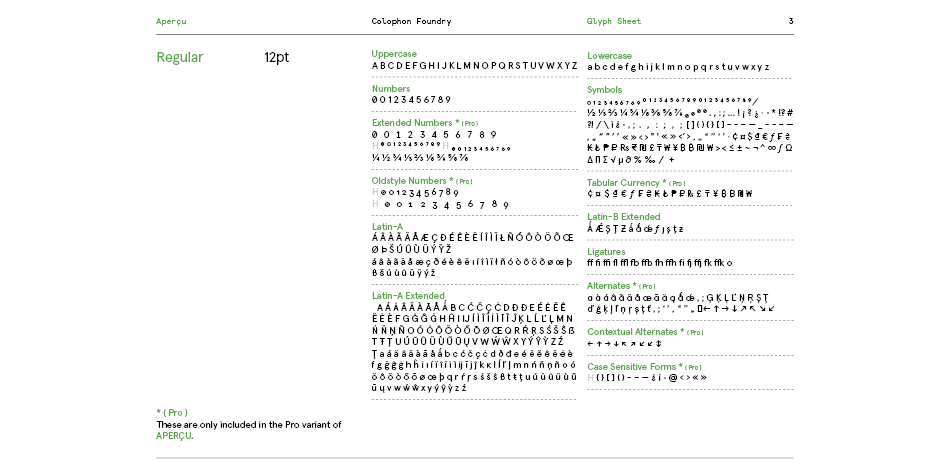
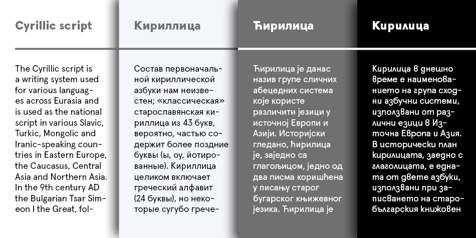
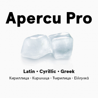
The PRO containing further language support in the form of Cyrillic and Greek scripts, as well as OpenType features, stylistic alternates, and copious marks and symbols. The Arabic contains all the features within the PRO version, but also full support for the Arabic script and is available in four base weights — Light, Regular, Medium and Bold.
Support for Thai and Vietnamese will be following shortly.
Design, Publisher, Copyright, License
Design: The Entente
Publisher: Colophon Foundry, London
The Entente
Anthony Sheret is the founder of the Entente, a Brighton (UK)-based design and art direction studio formed with Edd Harrington in late 2008. The studio is named after the relationship between both parties: The Friendly Understanding. Alongside Entente, he also runs Colophon Foundry.



Reviews
There are no reviews yet.