Description
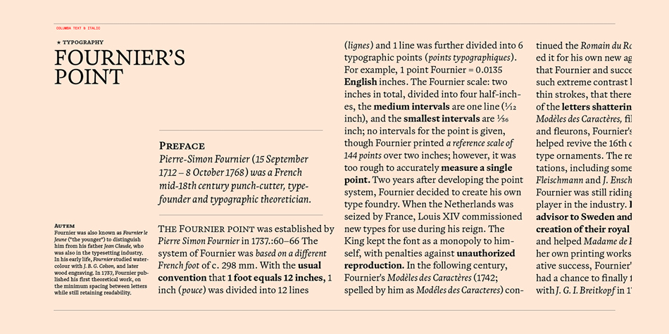
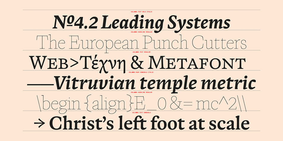
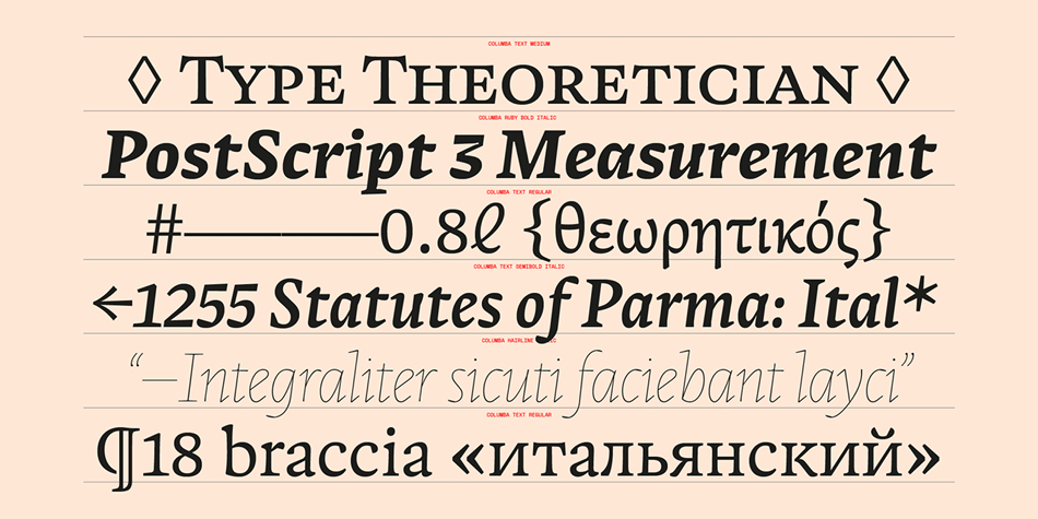
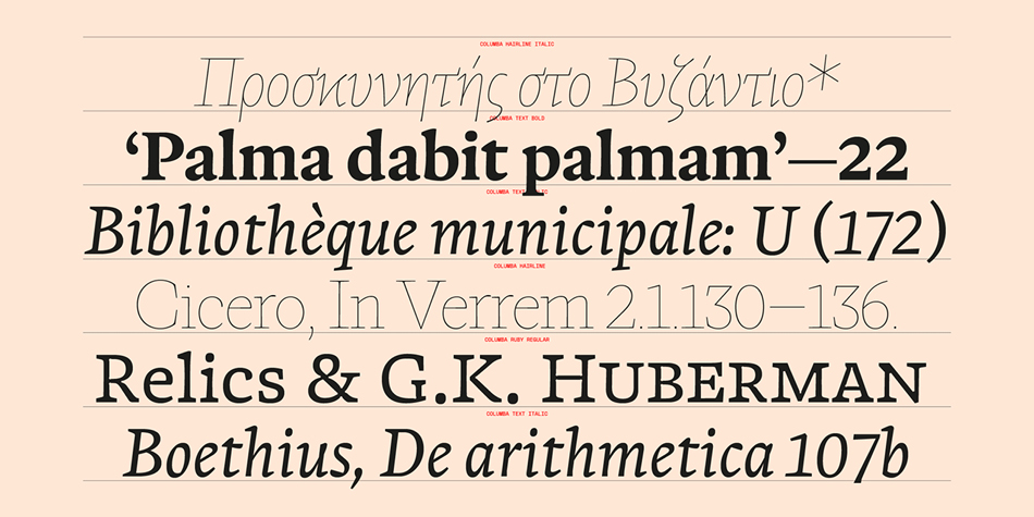
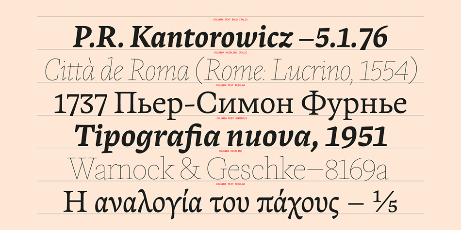
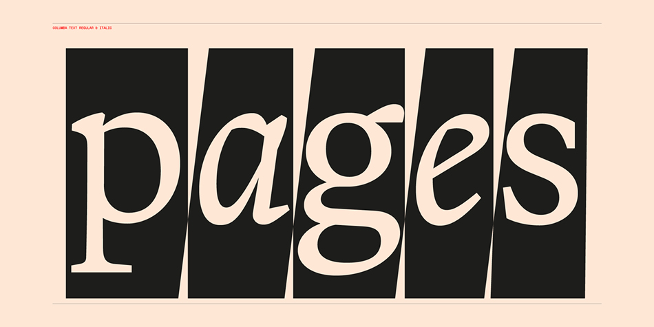
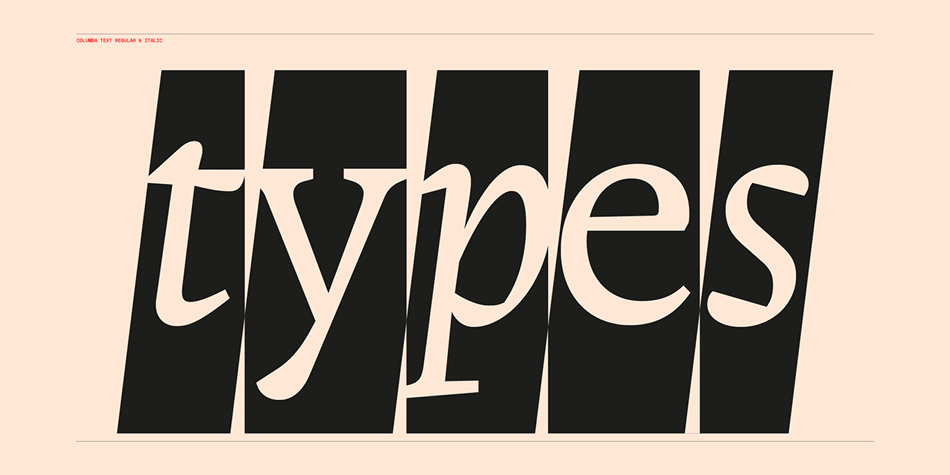
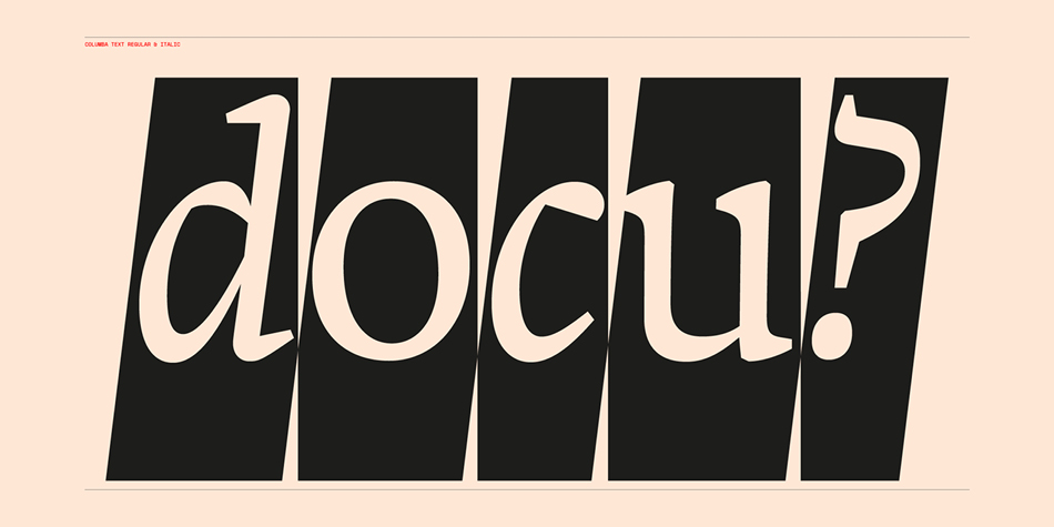
Combining historical influences from the work of Miklós Kis (1650-1702), Hendrik van den Keere (1540-1580) Columba is an old-style text typeface ideal for use in complicated tight-set printing environments, editorial, book and magazine work. The narrow forms and rotating stress in curved strokes not only make Columba useful for columned text, but its subtle bends and inclines in-place of typically straight down-strokes give the font a warm and flowing feeling.
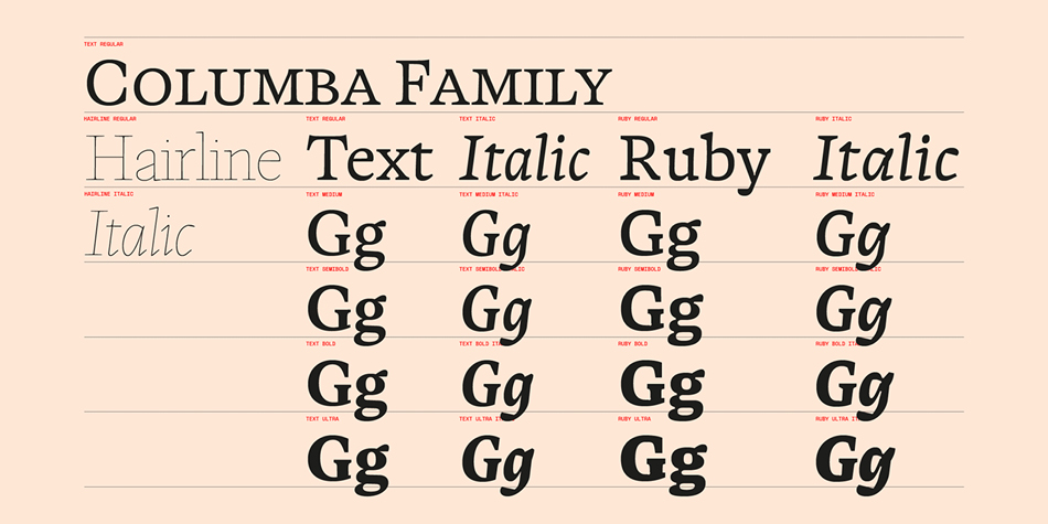
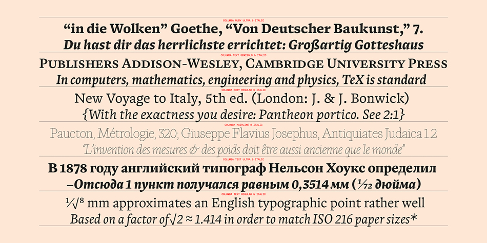
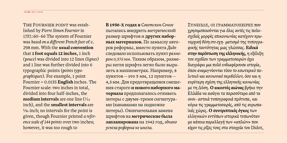
Devised along three axes – italic, weight and optical size – Columba has a caption size named ‘ruby’ (for 5-8pt) and a standard text size (for 9-14pt). Ruby is built around a system of ink traps, slab-like serifs and simplified stroke patterns making it easier to read at footnote-scale. The text size is ideal for articles and stories, and is designed with column width and line space efficiency in mind.
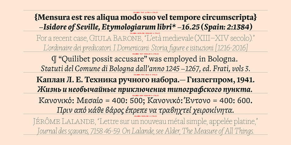
Columba is available in five weights – Regular, Medium, Semibold, Bold and Ultra with corresponding italics, and has a hairline weight for large-scale display work. As a variable font, custom weight and optical sizes can be set. Ink traps are designed to kick-in when the optical slider is set below 8pt.
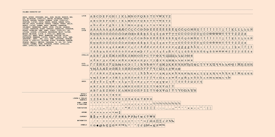
Columba covers three three writing systems – extended Latin, monotonic Greek and extended Cyrillic. The design of these scripts was acknowledged when Columba won the 2019 Granshan Grand Prize for Non-Latin Scripts.
Design, Publisher, Copyright, License
Design: Lewis McGuffie, Manuel de Lignières
Publisher: Colophon Foundry
License: COMMERCIAL
Specimen: Columba
Lewis McGuffie
British graphic designer and sign painter who was at some point in Tallinn, Estonia. Graduate of the MATD program at the University of Reading, class of 2019.







Reviews
There are no reviews yet.