Gilam

$ 249.00

License:
COMMERCIAL
Format:
OTF
Glyphs:
766
Features:
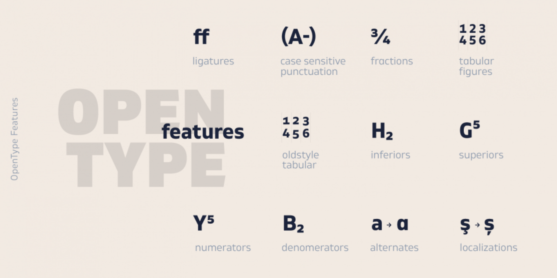
aalt calt case cpsp dlig dnom frac kern liga lnum mark mkmk numr onum ordn pnum salt sinf ss01 ss02 sups tnum
Version:
1.001
Published:
2018
LocalFonts:
26/06/2020
Styles:
Complete family of 20 fonts
Designer:
Ivan Petrov, Plamen Motev
Copyright:
© 2018 by Fontfabric. All rights reserved.

Description

Font Sampler

Gilam Thin Italic DEMO
  • Gilam Thin Italic DEMO
  • Gilam Black DEMO
Select a sample text
  • Select a sample text
  • hamburgerfontstiv
  • abcdefghijklmnopqrstuvwxyz
  • ABCDEFGHIJKLMNOPQRSTUVWXYZ
  • ff fi fl fj ffi ffl ffj
  • 1 2 3 4 5 6 7 8 9 0
  • 1/2 2/5 3/4 5/8 7/8 10/12
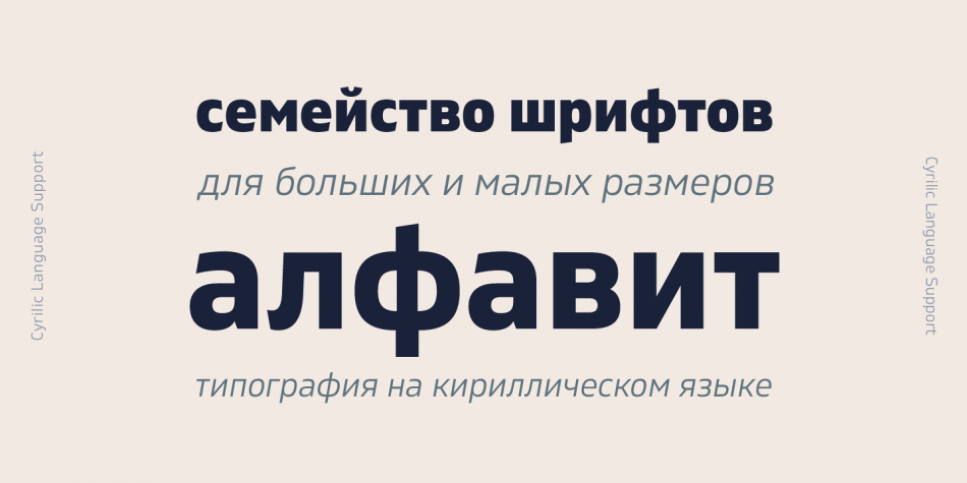
  • АБВГДЕЖЗИЙКЛМНОПРСТУФХЦЧШЩЪЬЮЯЍ
  • абвгдежзийклмнопрстуфхцчшщъьюяѝ
  • АБВГДЕЁЖЗИЙКЛМНОПРСТУФХЦЧШЩЪЫЬЭЮЯ
  • абвгдеёжзийклмнопрстуфхцчшщъыьэюя
  • АБВГДЂЕЖЗИЈКЛЉМНЊОПРСТЋУФХЦЧЏШ
  • абвгдђежзијклљмнњопрстћуфхцчџш
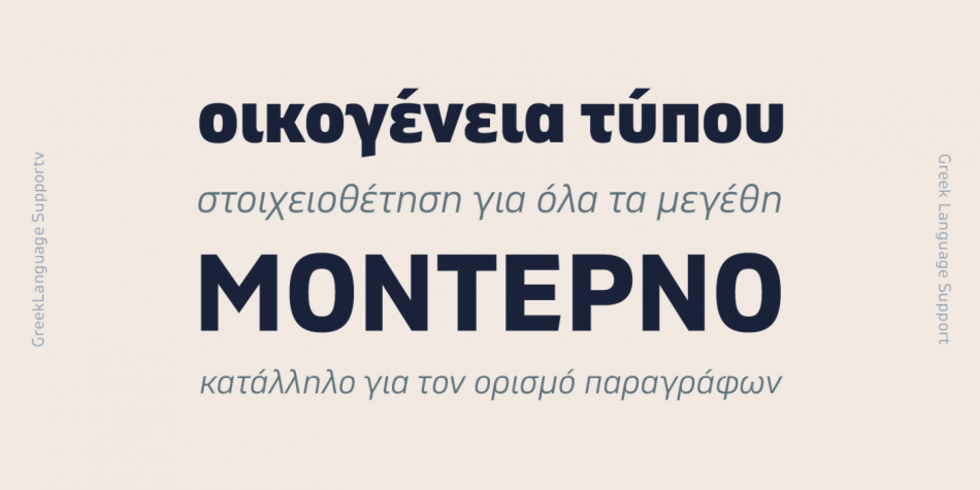
  • ​‌Α​‌Β​‌Γ​‌Δ​‌Ε​‌Ζ​‌Η​‌Θ​‌Ι​‌Κ​‌Λ​‌Μ​‌Ν​‌Ξ​‌Ο​‌Π​‌Ρ​‌Σ​‌Τ​‌Υ​‌Φ​‌Χ​‌Ψ​‌Ω​‌
  • α​‌β​‌γ​‌δ​‌ε​‌ζ​‌η​‌θ​‌ι​‌κ​‌λ​‌μ​‌ν​‌ξ​‌ο​‌π​‌ρ​‌σ​‌τ​‌υ​‌φ​‌χ​‌ψ​‌ω
  • ​‌ά​‌Ά​‌έ​‌Έ​‌έ​‌Ή​‌ί​‌ϊ​‌ΐ​‌Ί​‌ό​‌Ό​‌ύ​‌ΰ​‌ϋ​‌Ύ​‌Ϋ​‌Ώ
  • (NL) Op brute wijze ving de schooljuf de quasi-kalme lynx. Het Nederlands is een West-Germaanse taal en de moedertaal van de meeste inwoners van Nederland, België en Suriname. In de Europese Unie spreken ongeveer 23 miljoen mensen Nederlands als eerste taal, en een bijkomende vijf miljoen als tweede taal. Verder is het Nederlands ook een officiële taal van de Caraïbische (ei)landen Aruba, Curaçao en Sint-Maarten, terwijl de Franse Westhoek en de regio rondom de Duitse stad Kleef van oudsher Nederlandstalige gebieden zijn, en daar Nederlandse dialecten mogelijk nog gesproken worden door de oudste generaties. Ook in de voormalige kolonie Indonesië kunnen in sommige gebieden de oudste generaties nog Nederlands spreken. Het aantal sprekers van het Nederlands in Verenigde Staten, Canada en Australië wordt geschat op ruim een half miljoen. De Kaap-Hollandse dialecten van Zuid-Afrika en Namibië werden gestandaardiseerd tot Afrikaans, een dochtertaal van het Nederlands. Check for local features. Select the appropriate language: • f i j > fij • f í j > fíj. Test the font with your own texts.
  • (RO) Înjurând pițigăiat, zoofobul comandă vexat whisky și tequila. Limba română este o limbă indo-europeană, din grupul italic și din subgrupul oriental al limbilor romanice. Printre limbile romanice, româna este a cincea după numărul de vorbitori, în urma spaniolei, portughezei, francezei și italienei. Din motive de diferențiere tipologică, limba română mai este numită în lingvistica comparată limba dacoromână sau dialectul dacoromân. De asemenea, este înregistrată ca limbă de stat atât în România cât și în Republica Moldova, unde circa 75% din populație o consideră limbă maternă (inclusiv sub denumirea de „limba moldovenească”). Check for local features. Select the appropriate language: • ş > ș • ţ > ț. Test the font with your own texts.
  • (TR) Pijamalı hasta, yağız şoföre çabucak güvendi. Türkçe ya da Türk dili, batıda Balkanlar’dan başlayıp doğuda Hazar Denizi sahasına kadar konuşulan Altay dillerinden biridir. Yaşı, en eski hesaplara göre 8500 olan Türkçe, bugün yaşayan Dünya dilleri arasında en eski yazılı belgelere sahip olan dildir. Bu belgeler, çivi yazılı Sümerce tabletlerdeki alıntı kelimelerdir. Türk yazı dilleri içinde Oğuz sahası yazı dillerinden Osmanlı Türkçesinin devamını oluşturur. Başta Türkiye olmak üzere eski Osmanlı İmparatorluğu coğrafyasında konuşulan Türkçe, dünyada en fazla konuşulan 5. dildir. Türkçe sondan eklemeli bir dildir. Bundan ötürü kullanılan herhangi bir eylem üzerinden istenildiği kadar sözcük türetilebilir. Türkiye Türkçesi bu yönünden dolayı diğer Türk dilleriyle ortak ya da ayrık bulunan onlarca eke sahiptir. Türkçe çok geniş kullanımıyla birlikte zengin bir dil olmasının yanı sıra, genel itibarıyla “özne-nesne-yüklem” biçimindeki cümle kuruluşuna sahiptir. Check for local features. Select the appropriate language. Test the font with your own texts.
  • (BG) Българският език е индоевропейски език от групата на южнославянските езици. Той е официалният език на Република България и един от 23-те официални езика на Европейския съюз. Българският език е плурицентричен език – има няколко книжовни норми. Наред с основната, използвана в България, съществуват още македонска норма, която също използва кирилица, и банатска норма, която използва латиница.
  • (SR) Српски језик је један од словенских језика из породице индоевропских језика. Први писани споменици у српској редакцији старословенског језика потичу из 11. и 12. века. Српски језик је стандардни језик у службеној употреби у Србији и Босни и Херцеговини, а у употреби је и у другим земљама где живе Срби, међу осталима и у Црној Гори, Хрватској и Македонији. По пореклу, граматици и по речничком фонду српском језику су слични хрватски, црногорски и бошњачки језик, тако да се говорници ових језика могу још увек без проблема споразумевати. У другој половини 19. и у 20. веку (југословенски период) ови језици су сматрани јединственим српскохрватским језиком. Српски као стандардни језик се 1991. године поново издвојио из српскохрватског језичког стандарда и наставио да се развија самостално. Српска језичка норма је дефинисана пре стварања српскохрватског стандарда.
Select language
  • Select language
  • Bulgarian language
  • Serbian Language
  • Macedonian language
  • Dutch language
  • Hungarian language
  • Romanian language
  • Turkish language
(EN) The quick brown fox jumps over the lazy dog. (NL) Op brute wijze ving de schooljuf de quasi-kalme lynx. (CS) Nechť již hříšné saxofony ďáblů rozezvučí síň úděsnými tóny waltzu, tanga a quickstepu. (HU) Jó foxim és don Quijote húszwattos lámpánál ülve egy pár bűvös cipőt készít. (RO) Înjurând pițigăiat, zoofobul comandă vexat whisky și tequila. (RU) Разъяренный чтец эгоистично бьёт пятью жердями шустрого фехтовальщика. (BG) Огньове изгаряха с блуждаещи пламъци любовта човешка на Орфей. (SR) Фијуче ветар у шибљу, леди пасаже и куће иза њих и гунђа у оџацима. (EL) Ταχίστη αλώπηξ βαφής ψημένη γη, δρασκελίζει υπέρ νωθρού κυνός. Type your own text to test the font!
Description

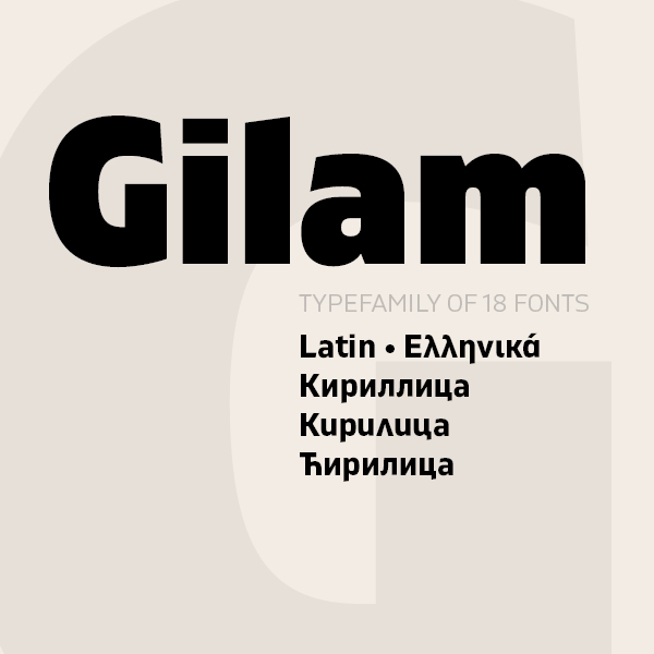
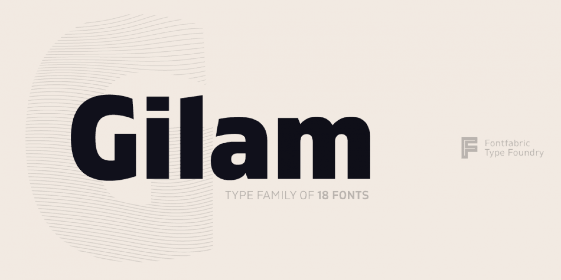
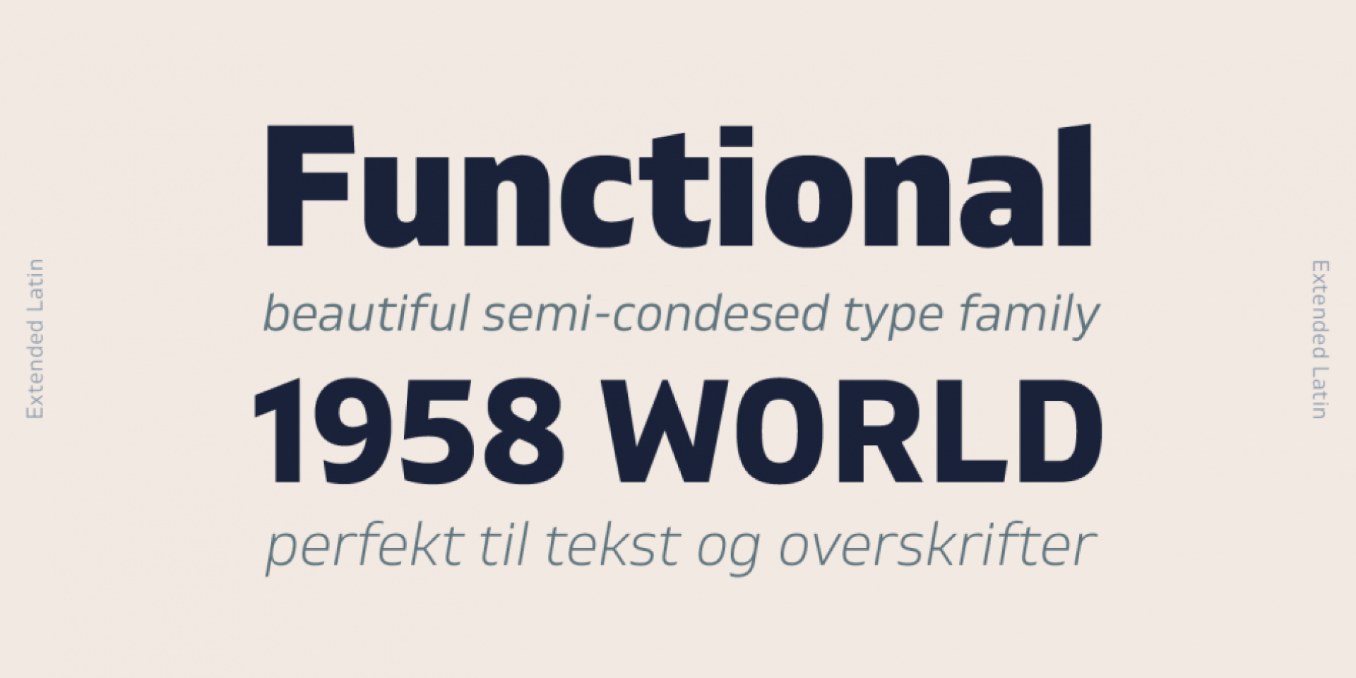
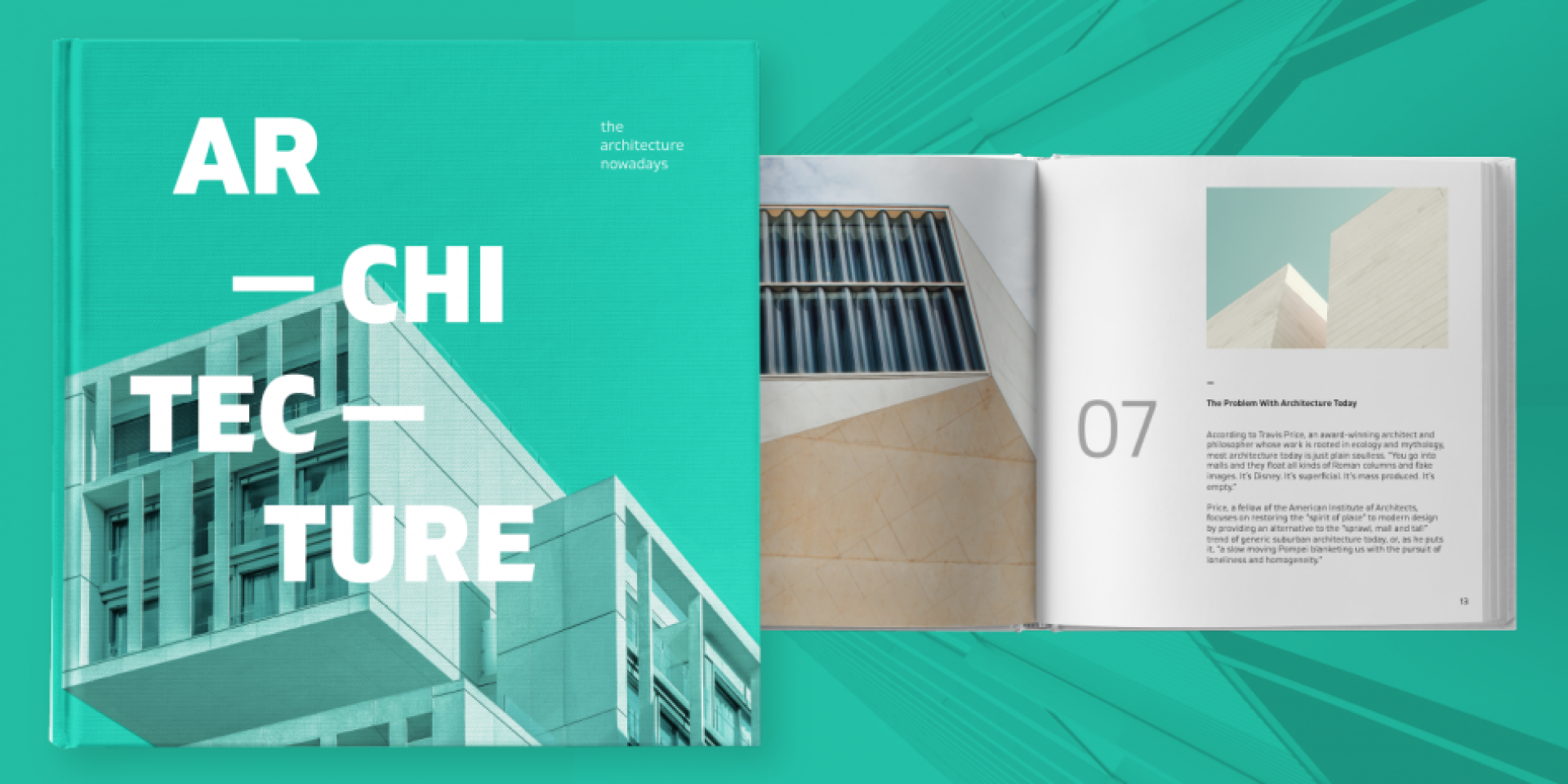
Gilam is a sans serif font with semi-condensed proportions. The typeface was based on the famous DIN but combines its popular neo-grotesque look with characteristics, such as the pointed edges in the “W” and “M” as well as the outward cut terminals, which gives a distinctive look to the modern geometric typeface. The complete set of 9 weights plus italics gives to designers the absolute freedom to create anything. Perfect layouts with blocks of text, headlines, motion graphics, logos, apps, and websites are just part of the intended usage of this versatile typeface.

Features:
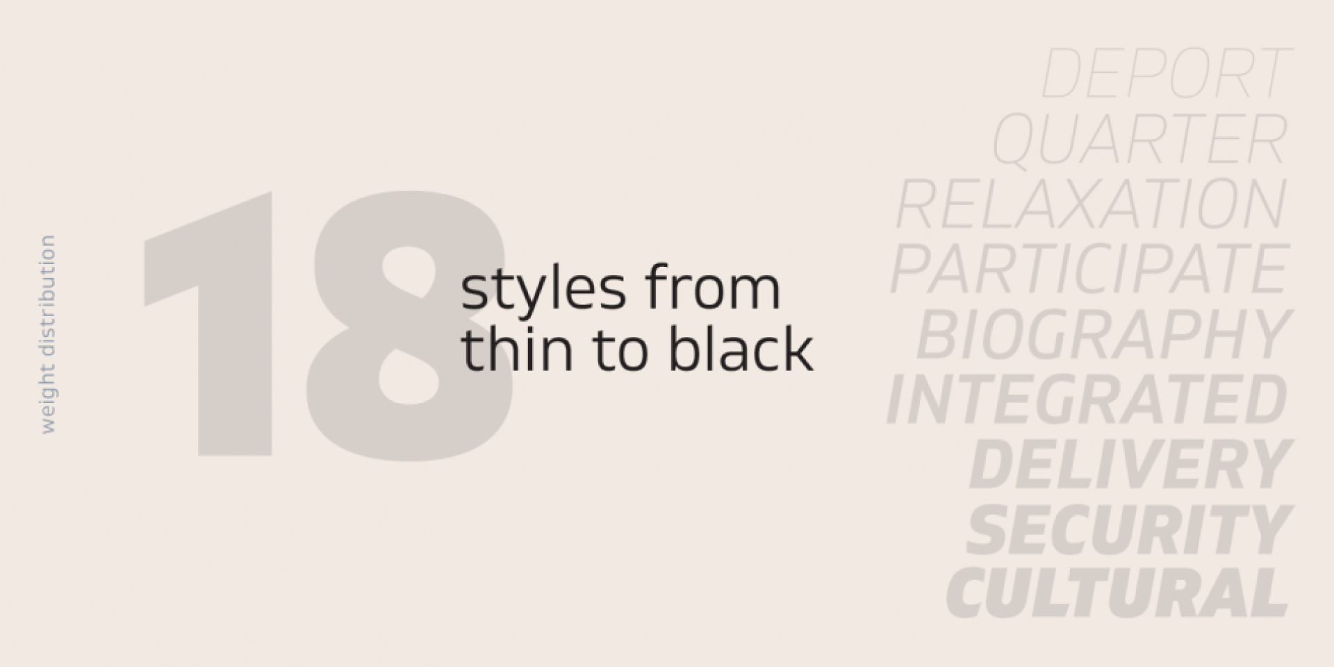
• 765 glyphs in 18 styles;
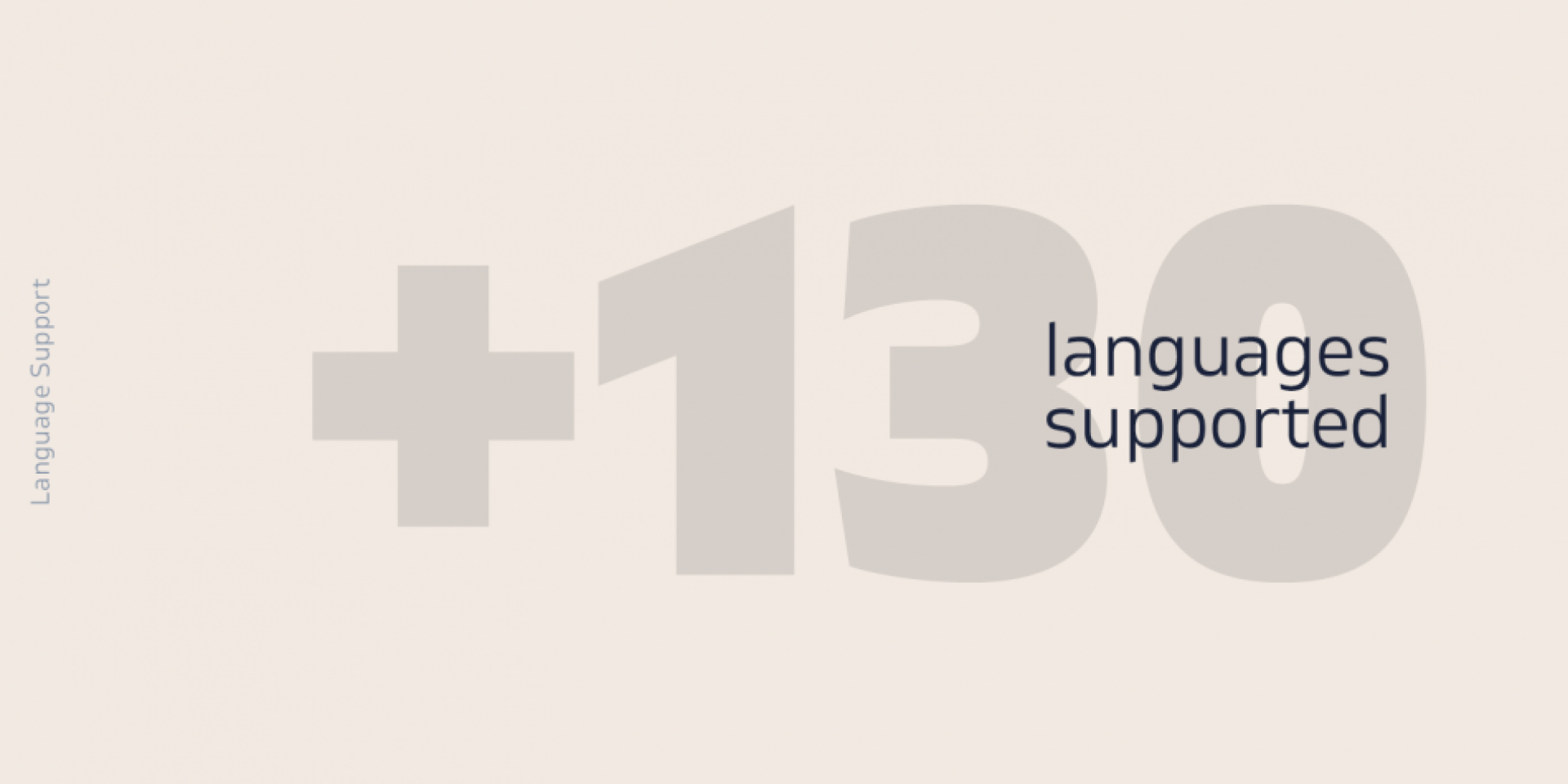
• Extended Latin, Cyrillic and Greek;
• Geometric forms and low contrast;
• Prominent x-height which makes it legible in a text;
• Perfect for headlines and logos;
• Suitable for web, print, motion graphics etc.
• Semi-condensed proportion;
• Advanced typographical support and OpenType features including case-sensitive forms, fractions, superscript and subscript characters, and stylistic alternates;
• Complete set of figures – old style and lining figures, which come with proportional and tabular variation;

Gilam means “joy of people” so that you can enjoy it!

Design, Publisher, Copyright, License

Design: Ivan Petrov, Plamen Motev

Publisher: Fontfabric

Copyright 2018 by Fontfabric. All rights reserved.

Ivan Petrov

Ivan Petrov

Ivan Petrov is based in Saint Petersburg, Russia. Bulgarian codesigner with Julia Zhdanova of the free typeface Artifika at Cyreal and Google Font Directory in 2011. He is currently located in Moscow. At Cyreal, he published the free font Volkhov (2011; download at Fontsquirrel), a low-contrast serifed typeface with a robust character, and the didone typeface Prata (2011). He also created a number of beautiful experimental typefaces in 2011. Bolgariy (2012) is a warm display typeface made for advertising Bulgaria. In 2014, he published the 18-style sans serif typeface system Glober at Fontfabric. Inspired by strong German grotesques such as DIN and Dax, it has a great spectrum, from hairline (called Thin) to Heavy. Glober won an award at Modern Cyrillic 2014.

Plamen Motev

Plamen Motev

Type designer based in Sofia, Bulgaria. As a student working with Fontfabric in Sofia, Bulgaria, Plamen Motev designed the free circle-themed slightly condensed retro typeface Phenomena (done together with Radomir Tinkov) and the free 8-style narrow grotesque family Akrobat for Latin and Cyrillic in 2016. In 2017, Plamen Motev and Svetoslav Simov co-designed Uni Neue, a total remake of Fontfabric’s earler typeface Uni Sans (2009). He was part of the Fontfabric team that designed the 521-font family Zing Rust, Zing Sans Rust and Zing Script Rust in 2017. Typefaces from 2018: Gilam (by Ivan Petrov, Plamen Motev and Svetoslav Simov: based on DIN, but more geometric and with obliquely cut terminals).

Commercial license

Buy at: Fontspring

Free DEMO

Download v.1.001:
Gilam Thin Italic, Black | Google Drive

Get permission to open a file on Google Drive

• Open the file.
• On the “You need permission” page, click “Request access”.
• The admins of the site will receive your request to access the file you want to download.
• After they approve your request, you’ll be notified by email.