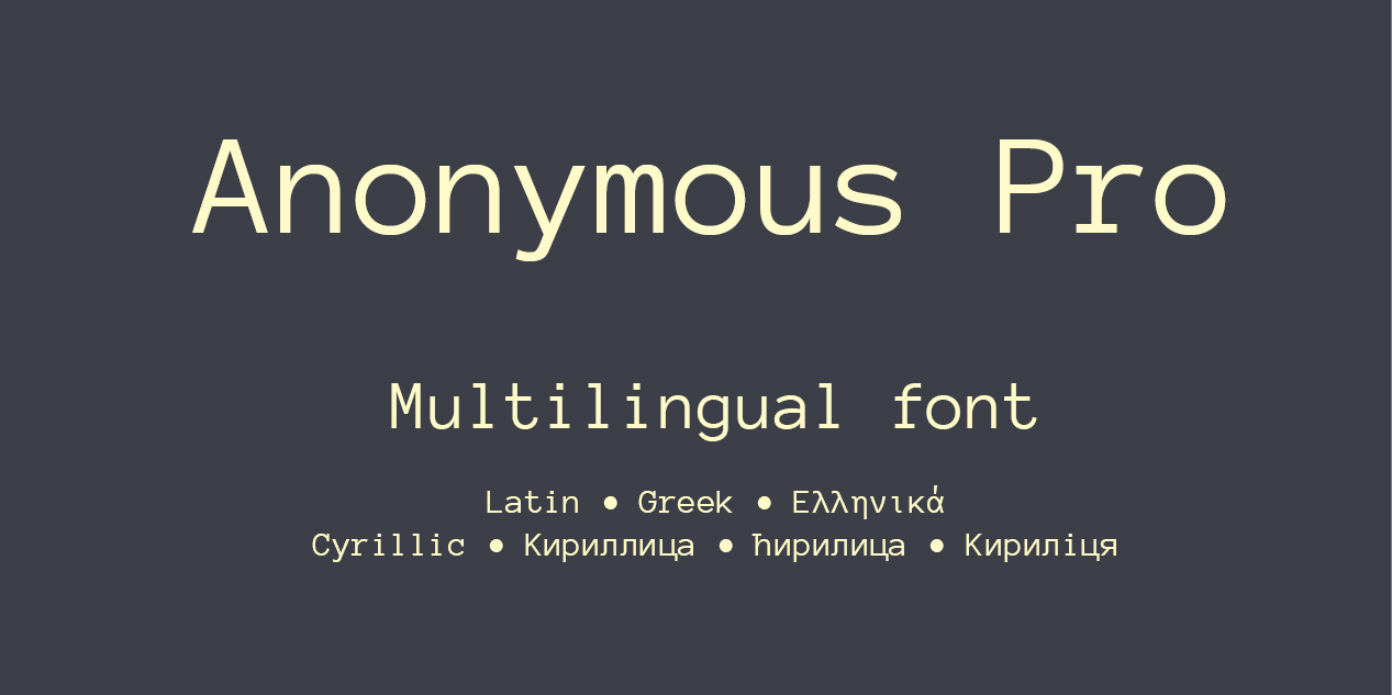


Anonymous Pro is a family of four fixed-width fonts designed especially with coding in mind. Characters that could be mistaken for one another (O, 0, I, l, 1, etc.) have distinct shapes to make them easier to tell apart in the context of source code.
Anonymous Pro also features an international, Unicode-based character set, with support for most Western and European Latin-based languages, Greek, and Cyrillic. It also includes special “box drawing” characters for those who need them.
While Anonymous Pro looks great on Macs and Windows PCs with antialiasing enabled, it also includes embedded bitmaps for specific pixel sizes (“ppems” in font nerd speak) for both the regular and bold weight. (Since slanted bitmaps look pretty bad and hard to read at the supported sizes, I chose to use the upright bitmaps for the italics as well.) Bitmaps are included for these ppems: 10, 11, 12, and 13. See the usage notes below for info on what point sizes these ppems correspond to on Mac and Windows.
Anonymous Pro is based on an earlier font, Anonymous™, which was my TrueType version of Anonymous 9, a freeware Macintosh bitmap font developed in the mid-’90s by Susan Lesch and David Lamkins. The bitmap version was intended as a more legible alternative to Monaco, the fixed-width Macintosh system font.
Anonymous Pro differs from Anonymous™ and Anonymous 9 in a few key characters. While the earlier fonts had a one-story lowercase “a” like Monaco, Anonymous Pro features a two-story lowercase “a” to help distinguish it from the “o”. In the earlier fonts, the slashed zero, designed to look different than the capital “O”, goes the “wrong” way compared to most fonts that have this feature. Susan and David did this intentionally to distinguish it from the slashed capital “Ø” used in some languages. Some people thought this looked odd, so I put it the “right” way, and distinguish it from the “Ø” by keeping the slash inside the character.
Another significant change was to adjust the size of the characters in relation to the point size. Anonymous™ was approximately two sizes larger than comparable fonts at the same point size. This was in keeping with the old Monaco font, but can be annoying when switching between fonts. Anonymous Pro has been adjusted so that it appears about the same size as comparable fonts set at the same point size. If you have been using Anonymous™, you will need to increase the point size to get the same appearance.
Finally, unlike Anonymous™, Anonymous Pro is available in one universal TrueType format that will work on Mac OS X, Windows, and GNU/Linux.
Design, Publisher, Copyright, License
Publisher: Mark Simonson Studio
Copyright 2009 by Mark Simonson. All rights reserved.
License: SIL OPEN FONT LICENSE
Mark Simonson
![]()
Mark Simonson (born 1955) is an American independent font designer who works in St. Paul, Minnesota. Simonson has described his fonts as often being inspired by lettering styles of the past, such as the graphic design of the 1970s and Art Deco graphics. Simonson’s most popular font is Proxima Nova (1994, revised 2005), a geometric-grotesque sans-serif design used by companies such as BuzzFeed, Mashable, NBC, Wired and Mic. As of June 2016, it is the second highest-selling family on font sales website MyFonts. Simonson worked as a graphic designer before specialising in font design. His career as a font designer got a boost when his partner Pat won money on the game show Who Wants to Be a Millionaire, as her success allowed him to take six months off from graphic design work to develop several new fonts that he could sell. He has also written blog articles on the history of type design and the lettering styles used in films.
Web:
Typefaces: Proxima Nova, Proxima Vara, Anonymous Pro, Felt Tip Roman, Goldenbook, Mostra Nuova
More… Wikipedia | Mark Simonson
Free License
Download v. 1.003: Anonymous Pro | Mark Simonson Studio


