Carrois Type Design (Berlin, Germany) started up officially ca. 2010, although Ralph du Carrois has been designing typefaces since ca. 2002. This dynamic company in Germany has three art directors, Jenny du Carrois, Anja Meiners and Botjo Nikoltchev. All three also design typefaces, as well as Adam Twardoch, Andreas Eigendorf and Ralph du Carrois himself. The company specializes in custom type.
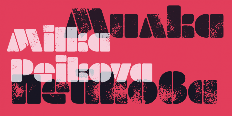
Milka Peikova (b. 1919, Pavel, Bulgaria, d. 2016, Sofia, Bulgaria) was a famous Bulgarian artist. She created paintings, posters, book covers, portraits of famous Bulgarians, textile designs and alphabets, both individually and together with her husband Georgi Kovachev-Grishata (1920-2012). She is a graduate of the Bulgarian National Art Academy, class of 1948. She founded Cosmos magazine and designed for the Women Today and Problems of Art magazines.
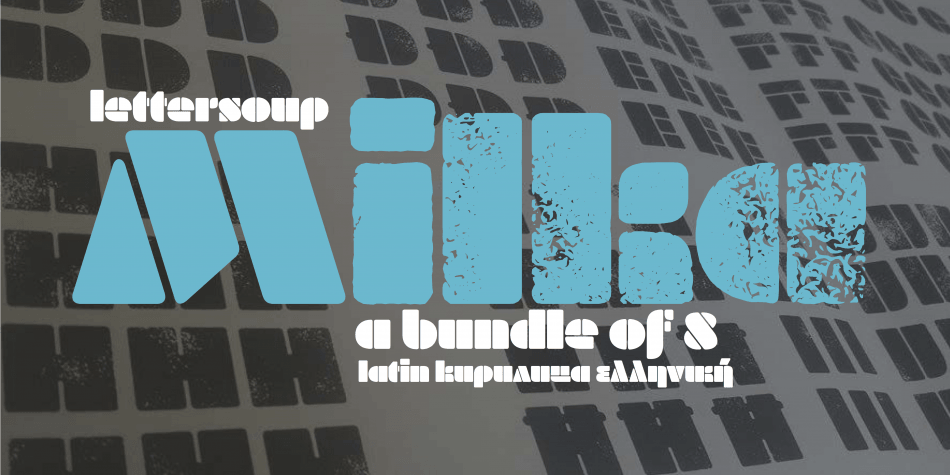
In 1979, she designed an alphabet that was extended to an 8-style Latin / Greek / Cyrillic stencil typeface—Milka (2016)—by a team of designers at Lettersoup that includes Ani Petrova, Botio Nikoltchev, Adam Twardoch and Andreas Eigendorf. The basic Milka font is a clean stencil design, while the Aged, Baked, Brittle, Crunchy, Dry and Soft styles are inspired by stencil and letterpress techniques and expand the usefulness by adding various degrees of warmth or roughness.
Milka Peikova also designed the first Bulgarian typeface for phototypesetting called Grilimil with her husband Georgi Kovachev-Grishata. She is the recipient of the first prize for a typeface at the Bulgarian National Book Exhibition and Illustration.
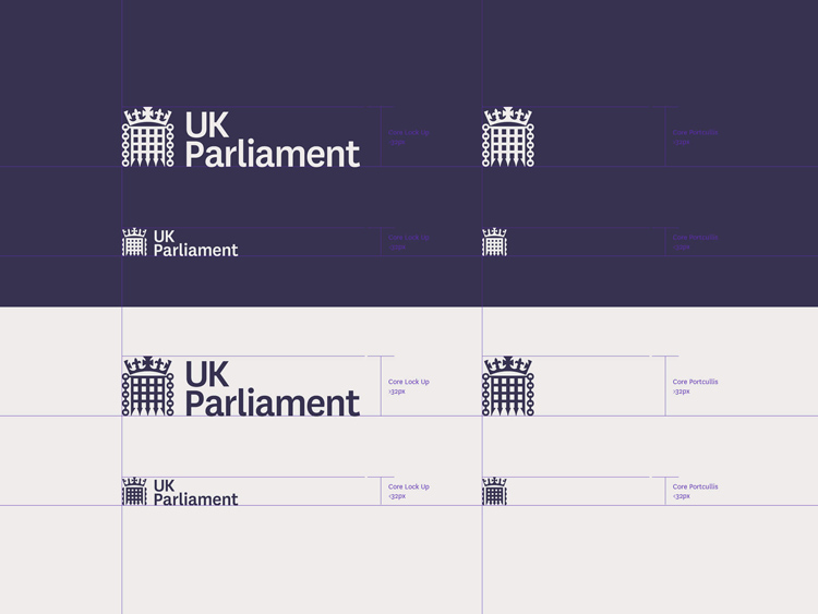
The visual identity of the UK Parliament has been reviewed and updated
The visual identity of the UK Parliament has been reviewed and updated because the current version was designed for printed material and does not work successfully on digital channels.
The new visual identity can already be seen on the UK Parliament’s website and social media channels.
Unlike its predecessor, the new version works on responsively designed digital channels, i.e. where the design has to change size depending on whether it is being viewed on a computer, tablet or mobile phone. The new visual identity is also more accessible and readable than its predecessor.
The new visual identity uses ‘UK Parliament’ rather than ‘Houses of Parliament’ to highlight the role of the institution in the UK’s constitution, and to distinguish it from the building it occupies.
The two Houses share a large number of public-facing services which require a consistent parliamentary identity. The new visual identity will be implemented across these services in a phased approach, to ensure that the public can easily identify the services provided by the UK Parliament. Design studio SomeOne explored a number of options for typefaces. It was important that the chosen typeface could portray Parliament’s vast heritage as well help to reflect it being an inclusive and modern organisation. Two typefaces were choosen: Register (A2 Type Foundry) and National (Klim Type Foundry), which work well as a combination or individually.
The House of Commons and House of Lords will continue to use their own, existing visual identities.
Valery Golyzhenkov’s First Prize typeface has been considerably extended, to include as many as 27 styles, announcded Type.Today Journal! Three bold styles have been complemented by lighter styles and an additional line of narrowed styles. First Prize now comes with enhanced versatility and a wider range of application options. Specimen
Druk is a study in extremes, featuring the narrowest, widest, and heaviest typefaces in the Commercial Type library to date. Starting from Medium and going up to Super, Druk is uncompromisingly bold. Specimen
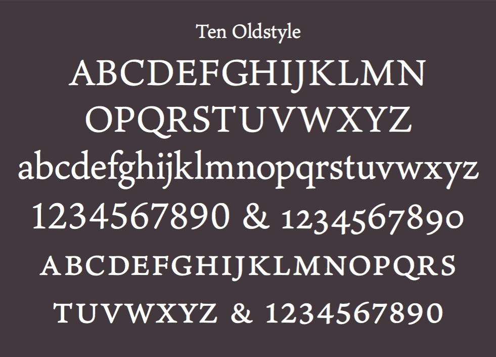
Robert Slimbach: “As type usage becomes increasingly globalized, type designers are increasingly called upon to extend the language coverage of their typefaces.
As a Western type designer, I’m often challenged to design non-Latin extensions for both new and existing designs. Because Latin has always been my initial focus, I’m used to adapting non-Latin scripts to work within Western typographic standards. In doing so, I seek to balance script compatibility with script authenticity. With the Ten Oldstyle project, the tables had turned, and I was now being called upon to develop a Latin roman design to accompany the new Ten Mincho font that was being developed by Adobe …”
IBM launched in beta its new bespoke typeface IBM Plex and thus said farewell to Helvetic. “When I came to IBM, explains Mike Abbink (the typeface’s designer and IBM’s executive creative director of brand experience and design), it was a big discussion: Why does IBM not have a bespoke typeface? Why are we still clinging on to Helvetica? The way we speak to people and the conversations we need to have and we’d like to have, is that still the right way to express ourselves? We should really design a typeface that really reflects our belief system and make it relevant to people now. Helvetica is a child of a particular sect of modernist thinking that’s gone today.”
So, Mike Abbink and his team made it. The new IBM bespoke font family is IBM Plex. And it is free. Really! Free to download, free to use. Free under SIL Open Font License. Go to Github and you will realize that this is true.
The new visual history of IBM that starts with IBM Plex is open minded to people.
“If shoe stores or coffee shops or small businesses are using it for their identity, awesome,” Abbink says in the video. “They’re agreeing they want to be part of a discussion around machines and how they’re going to evolve and progress our world.”
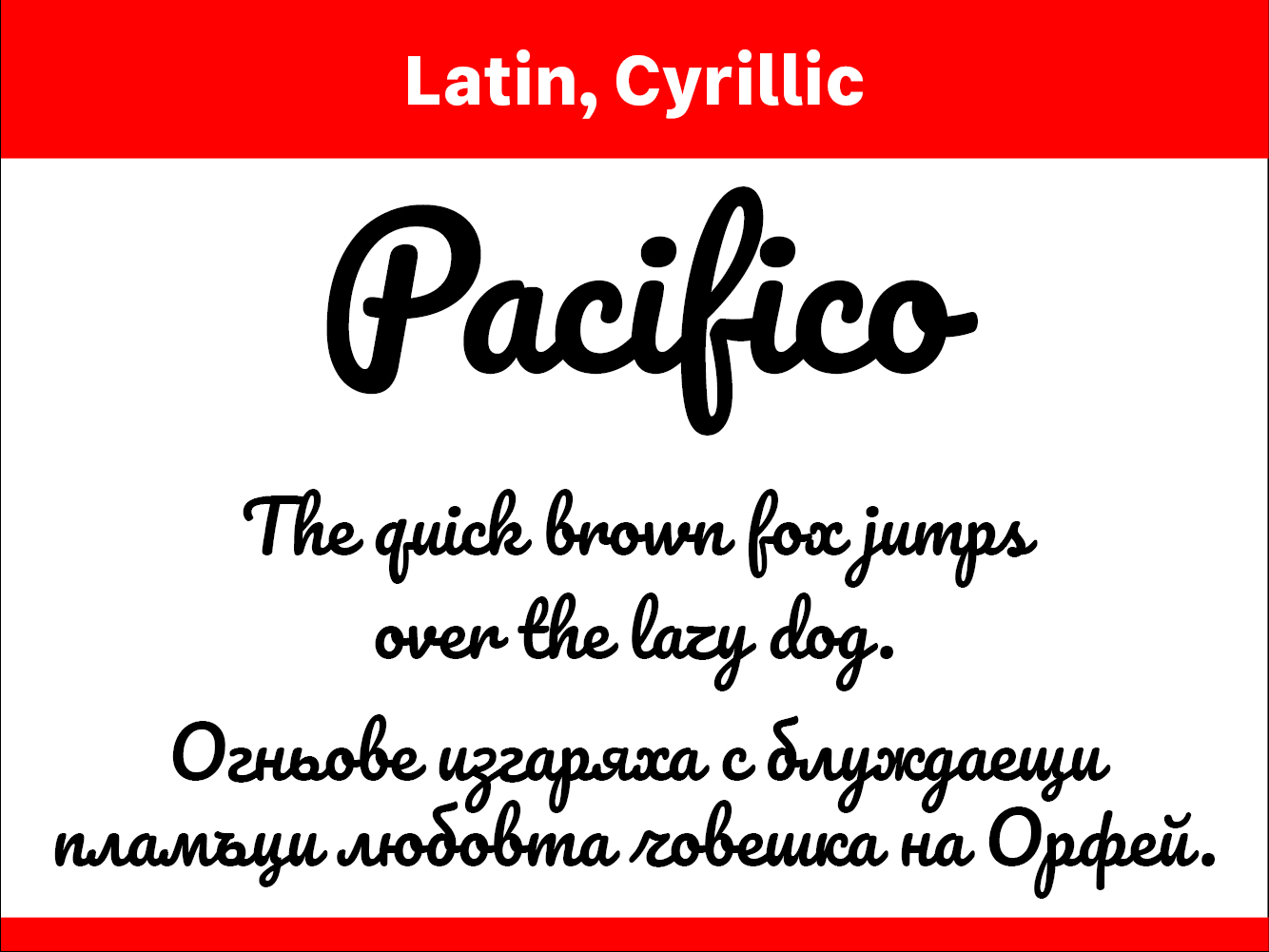
Aloha! Pacifico is an original and fun brush script handwriting font by Vernon Adams which was inspired by the 1950s American surf culture in 2011. It was redrawn by Jacques Le Bailly at Baron von Fonthausen in 2016. It was expanded to Cyrillic by Botjo Nikoltchev and Ani Petrova at Lettersoup in 2017.
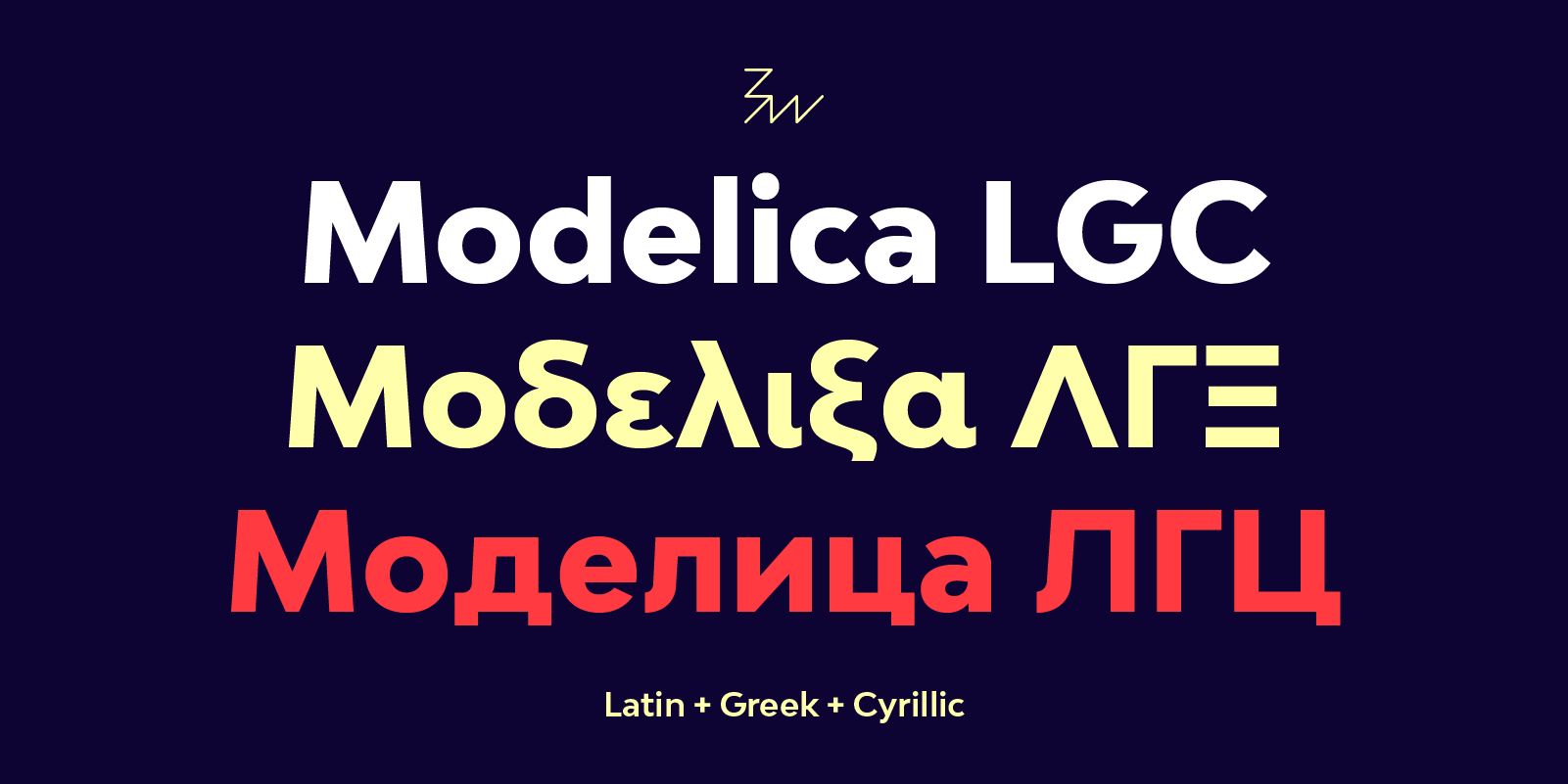
Please welcome the upgraded Bw Modelica LGC, which stands for Latin, Greek and Cyrillic. Initially released supporting all Latin European languages, we just expanded the character set to cover Greek and Cyrillic scripts (including Bulgarian, Serbian, Macedonian letterform model). The Bw Modelica font family is available in different subsets so you don’t have to license for characters you are never going to use. It also has a dedicated microsite where you can test all the different character sets available in one place. Designed by Alberto Romanos, Bw Modelica is a minimal, robust, reliable & pragmatic geometric sans. Its clean shapes and generous x-height makes it a very competent typeface for both, display and body copy purposes.
Sean McBridge announced on Adobe Typekit Blog an improvement in support for older versions of Internet Explorer. The new published kits now serves additional variation-specific font-family names to IE 6-8. This makes it possible to work around bugs in these browsers that are triggered when multiple weights and styles of a single font family are used in the same kit, explain Sean McBridge. Most importantly, these additional font-family names make it possible to use more than four weights and styles of a single font family in IE 6-8.
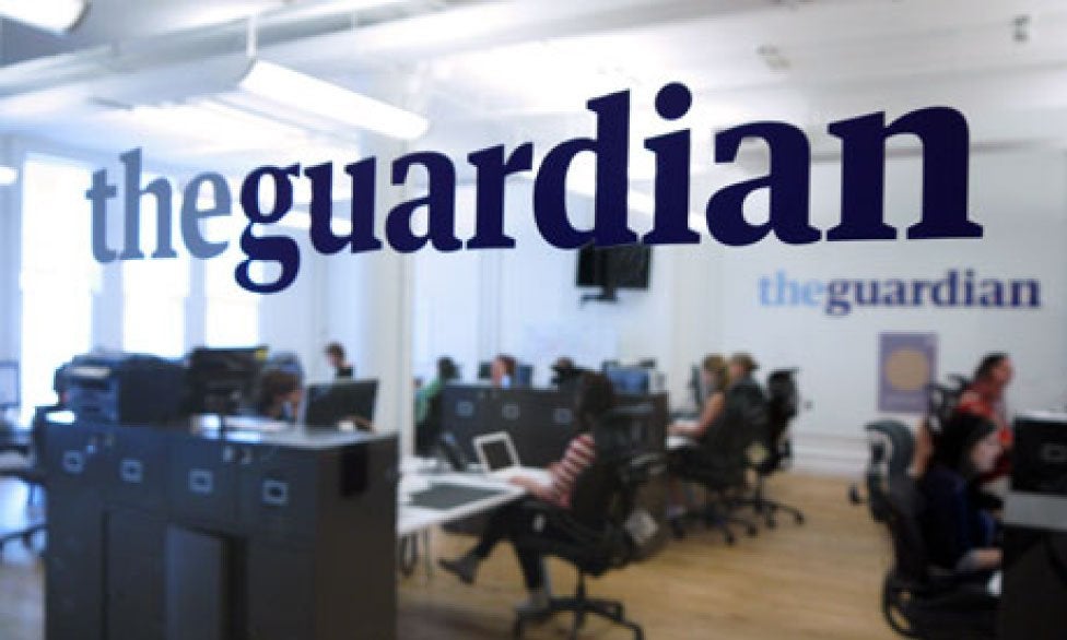
The Guardian with the design experts Commercial Type introduce a font called Guardian Headline
On Monday 15 January, The Guardian unveil a new look theguardian.com and Guardian app in line with the launch of The Guardian in tabloid print format. Katharine Viner: We have thought carefully about how our use of typography, colour and images can support and enhance Guardian journalism. We have introduced a font called Guardian Headline that is simple, confident and impactful. This was a collaboration with the design experts Commercial Type, who created the original Guardian Egyptian, and is easier to read. We’re using a range of energetic colours, and the much-loved Guardian visual wit and style remain at the heart of the look. The masthead has a renewed strength and confidence to represent the Guardian’s place and mission in these challenging times.
An interview with Yuri Yarmola on font designer tools, Photoshop effect and FontLab VI
in connection with the completion of the FontLab VI and its release for sale the Russian online magazine ‘Type Journal’ publishes an extensive and very curious interview with Yuri Yarmola (text in Russian).
Thom Janssen introduced on Github the GlyphMorf. GlyphMorf is an experimental way for making parametric adjustments for a font, in RoboFont. Downloading GlyphMorf Extension is free. Using GlyphMorf in a professional environment is not.
GlyphMorf analyses the glyph drawing and extract parameters out of it. By redrawing the glyph with different parameters you get different new glyphs / fonts. The drawing should be so that every point on the contour can be paired with an other point in the same contour on the other side of the stem/stroke. This means that all contours must have an even number of points. The starting point marks the beginning of the inner or outer part of the contour, depends a bit on the design. See image, the selected (orange) segments show the first half of the contours.
TT Tunnels by Typetype is a display sans font family. This typeface has five styles.
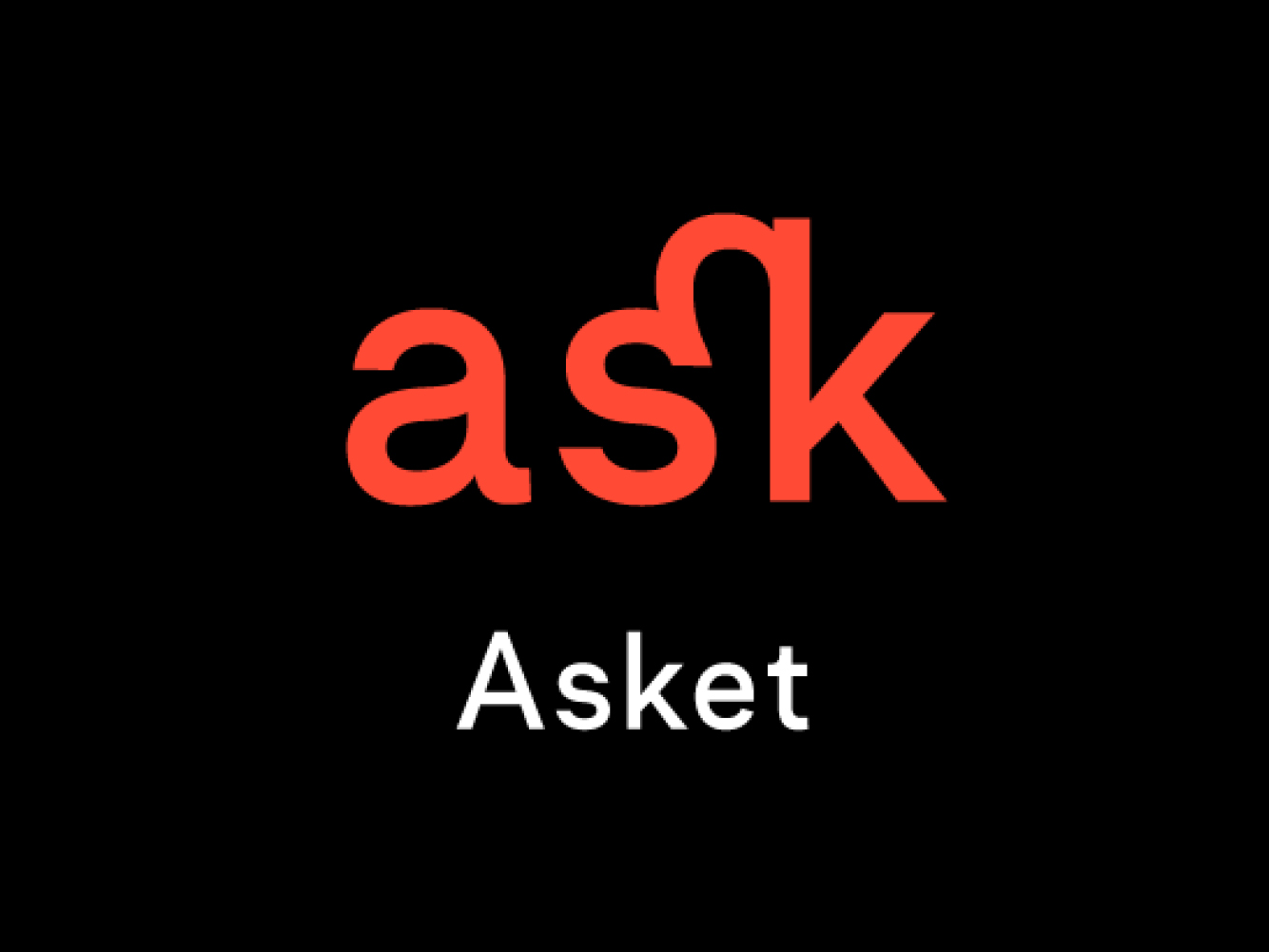
Asket by Elena Kowalski is a sans serif typeface with Latin and Cyrillic scripts.
Bw Modelica LGC by Alberto Romanos is a sans serif typeface with Latin, Greek and Cyrillic scripts.
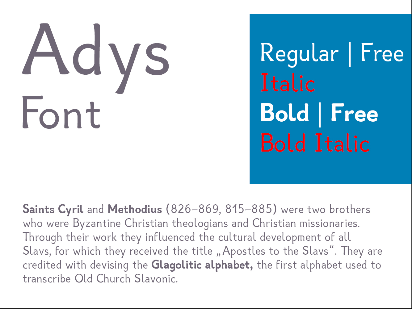
Adys by Kristina Kostova is designed to help people who suffer from dyslexia in minor stages. However, it does not create any discomfort for people who do not have any specific symptoms. This is what makes it suitable for widespread use.
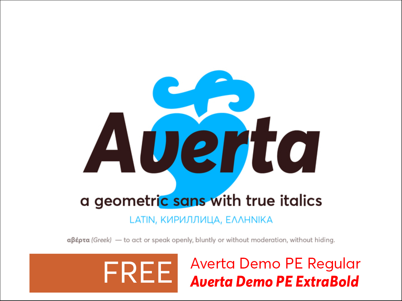
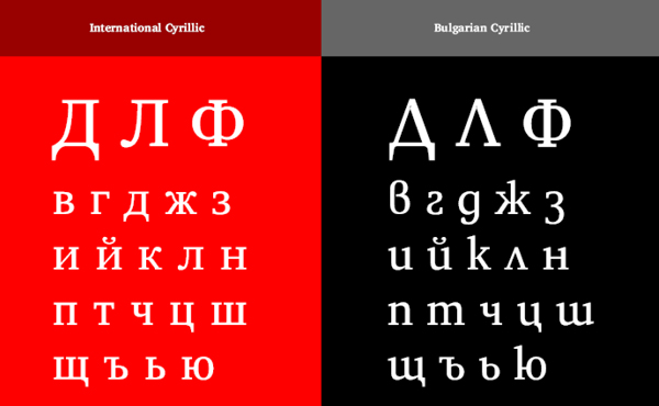
Averta by Kostas Bartsokas comes in eight weights with matching italics and supports over two hundred languages with an extended Latin, Cyrillic (Russian, Bulgarian, and Serbian/Macedonian alternates), Greek and Vietnamese character set.
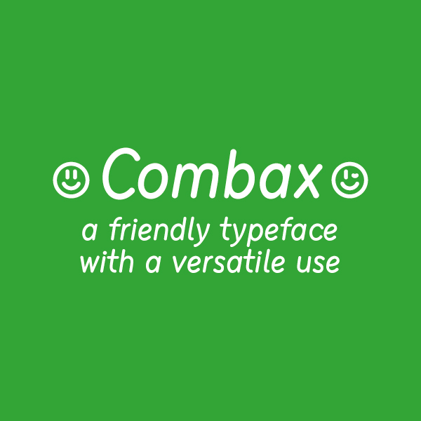
Combax by Vasil Stanev is a text font with a wide language support and special care for localization. Featuring Cyrillic and also extended Latin, it’s one weight is rich in ligatures, punctuation and symbols and also careful coding. Playful yet robust, it is the perfect choice when you are loking for a Comic Sans replacement.
Wind
Typotheque
23 November 2017
Typotheque announced the issue of Wind – a capital-only display typeface by Hansje van Halem for intricate headlines, and optical effects.
Wind is the first published typeface of Amsterdam-based book and graphic designer Hansje van Halem. Like her other work, which is highly experimental, it uses vivid colours and intricately detailed patterns to create unexpected optical illusions, and its various layers can be combined and overlaid to create vibrant, hypnotic patterns.
This GitHub repository is used for discussion and review of proposals for registration of OpenType design-variation axis tags.
Why register a design-variation axis?
OpenType supports custom or “foundry-defined” axes, allowing any font developer to create a font with whatever axes they wish (provided the syntactic requirements for a custom tag are met). So, why bother going through the process to register an axis? The short answer is that it can provide better experiences for end users and create opportunities for font and application developers.
While a font family design can be varied in any number of arbitrary ways, there are some kinds of variation that can seem useful and interesting to many different foundries. With custom axes, different foundries could create families with the same kinds of design variants, but because they have each identified the same variants in different ways, applications have no way to interact with particular variants, and users have inconsistent experiences.
A registered axis provides two key benefits over custom axes:
(EN) The quick brown fox jumps over the lazy dog. (NL) Op brute wijze ving de schooljuf de quasi-kalme lynx. (CS) Nechť již hříšné saxofony ďáblů rozezvučí síň úděsnými tóny waltzu, tanga a quickstepu. (HU) Jó foxim és don Quijote húszwattos lámpánál ülve egy pár bűvös cipőt készít. (RO) Înjurând pițigăiat, zoofobul comandă vexat whisky și tequila. (RU) Разъяренный чтец эгоистично бьёт пятью жердями шустрого фехтовальщика. (BG) Огньове изгаряха с блуждаещи пламъци любовта човешка на Орфей. (SR) Фијуче ветар у шибљу, леди пасаже и куће иза њих и гунђа у оџацима. (EL) Ταχίστη αλώπηξ βαφής ψημένη γη, δρασκελίζει υπέρ νωθρού κυνός. Type your own text to test the font!
Description
Aloha! Pacifico is an original and fun brush script handwriting font by Vernon Adams which was inspired by the 1950s American surf culture in 2011. It was redrawn by Jacques Le Bailly at Baron von Fonthausen in 2016. It was expanded to Cyrillic by Botjo Nikoltchev and Ani Petrova at Lettersoup in 2017.
Vernon practiced typeface design from 2007 to 2014. A lifelong artist, during this time he eagerly explored designing type for the cloud-based era. His work spans all genres, from lively script faces to workhorse text families and operating system UI. Vernon graduated with an MA in Typeface Design from the University of Reading and lives in California. His designs are mostly published as open source Google Fonts and his favorite projects include Oxygen Mono, Monda, and Bowlby One. Follow his story at www.sansoxygen.com.
Design, Publisher, Copyright, License
Principal design: Vernon Adams
Design: Jacques Le Bailly, Botjo Nikoltchev, Ani Petrova
Publisher: Vernon Adams
Copyright 2011 by Vernon Adams. All rights reserved.
License: SIL OPEN FONT LICENSE
Vernon Adams
Vernon Adams (born England, 1967) was a furniture restorer, woodcarver and typeface designer. On August 24, 2016 Vernon Adams passed away from injuries sustained in a scooter accident in May of 2014. New Typography was his type design site. Vernon graduated in 2007 with an MA in type design from the University of Reading and lived in San Clemente, California.
(EN) The quick brown fox jumps over the lazy dog. (NL) Op brute wijze ving de schooljuf de quasi-kalme lynx. (CS) Nechť již hříšné saxofony ďáblů rozezvučí síň úděsnými tóny waltzu, tanga a quickstepu. (HU) Jó foxim és don Quijote húszwattos lámpánál ülve egy pár bűvös cipőt készít. (RO) Înjurând pițigăiat, zoofobul comandă vexat whisky și tequila. (RU) Разъяренный чтец эгоистично бьёт пятью жердями шустрого фехтовальщика. (BG) Огньове изгаряха с блуждаещи пламъци любовта човешка на Орфей. (SR) Фијуче ветар у шибљу, леди пасаже и куће иза њих и гунђа у оџацима. (EL) Ταχίστη αλώπηξ βαφής ψημένη γη, δρασκελίζει υπέρ νωθρού κυνός. Type your own text to test the font!
Description
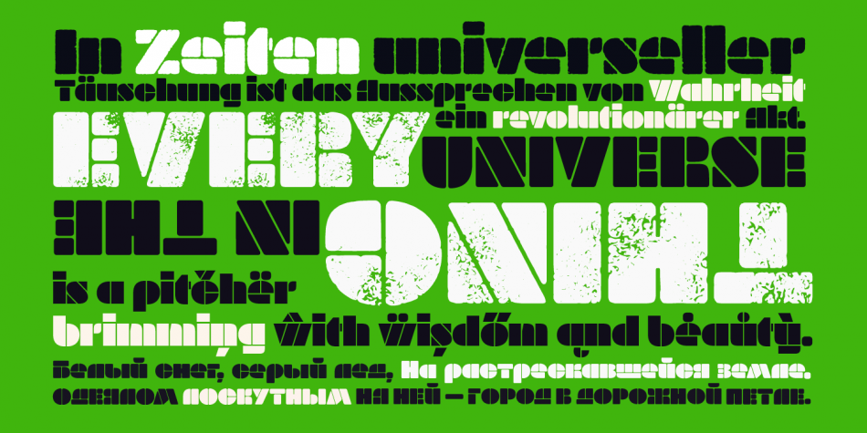
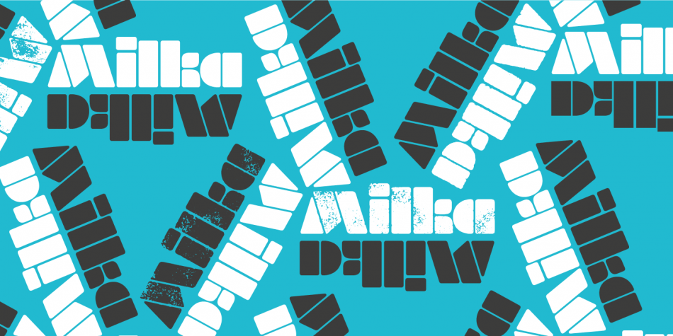
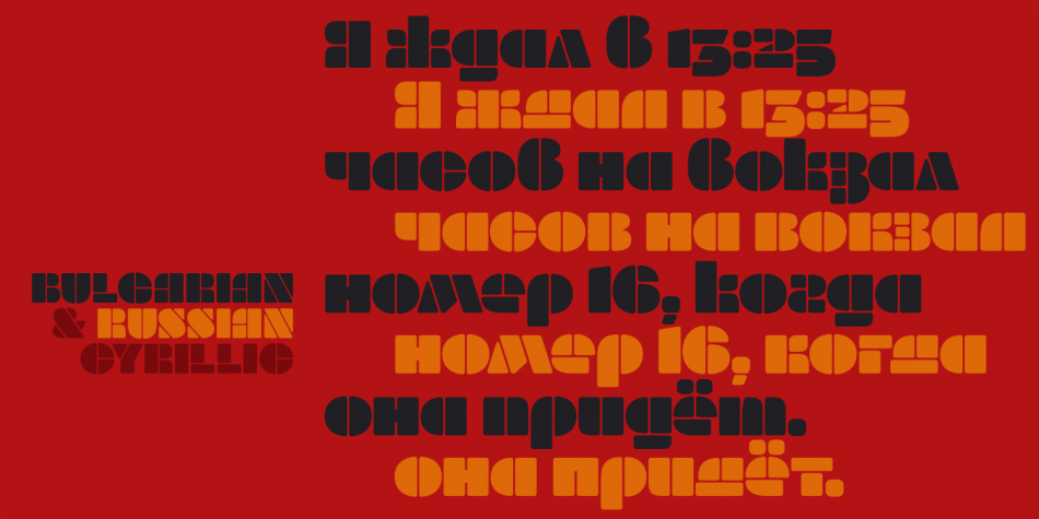
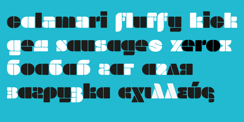
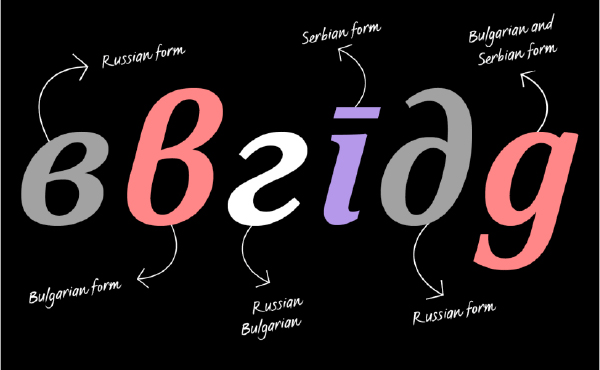
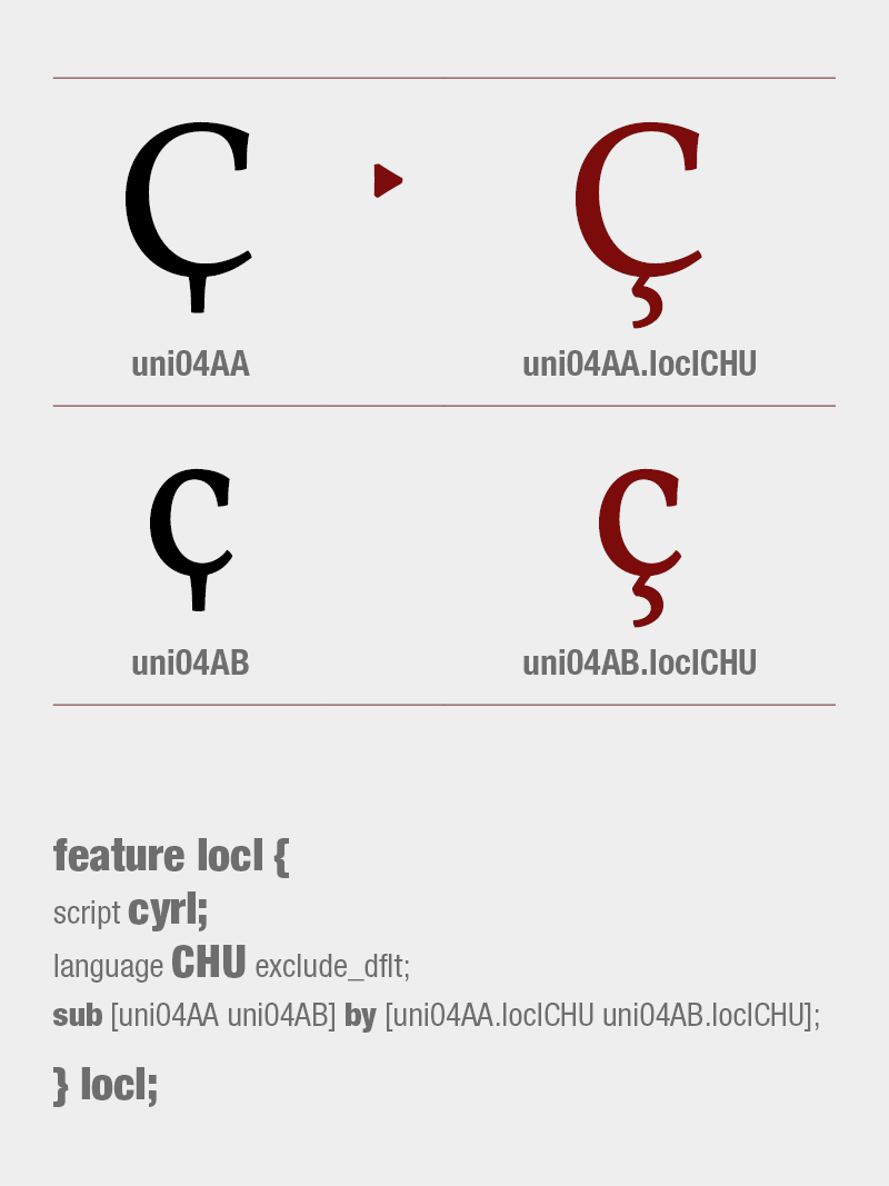
Milka is an 8-style stencil font family created by a team of designers born within the span of almost 70 years. It is a digital expansion on an alphabet designed in 1979 by the famous Bulgarian artist Milka Peikova.
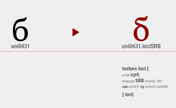
The basic Milka font is a clean stencil design, while the Aged, Baked, Brittle, Crunchy, Dry and Soft styles are inspired by stencil and letterpress techniques and expand the usefulness by adding various degrees of warmth or roughness. The Milka font family has extensive Latin, Cyrillic and Greek character set support including localized forms for Russian and Bulgarian as well as numerous OpenType features.
Since 2014, Berlin-based Bulgarian type designer Botio Nikoltchev has been working with three Bulgarian female designers (the original designer Milka Peikova, who passed away in 2016 at the age of 96, and with Ani Petrova and Anelia Pashova, both from a young generation), as well as with Berlin-based Adam Twardoch and Andreas Eigendorf to create a modern revival of Ms Peikova’s inspiring stencil alphabet. Milka Peikova (1919-2016) was one of Bulgaria’s most famous female artists whose work has influenced several generations of Bulgarian designers. During her impressive career spanning almost seven decades, she created paintings, posters, book covers, textile designs and alphabets, both individually and together with her husband Georgi Kovachev-Grishata (1920–2012).
To try Milka in your project, download the Milka Free (uppercase-only) version at MyFonts!
Design, Publisher, Copyright, License
Design: Milka Peikova, Botio Nikoltchev , Ani Petrova , Adam Twardoch , Andreas Eigendorf
Publisher: Lettersoup
Copyright 2016 by Botio Nikoltchev. All rights reserved.
Milka Peikova (b. 1919, Pavel, Bulgaria, d. 2016, Sofia, Bulgaria) was a famous Bulgarian artist. She created paintings, posters, book covers, portraits of famous Bulgarians, textile designs and alphabets, both individually and together with her husband Georgi Kovachev-Grishata (1920-2012). She is a graduate of the Bulgarian National Art Academy, class of 1948. She founded Cosmos magazine and designed for the Women Today and Problems of Art magazines.
In 1979, she designed an alphabet that was extended to an 8-style Latin / Greek / Cyrillic stencil typeface—Milka (2016)—by a team of designers at Lettersoup that includes Ani Petrova, Botio Nikoltchev, Adam Twardoch and Andreas Eigendorf. The basic Milka font is a clean stencil design, while the Aged, Baked, Brittle, Crunchy, Dry and Soft styles are inspired by stencil and letterpress techniques and expand the usefulness by adding various degrees of warmth or roughness.
Milka Peikova also designed the first Bulgarian typeface for phototypesetting called Grilimil with her husband Georgi Kovachev-Grishata. She is the recipient of the first prize for a typeface at the Bulgarian National Book Exhibition and Illustration.
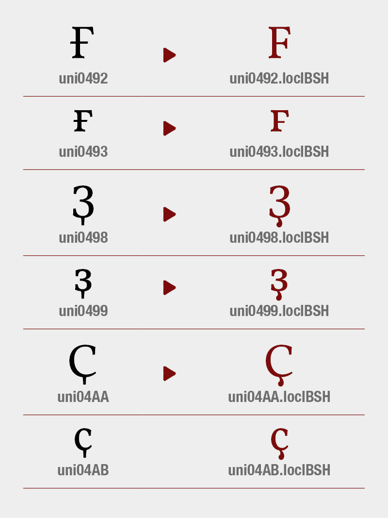
Botjo Nikoltchev, b. 1978, Sofia, Bulgaria. Botio studied graphic and type design in Potsdam. He is living and working as a freelance designer in Berlin. He studied communication design at the University of Applied Science Potsdam and took type design classes with Luc(as) de Groot. After his studies Botio worked with Ole Schäfer (Primetype) on the Cyrillic characters of PTL Manual, PTL Manual Mono and PTL Notes. Since 2010 he has been collaborating with Ralph du Carrois and Erik Spiekermann as type designer and art director at Carrois Type Design, focusing on Cyrillic, Greek and Arabic language extensions and CI projects. In 2014, he set up the commercial typefoundry Lettersoup.
Type designer, b. 1988, Sofia, Bulgaria, who works at Fontfabric, Svetoslav Simov’s typefoundry. She completed her Bachelor’s degree at The National Academy of Art in Sofia. In 2014 she obtained a Master’s degree in type design.
Adam Twardoch (b. 1975) was raised in Tychy, Poland, and graduated from the University of Frankfurt/Oder, Germany. He worked at for Agentur GmbH, a Frankfurt/Oder-based design firm. Since 1991, Adam has advised numerous type designers on Central European extensions of their typefaces and has created localized versions of over fifty fonts. He frequently writes on type-related matters, and is the founder of Font.org, a (now defunct) website featuring articles about typography in English and Polish. Adam Twardoch is Director of Products of FontLab (since 2004), and is typographic consultant at Linotype (since 2002) and Tiro Typeworks (since 2001), and general font specialist at MyFonts (2000-2012). Since 2012 he is based in Berlin. Adam Twardoch is working in the field of font technology, multilingual typography, CSS webfonts, Unicode and OpenType.
Berlin, Germany-based font engineer. Designer of several CE versions of FontFont fonts, such as the CE versions of Ole Schaefer’s Fago: FF Fago Office Sans CE, Fago Office Serif CE (2000).


 Bw Modelica LGC by Alberto Romanos is a sans serif typeface with Latin, Greek and Cyrillic scripts.